# 🎨 shadcn_flutter
**A cohesive shadcn/ui ecosystem for Flutter—components, theming, and
tooling—ready to ditch Material and Cupertino**
[](https://pub.dev/packages/shadcn_flutter)
[](https://pub.dev/packages/shadcn_flutter)
[](https://pub.dev/packages/shadcn_flutter)
[](https://github.com/sponsors/sunarya-thito)
[](https://github.com/sunarya-thito/shadcn_flutter)
---
🚀 A comprehensive Flutter UI ecosystem built on shadcn/ui: production‑ready
components, primitives, theming, and tooling for mobile, web, and desktop.
Interop with Material/Cupertino is optional—adopt incrementally or go all‑in.
**[📚 Widget Catalog](https://sunarya-thito.github.io/shadcn_flutter/)** •
**[📦 pub.dev](https://pub.dev/packages/shadcn_flutter)** •
**[💬 Discord](https://discord.gg/ZzfBPQG4sV)**
## ✨ Features
- 🎨 **70+ Beautiful Components** - From basic buttons to complex data tables
- 🧩 **Ecosystem‑first** - Components, primitives, theming, and tooling aligned
with shadcn/ui
- 🌙 **Dark/Light Mode** - Built-in theme switching with multiple color schemes
- 📱 **Responsive Design** - Components that work seamlessly across all screen
sizes
- 🔁 **Incremental Adoption** - Works inside MaterialApp/CupertinoApp; mix and
match while you migrate
- 🖥️📱 **All Platforms** - Android, iOS, Web, macOS, Windows, and Linux
- 🎯 **Type Safe** - Full TypeScript-like experience with Dart's strong typing
- 🚀 **Performance First** - Optimized components for smooth animations and
interactions
- 🎨 **Customizable** - Easy theming and styling to match your brand
- 📦 **Tree Shakable** - Import only what you need
## 🧩 Components Library
### Animation
[](https://sunarya-thito.github.io/shadcn_flutter/#/components/animated_value_builder)
[](https://sunarya-thito.github.io/shadcn_flutter/#/components/number_ticker)
[](https://sunarya-thito.github.io/shadcn_flutter/#/components/repeated_animation_builder)
### Disclosure
[](https://sunarya-thito.github.io/shadcn_flutter/#/components/accordion)
[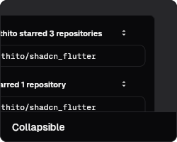](https://sunarya-thito.github.io/shadcn_flutter/#/components/collapsible)
### Feedback
[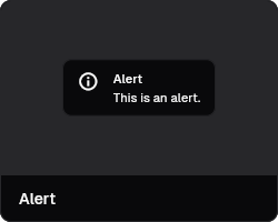](https://sunarya-thito.github.io/shadcn_flutter/#/components/alert)
[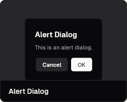](https://sunarya-thito.github.io/shadcn_flutter/#/components/alert-dialog)
[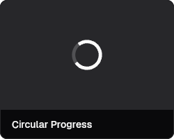](https://sunarya-thito.github.io/shadcn_flutter/#/components/circular-progress)
[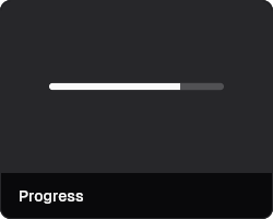](https://sunarya-thito.github.io/shadcn_flutter/#/components/progress)
[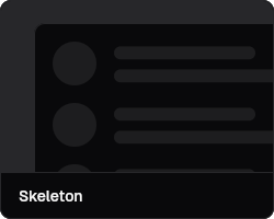](https://sunarya-thito.github.io/shadcn_flutter/#/components/skeleton)
[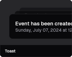](https://sunarya-thito.github.io/shadcn_flutter/#/components/toast)
### Forms
[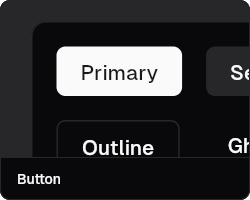](https://sunarya-thito.github.io/shadcn_flutter/#/components/button)
[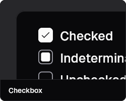](https://sunarya-thito.github.io/shadcn_flutter/#/components/checkbox)
[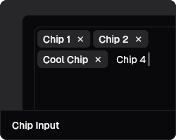](https://sunarya-thito.github.io/shadcn_flutter/#/components/chip_input)
[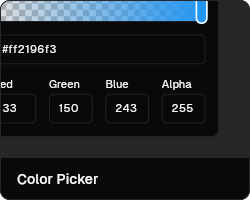](https://sunarya-thito.github.io/shadcn_flutter/#/components/color-picker)
[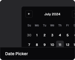](https://sunarya-thito.github.io/shadcn_flutter/#/components/date_picker)
[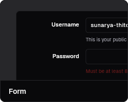](https://sunarya-thito.github.io/shadcn_flutter/#/components/form)
[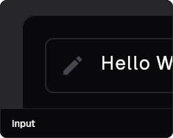](https://sunarya-thito.github.io/shadcn_flutter/#/components/input)
[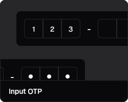](https://sunarya-thito.github.io/shadcn_flutter/#/components/input_otp)
[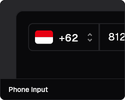](https://sunarya-thito.github.io/shadcn_flutter/#/components/phone_input)
[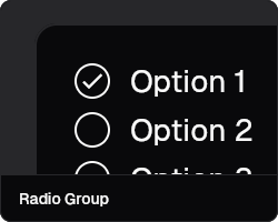](https://sunarya-thito.github.io/shadcn_flutter/#/components/radio_group)
[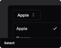](https://sunarya-thito.github.io/shadcn_flutter/#/components/select)
[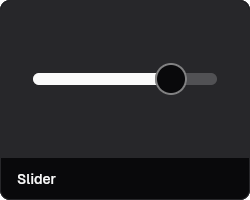](https://sunarya-thito.github.io/shadcn_flutter/#/components/slider)
[](https://sunarya-thito.github.io/shadcn_flutter/#/components/star_rating)
[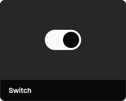](https://sunarya-thito.github.io/shadcn_flutter/#/components/switch)
[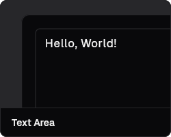](https://sunarya-thito.github.io/shadcn_flutter/#/components/text_area)
[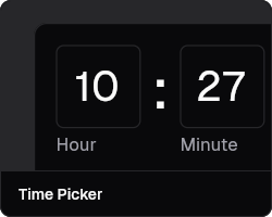](https://sunarya-thito.github.io/shadcn_flutter/#/components/time_picker)
[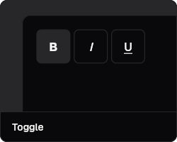](https://sunarya-thito.github.io/shadcn_flutter/#/components/toggle)
### Layout
[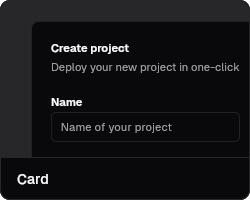](https://sunarya-thito.github.io/shadcn_flutter/#/components/card)
[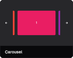](https://sunarya-thito.github.io/shadcn_flutter/#/components/carousel)
[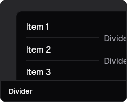](https://sunarya-thito.github.io/shadcn_flutter/#/components/divider)
[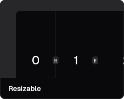](https://sunarya-thito.github.io/shadcn_flutter/#/components/resizable)
[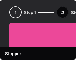](https://sunarya-thito.github.io/shadcn_flutter/#/components/stepper)
[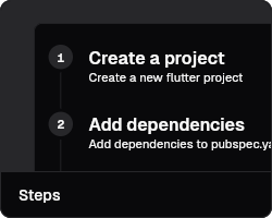](https://sunarya-thito.github.io/shadcn_flutter/#/components/steps)
[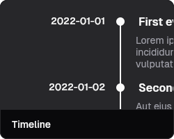](https://sunarya-thito.github.io/shadcn_flutter/#/components/timeline)
### Navigation
[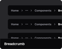](https://sunarya-thito.github.io/shadcn_flutter/#/components/breadcrumb)
[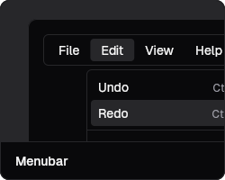](https://sunarya-thito.github.io/shadcn_flutter/#/components/menubar)
[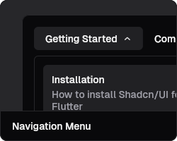](https://sunarya-thito.github.io/shadcn_flutter/#/components/navigation_menu)
[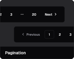](https://sunarya-thito.github.io/shadcn_flutter/#/components/pagination)
[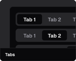](https://sunarya-thito.github.io/shadcn_flutter/#/components/tabs)
[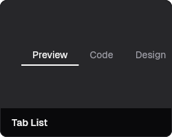](https://sunarya-thito.github.io/shadcn_flutter/#/components/tab_list)
[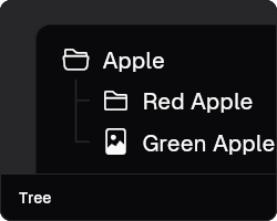](https://sunarya-thito.github.io/shadcn_flutter/#/components/tree)
### Surfaces
[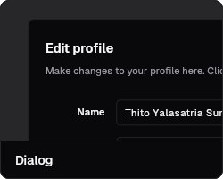](https://sunarya-thito.github.io/shadcn_flutter/#/components/dialog)
[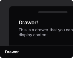](https://sunarya-thito.github.io/shadcn_flutter/#/components/drawer)
[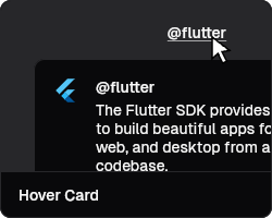](https://sunarya-thito.github.io/shadcn_flutter/#/components/hover_card)
[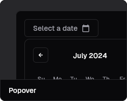](https://sunarya-thito.github.io/shadcn_flutter/#/components/popover)
[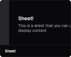](https://sunarya-thito.github.io/shadcn_flutter/#/components/sheet)
[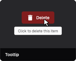](https://sunarya-thito.github.io/shadcn_flutter/#/components/tooltip)
### Data Display
[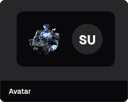](https://sunarya-thito.github.io/shadcn_flutter/#/components/avatar)
[](https://sunarya-thito.github.io/shadcn_flutter/#/components/avatar_group)
[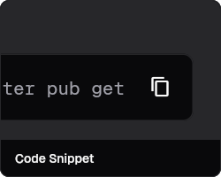](https://sunarya-thito.github.io/shadcn_flutter/#/components/code-snippet)
[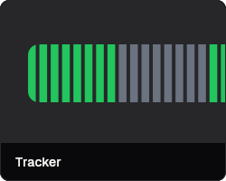](https://sunarya-thito.github.io/shadcn_flutter/#/components/tracker)
### Utilities
[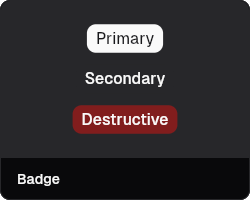](https://sunarya-thito.github.io/shadcn_flutter/#/components/badge)
[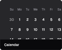](https://sunarya-thito.github.io/shadcn_flutter/#/components/calendar)
[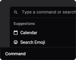](https://sunarya-thito.github.io/shadcn_flutter/#/components/command)
[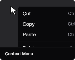](https://sunarya-thito.github.io/shadcn_flutter/#/components/context_menu)
[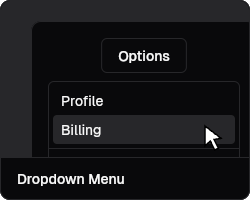](https://sunarya-thito.github.io/shadcn_flutter/#/components/dropdown_menu)
## 🧠 LLMs Support
This repository includes a prebuilt, machine‑friendly reference file you can
feed to LLMs and editor assistants:
- [`llms-full.txt`](https://sunarya-thito.github.io/shadcn_flutter/llms-full.txt) -
Full component reference with props, methods, and usage examples
## ❓ FAQ
Does this replace Material/Cupertino?
Yes. shadcn_flutter is a standalone ecosystem built on the shadcn/ui design
system. Interop with Material/Cupertino is optional so you can adopt it
incrementally or go all‑in.
Can I use it with my existing MaterialApp/CupertinoApp?
Yes. Drop shadcn_flutter components into your app, keep your current routing
(e.g., GoRouter) and state management, and migrate over time.
Does it support GoRouter?
Yes.
Which platforms are supported?
Android, iOS, Web, macOS, Windows, and Linux.
Can I use it commercially?
Yes. Free to use for personal and commercial projects. No attribution required.
Can I choose between Default and New York styles?
This package currently supports the New York style. If you need the default
style of shadcn/ui, consider this package:
[flutter-shadcn-ui](https://github.com/nank1ro/flutter-shadcn-ui) by
[@nank1ro](https://x.com/nank1ro).
## 🤝 Contributing & Support
We welcome contributions from the community! Here's how you can help make
shadcn_flutter even better:
### 🌟 Ways to Contribute
[](https://github.com/sunarya-thito/shadcn_flutter)
[](https://github.com/sponsors/sunarya-thito)
[](https://github.com/sunarya-thito/shadcn_flutter/issues)
[](https://github.com/sunarya-thito/shadcn_flutter/issues)
#### 💰 Financial Support
- 💖 **[GitHub Sponsors](https://github.com/sponsors/sunarya-thito)** - Support
ongoing development
- 💰 **[PayPal](https://paypal.me/sunaryathito)** - Support ongoing development
- ⭐ **Star the repository** - Help us reach more developers
- 📢 **Share the project** - Spread the word in your community
#### 🛠️ Code Contributions
- 🐛 **Bug fixes** - Help us squash those pesky bugs
- ✨ **New features** - Add components or enhance existing ones
- 📚 **Documentation** - Improve guides, examples, and API docs
- 🧪 **Testing** - Write tests to improve reliability
#### 🗨️ Community Support
- 💬 **[Join our Discord](https://discord.gg/ZzfBPQG4sV)** - Get help and
connect with other developers
- 🤝 **Help others** - Answer questions and share your knowledge
- 📝 **Write tutorials** - Create blog posts or video tutorials
### 🏆 Recognition
This project is funded and maintained by the community. Every contribution, no
matter how small, makes a difference and helps ensure the continued development
of shadcn_flutter.
**Thank you to all our contributors and supporters! 🙏**
---
**Built with ❤️ by [Thito Yalasatria Sunarya](https://github.com/sunarya-thito)
and the community**
_Made in Indonesia 🇮🇩_
/// A collection of Bootstrap Icons as Flutter IconData.
///
/// Provides access to the complete Bootstrap Icons font family.
/// Each icon is defined as a static constant [IconData] that can be
/// used directly with Flutter's [Icon] widget.
///
/// Example:
/// ```dart
/// Icon(BootstrapIcons.alarm)
/// ```
class BootstrapIcons {
/// Bootstrap icon for icon123.
static IconData icon123;
/// Bootstrap icon for alarm fill.
static IconData alarmFill;
/// Bootstrap icon for alarm.
static IconData alarm;
/// Bootstrap icon for align bottom.
static IconData alignBottom;
/// Bootstrap icon for align center.
static IconData alignCenter;
/// Bootstrap icon for align end.
static IconData alignEnd;
/// Bootstrap icon for align middle.
static IconData alignMiddle;
/// Bootstrap icon for align start.
static IconData alignStart;
/// Bootstrap icon for align top.
static IconData alignTop;
/// Bootstrap icon for alt.
static IconData alt;
/// Bootstrap icon for app indicator.
static IconData appIndicator;
/// Bootstrap icon for app.
static IconData app;
/// Bootstrap icon for archive fill.
static IconData archiveFill;
/// Bootstrap icon for archive.
static IconData archive;
/// Bootstrap icon for arrow90deg down.
static IconData arrow90degDown;
/// Bootstrap icon for arrow90deg left.
static IconData arrow90degLeft;
/// Bootstrap icon for arrow90deg right.
static IconData arrow90degRight;
/// Bootstrap icon for arrow90deg up.
static IconData arrow90degUp;
/// Bootstrap icon for arrow bar down.
static IconData arrowBarDown;
/// Bootstrap icon for arrow bar left.
static IconData arrowBarLeft;
/// Bootstrap icon for arrow bar right.
static IconData arrowBarRight;
/// Bootstrap icon for arrow bar up.
static IconData arrowBarUp;
/// Bootstrap icon for arrow clockwise.
static IconData arrowClockwise;
/// Bootstrap icon for arrow counterclockwise.
static IconData arrowCounterclockwise;
/// Bootstrap icon for arrow down circle fill.
static IconData arrowDownCircleFill;
/// Bootstrap icon for arrow down circle.
static IconData arrowDownCircle;
/// Bootstrap icon for arrow down left circle fill.
static IconData arrowDownLeftCircleFill;
/// Bootstrap icon for arrow down left circle.
static IconData arrowDownLeftCircle;
/// Bootstrap icon for arrow down left square fill.
static IconData arrowDownLeftSquareFill;
/// Bootstrap icon for arrow down left square.
static IconData arrowDownLeftSquare;
/// Bootstrap icon for arrow down left.
static IconData arrowDownLeft;
/// Bootstrap icon for arrow down right circle fill.
static IconData arrowDownRightCircleFill;
/// Bootstrap icon for arrow down right circle.
static IconData arrowDownRightCircle;
/// Bootstrap icon for arrow down right square fill.
static IconData arrowDownRightSquareFill;
/// Bootstrap icon for arrow down right square.
static IconData arrowDownRightSquare;
/// Bootstrap icon for arrow down right.
static IconData arrowDownRight;
/// Bootstrap icon for arrow down short.
static IconData arrowDownShort;
/// Bootstrap icon for arrow down square fill.
static IconData arrowDownSquareFill;
/// Bootstrap icon for arrow down square.
static IconData arrowDownSquare;
/// Bootstrap icon for arrow down up.
static IconData arrowDownUp;
/// Bootstrap icon for arrow down.
static IconData arrowDown;
/// Bootstrap icon for arrow left circle fill.
static IconData arrowLeftCircleFill;
/// Bootstrap icon for arrow left circle.
static IconData arrowLeftCircle;
/// Bootstrap icon for arrow left right.
static IconData arrowLeftRight;
/// Bootstrap icon for arrow left short.
static IconData arrowLeftShort;
/// Bootstrap icon for arrow left square fill.
static IconData arrowLeftSquareFill;
/// Bootstrap icon for arrow left square.
static IconData arrowLeftSquare;
/// Bootstrap icon for arrow left.
static IconData arrowLeft;
/// Bootstrap icon for arrow repeat.
static IconData arrowRepeat;
/// Bootstrap icon for arrow return left.
static IconData arrowReturnLeft;
/// Bootstrap icon for arrow return right.
static IconData arrowReturnRight;
/// Bootstrap icon for arrow right circle fill.
static IconData arrowRightCircleFill;
/// Bootstrap icon for arrow right circle.
static IconData arrowRightCircle;
/// Bootstrap icon for arrow right short.
static IconData arrowRightShort;
/// Bootstrap icon for arrow right square fill.
static IconData arrowRightSquareFill;
/// Bootstrap icon for arrow right square.
static IconData arrowRightSquare;
/// Bootstrap icon for arrow right.
static IconData arrowRight;
/// Bootstrap icon for arrow up circle fill.
static IconData arrowUpCircleFill;
/// Bootstrap icon for arrow up circle.
static IconData arrowUpCircle;
/// Bootstrap icon for arrow up left circle fill.
static IconData arrowUpLeftCircleFill;
/// Bootstrap icon for arrow up left circle.
static IconData arrowUpLeftCircle;
/// Bootstrap icon for arrow up left square fill.
static IconData arrowUpLeftSquareFill;
/// Bootstrap icon for arrow up left square.
static IconData arrowUpLeftSquare;
/// Bootstrap icon for arrow up left.
static IconData arrowUpLeft;
/// Bootstrap icon for arrow up right circle fill.
static IconData arrowUpRightCircleFill;
/// Bootstrap icon for arrow up right circle.
static IconData arrowUpRightCircle;
/// Bootstrap icon for arrow up right square fill.
static IconData arrowUpRightSquareFill;
/// Bootstrap icon for arrow up right square.
static IconData arrowUpRightSquare;
/// Bootstrap icon for arrow up right.
static IconData arrowUpRight;
/// Bootstrap icon for arrow up short.
static IconData arrowUpShort;
/// Bootstrap icon for arrow up square fill.
static IconData arrowUpSquareFill;
/// Bootstrap icon for arrow up square.
static IconData arrowUpSquare;
/// Bootstrap icon for arrow up.
static IconData arrowUp;
/// Bootstrap icon for arrows angle contract.
static IconData arrowsAngleContract;
/// Bootstrap icon for arrows angle expand.
static IconData arrowsAngleExpand;
/// Bootstrap icon for arrows collapse.
static IconData arrowsCollapse;
/// Bootstrap icon for arrows expand.
static IconData arrowsExpand;
/// Bootstrap icon for arrows fullscreen.
static IconData arrowsFullscreen;
/// Bootstrap icon for arrows move.
static IconData arrowsMove;
/// Bootstrap icon for aspect ratio fill.
static IconData aspectRatioFill;
/// Bootstrap icon for aspect ratio.
static IconData aspectRatio;
/// Bootstrap icon for asterisk.
static IconData asterisk;
/// Bootstrap icon for at.
static IconData at;
/// Bootstrap icon for award fill.
static IconData awardFill;
/// Bootstrap icon for award.
static IconData award;
/// Bootstrap icon for back.
static IconData back;
/// Bootstrap icon for backspace fill.
static IconData backspaceFill;
/// Bootstrap icon for backspace reverse fill.
static IconData backspaceReverseFill;
/// Bootstrap icon for backspace reverse.
static IconData backspaceReverse;
/// Bootstrap icon for backspace.
static IconData backspace;
/// Bootstrap icon for badge3d fill.
static IconData badge3dFill;
/// Bootstrap icon for badge3d.
static IconData badge3d;
/// Bootstrap icon for badge4k fill.
static IconData badge4kFill;
/// Bootstrap icon for badge4k.
static IconData badge4k;
/// Bootstrap icon for badge8k fill.
static IconData badge8kFill;
/// Bootstrap icon for badge8k.
static IconData badge8k;
/// Bootstrap icon for badge ad fill.
static IconData badgeAdFill;
/// Bootstrap icon for badge ad.
static IconData badgeAd;
/// Bootstrap icon for badge ar fill.
static IconData badgeArFill;
/// Bootstrap icon for badge ar.
static IconData badgeAr;
/// Bootstrap icon for badge cc fill.
static IconData badgeCcFill;
/// Bootstrap icon for badge cc.
static IconData badgeCc;
/// Bootstrap icon for badge hd fill.
static IconData badgeHdFill;
/// Bootstrap icon for badge hd.
static IconData badgeHd;
/// Bootstrap icon for badge tm fill.
static IconData badgeTmFill;
/// Bootstrap icon for badge tm.
static IconData badgeTm;
/// Bootstrap icon for badge vo fill.
static IconData badgeVoFill;
/// Bootstrap icon for badge vo.
static IconData badgeVo;
/// Bootstrap icon for badge vr fill.
static IconData badgeVrFill;
/// Bootstrap icon for badge vr.
static IconData badgeVr;
/// Bootstrap icon for badge wc fill.
static IconData badgeWcFill;
/// Bootstrap icon for badge wc.
static IconData badgeWc;
/// Bootstrap icon for bag check fill.
static IconData bagCheckFill;
/// Bootstrap icon for bag check.
static IconData bagCheck;
/// Bootstrap icon for bag dash fill.
static IconData bagDashFill;
/// Bootstrap icon for bag dash.
static IconData bagDash;
/// Bootstrap icon for bag fill.
static IconData bagFill;
/// Bootstrap icon for bag plus fill.
static IconData bagPlusFill;
/// Bootstrap icon for bag plus.
static IconData bagPlus;
/// Bootstrap icon for bag x fill.
static IconData bagXFill;
/// Bootstrap icon for bag x.
static IconData bagX;
/// Bootstrap icon for bag.
static IconData bag;
/// Bootstrap icon for bar chart fill.
static IconData barChartFill;
/// Bootstrap icon for bar chart line fill.
static IconData barChartLineFill;
/// Bootstrap icon for bar chart line.
static IconData barChartLine;
/// Bootstrap icon for bar chart steps.
static IconData barChartSteps;
/// Bootstrap icon for bar chart.
static IconData barChart;
/// Bootstrap icon for basket fill.
static IconData basketFill;
/// Bootstrap icon for basket.
static IconData basket;
/// Bootstrap icon for basket2 fill.
static IconData basket2Fill;
/// Bootstrap icon for basket2.
static IconData basket2;
/// Bootstrap icon for basket3 fill.
static IconData basket3Fill;
/// Bootstrap icon for basket3.
static IconData basket3;
/// Bootstrap icon for battery charging.
static IconData batteryCharging;
/// Bootstrap icon for battery full.
static IconData batteryFull;
/// Bootstrap icon for battery half.
static IconData batteryHalf;
/// Bootstrap icon for battery.
static IconData battery;
/// Bootstrap icon for bell fill.
static IconData bellFill;
/// Bootstrap icon for bell.
static IconData bell;
/// Bootstrap icon for bezier.
static IconData bezier;
/// Bootstrap icon for bezier2.
static IconData bezier2;
/// Bootstrap icon for bicycle.
static IconData bicycle;
/// Bootstrap icon for binoculars fill.
static IconData binocularsFill;
/// Bootstrap icon for binoculars.
static IconData binoculars;
/// Bootstrap icon for blockquote left.
static IconData blockquoteLeft;
/// Bootstrap icon for blockquote right.
static IconData blockquoteRight;
/// Bootstrap icon for book fill.
static IconData bookFill;
/// Bootstrap icon for book half.
static IconData bookHalf;
/// Bootstrap icon for book.
static IconData book;
/// Bootstrap icon for bookmark check fill.
static IconData bookmarkCheckFill;
/// Bootstrap icon for bookmark check.
static IconData bookmarkCheck;
/// Bootstrap icon for bookmark dash fill.
static IconData bookmarkDashFill;
/// Bootstrap icon for bookmark dash.
static IconData bookmarkDash;
/// Bootstrap icon for bookmark fill.
static IconData bookmarkFill;
/// Bootstrap icon for bookmark heart fill.
static IconData bookmarkHeartFill;
/// Bootstrap icon for bookmark heart.
static IconData bookmarkHeart;
/// Bootstrap icon for bookmark plus fill.
static IconData bookmarkPlusFill;
/// Bootstrap icon for bookmark plus.
static IconData bookmarkPlus;
/// Bootstrap icon for bookmark star fill.
static IconData bookmarkStarFill;
/// Bootstrap icon for bookmark star.
static IconData bookmarkStar;
/// Bootstrap icon for bookmark x fill.
static IconData bookmarkXFill;
/// Bootstrap icon for bookmark x.
static IconData bookmarkX;
/// Bootstrap icon for bookmark.
static IconData bookmark;
/// Bootstrap icon for bookmarks fill.
static IconData bookmarksFill;
/// Bootstrap icon for bookmarks.
static IconData bookmarks;
/// Bootstrap icon for bookshelf.
static IconData bookshelf;
/// Bootstrap icon for bootstrap fill.
static IconData bootstrapFill;
/// Bootstrap icon for bootstrap reboot.
static IconData bootstrapReboot;
/// Bootstrap icon for bootstrap.
static IconData bootstrap;
/// Bootstrap icon for border all.
static IconData borderAll;
/// Bootstrap icon for border bottom.
static IconData borderBottom;
/// Bootstrap icon for border center.
static IconData borderCenter;
/// Bootstrap icon for border inner.
static IconData borderInner;
/// Bootstrap icon for border left.
static IconData borderLeft;
/// Bootstrap icon for border middle.
static IconData borderMiddle;
/// Bootstrap icon for border outer.
static IconData borderOuter;
/// Bootstrap icon for border right.
static IconData borderRight;
/// Bootstrap icon for border style.
static IconData borderStyle;
/// Bootstrap icon for border top.
static IconData borderTop;
/// Bootstrap icon for border width.
static IconData borderWidth;
/// Bootstrap icon for border.
static IconData border;
/// Bootstrap icon for bounding box circles.
static IconData boundingBoxCircles;
/// Bootstrap icon for bounding box.
static IconData boundingBox;
/// Bootstrap icon for box arrow down left.
static IconData boxArrowDownLeft;
/// Bootstrap icon for box arrow down right.
static IconData boxArrowDownRight;
/// Bootstrap icon for box arrow down.
static IconData boxArrowDown;
/// Bootstrap icon for box arrow in down left.
static IconData boxArrowInDownLeft;
/// Bootstrap icon for box arrow in down right.
static IconData boxArrowInDownRight;
/// Bootstrap icon for box arrow in down.
static IconData boxArrowInDown;
/// Bootstrap icon for box arrow in left.
static IconData boxArrowInLeft;
/// Bootstrap icon for box arrow in right.
static IconData boxArrowInRight;
/// Bootstrap icon for box arrow in up left.
static IconData boxArrowInUpLeft;
/// Bootstrap icon for box arrow in up right.
static IconData boxArrowInUpRight;
/// Bootstrap icon for box arrow in up.
static IconData boxArrowInUp;
/// Bootstrap icon for box arrow left.
static IconData boxArrowLeft;
/// Bootstrap icon for box arrow right.
static IconData boxArrowRight;
/// Bootstrap icon for box arrow up left.
static IconData boxArrowUpLeft;
/// Bootstrap icon for box arrow up right.
static IconData boxArrowUpRight;
/// Bootstrap icon for box arrow up.
static IconData boxArrowUp;
/// Bootstrap icon for box seam.
static IconData boxSeam;
/// Bootstrap icon for box.
static IconData box;
/// Bootstrap icon for braces.
static IconData braces;
/// Bootstrap icon for bricks.
static IconData bricks;
/// Bootstrap icon for briefcase fill.
static IconData briefcaseFill;
/// Bootstrap icon for briefcase.
static IconData briefcase;
/// Bootstrap icon for brightness alt high fill.
static IconData brightnessAltHighFill;
/// Bootstrap icon for brightness alt high.
static IconData brightnessAltHigh;
/// Bootstrap icon for brightness alt low fill.
static IconData brightnessAltLowFill;
/// Bootstrap icon for brightness alt low.
static IconData brightnessAltLow;
/// Bootstrap icon for brightness high fill.
static IconData brightnessHighFill;
/// Bootstrap icon for brightness high.
static IconData brightnessHigh;
/// Bootstrap icon for brightness low fill.
static IconData brightnessLowFill;
/// Bootstrap icon for brightness low.
static IconData brightnessLow;
/// Bootstrap icon for broadcast pin.
static IconData broadcastPin;
/// Bootstrap icon for broadcast.
static IconData broadcast;
/// Bootstrap icon for brush fill.
static IconData brushFill;
/// Bootstrap icon for brush.
static IconData brush;
/// Bootstrap icon for bucket fill.
static IconData bucketFill;
/// Bootstrap icon for bucket.
static IconData bucket;
/// Bootstrap icon for bug fill.
static IconData bugFill;
/// Bootstrap icon for bug.
static IconData bug;
/// Bootstrap icon for building.
static IconData building;
/// Bootstrap icon for bullseye.
static IconData bullseye;
/// Bootstrap icon for calculator fill.
static IconData calculatorFill;
/// Bootstrap icon for calculator.
static IconData calculator;
/// Bootstrap icon for calendar check fill.
static IconData calendarCheckFill;
/// Bootstrap icon for calendar check.
static IconData calendarCheck;
/// Bootstrap icon for calendar date fill.
static IconData calendarDateFill;
/// Bootstrap icon for calendar date.
static IconData calendarDate;
/// Bootstrap icon for calendar day fill.
static IconData calendarDayFill;
/// Bootstrap icon for calendar day.
static IconData calendarDay;
/// Bootstrap icon for calendar event fill.
static IconData calendarEventFill;
/// Bootstrap icon for calendar event.
static IconData calendarEvent;
/// Bootstrap icon for calendar fill.
static IconData calendarFill;
/// Bootstrap icon for calendar minus fill.
static IconData calendarMinusFill;
/// Bootstrap icon for calendar minus.
static IconData calendarMinus;
/// Bootstrap icon for calendar month fill.
static IconData calendarMonthFill;
/// Bootstrap icon for calendar month.
static IconData calendarMonth;
/// Bootstrap icon for calendar plus fill.
static IconData calendarPlusFill;
/// Bootstrap icon for calendar plus.
static IconData calendarPlus;
/// Bootstrap icon for calendar range fill.
static IconData calendarRangeFill;
/// Bootstrap icon for calendar range.
static IconData calendarRange;
/// Bootstrap icon for calendar week fill.
static IconData calendarWeekFill;
/// Bootstrap icon for calendar week.
static IconData calendarWeek;
/// Bootstrap icon for calendar x fill.
static IconData calendarXFill;
/// Bootstrap icon for calendar x.
static IconData calendarX;
/// Bootstrap icon for calendar.
static IconData calendar;
/// Bootstrap icon for calendar2 check fill.
static IconData calendar2CheckFill;
/// Bootstrap icon for calendar2 check.
static IconData calendar2Check;
/// Bootstrap icon for calendar2 date fill.
static IconData calendar2DateFill;
/// Bootstrap icon for calendar2 date.
static IconData calendar2Date;
/// Bootstrap icon for calendar2 day fill.
static IconData calendar2DayFill;
/// Bootstrap icon for calendar2 day.
static IconData calendar2Day;
/// Bootstrap icon for calendar2 event fill.
static IconData calendar2EventFill;
/// Bootstrap icon for calendar2 event.
static IconData calendar2Event;
/// Bootstrap icon for calendar2 fill.
static IconData calendar2Fill;
/// Bootstrap icon for calendar2 minus fill.
static IconData calendar2MinusFill;
/// Bootstrap icon for calendar2 minus.
static IconData calendar2Minus;
/// Bootstrap icon for calendar2 month fill.
static IconData calendar2MonthFill;
/// Bootstrap icon for calendar2 month.
static IconData calendar2Month;
/// Bootstrap icon for calendar2 plus fill.
static IconData calendar2PlusFill;
/// Bootstrap icon for calendar2 plus.
static IconData calendar2Plus;
/// Bootstrap icon for calendar2 range fill.
static IconData calendar2RangeFill;
/// Bootstrap icon for calendar2 range.
static IconData calendar2Range;
/// Bootstrap icon for calendar2 week fill.
static IconData calendar2WeekFill;
/// Bootstrap icon for calendar2 week.
static IconData calendar2Week;
/// Bootstrap icon for calendar2 x fill.
static IconData calendar2XFill;
/// Bootstrap icon for calendar2 x.
static IconData calendar2X;
/// Bootstrap icon for calendar2.
static IconData calendar2;
/// Bootstrap icon for calendar3 event fill.
static IconData calendar3EventFill;
/// Bootstrap icon for calendar3 event.
static IconData calendar3Event;
/// Bootstrap icon for calendar3 fill.
static IconData calendar3Fill;
/// Bootstrap icon for calendar3 range fill.
static IconData calendar3RangeFill;
/// Bootstrap icon for calendar3 range.
static IconData calendar3Range;
/// Bootstrap icon for calendar3 week fill.
static IconData calendar3WeekFill;
/// Bootstrap icon for calendar3 week.
static IconData calendar3Week;
/// Bootstrap icon for calendar3.
static IconData calendar3;
/// Bootstrap icon for calendar4 event.
static IconData calendar4Event;
/// Bootstrap icon for calendar4 range.
static IconData calendar4Range;
/// Bootstrap icon for calendar4 week.
static IconData calendar4Week;
/// Bootstrap icon for calendar4.
static IconData calendar4;
/// Bootstrap icon for camera fill.
static IconData cameraFill;
/// Bootstrap icon for camera reels fill.
static IconData cameraReelsFill;
/// Bootstrap icon for camera reels.
static IconData cameraReels;
/// Bootstrap icon for camera video fill.
static IconData cameraVideoFill;
/// Bootstrap icon for camera video off fill.
static IconData cameraVideoOffFill;
/// Bootstrap icon for camera video off.
static IconData cameraVideoOff;
/// Bootstrap icon for camera video.
static IconData cameraVideo;
/// Bootstrap icon for camera.
static IconData camera;
/// Bootstrap icon for camera2.
static IconData camera2;
/// Bootstrap icon for capslock fill.
static IconData capslockFill;
/// Bootstrap icon for capslock.
static IconData capslock;
/// Bootstrap icon for card checklist.
static IconData cardChecklist;
/// Bootstrap icon for card heading.
static IconData cardHeading;
/// Bootstrap icon for card image.
static IconData cardImage;
/// Bootstrap icon for card list.
static IconData cardList;
/// Bootstrap icon for card text.
static IconData cardText;
/// Bootstrap icon for caret down fill.
static IconData caretDownFill;
/// Bootstrap icon for caret down square fill.
static IconData caretDownSquareFill;
/// Bootstrap icon for caret down square.
static IconData caretDownSquare;
/// Bootstrap icon for caret down.
static IconData caretDown;
/// Bootstrap icon for caret left fill.
static IconData caretLeftFill;
/// Bootstrap icon for caret left square fill.
static IconData caretLeftSquareFill;
/// Bootstrap icon for caret left square.
static IconData caretLeftSquare;
/// Bootstrap icon for caret left.
static IconData caretLeft;
/// Bootstrap icon for caret right fill.
static IconData caretRightFill;
/// Bootstrap icon for caret right square fill.
static IconData caretRightSquareFill;
/// Bootstrap icon for caret right square.
static IconData caretRightSquare;
/// Bootstrap icon for caret right.
static IconData caretRight;
/// Bootstrap icon for caret up fill.
static IconData caretUpFill;
/// Bootstrap icon for caret up square fill.
static IconData caretUpSquareFill;
/// Bootstrap icon for caret up square.
static IconData caretUpSquare;
/// Bootstrap icon for caret up.
static IconData caretUp;
/// Bootstrap icon for cart check fill.
static IconData cartCheckFill;
/// Bootstrap icon for cart check.
static IconData cartCheck;
/// Bootstrap icon for cart dash fill.
static IconData cartDashFill;
/// Bootstrap icon for cart dash.
static IconData cartDash;
/// Bootstrap icon for cart fill.
static IconData cartFill;
/// Bootstrap icon for cart plus fill.
static IconData cartPlusFill;
/// Bootstrap icon for cart plus.
static IconData cartPlus;
/// Bootstrap icon for cart x fill.
static IconData cartXFill;
/// Bootstrap icon for cart x.
static IconData cartX;
/// Bootstrap icon for cart.
static IconData cart;
/// Bootstrap icon for cart2.
static IconData cart2;
/// Bootstrap icon for cart3.
static IconData cart3;
/// Bootstrap icon for cart4.
static IconData cart4;
/// Bootstrap icon for cash stack.
static IconData cashStack;
/// Bootstrap icon for cash.
static IconData cash;
/// Bootstrap icon for cast.
static IconData cast;
/// Bootstrap icon for chat dots fill.
static IconData chatDotsFill;
/// Bootstrap icon for chat dots.
static IconData chatDots;
/// Bootstrap icon for chat fill.
static IconData chatFill;
/// Bootstrap icon for chat left dots fill.
static IconData chatLeftDotsFill;
/// Bootstrap icon for chat left dots.
static IconData chatLeftDots;
/// Bootstrap icon for chat left fill.
static IconData chatLeftFill;
/// Bootstrap icon for chat left quote fill.
static IconData chatLeftQuoteFill;
/// Bootstrap icon for chat left quote.
static IconData chatLeftQuote;
/// Bootstrap icon for chat left text fill.
static IconData chatLeftTextFill;
/// Bootstrap icon for chat left text.
static IconData chatLeftText;
/// Bootstrap icon for chat left.
static IconData chatLeft;
/// Bootstrap icon for chat quote fill.
static IconData chatQuoteFill;
/// Bootstrap icon for chat quote.
static IconData chatQuote;
/// Bootstrap icon for chat right dots fill.
static IconData chatRightDotsFill;
/// Bootstrap icon for chat right dots.
static IconData chatRightDots;
/// Bootstrap icon for chat right fill.
static IconData chatRightFill;
/// Bootstrap icon for chat right quote fill.
static IconData chatRightQuoteFill;
/// Bootstrap icon for chat right quote.
static IconData chatRightQuote;
/// Bootstrap icon for chat right text fill.
static IconData chatRightTextFill;
/// Bootstrap icon for chat right text.
static IconData chatRightText;
/// Bootstrap icon for chat right.
static IconData chatRight;
/// Bootstrap icon for chat square dots fill.
static IconData chatSquareDotsFill;
/// Bootstrap icon for chat square dots.
static IconData chatSquareDots;
/// Bootstrap icon for chat square fill.
static IconData chatSquareFill;
/// Bootstrap icon for chat square quote fill.
static IconData chatSquareQuoteFill;
/// Bootstrap icon for chat square quote.
static IconData chatSquareQuote;
/// Bootstrap icon for chat square text fill.
static IconData chatSquareTextFill;
/// Bootstrap icon for chat square text.
static IconData chatSquareText;
/// Bootstrap icon for chat square.
static IconData chatSquare;
/// Bootstrap icon for chat text fill.
static IconData chatTextFill;
/// Bootstrap icon for chat text.
static IconData chatText;
/// Bootstrap icon for chat.
static IconData chat;
/// Bootstrap icon for check all.
static IconData checkAll;
/// Bootstrap icon for check circle fill.
static IconData checkCircleFill;
/// Bootstrap icon for check circle.
static IconData checkCircle;
/// Bootstrap icon for check square fill.
static IconData checkSquareFill;
/// Bootstrap icon for check square.
static IconData checkSquare;
/// Bootstrap icon for check.
static IconData check;
/// Bootstrap icon for check2 all.
static IconData check2All;
/// Bootstrap icon for check2 circle.
static IconData check2Circle;
/// Bootstrap icon for check2 square.
static IconData check2Square;
/// Bootstrap icon for check2.
static IconData check2;
/// Bootstrap icon for chevron bar contract.
static IconData chevronBarContract;
/// Bootstrap icon for chevron bar down.
static IconData chevronBarDown;
/// Bootstrap icon for chevron bar expand.
static IconData chevronBarExpand;
/// Bootstrap icon for chevron bar left.
static IconData chevronBarLeft;
/// Bootstrap icon for chevron bar right.
static IconData chevronBarRight;
/// Bootstrap icon for chevron bar up.
static IconData chevronBarUp;
/// Bootstrap icon for chevron compact down.
static IconData chevronCompactDown;
/// Bootstrap icon for chevron compact left.
static IconData chevronCompactLeft;
/// Bootstrap icon for chevron compact right.
static IconData chevronCompactRight;
/// Bootstrap icon for chevron compact up.
static IconData chevronCompactUp;
/// Bootstrap icon for chevron contract.
static IconData chevronContract;
/// Bootstrap icon for chevron double down.
static IconData chevronDoubleDown;
/// Bootstrap icon for chevron double left.
static IconData chevronDoubleLeft;
/// Bootstrap icon for chevron double right.
static IconData chevronDoubleRight;
/// Bootstrap icon for chevron double up.
static IconData chevronDoubleUp;
/// Bootstrap icon for chevron down.
static IconData chevronDown;
/// Bootstrap icon for chevron expand.
static IconData chevronExpand;
/// Bootstrap icon for chevron left.
static IconData chevronLeft;
/// Bootstrap icon for chevron right.
static IconData chevronRight;
/// Bootstrap icon for chevron up.
static IconData chevronUp;
/// Bootstrap icon for circle fill.
static IconData circleFill;
/// Bootstrap icon for circle half.
static IconData circleHalf;
/// Bootstrap icon for circle square.
static IconData circleSquare;
/// Bootstrap icon for circle.
static IconData circle;
/// Bootstrap icon for clipboard check.
static IconData clipboardCheck;
/// Bootstrap icon for clipboard data.
static IconData clipboardData;
/// Bootstrap icon for clipboard minus.
static IconData clipboardMinus;
/// Bootstrap icon for clipboard plus.
static IconData clipboardPlus;
/// Bootstrap icon for clipboard x.
static IconData clipboardX;
/// Bootstrap icon for clipboard.
static IconData clipboard;
/// Bootstrap icon for clock fill.
static IconData clockFill;
/// Bootstrap icon for clock history.
static IconData clockHistory;
/// Bootstrap icon for clock.
static IconData clock;
/// Bootstrap icon for cloud arrow down fill.
static IconData cloudArrowDownFill;
/// Bootstrap icon for cloud arrow down.
static IconData cloudArrowDown;
/// Bootstrap icon for cloud arrow up fill.
static IconData cloudArrowUpFill;
/// Bootstrap icon for cloud arrow up.
static IconData cloudArrowUp;
/// Bootstrap icon for cloud check fill.
static IconData cloudCheckFill;
/// Bootstrap icon for cloud check.
static IconData cloudCheck;
/// Bootstrap icon for cloud download fill.
static IconData cloudDownloadFill;
/// Bootstrap icon for cloud download.
static IconData cloudDownload;
/// Bootstrap icon for cloud drizzle fill.
static IconData cloudDrizzleFill;
/// Bootstrap icon for cloud drizzle.
static IconData cloudDrizzle;
/// Bootstrap icon for cloud fill.
static IconData cloudFill;
/// Bootstrap icon for cloud fog fill.
static IconData cloudFogFill;
/// Bootstrap icon for cloud fog.
static IconData cloudFog;
/// Bootstrap icon for cloud fog2 fill.
static IconData cloudFog2Fill;
/// Bootstrap icon for cloud fog2.
static IconData cloudFog2;
/// Bootstrap icon for cloud hail fill.
static IconData cloudHailFill;
/// Bootstrap icon for cloud hail.
static IconData cloudHail;
/// Bootstrap icon for cloud haze fill.
static IconData cloudHazeFill;
/// Bootstrap icon for cloud haze.
static IconData cloudHaze;
/// Bootstrap icon for cloud haze2 fill.
static IconData cloudHaze2Fill;
/// Bootstrap icon for cloud lightning fill.
static IconData cloudLightningFill;
/// Bootstrap icon for cloud lightning rain fill.
static IconData cloudLightningRainFill;
/// Bootstrap icon for cloud lightning rain.
static IconData cloudLightningRain;
/// Bootstrap icon for cloud lightning.
static IconData cloudLightning;
/// Bootstrap icon for cloud minus fill.
static IconData cloudMinusFill;
/// Bootstrap icon for cloud minus.
static IconData cloudMinus;
/// Bootstrap icon for cloud moon fill.
static IconData cloudMoonFill;
/// Bootstrap icon for cloud moon.
static IconData cloudMoon;
/// Bootstrap icon for cloud plus fill.
static IconData cloudPlusFill;
/// Bootstrap icon for cloud plus.
static IconData cloudPlus;
/// Bootstrap icon for cloud rain fill.
static IconData cloudRainFill;
/// Bootstrap icon for cloud rain heavy fill.
static IconData cloudRainHeavyFill;
/// Bootstrap icon for cloud rain heavy.
static IconData cloudRainHeavy;
/// Bootstrap icon for cloud rain.
static IconData cloudRain;
/// Bootstrap icon for cloud slash fill.
static IconData cloudSlashFill;
/// Bootstrap icon for cloud slash.
static IconData cloudSlash;
/// Bootstrap icon for cloud sleet fill.
static IconData cloudSleetFill;
/// Bootstrap icon for cloud sleet.
static IconData cloudSleet;
/// Bootstrap icon for cloud snow fill.
static IconData cloudSnowFill;
/// Bootstrap icon for cloud snow.
static IconData cloudSnow;
/// Bootstrap icon for cloud sun fill.
static IconData cloudSunFill;
/// Bootstrap icon for cloud sun.
static IconData cloudSun;
/// Bootstrap icon for cloud upload fill.
static IconData cloudUploadFill;
/// Bootstrap icon for cloud upload.
static IconData cloudUpload;
/// Bootstrap icon for cloud.
static IconData cloud;
/// Bootstrap icon for clouds fill.
static IconData cloudsFill;
/// Bootstrap icon for clouds.
static IconData clouds;
/// Bootstrap icon for cloudy fill.
static IconData cloudyFill;
/// Bootstrap icon for cloudy.
static IconData cloudy;
/// Bootstrap icon for code slash.
static IconData codeSlash;
/// Bootstrap icon for code square.
static IconData codeSquare;
/// Bootstrap icon for code.
static IconData code;
/// Bootstrap icon for collection fill.
static IconData collectionFill;
/// Bootstrap icon for collection play fill.
static IconData collectionPlayFill;
/// Bootstrap icon for collection play.
static IconData collectionPlay;
/// Bootstrap icon for collection.
static IconData collection;
/// Bootstrap icon for columns gap.
static IconData columnsGap;
/// Bootstrap icon for columns.
static IconData columns;
/// Bootstrap icon for command.
static IconData command;
/// Bootstrap icon for compass fill.
static IconData compassFill;
/// Bootstrap icon for compass.
static IconData compass;
/// Bootstrap icon for cone striped.
static IconData coneStriped;
/// Bootstrap icon for cone.
static IconData cone;
/// Bootstrap icon for controller.
static IconData controller;
/// Bootstrap icon for cpu fill.
static IconData cpuFill;
/// Bootstrap icon for cpu.
static IconData cpu;
/// Bootstrap icon for credit card2 back fill.
static IconData creditCard2BackFill;
/// Bootstrap icon for credit card2 back.
static IconData creditCard2Back;
/// Bootstrap icon for credit card2 front fill.
static IconData creditCard2FrontFill;
/// Bootstrap icon for credit card2 front.
static IconData creditCard2Front;
/// Bootstrap icon for credit card fill.
static IconData creditCardFill;
/// Bootstrap icon for credit card.
static IconData creditCard;
/// Bootstrap icon for crop.
static IconData crop;
/// Bootstrap icon for cup fill.
static IconData cupFill;
/// Bootstrap icon for cup straw.
static IconData cupStraw;
/// Bootstrap icon for cup.
static IconData cup;
/// Bootstrap icon for cursor fill.
static IconData cursorFill;
/// Bootstrap icon for cursor text.
static IconData cursorText;
/// Bootstrap icon for cursor.
static IconData cursor;
/// Bootstrap icon for dash circle dotted.
static IconData dashCircleDotted;
/// Bootstrap icon for dash circle fill.
static IconData dashCircleFill;
/// Bootstrap icon for dash circle.
static IconData dashCircle;
/// Bootstrap icon for dash square dotted.
static IconData dashSquareDotted;
/// Bootstrap icon for dash square fill.
static IconData dashSquareFill;
/// Bootstrap icon for dash square.
static IconData dashSquare;
/// Bootstrap icon for dash.
static IconData dash;
/// Bootstrap icon for diagram2 fill.
static IconData diagram2Fill;
/// Bootstrap icon for diagram2.
static IconData diagram2;
/// Bootstrap icon for diagram3 fill.
static IconData diagram3Fill;
/// Bootstrap icon for diagram3.
static IconData diagram3;
/// Bootstrap icon for diamond fill.
static IconData diamondFill;
/// Bootstrap icon for diamond half.
static IconData diamondHalf;
/// Bootstrap icon for diamond.
static IconData diamond;
/// Bootstrap icon for dice1 fill.
static IconData dice1Fill;
/// Bootstrap icon for dice1.
static IconData dice1;
/// Bootstrap icon for dice2 fill.
static IconData dice2Fill;
/// Bootstrap icon for dice2.
static IconData dice2;
/// Bootstrap icon for dice3 fill.
static IconData dice3Fill;
/// Bootstrap icon for dice3.
static IconData dice3;
/// Bootstrap icon for dice4 fill.
static IconData dice4Fill;
/// Bootstrap icon for dice4.
static IconData dice4;
/// Bootstrap icon for dice5 fill.
static IconData dice5Fill;
/// Bootstrap icon for dice5.
static IconData dice5;
/// Bootstrap icon for dice6 fill.
static IconData dice6Fill;
/// Bootstrap icon for dice6.
static IconData dice6;
/// Bootstrap icon for disc fill.
static IconData discFill;
/// Bootstrap icon for disc.
static IconData disc;
/// Bootstrap icon for discord.
static IconData discord;
/// Bootstrap icon for display fill.
static IconData displayFill;
/// Bootstrap icon for display.
static IconData display;
/// Bootstrap icon for distribute horizontal.
static IconData distributeHorizontal;
/// Bootstrap icon for distribute vertical.
static IconData distributeVertical;
/// Bootstrap icon for door closed fill.
static IconData doorClosedFill;
/// Bootstrap icon for door closed.
static IconData doorClosed;
/// Bootstrap icon for door open fill.
static IconData doorOpenFill;
/// Bootstrap icon for door open.
static IconData doorOpen;
/// Bootstrap icon for dot.
static IconData dot;
/// Bootstrap icon for download.
static IconData download;
/// Bootstrap icon for droplet fill.
static IconData dropletFill;
/// Bootstrap icon for droplet half.
static IconData dropletHalf;
/// Bootstrap icon for droplet.
static IconData droplet;
/// Bootstrap icon for earbuds.
static IconData earbuds;
/// Bootstrap icon for easel fill.
static IconData easelFill;
/// Bootstrap icon for easel.
static IconData easel;
/// Bootstrap icon for egg fill.
static IconData eggFill;
/// Bootstrap icon for egg fried.
static IconData eggFried;
/// Bootstrap icon for egg.
static IconData egg;
/// Bootstrap icon for eject fill.
static IconData ejectFill;
/// Bootstrap icon for eject.
static IconData eject;
/// Bootstrap icon for emoji angry fill.
static IconData emojiAngryFill;
/// Bootstrap icon for emoji angry.
static IconData emojiAngry;
/// Bootstrap icon for emoji dizzy fill.
static IconData emojiDizzyFill;
/// Bootstrap icon for emoji dizzy.
static IconData emojiDizzy;
/// Bootstrap icon for emoji expressionless fill.
static IconData emojiExpressionlessFill;
/// Bootstrap icon for emoji expressionless.
static IconData emojiExpressionless;
/// Bootstrap icon for emoji frown fill.
static IconData emojiFrownFill;
/// Bootstrap icon for emoji frown.
static IconData emojiFrown;
/// Bootstrap icon for emoji heart eyes fill.
static IconData emojiHeartEyesFill;
/// Bootstrap icon for emoji heart eyes.
static IconData emojiHeartEyes;
/// Bootstrap icon for emoji laughing fill.
static IconData emojiLaughingFill;
/// Bootstrap icon for emoji laughing.
static IconData emojiLaughing;
/// Bootstrap icon for emoji neutral fill.
static IconData emojiNeutralFill;
/// Bootstrap icon for emoji neutral.
static IconData emojiNeutral;
/// Bootstrap icon for emoji smile fill.
static IconData emojiSmileFill;
/// Bootstrap icon for emoji smile upside down fill.
static IconData emojiSmileUpsideDownFill;
/// Bootstrap icon for emoji smile upside down.
static IconData emojiSmileUpsideDown;
/// Bootstrap icon for emoji smile.
static IconData emojiSmile;
/// Bootstrap icon for emoji sunglasses fill.
static IconData emojiSunglassesFill;
/// Bootstrap icon for emoji sunglasses.
static IconData emojiSunglasses;
/// Bootstrap icon for emoji wink fill.
static IconData emojiWinkFill;
/// Bootstrap icon for emoji wink.
static IconData emojiWink;
/// Bootstrap icon for envelope fill.
static IconData envelopeFill;
/// Bootstrap icon for envelope open fill.
static IconData envelopeOpenFill;
/// Bootstrap icon for envelope open.
static IconData envelopeOpen;
/// Bootstrap icon for envelope.
static IconData envelope;
/// Bootstrap icon for eraser fill.
static IconData eraserFill;
/// Bootstrap icon for eraser.
static IconData eraser;
/// Bootstrap icon for exclamation circle fill.
static IconData exclamationCircleFill;
/// Bootstrap icon for exclamation circle.
static IconData exclamationCircle;
/// Bootstrap icon for exclamation diamond fill.
static IconData exclamationDiamondFill;
/// Bootstrap icon for exclamation diamond.
static IconData exclamationDiamond;
/// Bootstrap icon for exclamation octagon fill.
static IconData exclamationOctagonFill;
/// Bootstrap icon for exclamation octagon.
static IconData exclamationOctagon;
/// Bootstrap icon for exclamation square fill.
static IconData exclamationSquareFill;
/// Bootstrap icon for exclamation square.
static IconData exclamationSquare;
/// Bootstrap icon for exclamation triangle fill.
static IconData exclamationTriangleFill;
/// Bootstrap icon for exclamation triangle.
static IconData exclamationTriangle;
/// Bootstrap icon for exclamation.
static IconData exclamation;
/// Bootstrap icon for exclude.
static IconData exclude;
/// Bootstrap icon for eye fill.
static IconData eyeFill;
/// Bootstrap icon for eye slash fill.
static IconData eyeSlashFill;
/// Bootstrap icon for eye slash.
static IconData eyeSlash;
/// Bootstrap icon for eye.
static IconData eye;
/// Bootstrap icon for eyedropper.
static IconData eyedropper;
/// Bootstrap icon for eyeglasses.
static IconData eyeglasses;
/// Bootstrap icon for facebook.
static IconData facebook;
/// Bootstrap icon for file arrow down fill.
static IconData fileArrowDownFill;
/// Bootstrap icon for file arrow down.
static IconData fileArrowDown;
/// Bootstrap icon for file arrow up fill.
static IconData fileArrowUpFill;
/// Bootstrap icon for file arrow up.
static IconData fileArrowUp;
/// Bootstrap icon for file bar graph fill.
static IconData fileBarGraphFill;
/// Bootstrap icon for file bar graph.
static IconData fileBarGraph;
/// Bootstrap icon for file binary fill.
static IconData fileBinaryFill;
/// Bootstrap icon for file binary.
static IconData fileBinary;
/// Bootstrap icon for file break fill.
static IconData fileBreakFill;
/// Bootstrap icon for file break.
static IconData fileBreak;
/// Bootstrap icon for file check fill.
static IconData fileCheckFill;
/// Bootstrap icon for file check.
static IconData fileCheck;
/// Bootstrap icon for file code fill.
static IconData fileCodeFill;
/// Bootstrap icon for file code.
static IconData fileCode;
/// Bootstrap icon for file diff fill.
static IconData fileDiffFill;
/// Bootstrap icon for file diff.
static IconData fileDiff;
/// Bootstrap icon for file earmark arrow down fill.
static IconData fileEarmarkArrowDownFill;
/// Bootstrap icon for file earmark arrow down.
static IconData fileEarmarkArrowDown;
/// Bootstrap icon for file earmark arrow up fill.
static IconData fileEarmarkArrowUpFill;
/// Bootstrap icon for file earmark arrow up.
static IconData fileEarmarkArrowUp;
/// Bootstrap icon for file earmark bar graph fill.
static IconData fileEarmarkBarGraphFill;
/// Bootstrap icon for file earmark bar graph.
static IconData fileEarmarkBarGraph;
/// Bootstrap icon for file earmark binary fill.
static IconData fileEarmarkBinaryFill;
/// Bootstrap icon for file earmark binary.
static IconData fileEarmarkBinary;
/// Bootstrap icon for file earmark break fill.
static IconData fileEarmarkBreakFill;
/// Bootstrap icon for file earmark break.
static IconData fileEarmarkBreak;
/// Bootstrap icon for file earmark check fill.
static IconData fileEarmarkCheckFill;
/// Bootstrap icon for file earmark check.
static IconData fileEarmarkCheck;
/// Bootstrap icon for file earmark code fill.
static IconData fileEarmarkCodeFill;
/// Bootstrap icon for file earmark code.
static IconData fileEarmarkCode;
/// Bootstrap icon for file earmark diff fill.
static IconData fileEarmarkDiffFill;
/// Bootstrap icon for file earmark diff.
static IconData fileEarmarkDiff;
/// Bootstrap icon for file earmark easel fill.
static IconData fileEarmarkEaselFill;
/// Bootstrap icon for file earmark easel.
static IconData fileEarmarkEasel;
/// Bootstrap icon for file earmark excel fill.
static IconData fileEarmarkExcelFill;
/// Bootstrap icon for file earmark excel.
static IconData fileEarmarkExcel;
/// Bootstrap icon for file earmark fill.
static IconData fileEarmarkFill;
/// Bootstrap icon for file earmark font fill.
static IconData fileEarmarkFontFill;
/// Bootstrap icon for file earmark font.
static IconData fileEarmarkFont;
/// Bootstrap icon for file earmark image fill.
static IconData fileEarmarkImageFill;
/// Bootstrap icon for file earmark image.
static IconData fileEarmarkImage;
/// Bootstrap icon for file earmark lock fill.
static IconData fileEarmarkLockFill;
/// Bootstrap icon for file earmark lock.
static IconData fileEarmarkLock;
/// Bootstrap icon for file earmark lock2 fill.
static IconData fileEarmarkLock2Fill;
/// Bootstrap icon for file earmark lock2.
static IconData fileEarmarkLock2;
/// Bootstrap icon for file earmark medical fill.
static IconData fileEarmarkMedicalFill;
/// Bootstrap icon for file earmark medical.
static IconData fileEarmarkMedical;
/// Bootstrap icon for file earmark minus fill.
static IconData fileEarmarkMinusFill;
/// Bootstrap icon for file earmark minus.
static IconData fileEarmarkMinus;
/// Bootstrap icon for file earmark music fill.
static IconData fileEarmarkMusicFill;
/// Bootstrap icon for file earmark music.
static IconData fileEarmarkMusic;
/// Bootstrap icon for file earmark person fill.
static IconData fileEarmarkPersonFill;
/// Bootstrap icon for file earmark person.
static IconData fileEarmarkPerson;
/// Bootstrap icon for file earmark play fill.
static IconData fileEarmarkPlayFill;
/// Bootstrap icon for file earmark play.
static IconData fileEarmarkPlay;
/// Bootstrap icon for file earmark plus fill.
static IconData fileEarmarkPlusFill;
/// Bootstrap icon for file earmark plus.
static IconData fileEarmarkPlus;
/// Bootstrap icon for file earmark post fill.
static IconData fileEarmarkPostFill;
/// Bootstrap icon for file earmark post.
static IconData fileEarmarkPost;
/// Bootstrap icon for file earmark ppt fill.
static IconData fileEarmarkPptFill;
/// Bootstrap icon for file earmark ppt.
static IconData fileEarmarkPpt;
/// Bootstrap icon for file earmark richtext fill.
static IconData fileEarmarkRichtextFill;
/// Bootstrap icon for file earmark richtext.
static IconData fileEarmarkRichtext;
/// Bootstrap icon for file earmark ruled fill.
static IconData fileEarmarkRuledFill;
/// Bootstrap icon for file earmark ruled.
static IconData fileEarmarkRuled;
/// Bootstrap icon for file earmark slides fill.
static IconData fileEarmarkSlidesFill;
/// Bootstrap icon for file earmark slides.
static IconData fileEarmarkSlides;
/// Bootstrap icon for file earmark spreadsheet fill.
static IconData fileEarmarkSpreadsheetFill;
/// Bootstrap icon for file earmark spreadsheet.
static IconData fileEarmarkSpreadsheet;
/// Bootstrap icon for file earmark text fill.
static IconData fileEarmarkTextFill;
/// Bootstrap icon for file earmark text.
static IconData fileEarmarkText;
/// Bootstrap icon for file earmark word fill.
static IconData fileEarmarkWordFill;
/// Bootstrap icon for file earmark word.
static IconData fileEarmarkWord;
/// Bootstrap icon for file earmark x fill.
static IconData fileEarmarkXFill;
/// Bootstrap icon for file earmark x.
static IconData fileEarmarkX;
/// Bootstrap icon for file earmark zip fill.
static IconData fileEarmarkZipFill;
/// Bootstrap icon for file earmark zip.
static IconData fileEarmarkZip;
/// Bootstrap icon for file earmark.
static IconData fileEarmark;
/// Bootstrap icon for file easel fill.
static IconData fileEaselFill;
/// Bootstrap icon for file easel.
static IconData fileEasel;
/// Bootstrap icon for file excel fill.
static IconData fileExcelFill;
/// Bootstrap icon for file excel.
static IconData fileExcel;
/// Bootstrap icon for file fill.
static IconData fileFill;
/// Bootstrap icon for file font fill.
static IconData fileFontFill;
/// Bootstrap icon for file font.
static IconData fileFont;
/// Bootstrap icon for file image fill.
static IconData fileImageFill;
/// Bootstrap icon for file image.
static IconData fileImage;
/// Bootstrap icon for file lock fill.
static IconData fileLockFill;
/// Bootstrap icon for file lock.
static IconData fileLock;
/// Bootstrap icon for file lock2 fill.
static IconData fileLock2Fill;
/// Bootstrap icon for file lock2.
static IconData fileLock2;
/// Bootstrap icon for file medical fill.
static IconData fileMedicalFill;
/// Bootstrap icon for file medical.
static IconData fileMedical;
/// Bootstrap icon for file minus fill.
static IconData fileMinusFill;
/// Bootstrap icon for file minus.
static IconData fileMinus;
/// Bootstrap icon for file music fill.
static IconData fileMusicFill;
/// Bootstrap icon for file music.
static IconData fileMusic;
/// Bootstrap icon for file person fill.
static IconData filePersonFill;
/// Bootstrap icon for file person.
static IconData filePerson;
/// Bootstrap icon for file play fill.
static IconData filePlayFill;
/// Bootstrap icon for file play.
static IconData filePlay;
/// Bootstrap icon for file plus fill.
static IconData filePlusFill;
/// Bootstrap icon for file plus.
static IconData filePlus;
/// Bootstrap icon for file post fill.
static IconData filePostFill;
/// Bootstrap icon for file post.
static IconData filePost;
/// Bootstrap icon for file ppt fill.
static IconData filePptFill;
/// Bootstrap icon for file ppt.
static IconData filePpt;
/// Bootstrap icon for file richtext fill.
static IconData fileRichtextFill;
/// Bootstrap icon for file richtext.
static IconData fileRichtext;
/// Bootstrap icon for file ruled fill.
static IconData fileRuledFill;
/// Bootstrap icon for file ruled.
static IconData fileRuled;
/// Bootstrap icon for file slides fill.
static IconData fileSlidesFill;
/// Bootstrap icon for file slides.
static IconData fileSlides;
/// Bootstrap icon for file spreadsheet fill.
static IconData fileSpreadsheetFill;
/// Bootstrap icon for file spreadsheet.
static IconData fileSpreadsheet;
/// Bootstrap icon for file text fill.
static IconData fileTextFill;
/// Bootstrap icon for file text.
static IconData fileText;
/// Bootstrap icon for file word fill.
static IconData fileWordFill;
/// Bootstrap icon for file word.
static IconData fileWord;
/// Bootstrap icon for file x fill.
static IconData fileXFill;
/// Bootstrap icon for file x.
static IconData fileX;
/// Bootstrap icon for file zip fill.
static IconData fileZipFill;
/// Bootstrap icon for file zip.
static IconData fileZip;
/// Bootstrap icon for file.
static IconData file;
/// Bootstrap icon for files alt.
static IconData filesAlt;
/// Bootstrap icon for files.
static IconData files;
/// Bootstrap icon for film.
static IconData film;
/// Bootstrap icon for filter circle fill.
static IconData filterCircleFill;
/// Bootstrap icon for filter circle.
static IconData filterCircle;
/// Bootstrap icon for filter left.
static IconData filterLeft;
/// Bootstrap icon for filter right.
static IconData filterRight;
/// Bootstrap icon for filter square fill.
static IconData filterSquareFill;
/// Bootstrap icon for filter square.
static IconData filterSquare;
/// Bootstrap icon for filter.
static IconData filter;
/// Bootstrap icon for flag fill.
static IconData flagFill;
/// Bootstrap icon for flag.
static IconData flag;
/// Bootstrap icon for flower1.
static IconData flower1;
/// Bootstrap icon for flower2.
static IconData flower2;
/// Bootstrap icon for flower3.
static IconData flower3;
/// Bootstrap icon for folder check.
static IconData folderCheck;
/// Bootstrap icon for folder fill.
static IconData folderFill;
/// Bootstrap icon for folder minus.
static IconData folderMinus;
/// Bootstrap icon for folder plus.
static IconData folderPlus;
/// Bootstrap icon for folder symlink fill.
static IconData folderSymlinkFill;
/// Bootstrap icon for folder symlink.
static IconData folderSymlink;
/// Bootstrap icon for folder x.
static IconData folderX;
/// Bootstrap icon for folder.
static IconData folder;
/// Bootstrap icon for folder2 open.
static IconData folder2Open;
/// Bootstrap icon for folder2.
static IconData folder2;
/// Bootstrap icon for fonts.
static IconData fonts;
/// Bootstrap icon for forward fill.
static IconData forwardFill;
/// Bootstrap icon for forward.
static IconData forward;
/// Bootstrap icon for front.
static IconData front;
/// Bootstrap icon for fullscreen exit.
static IconData fullscreenExit;
/// Bootstrap icon for fullscreen.
static IconData fullscreen;
/// Bootstrap icon for funnel fill.
static IconData funnelFill;
/// Bootstrap icon for funnel.
static IconData funnel;
/// Bootstrap icon for gear fill.
static IconData gearFill;
/// Bootstrap icon for gear wide connected.
static IconData gearWideConnected;
/// Bootstrap icon for gear wide.
static IconData gearWide;
/// Bootstrap icon for gear.
static IconData gear;
/// Bootstrap icon for gem.
static IconData gem;
/// Bootstrap icon for geo alt fill.
static IconData geoAltFill;
/// Bootstrap icon for geo alt.
static IconData geoAlt;
/// Bootstrap icon for geo fill.
static IconData geoFill;
/// Bootstrap icon for geo.
static IconData geo;
/// Bootstrap icon for gift fill.
static IconData giftFill;
/// Bootstrap icon for gift.
static IconData gift;
/// Bootstrap icon for github.
static IconData github;
/// Bootstrap icon for globe.
static IconData globe;
/// Bootstrap icon for globe2.
static IconData globe2;
/// Bootstrap icon for google.
static IconData google;
/// Bootstrap icon for graph down.
static IconData graphDown;
/// Bootstrap icon for graph up.
static IconData graphUp;
/// Bootstrap icon for grid1x2 fill.
static IconData grid1x2Fill;
/// Bootstrap icon for grid1x2.
static IconData grid1x2;
/// Bootstrap icon for grid3x2 gap fill.
static IconData grid3x2GapFill;
/// Bootstrap icon for grid3x2 gap.
static IconData grid3x2Gap;
/// Bootstrap icon for grid3x2.
static IconData grid3x2;
/// Bootstrap icon for grid3x3 gap fill.
static IconData grid3x3GapFill;
/// Bootstrap icon for grid3x3 gap.
static IconData grid3x3Gap;
/// Bootstrap icon for grid3x3.
static IconData grid3x3;
/// Bootstrap icon for grid fill.
static IconData gridFill;
/// Bootstrap icon for grid.
static IconData grid;
/// Bootstrap icon for grip horizontal.
static IconData gripHorizontal;
/// Bootstrap icon for grip vertical.
static IconData gripVertical;
/// Bootstrap icon for hammer.
static IconData hammer;
/// Bootstrap icon for hand index fill.
static IconData handIndexFill;
/// Bootstrap icon for hand index thumb fill.
static IconData handIndexThumbFill;
/// Bootstrap icon for hand index thumb.
static IconData handIndexThumb;
/// Bootstrap icon for hand index.
static IconData handIndex;
/// Bootstrap icon for hand thumbs down fill.
static IconData handThumbsDownFill;
/// Bootstrap icon for hand thumbs down.
static IconData handThumbsDown;
/// Bootstrap icon for hand thumbs up fill.
static IconData handThumbsUpFill;
/// Bootstrap icon for hand thumbs up.
static IconData handThumbsUp;
/// Bootstrap icon for handbag fill.
static IconData handbagFill;
/// Bootstrap icon for handbag.
static IconData handbag;
/// Bootstrap icon for hash.
static IconData hash;
/// Bootstrap icon for hdd fill.
static IconData hddFill;
/// Bootstrap icon for hdd network fill.
static IconData hddNetworkFill;
/// Bootstrap icon for hdd network.
static IconData hddNetwork;
/// Bootstrap icon for hdd rack fill.
static IconData hddRackFill;
/// Bootstrap icon for hdd rack.
static IconData hddRack;
/// Bootstrap icon for hdd stack fill.
static IconData hddStackFill;
/// Bootstrap icon for hdd stack.
static IconData hddStack;
/// Bootstrap icon for hdd.
static IconData hdd;
/// Bootstrap icon for headphones.
static IconData headphones;
/// Bootstrap icon for headset.
static IconData headset;
/// Bootstrap icon for heart fill.
static IconData heartFill;
/// Bootstrap icon for heart half.
static IconData heartHalf;
/// Bootstrap icon for heart.
static IconData heart;
/// Bootstrap icon for heptagon fill.
static IconData heptagonFill;
/// Bootstrap icon for heptagon half.
static IconData heptagonHalf;
/// Bootstrap icon for heptagon.
static IconData heptagon;
/// Bootstrap icon for hexagon fill.
static IconData hexagonFill;
/// Bootstrap icon for hexagon half.
static IconData hexagonHalf;
/// Bootstrap icon for hexagon.
static IconData hexagon;
/// Bootstrap icon for hourglass bottom.
static IconData hourglassBottom;
/// Bootstrap icon for hourglass split.
static IconData hourglassSplit;
/// Bootstrap icon for hourglass top.
static IconData hourglassTop;
/// Bootstrap icon for hourglass.
static IconData hourglass;
/// Bootstrap icon for house door fill.
static IconData houseDoorFill;
/// Bootstrap icon for house door.
static IconData houseDoor;
/// Bootstrap icon for house fill.
static IconData houseFill;
/// Bootstrap icon for house.
static IconData house;
/// Bootstrap icon for hr.
static IconData hr;
/// Bootstrap icon for hurricane.
static IconData hurricane;
/// Bootstrap icon for image alt.
static IconData imageAlt;
/// Bootstrap icon for image fill.
static IconData imageFill;
/// Bootstrap icon for image.
static IconData image;
/// Bootstrap icon for images.
static IconData images;
/// Bootstrap icon for inbox fill.
static IconData inboxFill;
/// Bootstrap icon for inbox.
static IconData inbox;
/// Bootstrap icon for inboxes fill.
static IconData inboxesFill;
/// Bootstrap icon for inboxes.
static IconData inboxes;
/// Bootstrap icon for info circle fill.
static IconData infoCircleFill;
/// Bootstrap icon for info circle.
static IconData infoCircle;
/// Bootstrap icon for info square fill.
static IconData infoSquareFill;
/// Bootstrap icon for info square.
static IconData infoSquare;
/// Bootstrap icon for info.
static IconData info;
/// Bootstrap icon for input cursor text.
static IconData inputCursorText;
/// Bootstrap icon for input cursor.
static IconData inputCursor;
/// Bootstrap icon for instagram.
static IconData instagram;
/// Bootstrap icon for intersect.
static IconData intersect;
/// Bootstrap icon for journal album.
static IconData journalAlbum;
/// Bootstrap icon for journal arrow down.
static IconData journalArrowDown;
/// Bootstrap icon for journal arrow up.
static IconData journalArrowUp;
/// Bootstrap icon for journal bookmark fill.
static IconData journalBookmarkFill;
/// Bootstrap icon for journal bookmark.
static IconData journalBookmark;
/// Bootstrap icon for journal check.
static IconData journalCheck;
/// Bootstrap icon for journal code.
static IconData journalCode;
/// Bootstrap icon for journal medical.
static IconData journalMedical;
/// Bootstrap icon for journal minus.
static IconData journalMinus;
/// Bootstrap icon for journal plus.
static IconData journalPlus;
/// Bootstrap icon for journal richtext.
static IconData journalRichtext;
/// Bootstrap icon for journal text.
static IconData journalText;
/// Bootstrap icon for journal x.
static IconData journalX;
/// Bootstrap icon for journal.
static IconData journal;
/// Bootstrap icon for journals.
static IconData journals;
/// Bootstrap icon for joystick.
static IconData joystick;
/// Bootstrap icon for justify left.
static IconData justifyLeft;
/// Bootstrap icon for justify right.
static IconData justifyRight;
/// Bootstrap icon for justify.
static IconData justify;
/// Bootstrap icon for kanban fill.
static IconData kanbanFill;
/// Bootstrap icon for kanban.
static IconData kanban;
/// Bootstrap icon for key fill.
static IconData keyFill;
/// Bootstrap icon for key.
static IconData key;
/// Bootstrap icon for keyboard fill.
static IconData keyboardFill;
/// Bootstrap icon for keyboard.
static IconData keyboard;
/// Bootstrap icon for ladder.
static IconData ladder;
/// Bootstrap icon for lamp fill.
static IconData lampFill;
/// Bootstrap icon for lamp.
static IconData lamp;
/// Bootstrap icon for laptop fill.
static IconData laptopFill;
/// Bootstrap icon for laptop.
static IconData laptop;
/// Bootstrap icon for layer backward.
static IconData layerBackward;
/// Bootstrap icon for layer forward.
static IconData layerForward;
/// Bootstrap icon for layers fill.
static IconData layersFill;
/// Bootstrap icon for layers half.
static IconData layersHalf;
/// Bootstrap icon for layers.
static IconData layers;
/// Bootstrap icon for layout sidebar inset reverse.
static IconData layoutSidebarInsetReverse;
/// Bootstrap icon for layout sidebar inset.
static IconData layoutSidebarInset;
/// Bootstrap icon for layout sidebar reverse.
static IconData layoutSidebarReverse;
/// Bootstrap icon for layout sidebar.
static IconData layoutSidebar;
/// Bootstrap icon for layout split.
static IconData layoutSplit;
/// Bootstrap icon for layout text sidebar reverse.
static IconData layoutTextSidebarReverse;
/// Bootstrap icon for layout text sidebar.
static IconData layoutTextSidebar;
/// Bootstrap icon for layout text window reverse.
static IconData layoutTextWindowReverse;
/// Bootstrap icon for layout text window.
static IconData layoutTextWindow;
/// Bootstrap icon for layout three columns.
static IconData layoutThreeColumns;
/// Bootstrap icon for layout wtf.
static IconData layoutWtf;
/// Bootstrap icon for life preserver.
static IconData lifePreserver;
/// Bootstrap icon for lightbulb fill.
static IconData lightbulbFill;
/// Bootstrap icon for lightbulb off fill.
static IconData lightbulbOffFill;
/// Bootstrap icon for lightbulb off.
static IconData lightbulbOff;
/// Bootstrap icon for lightbulb.
static IconData lightbulb;
/// Bootstrap icon for lightning charge fill.
static IconData lightningChargeFill;
/// Bootstrap icon for lightning charge.
static IconData lightningCharge;
/// Bootstrap icon for lightning fill.
static IconData lightningFill;
/// Bootstrap icon for lightning.
static IconData lightning;
/// Bootstrap icon for link45deg.
static IconData link45deg;
/// Bootstrap icon for link.
static IconData link;
/// Bootstrap icon for linkedin.
static IconData linkedin;
/// Bootstrap icon for list check.
static IconData listCheck;
/// Bootstrap icon for list nested.
static IconData listNested;
/// Bootstrap icon for list ol.
static IconData listOl;
/// Bootstrap icon for list stars.
static IconData listStars;
/// Bootstrap icon for list task.
static IconData listTask;
/// Bootstrap icon for list ul.
static IconData listUl;
/// Bootstrap icon for list.
static IconData list;
/// Bootstrap icon for lock fill.
static IconData lockFill;
/// Bootstrap icon for lock.
static IconData lock;
/// Bootstrap icon for mailbox.
static IconData mailbox;
/// Bootstrap icon for mailbox2.
static IconData mailbox2;
/// Bootstrap icon for map fill.
static IconData mapFill;
/// Bootstrap icon for map.
static IconData map;
/// Bootstrap icon for markdown fill.
static IconData markdownFill;
/// Bootstrap icon for markdown.
static IconData markdown;
/// Bootstrap icon for mask.
static IconData mask;
/// Bootstrap icon for megaphone fill.
static IconData megaphoneFill;
/// Bootstrap icon for megaphone.
static IconData megaphone;
/// Bootstrap icon for menu app fill.
static IconData menuAppFill;
/// Bootstrap icon for menu app.
static IconData menuApp;
/// Bootstrap icon for menu button fill.
static IconData menuButtonFill;
/// Bootstrap icon for menu button wide fill.
static IconData menuButtonWideFill;
/// Bootstrap icon for menu button wide.
static IconData menuButtonWide;
/// Bootstrap icon for menu button.
static IconData menuButton;
/// Bootstrap icon for menu down.
static IconData menuDown;
/// Bootstrap icon for menu up.
static IconData menuUp;
/// Bootstrap icon for mic fill.
static IconData micFill;
/// Bootstrap icon for mic mute fill.
static IconData micMuteFill;
/// Bootstrap icon for mic mute.
static IconData micMute;
/// Bootstrap icon for mic.
static IconData mic;
/// Bootstrap icon for minecart loaded.
static IconData minecartLoaded;
/// Bootstrap icon for minecart.
static IconData minecart;
/// Bootstrap icon for moisture.
static IconData moisture;
/// Bootstrap icon for moon fill.
static IconData moonFill;
/// Bootstrap icon for moon stars fill.
static IconData moonStarsFill;
/// Bootstrap icon for moon stars.
static IconData moonStars;
/// Bootstrap icon for moon.
static IconData moon;
/// Bootstrap icon for mouse fill.
static IconData mouseFill;
/// Bootstrap icon for mouse.
static IconData mouse;
/// Bootstrap icon for mouse2 fill.
static IconData mouse2Fill;
/// Bootstrap icon for mouse2.
static IconData mouse2;
/// Bootstrap icon for mouse3 fill.
static IconData mouse3Fill;
/// Bootstrap icon for mouse3.
static IconData mouse3;
/// Bootstrap icon for music note beamed.
static IconData musicNoteBeamed;
/// Bootstrap icon for music note list.
static IconData musicNoteList;
/// Bootstrap icon for music note.
static IconData musicNote;
/// Bootstrap icon for music player fill.
static IconData musicPlayerFill;
/// Bootstrap icon for music player.
static IconData musicPlayer;
/// Bootstrap icon for newspaper.
static IconData newspaper;
/// Bootstrap icon for node minus fill.
static IconData nodeMinusFill;
/// Bootstrap icon for node minus.
static IconData nodeMinus;
/// Bootstrap icon for node plus fill.
static IconData nodePlusFill;
/// Bootstrap icon for node plus.
static IconData nodePlus;
/// Bootstrap icon for nut fill.
static IconData nutFill;
/// Bootstrap icon for nut.
static IconData nut;
/// Bootstrap icon for octagon fill.
static IconData octagonFill;
/// Bootstrap icon for octagon half.
static IconData octagonHalf;
/// Bootstrap icon for octagon.
static IconData octagon;
/// Bootstrap icon for option.
static IconData option;
/// Bootstrap icon for outlet.
static IconData outlet;
/// Bootstrap icon for paint bucket.
static IconData paintBucket;
/// Bootstrap icon for palette fill.
static IconData paletteFill;
/// Bootstrap icon for palette.
static IconData palette;
/// Bootstrap icon for palette2.
static IconData palette2;
/// Bootstrap icon for paperclip.
static IconData paperclip;
/// Bootstrap icon for paragraph.
static IconData paragraph;
/// Bootstrap icon for patch check fill.
static IconData patchCheckFill;
/// Bootstrap icon for patch check.
static IconData patchCheck;
/// Bootstrap icon for patch exclamation fill.
static IconData patchExclamationFill;
/// Bootstrap icon for patch exclamation.
static IconData patchExclamation;
/// Bootstrap icon for patch minus fill.
static IconData patchMinusFill;
/// Bootstrap icon for patch minus.
static IconData patchMinus;
/// Bootstrap icon for patch plus fill.
static IconData patchPlusFill;
/// Bootstrap icon for patch plus.
static IconData patchPlus;
/// Bootstrap icon for patch question fill.
static IconData patchQuestionFill;
/// Bootstrap icon for patch question.
static IconData patchQuestion;
/// Bootstrap icon for pause btn fill.
static IconData pauseBtnFill;
/// Bootstrap icon for pause btn.
static IconData pauseBtn;
/// Bootstrap icon for pause circle fill.
static IconData pauseCircleFill;
/// Bootstrap icon for pause circle.
static IconData pauseCircle;
/// Bootstrap icon for pause fill.
static IconData pauseFill;
/// Bootstrap icon for pause.
static IconData pause;
/// Bootstrap icon for peace fill.
static IconData peaceFill;
/// Bootstrap icon for peace.
static IconData peace;
/// Bootstrap icon for pen fill.
static IconData penFill;
/// Bootstrap icon for pen.
static IconData pen;
/// Bootstrap icon for pencil fill.
static IconData pencilFill;
/// Bootstrap icon for pencil square.
static IconData pencilSquare;
/// Bootstrap icon for pencil.
static IconData pencil;
/// Bootstrap icon for pentagon fill.
static IconData pentagonFill;
/// Bootstrap icon for pentagon half.
static IconData pentagonHalf;
/// Bootstrap icon for pentagon.
static IconData pentagon;
/// Bootstrap icon for people fill.
static IconData peopleFill;
/// Bootstrap icon for people.
static IconData people;
/// Bootstrap icon for percent.
static IconData percent;
/// Bootstrap icon for person badge fill.
static IconData personBadgeFill;
/// Bootstrap icon for person badge.
static IconData personBadge;
/// Bootstrap icon for person bounding box.
static IconData personBoundingBox;
/// Bootstrap icon for person check fill.
static IconData personCheckFill;
/// Bootstrap icon for person check.
static IconData personCheck;
/// Bootstrap icon for person circle.
static IconData personCircle;
/// Bootstrap icon for person dash fill.
static IconData personDashFill;
/// Bootstrap icon for person dash.
static IconData personDash;
/// Bootstrap icon for person fill.
static IconData personFill;
/// Bootstrap icon for person lines fill.
static IconData personLinesFill;
/// Bootstrap icon for person plus fill.
static IconData personPlusFill;
/// Bootstrap icon for person plus.
static IconData personPlus;
/// Bootstrap icon for person square.
static IconData personSquare;
/// Bootstrap icon for person x fill.
static IconData personXFill;
/// Bootstrap icon for person x.
static IconData personX;
/// Bootstrap icon for person.
static IconData person;
/// Bootstrap icon for phone fill.
static IconData phoneFill;
/// Bootstrap icon for phone landscape fill.
static IconData phoneLandscapeFill;
/// Bootstrap icon for phone landscape.
static IconData phoneLandscape;
/// Bootstrap icon for phone vibrate fill.
static IconData phoneVibrateFill;
/// Bootstrap icon for phone vibrate.
static IconData phoneVibrate;
/// Bootstrap icon for phone.
static IconData phone;
/// Bootstrap icon for pie chart fill.
static IconData pieChartFill;
/// Bootstrap icon for pie chart.
static IconData pieChart;
/// Bootstrap icon for pin angle fill.
static IconData pinAngleFill;
/// Bootstrap icon for pin angle.
static IconData pinAngle;
/// Bootstrap icon for pin fill.
static IconData pinFill;
/// Bootstrap icon for pin.
static IconData pin;
/// Bootstrap icon for pip fill.
static IconData pipFill;
/// Bootstrap icon for pip.
static IconData pip;
/// Bootstrap icon for play btn fill.
static IconData playBtnFill;
/// Bootstrap icon for play btn.
static IconData playBtn;
/// Bootstrap icon for play circle fill.
static IconData playCircleFill;
/// Bootstrap icon for play circle.
static IconData playCircle;
/// Bootstrap icon for play fill.
static IconData playFill;
/// Bootstrap icon for play.
static IconData play;
/// Bootstrap icon for plug fill.
static IconData plugFill;
/// Bootstrap icon for plug.
static IconData plug;
/// Bootstrap icon for plus circle dotted.
static IconData plusCircleDotted;
/// Bootstrap icon for plus circle fill.
static IconData plusCircleFill;
/// Bootstrap icon for plus circle.
static IconData plusCircle;
/// Bootstrap icon for plus square dotted.
static IconData plusSquareDotted;
/// Bootstrap icon for plus square fill.
static IconData plusSquareFill;
/// Bootstrap icon for plus square.
static IconData plusSquare;
/// Bootstrap icon for plus.
static IconData plus;
/// Bootstrap icon for power.
static IconData power;
/// Bootstrap icon for printer fill.
static IconData printerFill;
/// Bootstrap icon for printer.
static IconData printer;
/// Bootstrap icon for puzzle fill.
static IconData puzzleFill;
/// Bootstrap icon for puzzle.
static IconData puzzle;
/// Bootstrap icon for question circle fill.
static IconData questionCircleFill;
/// Bootstrap icon for question circle.
static IconData questionCircle;
/// Bootstrap icon for question diamond fill.
static IconData questionDiamondFill;
/// Bootstrap icon for question diamond.
static IconData questionDiamond;
/// Bootstrap icon for question octagon fill.
static IconData questionOctagonFill;
/// Bootstrap icon for question octagon.
static IconData questionOctagon;
/// Bootstrap icon for question square fill.
static IconData questionSquareFill;
/// Bootstrap icon for question square.
static IconData questionSquare;
/// Bootstrap icon for question.
static IconData question;
/// Bootstrap icon for rainbow.
static IconData rainbow;
/// Bootstrap icon for receipt cutoff.
static IconData receiptCutoff;
/// Bootstrap icon for receipt.
static IconData receipt;
/// Bootstrap icon for reception0.
static IconData reception0;
/// Bootstrap icon for reception1.
static IconData reception1;
/// Bootstrap icon for reception2.
static IconData reception2;
/// Bootstrap icon for reception3.
static IconData reception3;
/// Bootstrap icon for reception4.
static IconData reception4;
/// Bootstrap icon for record btn fill.
static IconData recordBtnFill;
/// Bootstrap icon for record btn.
static IconData recordBtn;
/// Bootstrap icon for record circle fill.
static IconData recordCircleFill;
/// Bootstrap icon for record circle.
static IconData recordCircle;
/// Bootstrap icon for record fill.
static IconData recordFill;
/// Bootstrap icon for record.
static IconData record;
/// Bootstrap icon for record2 fill.
static IconData record2Fill;
/// Bootstrap icon for record2.
static IconData record2;
/// Bootstrap icon for reply all fill.
static IconData replyAllFill;
/// Bootstrap icon for reply all.
static IconData replyAll;
/// Bootstrap icon for reply fill.
static IconData replyFill;
/// Bootstrap icon for reply.
static IconData reply;
/// Bootstrap icon for rss fill.
static IconData rssFill;
/// Bootstrap icon for rss.
static IconData rss;
/// Bootstrap icon for rulers.
static IconData rulers;
/// Bootstrap icon for save fill.
static IconData saveFill;
/// Bootstrap icon for save.
static IconData save;
/// Bootstrap icon for save2 fill.
static IconData save2Fill;
/// Bootstrap icon for save2.
static IconData save2;
/// Bootstrap icon for scissors.
static IconData scissors;
/// Bootstrap icon for screwdriver.
static IconData screwdriver;
/// Bootstrap icon for search.
static IconData search;
/// Bootstrap icon for segmented nav.
static IconData segmentedNav;
/// Bootstrap icon for server.
static IconData server;
/// Bootstrap icon for share fill.
static IconData shareFill;
/// Bootstrap icon for share.
static IconData share;
/// Bootstrap icon for shield check.
static IconData shieldCheck;
/// Bootstrap icon for shield exclamation.
static IconData shieldExclamation;
/// Bootstrap icon for shield fill check.
static IconData shieldFillCheck;
/// Bootstrap icon for shield fill exclamation.
static IconData shieldFillExclamation;
/// Bootstrap icon for shield fill minus.
static IconData shieldFillMinus;
/// Bootstrap icon for shield fill plus.
static IconData shieldFillPlus;
/// Bootstrap icon for shield fill x.
static IconData shieldFillX;
/// Bootstrap icon for shield fill.
static IconData shieldFill;
/// Bootstrap icon for shield lock fill.
static IconData shieldLockFill;
/// Bootstrap icon for shield lock.
static IconData shieldLock;
/// Bootstrap icon for shield minus.
static IconData shieldMinus;
/// Bootstrap icon for shield plus.
static IconData shieldPlus;
/// Bootstrap icon for shield shaded.
static IconData shieldShaded;
/// Bootstrap icon for shield slash fill.
static IconData shieldSlashFill;
/// Bootstrap icon for shield slash.
static IconData shieldSlash;
/// Bootstrap icon for shield x.
static IconData shieldX;
/// Bootstrap icon for shield.
static IconData shield;
/// Bootstrap icon for shift fill.
static IconData shiftFill;
/// Bootstrap icon for shift.
static IconData shift;
/// Bootstrap icon for shop window.
static IconData shopWindow;
/// Bootstrap icon for shop.
static IconData shop;
/// Bootstrap icon for shuffle.
static IconData shuffle;
/// Bootstrap icon for signpost2 fill.
static IconData signpost2Fill;
/// Bootstrap icon for signpost2.
static IconData signpost2;
/// Bootstrap icon for signpost fill.
static IconData signpostFill;
/// Bootstrap icon for signpost split fill.
static IconData signpostSplitFill;
/// Bootstrap icon for signpost split.
static IconData signpostSplit;
/// Bootstrap icon for signpost.
static IconData signpost;
/// Bootstrap icon for sim fill.
static IconData simFill;
/// Bootstrap icon for sim.
static IconData sim;
/// Bootstrap icon for skip backward btn fill.
static IconData skipBackwardBtnFill;
/// Bootstrap icon for skip backward btn.
static IconData skipBackwardBtn;
/// Bootstrap icon for skip backward circle fill.
static IconData skipBackwardCircleFill;
/// Bootstrap icon for skip backward circle.
static IconData skipBackwardCircle;
/// Bootstrap icon for skip backward fill.
static IconData skipBackwardFill;
/// Bootstrap icon for skip backward.
static IconData skipBackward;
/// Bootstrap icon for skip end btn fill.
static IconData skipEndBtnFill;
/// Bootstrap icon for skip end btn.
static IconData skipEndBtn;
/// Bootstrap icon for skip end circle fill.
static IconData skipEndCircleFill;
/// Bootstrap icon for skip end circle.
static IconData skipEndCircle;
/// Bootstrap icon for skip end fill.
static IconData skipEndFill;
/// Bootstrap icon for skip end.
static IconData skipEnd;
/// Bootstrap icon for skip forward btn fill.
static IconData skipForwardBtnFill;
/// Bootstrap icon for skip forward btn.
static IconData skipForwardBtn;
/// Bootstrap icon for skip forward circle fill.
static IconData skipForwardCircleFill;
/// Bootstrap icon for skip forward circle.
static IconData skipForwardCircle;
/// Bootstrap icon for skip forward fill.
static IconData skipForwardFill;
/// Bootstrap icon for skip forward.
static IconData skipForward;
/// Bootstrap icon for skip start btn fill.
static IconData skipStartBtnFill;
/// Bootstrap icon for skip start btn.
static IconData skipStartBtn;
/// Bootstrap icon for skip start circle fill.
static IconData skipStartCircleFill;
/// Bootstrap icon for skip start circle.
static IconData skipStartCircle;
/// Bootstrap icon for skip start fill.
static IconData skipStartFill;
/// Bootstrap icon for skip start.
static IconData skipStart;
/// Bootstrap icon for slack.
static IconData slack;
/// Bootstrap icon for slash circle fill.
static IconData slashCircleFill;
/// Bootstrap icon for slash circle.
static IconData slashCircle;
/// Bootstrap icon for slash square fill.
static IconData slashSquareFill;
/// Bootstrap icon for slash square.
static IconData slashSquare;
/// Bootstrap icon for slash.
static IconData slash;
/// Bootstrap icon for sliders.
static IconData sliders;
/// Bootstrap icon for smartwatch.
static IconData smartwatch;
/// Bootstrap icon for snow.
static IconData snow;
/// Bootstrap icon for snow2.
static IconData snow2;
/// Bootstrap icon for snow3.
static IconData snow3;
/// Bootstrap icon for sort alpha down alt.
static IconData sortAlphaDownAlt;
/// Bootstrap icon for sort alpha down.
static IconData sortAlphaDown;
/// Bootstrap icon for sort alpha up alt.
static IconData sortAlphaUpAlt;
/// Bootstrap icon for sort alpha up.
static IconData sortAlphaUp;
/// Bootstrap icon for sort down alt.
static IconData sortDownAlt;
/// Bootstrap icon for sort down.
static IconData sortDown;
/// Bootstrap icon for sort numeric down alt.
static IconData sortNumericDownAlt;
/// Bootstrap icon for sort numeric down.
static IconData sortNumericDown;
/// Bootstrap icon for sort numeric up alt.
static IconData sortNumericUpAlt;
/// Bootstrap icon for sort numeric up.
static IconData sortNumericUp;
/// Bootstrap icon for sort up alt.
static IconData sortUpAlt;
/// Bootstrap icon for sort up.
static IconData sortUp;
/// Bootstrap icon for soundwave.
static IconData soundwave;
/// Bootstrap icon for speaker fill.
static IconData speakerFill;
/// Bootstrap icon for speaker.
static IconData speaker;
/// Bootstrap icon for speedometer.
static IconData speedometer;
/// Bootstrap icon for speedometer2.
static IconData speedometer2;
/// Bootstrap icon for spellcheck.
static IconData spellcheck;
/// Bootstrap icon for square fill.
static IconData squareFill;
/// Bootstrap icon for square half.
static IconData squareHalf;
/// Bootstrap icon for square.
static IconData square;
/// Bootstrap icon for stack.
static IconData stack;
/// Bootstrap icon for star fill.
static IconData starFill;
/// Bootstrap icon for star half.
static IconData starHalf;
/// Bootstrap icon for star.
static IconData star;
/// Bootstrap icon for stars.
static IconData stars;
/// Bootstrap icon for stickies fill.
static IconData stickiesFill;
/// Bootstrap icon for stickies.
static IconData stickies;
/// Bootstrap icon for sticky fill.
static IconData stickyFill;
/// Bootstrap icon for sticky.
static IconData sticky;
/// Bootstrap icon for stop btn fill.
static IconData stopBtnFill;
/// Bootstrap icon for stop btn.
static IconData stopBtn;
/// Bootstrap icon for stop circle fill.
static IconData stopCircleFill;
/// Bootstrap icon for stop circle.
static IconData stopCircle;
/// Bootstrap icon for stop fill.
static IconData stopFill;
/// Bootstrap icon for stop.
static IconData stop;
/// Bootstrap icon for stoplights fill.
static IconData stoplightsFill;
/// Bootstrap icon for stoplights.
static IconData stoplights;
/// Bootstrap icon for stopwatch fill.
static IconData stopwatchFill;
/// Bootstrap icon for stopwatch.
static IconData stopwatch;
/// Bootstrap icon for subtract.
static IconData subtract;
/// Bootstrap icon for suit club fill.
static IconData suitClubFill;
/// Bootstrap icon for suit club.
static IconData suitClub;
/// Bootstrap icon for suit diamond fill.
static IconData suitDiamondFill;
/// Bootstrap icon for suit diamond.
static IconData suitDiamond;
/// Bootstrap icon for suit heart fill.
static IconData suitHeartFill;
/// Bootstrap icon for suit heart.
static IconData suitHeart;
/// Bootstrap icon for suit spade fill.
static IconData suitSpadeFill;
/// Bootstrap icon for suit spade.
static IconData suitSpade;
/// Bootstrap icon for sun fill.
static IconData sunFill;
/// Bootstrap icon for sun.
static IconData sun;
/// Bootstrap icon for sunglasses.
static IconData sunglasses;
/// Bootstrap icon for sunrise fill.
static IconData sunriseFill;
/// Bootstrap icon for sunrise.
static IconData sunrise;
/// Bootstrap icon for sunset fill.
static IconData sunsetFill;
/// Bootstrap icon for sunset.
static IconData sunset;
/// Bootstrap icon for symmetry horizontal.
static IconData symmetryHorizontal;
/// Bootstrap icon for symmetry vertical.
static IconData symmetryVertical;
/// Bootstrap icon for table.
static IconData table;
/// Bootstrap icon for tablet fill.
static IconData tabletFill;
/// Bootstrap icon for tablet landscape fill.
static IconData tabletLandscapeFill;
/// Bootstrap icon for tablet landscape.
static IconData tabletLandscape;
/// Bootstrap icon for tablet.
static IconData tablet;
/// Bootstrap icon for tag fill.
static IconData tagFill;
/// Bootstrap icon for tag.
static IconData tag;
/// Bootstrap icon for tags fill.
static IconData tagsFill;
/// Bootstrap icon for tags.
static IconData tags;
/// Bootstrap icon for telegram.
static IconData telegram;
/// Bootstrap icon for telephone fill.
static IconData telephoneFill;
/// Bootstrap icon for telephone forward fill.
static IconData telephoneForwardFill;
/// Bootstrap icon for telephone forward.
static IconData telephoneForward;
/// Bootstrap icon for telephone inbound fill.
static IconData telephoneInboundFill;
/// Bootstrap icon for telephone inbound.
static IconData telephoneInbound;
/// Bootstrap icon for telephone minus fill.
static IconData telephoneMinusFill;
/// Bootstrap icon for telephone minus.
static IconData telephoneMinus;
/// Bootstrap icon for telephone outbound fill.
static IconData telephoneOutboundFill;
/// Bootstrap icon for telephone outbound.
static IconData telephoneOutbound;
/// Bootstrap icon for telephone plus fill.
static IconData telephonePlusFill;
/// Bootstrap icon for telephone plus.
static IconData telephonePlus;
/// Bootstrap icon for telephone x fill.
static IconData telephoneXFill;
/// Bootstrap icon for telephone x.
static IconData telephoneX;
/// Bootstrap icon for telephone.
static IconData telephone;
/// Bootstrap icon for terminal fill.
static IconData terminalFill;
/// Bootstrap icon for terminal.
static IconData terminal;
/// Bootstrap icon for text center.
static IconData textCenter;
/// Bootstrap icon for text indent left.
static IconData textIndentLeft;
/// Bootstrap icon for text indent right.
static IconData textIndentRight;
/// Bootstrap icon for text left.
static IconData textLeft;
/// Bootstrap icon for text paragraph.
static IconData textParagraph;
/// Bootstrap icon for text right.
static IconData textRight;
/// Bootstrap icon for textarea resize.
static IconData textareaResize;
/// Bootstrap icon for textarea t.
static IconData textareaT;
/// Bootstrap icon for textarea.
static IconData textarea;
/// Bootstrap icon for thermometer half.
static IconData thermometerHalf;
/// Bootstrap icon for thermometer high.
static IconData thermometerHigh;
/// Bootstrap icon for thermometer low.
static IconData thermometerLow;
/// Bootstrap icon for thermometer snow.
static IconData thermometerSnow;
/// Bootstrap icon for thermometer sun.
static IconData thermometerSun;
/// Bootstrap icon for thermometer.
static IconData thermometer;
/// Bootstrap icon for three dots vertical.
static IconData threeDotsVertical;
/// Bootstrap icon for three dots.
static IconData threeDots;
/// Bootstrap icon for toggle off.
static IconData toggleOff;
/// Bootstrap icon for toggle on.
static IconData toggleOn;
/// Bootstrap icon for toggle2 off.
static IconData toggle2Off;
/// Bootstrap icon for toggle2 on.
static IconData toggle2On;
/// Bootstrap icon for toggles.
static IconData toggles;
/// Bootstrap icon for toggles2.
static IconData toggles2;
/// Bootstrap icon for tools.
static IconData tools;
/// Bootstrap icon for tornado.
static IconData tornado;
/// Bootstrap icon for trash fill.
static IconData trashFill;
/// Bootstrap icon for trash.
static IconData trash;
/// Bootstrap icon for trash2 fill.
static IconData trash2Fill;
/// Bootstrap icon for trash2.
static IconData trash2;
/// Bootstrap icon for tree fill.
static IconData treeFill;
/// Bootstrap icon for tree.
static IconData tree;
/// Bootstrap icon for triangle fill.
static IconData triangleFill;
/// Bootstrap icon for triangle half.
static IconData triangleHalf;
/// Bootstrap icon for triangle.
static IconData triangle;
/// Bootstrap icon for trophy fill.
static IconData trophyFill;
/// Bootstrap icon for trophy.
static IconData trophy;
/// Bootstrap icon for tropical storm.
static IconData tropicalStorm;
/// Bootstrap icon for truck flatbed.
static IconData truckFlatbed;
/// Bootstrap icon for truck.
static IconData truck;
/// Bootstrap icon for tsunami.
static IconData tsunami;
/// Bootstrap icon for tv fill.
static IconData tvFill;
/// Bootstrap icon for tv.
static IconData tv;
/// Bootstrap icon for twitch.
static IconData twitch;
/// Bootstrap icon for twitter.
static IconData twitter;
/// Bootstrap icon for type bold.
static IconData typeBold;
/// Bootstrap icon for type h1.
static IconData typeH1;
/// Bootstrap icon for type h2.
static IconData typeH2;
/// Bootstrap icon for type h3.
static IconData typeH3;
/// Bootstrap icon for type italic.
static IconData typeItalic;
/// Bootstrap icon for type strikethrough.
static IconData typeStrikethrough;
/// Bootstrap icon for type underline.
static IconData typeUnderline;
/// Bootstrap icon for type.
static IconData type;
/// Bootstrap icon for ui checks grid.
static IconData uiChecksGrid;
/// Bootstrap icon for ui checks.
static IconData uiChecks;
/// Bootstrap icon for ui radios grid.
static IconData uiRadiosGrid;
/// Bootstrap icon for ui radios.
static IconData uiRadios;
/// Bootstrap icon for umbrella fill.
static IconData umbrellaFill;
/// Bootstrap icon for umbrella.
static IconData umbrella;
/// Bootstrap icon for union.
static IconData union;
/// Bootstrap icon for unlock fill.
static IconData unlockFill;
/// Bootstrap icon for unlock.
static IconData unlock;
/// Bootstrap icon for upc scan.
static IconData upcScan;
/// Bootstrap icon for upc.
static IconData upc;
/// Bootstrap icon for upload.
static IconData upload;
/// Bootstrap icon for vector pen.
static IconData vectorPen;
/// Bootstrap icon for view list.
static IconData viewList;
/// Bootstrap icon for view stacked.
static IconData viewStacked;
/// Bootstrap icon for vinyl fill.
static IconData vinylFill;
/// Bootstrap icon for vinyl.
static IconData vinyl;
/// Bootstrap icon for voicemail.
static IconData voicemail;
/// Bootstrap icon for volume down fill.
static IconData volumeDownFill;
/// Bootstrap icon for volume down.
static IconData volumeDown;
/// Bootstrap icon for volume mute fill.
static IconData volumeMuteFill;
/// Bootstrap icon for volume mute.
static IconData volumeMute;
/// Bootstrap icon for volume off fill.
static IconData volumeOffFill;
/// Bootstrap icon for volume off.
static IconData volumeOff;
/// Bootstrap icon for volume up fill.
static IconData volumeUpFill;
/// Bootstrap icon for volume up.
static IconData volumeUp;
/// Bootstrap icon for vr.
static IconData vr;
/// Bootstrap icon for wallet fill.
static IconData walletFill;
/// Bootstrap icon for wallet.
static IconData wallet;
/// Bootstrap icon for wallet2.
static IconData wallet2;
/// Bootstrap icon for watch.
static IconData watch;
/// Bootstrap icon for water.
static IconData water;
/// Bootstrap icon for whatsapp.
static IconData whatsapp;
/// Bootstrap icon for wifi1.
static IconData wifi1;
/// Bootstrap icon for wifi2.
static IconData wifi2;
/// Bootstrap icon for wifi off.
static IconData wifiOff;
/// Bootstrap icon for wifi.
static IconData wifi;
/// Bootstrap icon for wind.
static IconData wind;
/// Bootstrap icon for window dock.
static IconData windowDock;
/// Bootstrap icon for window sidebar.
static IconData windowSidebar;
/// Bootstrap icon for window.
static IconData window;
/// Bootstrap icon for wrench.
static IconData wrench;
/// Bootstrap icon for x circle fill.
static IconData xCircleFill;
/// Bootstrap icon for x circle.
static IconData xCircle;
/// Bootstrap icon for x diamond fill.
static IconData xDiamondFill;
/// Bootstrap icon for x diamond.
static IconData xDiamond;
/// Bootstrap icon for x octagon fill.
static IconData xOctagonFill;
/// Bootstrap icon for x octagon.
static IconData xOctagon;
/// Bootstrap icon for x square fill.
static IconData xSquareFill;
/// Bootstrap icon for x square.
static IconData xSquare;
/// Bootstrap icon for x.
static IconData x;
/// Bootstrap icon for youtube.
static IconData youtube;
/// Bootstrap icon for zoom in.
static IconData zoomIn;
/// Bootstrap icon for zoom out.
static IconData zoomOut;
/// Bootstrap icon for bank.
static IconData bank;
/// Bootstrap icon for bank2.
static IconData bank2;
/// Bootstrap icon for bell slash fill.
static IconData bellSlashFill;
/// Bootstrap icon for bell slash.
static IconData bellSlash;
/// Bootstrap icon for cash coin.
static IconData cashCoin;
/// Bootstrap icon for check lg.
static IconData checkLg;
/// Bootstrap icon for coin.
static IconData coin;
/// Bootstrap icon for currency bitcoin.
static IconData currencyBitcoin;
/// Bootstrap icon for currency dollar.
static IconData currencyDollar;
/// Bootstrap icon for currency euro.
static IconData currencyEuro;
/// Bootstrap icon for currency exchange.
static IconData currencyExchange;
/// Bootstrap icon for currency pound.
static IconData currencyPound;
/// Bootstrap icon for currency yen.
static IconData currencyYen;
/// Bootstrap icon for dash lg.
static IconData dashLg;
/// Bootstrap icon for exclamation lg.
static IconData exclamationLg;
/// Bootstrap icon for file earmark pdf fill.
static IconData fileEarmarkPdfFill;
/// Bootstrap icon for file earmark pdf.
static IconData fileEarmarkPdf;
/// Bootstrap icon for file pdf fill.
static IconData filePdfFill;
/// Bootstrap icon for file pdf.
static IconData filePdf;
/// Bootstrap icon for gender ambiguous.
static IconData genderAmbiguous;
/// Bootstrap icon for gender female.
static IconData genderFemale;
/// Bootstrap icon for gender male.
static IconData genderMale;
/// Bootstrap icon for gender trans.
static IconData genderTrans;
/// Bootstrap icon for headset vr.
static IconData headsetVr;
/// Bootstrap icon for info lg.
static IconData infoLg;
/// Bootstrap icon for mastodon.
static IconData mastodon;
/// Bootstrap icon for messenger.
static IconData messenger;
/// Bootstrap icon for piggy bank fill.
static IconData piggyBankFill;
/// Bootstrap icon for piggy bank.
static IconData piggyBank;
/// Bootstrap icon for pin map fill.
static IconData pinMapFill;
/// Bootstrap icon for pin map.
static IconData pinMap;
/// Bootstrap icon for plus lg.
static IconData plusLg;
/// Bootstrap icon for question lg.
static IconData questionLg;
/// Bootstrap icon for recycle.
static IconData recycle;
/// Bootstrap icon for reddit.
static IconData reddit;
/// Bootstrap icon for safe fill.
static IconData safeFill;
/// Bootstrap icon for safe2 fill.
static IconData safe2Fill;
/// Bootstrap icon for safe2.
static IconData safe2;
/// Bootstrap icon for sd card fill.
static IconData sdCardFill;
/// Bootstrap icon for sd card.
static IconData sdCard;
/// Bootstrap icon for skype.
static IconData skype;
/// Bootstrap icon for slash lg.
static IconData slashLg;
/// Bootstrap icon for translate.
static IconData translate;
/// Bootstrap icon for x lg.
static IconData xLg;
/// Bootstrap icon for safe.
static IconData safe;
/// Bootstrap icon for apple.
static IconData apple;
/// Bootstrap icon for microsoft.
static IconData microsoft;
/// Bootstrap icon for windows.
static IconData windows;
/// Bootstrap icon for behance.
static IconData behance;
/// Bootstrap icon for dribbble.
static IconData dribbble;
/// Bootstrap icon for line.
static IconData line;
/// Bootstrap icon for medium.
static IconData medium;
/// Bootstrap icon for paypal.
static IconData paypal;
/// Bootstrap icon for pinterest.
static IconData pinterest;
/// Bootstrap icon for signal.
static IconData signal;
/// Bootstrap icon for snapchat.
static IconData snapchat;
/// Bootstrap icon for spotify.
static IconData spotify;
/// Bootstrap icon for stack overflow.
static IconData stackOverflow;
/// Bootstrap icon for strava.
static IconData strava;
/// Bootstrap icon for wordpress.
static IconData wordpress;
/// Bootstrap icon for vimeo.
static IconData vimeo;
/// Bootstrap icon for activity.
static IconData activity;
/// Bootstrap icon for easel2 fill.
static IconData easel2Fill;
/// Bootstrap icon for easel2.
static IconData easel2;
/// Bootstrap icon for easel3 fill.
static IconData easel3Fill;
/// Bootstrap icon for easel3.
static IconData easel3;
/// Bootstrap icon for fan.
static IconData fan;
/// Bootstrap icon for fingerprint.
static IconData fingerprint;
/// Bootstrap icon for graph down arrow.
static IconData graphDownArrow;
/// Bootstrap icon for graph up arrow.
static IconData graphUpArrow;
/// Bootstrap icon for hypnotize.
static IconData hypnotize;
/// Bootstrap icon for magic.
static IconData magic;
/// Bootstrap icon for person rolodex.
static IconData personRolodex;
/// Bootstrap icon for person video.
static IconData personVideo;
/// Bootstrap icon for person video2.
static IconData personVideo2;
/// Bootstrap icon for person video3.
static IconData personVideo3;
/// Bootstrap icon for person workspace.
static IconData personWorkspace;
/// Bootstrap icon for radioactive.
static IconData radioactive;
/// Bootstrap icon for webcam fill.
static IconData webcamFill;
/// Bootstrap icon for webcam.
static IconData webcam;
/// Bootstrap icon for yin yang.
static IconData yinYang;
/// Bootstrap icon for bandaid fill.
static IconData bandaidFill;
/// Bootstrap icon for bandaid.
static IconData bandaid;
/// Bootstrap icon for bluetooth.
static IconData bluetooth;
/// Bootstrap icon for body text.
static IconData bodyText;
/// Bootstrap icon for boombox.
static IconData boombox;
/// Bootstrap icon for boxes.
static IconData boxes;
/// Bootstrap icon for dpad fill.
static IconData dpadFill;
/// Bootstrap icon for dpad.
static IconData dpad;
/// Bootstrap icon for ear fill.
static IconData earFill;
/// Bootstrap icon for ear.
static IconData ear;
/// Bootstrap icon for envelope check fill.
static IconData envelopeCheckFill;
/// Bootstrap icon for envelope check.
static IconData envelopeCheck;
/// Bootstrap icon for envelope dash fill.
static IconData envelopeDashFill;
/// Bootstrap icon for envelope dash.
static IconData envelopeDash;
/// Bootstrap icon for envelope exclamation fill.
static IconData envelopeExclamationFill;
/// Bootstrap icon for envelope exclamation.
static IconData envelopeExclamation;
/// Bootstrap icon for envelope plus fill.
static IconData envelopePlusFill;
/// Bootstrap icon for envelope plus.
static IconData envelopePlus;
/// Bootstrap icon for envelope slash fill.
static IconData envelopeSlashFill;
/// Bootstrap icon for envelope slash.
static IconData envelopeSlash;
/// Bootstrap icon for envelope x fill.
static IconData envelopeXFill;
/// Bootstrap icon for envelope x.
static IconData envelopeX;
/// Bootstrap icon for explicit fill.
static IconData explicitFill;
/// Bootstrap icon for explicit.
static IconData explicit;
/// Bootstrap icon for git.
static IconData git;
/// Bootstrap icon for infinity.
static IconData infinity;
/// Bootstrap icon for list columns reverse.
static IconData listColumnsReverse;
/// Bootstrap icon for list columns.
static IconData listColumns;
/// Bootstrap icon for meta.
static IconData meta;
/// Bootstrap icon for nintendo switch.
static IconData nintendoSwitch;
/// Bootstrap icon for pc display horizontal.
static IconData pcDisplayHorizontal;
/// Bootstrap icon for pc display.
static IconData pcDisplay;
/// Bootstrap icon for pc horizontal.
static IconData pcHorizontal;
/// Bootstrap icon for pc.
static IconData pc;
/// Bootstrap icon for playstation.
static IconData playstation;
/// Bootstrap icon for plus slash minus.
static IconData plusSlashMinus;
/// Bootstrap icon for projector fill.
static IconData projectorFill;
/// Bootstrap icon for projector.
static IconData projector;
/// Bootstrap icon for qr code scan.
static IconData qrCodeScan;
/// Bootstrap icon for qr code.
static IconData qrCode;
/// Bootstrap icon for quora.
static IconData quora;
/// Bootstrap icon for quote.
static IconData quote;
/// Bootstrap icon for robot.
static IconData robot;
/// Bootstrap icon for send check fill.
static IconData sendCheckFill;
/// Bootstrap icon for send check.
static IconData sendCheck;
/// Bootstrap icon for send dash fill.
static IconData sendDashFill;
/// Bootstrap icon for send dash.
static IconData sendDash;
/// Bootstrap icon for send exclamation fill.
static IconData sendExclamationFill;
/// Bootstrap icon for send exclamation.
static IconData sendExclamation;
/// Bootstrap icon for send fill.
static IconData sendFill;
/// Bootstrap icon for send plus fill.
static IconData sendPlusFill;
/// Bootstrap icon for send plus.
static IconData sendPlus;
/// Bootstrap icon for send slash fill.
static IconData sendSlashFill;
/// Bootstrap icon for send slash.
static IconData sendSlash;
/// Bootstrap icon for send x fill.
static IconData sendXFill;
/// Bootstrap icon for send x.
static IconData sendX;
/// Bootstrap icon for send.
static IconData send;
/// Bootstrap icon for steam.
static IconData steam;
/// Bootstrap icon for terminal dash.
static IconData terminalDash;
/// Bootstrap icon for terminal plus.
static IconData terminalPlus;
/// Bootstrap icon for terminal split.
static IconData terminalSplit;
/// Bootstrap icon for ticket detailed fill.
static IconData ticketDetailedFill;
/// Bootstrap icon for ticket detailed.
static IconData ticketDetailed;
/// Bootstrap icon for ticket fill.
static IconData ticketFill;
/// Bootstrap icon for ticket perforated fill.
static IconData ticketPerforatedFill;
/// Bootstrap icon for ticket perforated.
static IconData ticketPerforated;
/// Bootstrap icon for ticket.
static IconData ticket;
/// Bootstrap icon for tiktok.
static IconData tiktok;
/// Bootstrap icon for window dash.
static IconData windowDash;
/// Bootstrap icon for window desktop.
static IconData windowDesktop;
/// Bootstrap icon for window fullscreen.
static IconData windowFullscreen;
/// Bootstrap icon for window plus.
static IconData windowPlus;
/// Bootstrap icon for window split.
static IconData windowSplit;
/// Bootstrap icon for window stack.
static IconData windowStack;
/// Bootstrap icon for window x.
static IconData windowX;
/// Bootstrap icon for xbox.
static IconData xbox;
/// Bootstrap icon for ethernet.
static IconData ethernet;
/// Bootstrap icon for hdmi fill.
static IconData hdmiFill;
/// Bootstrap icon for hdmi.
static IconData hdmi;
/// Bootstrap icon for usb c fill.
static IconData usbCFill;
/// Bootstrap icon for usb c.
static IconData usbC;
/// Bootstrap icon for usb fill.
static IconData usbFill;
/// Bootstrap icon for usb plug fill.
static IconData usbPlugFill;
/// Bootstrap icon for usb plug.
static IconData usbPlug;
/// Bootstrap icon for usb symbol.
static IconData usbSymbol;
/// Bootstrap icon for usb.
static IconData usb;
/// Bootstrap icon for boombox fill.
static IconData boomboxFill;
/// Bootstrap icon for displayport.
static IconData displayport;
/// Bootstrap icon for gpu card.
static IconData gpuCard;
/// Bootstrap icon for memory.
static IconData memory;
/// Bootstrap icon for modem fill.
static IconData modemFill;
/// Bootstrap icon for modem.
static IconData modem;
/// Bootstrap icon for motherboard fill.
static IconData motherboardFill;
/// Bootstrap icon for motherboard.
static IconData motherboard;
/// Bootstrap icon for optical audio fill.
static IconData opticalAudioFill;
/// Bootstrap icon for optical audio.
static IconData opticalAudio;
/// Bootstrap icon for pci card.
static IconData pciCard;
/// Bootstrap icon for router fill.
static IconData routerFill;
/// Bootstrap icon for router.
static IconData router;
/// Bootstrap icon for thunderbolt fill.
static IconData thunderboltFill;
/// Bootstrap icon for thunderbolt.
static IconData thunderbolt;
/// Bootstrap icon for usb drive fill.
static IconData usbDriveFill;
/// Bootstrap icon for usb drive.
static IconData usbDrive;
/// Bootstrap icon for usb micro fill.
static IconData usbMicroFill;
/// Bootstrap icon for usb micro.
static IconData usbMicro;
/// Bootstrap icon for usb mini fill.
static IconData usbMiniFill;
/// Bootstrap icon for usb mini.
static IconData usbMini;
/// Bootstrap icon for cloud haze2.
static IconData cloudHaze2;
/// Bootstrap icon for device hdd fill.
static IconData deviceHddFill;
/// Bootstrap icon for device hdd.
static IconData deviceHdd;
/// Bootstrap icon for device ssd fill.
static IconData deviceSsdFill;
/// Bootstrap icon for device ssd.
static IconData deviceSsd;
/// Bootstrap icon for displayport fill.
static IconData displayportFill;
/// Bootstrap icon for mortarboard fill.
static IconData mortarboardFill;
/// Bootstrap icon for mortarboard.
static IconData mortarboard;
/// Bootstrap icon for terminal x.
static IconData terminalX;
/// Bootstrap icon for arrow through heart fill.
static IconData arrowThroughHeartFill;
/// Bootstrap icon for arrow through heart.
static IconData arrowThroughHeart;
/// Bootstrap icon for badge sd fill.
static IconData badgeSdFill;
/// Bootstrap icon for badge sd.
static IconData badgeSd;
/// Bootstrap icon for bag heart fill.
static IconData bagHeartFill;
/// Bootstrap icon for bag heart.
static IconData bagHeart;
/// Bootstrap icon for balloon fill.
static IconData balloonFill;
/// Bootstrap icon for balloon heart fill.
static IconData balloonHeartFill;
/// Bootstrap icon for balloon heart.
static IconData balloonHeart;
/// Bootstrap icon for balloon.
static IconData balloon;
/// Bootstrap icon for box2 fill.
static IconData box2Fill;
/// Bootstrap icon for box2 heart fill.
static IconData box2HeartFill;
/// Bootstrap icon for box2 heart.
static IconData box2Heart;
/// Bootstrap icon for box2.
static IconData box2;
/// Bootstrap icon for braces asterisk.
static IconData bracesAsterisk;
/// Bootstrap icon for calendar heart fill.
static IconData calendarHeartFill;
/// Bootstrap icon for calendar heart.
static IconData calendarHeart;
/// Bootstrap icon for calendar2 heart fill.
static IconData calendar2HeartFill;
/// Bootstrap icon for calendar2 heart.
static IconData calendar2Heart;
/// Bootstrap icon for chat heart fill.
static IconData chatHeartFill;
/// Bootstrap icon for chat heart.
static IconData chatHeart;
/// Bootstrap icon for chat left heart fill.
static IconData chatLeftHeartFill;
/// Bootstrap icon for chat left heart.
static IconData chatLeftHeart;
/// Bootstrap icon for chat right heart fill.
static IconData chatRightHeartFill;
/// Bootstrap icon for chat right heart.
static IconData chatRightHeart;
/// Bootstrap icon for chat square heart fill.
static IconData chatSquareHeartFill;
/// Bootstrap icon for chat square heart.
static IconData chatSquareHeart;
/// Bootstrap icon for clipboard check fill.
static IconData clipboardCheckFill;
/// Bootstrap icon for clipboard data fill.
static IconData clipboardDataFill;
/// Bootstrap icon for clipboard fill.
static IconData clipboardFill;
/// Bootstrap icon for clipboard heart fill.
static IconData clipboardHeartFill;
/// Bootstrap icon for clipboard heart.
static IconData clipboardHeart;
/// Bootstrap icon for clipboard minus fill.
static IconData clipboardMinusFill;
/// Bootstrap icon for clipboard plus fill.
static IconData clipboardPlusFill;
/// Bootstrap icon for clipboard pulse.
static IconData clipboardPulse;
/// Bootstrap icon for clipboard x fill.
static IconData clipboardXFill;
/// Bootstrap icon for clipboard2 check fill.
static IconData clipboard2CheckFill;
/// Bootstrap icon for clipboard2 check.
static IconData clipboard2Check;
/// Bootstrap icon for clipboard2 data fill.
static IconData clipboard2DataFill;
/// Bootstrap icon for clipboard2 data.
static IconData clipboard2Data;
/// Bootstrap icon for clipboard2 fill.
static IconData clipboard2Fill;
/// Bootstrap icon for clipboard2 heart fill.
static IconData clipboard2HeartFill;
/// Bootstrap icon for clipboard2 heart.
static IconData clipboard2Heart;
/// Bootstrap icon for clipboard2 minus fill.
static IconData clipboard2MinusFill;
/// Bootstrap icon for clipboard2 minus.
static IconData clipboard2Minus;
/// Bootstrap icon for clipboard2 plus fill.
static IconData clipboard2PlusFill;
/// Bootstrap icon for clipboard2 plus.
static IconData clipboard2Plus;
/// Bootstrap icon for clipboard2 pulse fill.
static IconData clipboard2PulseFill;
/// Bootstrap icon for clipboard2 pulse.
static IconData clipboard2Pulse;
/// Bootstrap icon for clipboard2 x fill.
static IconData clipboard2XFill;
/// Bootstrap icon for clipboard2 x.
static IconData clipboard2X;
/// Bootstrap icon for clipboard2.
static IconData clipboard2;
/// Bootstrap icon for emoji kiss fill.
static IconData emojiKissFill;
/// Bootstrap icon for emoji kiss.
static IconData emojiKiss;
/// Bootstrap icon for envelope heart fill.
static IconData envelopeHeartFill;
/// Bootstrap icon for envelope heart.
static IconData envelopeHeart;
/// Bootstrap icon for envelope open heart fill.
static IconData envelopeOpenHeartFill;
/// Bootstrap icon for envelope open heart.
static IconData envelopeOpenHeart;
/// Bootstrap icon for envelope paper fill.
static IconData envelopePaperFill;
/// Bootstrap icon for envelope paper heart fill.
static IconData envelopePaperHeartFill;
/// Bootstrap icon for envelope paper heart.
static IconData envelopePaperHeart;
/// Bootstrap icon for envelope paper.
static IconData envelopePaper;
/// Bootstrap icon for filetype aac.
static IconData filetypeAac;
/// Bootstrap icon for filetype ai.
static IconData filetypeAi;
/// Bootstrap icon for filetype bmp.
static IconData filetypeBmp;
/// Bootstrap icon for filetype cs.
static IconData filetypeCs;
/// Bootstrap icon for filetype css.
static IconData filetypeCss;
/// Bootstrap icon for filetype csv.
static IconData filetypeCsv;
/// Bootstrap icon for filetype doc.
static IconData filetypeDoc;
/// Bootstrap icon for filetype docx.
static IconData filetypeDocx;
/// Bootstrap icon for filetype exe.
static IconData filetypeExe;
/// Bootstrap icon for filetype gif.
static IconData filetypeGif;
/// Bootstrap icon for filetype heic.
static IconData filetypeHeic;
/// Bootstrap icon for filetype html.
static IconData filetypeHtml;
/// Bootstrap icon for filetype java.
static IconData filetypeJava;
/// Bootstrap icon for filetype jpg.
static IconData filetypeJpg;
/// Bootstrap icon for filetype js.
static IconData filetypeJs;
/// Bootstrap icon for filetype jsx.
static IconData filetypeJsx;
/// Bootstrap icon for filetype key.
static IconData filetypeKey;
/// Bootstrap icon for filetype m4p.
static IconData filetypeM4p;
/// Bootstrap icon for filetype md.
static IconData filetypeMd;
/// Bootstrap icon for filetype mdx.
static IconData filetypeMdx;
/// Bootstrap icon for filetype mov.
static IconData filetypeMov;
/// Bootstrap icon for filetype mp3.
static IconData filetypeMp3;
/// Bootstrap icon for filetype mp4.
static IconData filetypeMp4;
/// Bootstrap icon for filetype otf.
static IconData filetypeOtf;
/// Bootstrap icon for filetype pdf.
static IconData filetypePdf;
/// Bootstrap icon for filetype php.
static IconData filetypePhp;
/// Bootstrap icon for filetype png.
static IconData filetypePng;
/// Bootstrap icon for filetype ppt.
static IconData filetypePpt;
/// Bootstrap icon for filetype psd.
static IconData filetypePsd;
/// Bootstrap icon for filetype py.
static IconData filetypePy;
/// Bootstrap icon for filetype raw.
static IconData filetypeRaw;
/// Bootstrap icon for filetype rb.
static IconData filetypeRb;
/// Bootstrap icon for filetype sass.
static IconData filetypeSass;
/// Bootstrap icon for filetype scss.
static IconData filetypeScss;
/// Bootstrap icon for filetype sh.
static IconData filetypeSh;
/// Bootstrap icon for filetype svg.
static IconData filetypeSvg;
/// Bootstrap icon for filetype tiff.
static IconData filetypeTiff;
/// Bootstrap icon for filetype tsx.
static IconData filetypeTsx;
/// Bootstrap icon for filetype ttf.
static IconData filetypeTtf;
/// Bootstrap icon for filetype txt.
static IconData filetypeTxt;
/// Bootstrap icon for filetype wav.
static IconData filetypeWav;
/// Bootstrap icon for filetype woff.
static IconData filetypeWoff;
/// Bootstrap icon for filetype xls.
static IconData filetypeXls;
/// Bootstrap icon for filetype xml.
static IconData filetypeXml;
/// Bootstrap icon for filetype yml.
static IconData filetypeYml;
/// Bootstrap icon for heart arrow.
static IconData heartArrow;
/// Bootstrap icon for heart pulse fill.
static IconData heartPulseFill;
/// Bootstrap icon for heart pulse.
static IconData heartPulse;
/// Bootstrap icon for heartbreak fill.
static IconData heartbreakFill;
/// Bootstrap icon for heartbreak.
static IconData heartbreak;
/// Bootstrap icon for hearts.
static IconData hearts;
/// Bootstrap icon for hospital fill.
static IconData hospitalFill;
/// Bootstrap icon for hospital.
static IconData hospital;
/// Bootstrap icon for house heart fill.
static IconData houseHeartFill;
/// Bootstrap icon for house heart.
static IconData houseHeart;
/// Bootstrap icon for incognito.
static IconData incognito;
/// Bootstrap icon for magnet fill.
static IconData magnetFill;
/// Bootstrap icon for magnet.
static IconData magnet;
/// Bootstrap icon for person heart.
static IconData personHeart;
/// Bootstrap icon for person hearts.
static IconData personHearts;
/// Bootstrap icon for phone flip.
static IconData phoneFlip;
/// Bootstrap icon for plugin.
static IconData plugin;
/// Bootstrap icon for postage fill.
static IconData postageFill;
/// Bootstrap icon for postage heart fill.
static IconData postageHeartFill;
/// Bootstrap icon for postage heart.
static IconData postageHeart;
/// Bootstrap icon for postage.
static IconData postage;
/// Bootstrap icon for postcard fill.
static IconData postcardFill;
/// Bootstrap icon for postcard heart fill.
static IconData postcardHeartFill;
/// Bootstrap icon for postcard heart.
static IconData postcardHeart;
/// Bootstrap icon for postcard.
static IconData postcard;
/// Bootstrap icon for search heart fill.
static IconData searchHeartFill;
/// Bootstrap icon for search heart.
static IconData searchHeart;
/// Bootstrap icon for sliders2 vertical.
static IconData sliders2Vertical;
/// Bootstrap icon for sliders2.
static IconData sliders2;
/// Bootstrap icon for trash3 fill.
static IconData trash3Fill;
/// Bootstrap icon for trash3.
static IconData trash3;
/// Bootstrap icon for valentine.
static IconData valentine;
/// Bootstrap icon for valentine2.
static IconData valentine2;
/// Bootstrap icon for wrench adjustable circle fill.
static IconData wrenchAdjustableCircleFill;
/// Bootstrap icon for wrench adjustable circle.
static IconData wrenchAdjustableCircle;
/// Bootstrap icon for wrench adjustable.
static IconData wrenchAdjustable;
/// Bootstrap icon for filetype json.
static IconData filetypeJson;
/// Bootstrap icon for filetype pptx.
static IconData filetypePptx;
/// Bootstrap icon for filetype xlsx.
static IconData filetypeXlsx;
/// Bootstrap icon for icon1 circle fill.
static IconData icon1CircleFill;
/// Bootstrap icon for icon1 circle.
static IconData icon1Circle;
/// Bootstrap icon for icon1 square fill.
static IconData icon1SquareFill;
/// Bootstrap icon for icon1 square.
static IconData icon1Square;
/// Bootstrap icon for icon2 circle fill.
static IconData icon2CircleFill;
/// Bootstrap icon for icon2 circle.
static IconData icon2Circle;
/// Bootstrap icon for icon2 square fill.
static IconData icon2SquareFill;
/// Bootstrap icon for icon2 square.
static IconData icon2Square;
/// Bootstrap icon for icon3 circle fill.
static IconData icon3CircleFill;
/// Bootstrap icon for icon3 circle.
static IconData icon3Circle;
/// Bootstrap icon for icon3 square fill.
static IconData icon3SquareFill;
/// Bootstrap icon for icon3 square.
static IconData icon3Square;
/// Bootstrap icon for icon4 circle fill.
static IconData icon4CircleFill;
/// Bootstrap icon for icon4 circle.
static IconData icon4Circle;
/// Bootstrap icon for icon4 square fill.
static IconData icon4SquareFill;
/// Bootstrap icon for icon4 square.
static IconData icon4Square;
/// Bootstrap icon for icon5 circle fill.
static IconData icon5CircleFill;
/// Bootstrap icon for icon5 circle.
static IconData icon5Circle;
/// Bootstrap icon for icon5 square fill.
static IconData icon5SquareFill;
/// Bootstrap icon for icon5 square.
static IconData icon5Square;
/// Bootstrap icon for icon6 circle fill.
static IconData icon6CircleFill;
/// Bootstrap icon for icon6 circle.
static IconData icon6Circle;
/// Bootstrap icon for icon6 square fill.
static IconData icon6SquareFill;
/// Bootstrap icon for icon6 square.
static IconData icon6Square;
/// Bootstrap icon for icon7 circle fill.
static IconData icon7CircleFill;
/// Bootstrap icon for icon7 circle.
static IconData icon7Circle;
/// Bootstrap icon for icon7 square fill.
static IconData icon7SquareFill;
/// Bootstrap icon for icon7 square.
static IconData icon7Square;
/// Bootstrap icon for icon8 circle fill.
static IconData icon8CircleFill;
/// Bootstrap icon for icon8 circle.
static IconData icon8Circle;
/// Bootstrap icon for icon8 square fill.
static IconData icon8SquareFill;
/// Bootstrap icon for icon8 square.
static IconData icon8Square;
/// Bootstrap icon for icon9 circle fill.
static IconData icon9CircleFill;
/// Bootstrap icon for icon9 circle.
static IconData icon9Circle;
/// Bootstrap icon for icon9 square fill.
static IconData icon9SquareFill;
/// Bootstrap icon for icon9 square.
static IconData icon9Square;
/// Bootstrap icon for airplane engines fill.
static IconData airplaneEnginesFill;
/// Bootstrap icon for airplane engines.
static IconData airplaneEngines;
/// Bootstrap icon for airplane fill.
static IconData airplaneFill;
/// Bootstrap icon for airplane.
static IconData airplane;
/// Bootstrap icon for alexa.
static IconData alexa;
/// Bootstrap icon for alipay.
static IconData alipay;
/// Bootstrap icon for android.
static IconData android;
/// Bootstrap icon for android2.
static IconData android2;
/// Bootstrap icon for box fill.
static IconData boxFill;
/// Bootstrap icon for box seam fill.
static IconData boxSeamFill;
/// Bootstrap icon for browser chrome.
static IconData browserChrome;
/// Bootstrap icon for browser edge.
static IconData browserEdge;
/// Bootstrap icon for browser firefox.
static IconData browserFirefox;
/// Bootstrap icon for browser safari.
static IconData browserSafari;
/// Bootstrap icon for c circle fill.
static IconData cCircleFill;
/// Bootstrap icon for c circle.
static IconData cCircle;
/// Bootstrap icon for c square fill.
static IconData cSquareFill;
/// Bootstrap icon for c square.
static IconData cSquare;
/// Bootstrap icon for capsule pill.
static IconData capsulePill;
/// Bootstrap icon for capsule.
static IconData capsule;
/// Bootstrap icon for car front fill.
static IconData carFrontFill;
/// Bootstrap icon for car front.
static IconData carFront;
/// Bootstrap icon for cassette fill.
static IconData cassetteFill;
/// Bootstrap icon for cassette.
static IconData cassette;
/// Bootstrap icon for cc circle fill.
static IconData ccCircleFill;
/// Bootstrap icon for cc circle.
static IconData ccCircle;
/// Bootstrap icon for cc square fill.
static IconData ccSquareFill;
/// Bootstrap icon for cc square.
static IconData ccSquare;
/// Bootstrap icon for cup hot fill.
static IconData cupHotFill;
/// Bootstrap icon for cup hot.
static IconData cupHot;
/// Bootstrap icon for currency rupee.
static IconData currencyRupee;
/// Bootstrap icon for dropbox.
static IconData dropbox;
/// Bootstrap icon for escape.
static IconData escape;
/// Bootstrap icon for fast forward btn fill.
static IconData fastForwardBtnFill;
/// Bootstrap icon for fast forward btn.
static IconData fastForwardBtn;
/// Bootstrap icon for fast forward circle fill.
static IconData fastForwardCircleFill;
/// Bootstrap icon for fast forward circle.
static IconData fastForwardCircle;
/// Bootstrap icon for fast forward fill.
static IconData fastForwardFill;
/// Bootstrap icon for fast forward.
static IconData fastForward;
/// Bootstrap icon for filetype sql.
static IconData filetypeSql;
/// Bootstrap icon for fire.
static IconData fire;
/// Bootstrap icon for google play.
static IconData googlePlay;
/// Bootstrap icon for h circle fill.
static IconData hCircleFill;
/// Bootstrap icon for h circle.
static IconData hCircle;
/// Bootstrap icon for h square fill.
static IconData hSquareFill;
/// Bootstrap icon for h square.
static IconData hSquare;
/// Bootstrap icon for indent.
static IconData indent;
/// Bootstrap icon for lungs fill.
static IconData lungsFill;
/// Bootstrap icon for lungs.
static IconData lungs;
/// Bootstrap icon for microsoft teams.
static IconData microsoftTeams;
/// Bootstrap icon for p circle fill.
static IconData pCircleFill;
/// Bootstrap icon for p circle.
static IconData pCircle;
/// Bootstrap icon for p square fill.
static IconData pSquareFill;
/// Bootstrap icon for p square.
static IconData pSquare;
/// Bootstrap icon for pass fill.
static IconData passFill;
/// Bootstrap icon for pass.
static IconData pass;
/// Bootstrap icon for prescription.
static IconData prescription;
/// Bootstrap icon for prescription2.
static IconData prescription2;
/// Bootstrap icon for r circle fill.
static IconData rCircleFill;
/// Bootstrap icon for r circle.
static IconData rCircle;
/// Bootstrap icon for r square fill.
static IconData rSquareFill;
/// Bootstrap icon for r square.
static IconData rSquare;
/// Bootstrap icon for repeat1.
static IconData repeat1;
/// Bootstrap icon for repeat.
static IconData repeat;
/// Bootstrap icon for rewind btn fill.
static IconData rewindBtnFill;
/// Bootstrap icon for rewind btn.
static IconData rewindBtn;
/// Bootstrap icon for rewind circle fill.
static IconData rewindCircleFill;
/// Bootstrap icon for rewind circle.
static IconData rewindCircle;
/// Bootstrap icon for rewind fill.
static IconData rewindFill;
/// Bootstrap icon for rewind.
static IconData rewind;
/// Bootstrap icon for train freight front fill.
static IconData trainFreightFrontFill;
/// Bootstrap icon for train freight front.
static IconData trainFreightFront;
/// Bootstrap icon for train front fill.
static IconData trainFrontFill;
/// Bootstrap icon for train front.
static IconData trainFront;
/// Bootstrap icon for train lightrail front fill.
static IconData trainLightrailFrontFill;
/// Bootstrap icon for train lightrail front.
static IconData trainLightrailFront;
/// Bootstrap icon for truck front fill.
static IconData truckFrontFill;
/// Bootstrap icon for truck front.
static IconData truckFront;
/// Bootstrap icon for ubuntu.
static IconData ubuntu;
/// Bootstrap icon for unindent.
static IconData unindent;
/// Bootstrap icon for unity.
static IconData unity;
/// Bootstrap icon for universal access circle.
static IconData universalAccessCircle;
/// Bootstrap icon for universal access.
static IconData universalAccess;
/// Bootstrap icon for virus.
static IconData virus;
/// Bootstrap icon for virus2.
static IconData virus2;
/// Bootstrap icon for wechat.
static IconData wechat;
/// Bootstrap icon for yelp.
static IconData yelp;
/// Bootstrap icon for sign stop fill.
static IconData signStopFill;
/// Bootstrap icon for sign stop lights fill.
static IconData signStopLightsFill;
/// Bootstrap icon for sign stop lights.
static IconData signStopLights;
/// Bootstrap icon for sign stop.
static IconData signStop;
/// Bootstrap icon for sign turn left fill.
static IconData signTurnLeftFill;
/// Bootstrap icon for sign turn left.
static IconData signTurnLeft;
/// Bootstrap icon for sign turn right fill.
static IconData signTurnRightFill;
/// Bootstrap icon for sign turn right.
static IconData signTurnRight;
/// Bootstrap icon for sign turn slight left fill.
static IconData signTurnSlightLeftFill;
/// Bootstrap icon for sign turn slight left.
static IconData signTurnSlightLeft;
/// Bootstrap icon for sign turn slight right fill.
static IconData signTurnSlightRightFill;
/// Bootstrap icon for sign turn slight right.
static IconData signTurnSlightRight;
/// Bootstrap icon for sign yield fill.
static IconData signYieldFill;
/// Bootstrap icon for sign yield.
static IconData signYield;
/// Bootstrap icon for ev station fill.
static IconData evStationFill;
/// Bootstrap icon for ev station.
static IconData evStation;
/// Bootstrap icon for fuel pump diesel fill.
static IconData fuelPumpDieselFill;
/// Bootstrap icon for fuel pump diesel.
static IconData fuelPumpDiesel;
/// Bootstrap icon for fuel pump fill.
static IconData fuelPumpFill;
/// Bootstrap icon for fuel pump.
static IconData fuelPump;
/// Bootstrap icon for icon0 circle fill.
static IconData icon0CircleFill;
/// Bootstrap icon for icon0 circle.
static IconData icon0Circle;
/// Bootstrap icon for icon0 square fill.
static IconData icon0SquareFill;
/// Bootstrap icon for icon0 square.
static IconData icon0Square;
/// Bootstrap icon for rocket fill.
static IconData rocketFill;
/// Bootstrap icon for rocket takeoff fill.
static IconData rocketTakeoffFill;
/// Bootstrap icon for rocket takeoff.
static IconData rocketTakeoff;
/// Bootstrap icon for rocket.
static IconData rocket;
/// Bootstrap icon for stripe.
static IconData stripe;
/// Bootstrap icon for subscript.
static IconData subscript;
/// Bootstrap icon for superscript.
static IconData superscript;
/// Bootstrap icon for trello.
static IconData trello;
/// Bootstrap icon for envelope at fill.
static IconData envelopeAtFill;
/// Bootstrap icon for envelope at.
static IconData envelopeAt;
/// Bootstrap icon for regex.
static IconData regex;
/// Bootstrap icon for text wrap.
static IconData textWrap;
/// Bootstrap icon for sign dead end fill.
static IconData signDeadEndFill;
/// Bootstrap icon for sign dead end.
static IconData signDeadEnd;
/// Bootstrap icon for sign do not enter fill.
static IconData signDoNotEnterFill;
/// Bootstrap icon for sign do not enter.
static IconData signDoNotEnter;
/// Bootstrap icon for sign intersection fill.
static IconData signIntersectionFill;
/// Bootstrap icon for sign intersection side fill.
static IconData signIntersectionSideFill;
/// Bootstrap icon for sign intersection side.
static IconData signIntersectionSide;
/// Bootstrap icon for sign intersection t fill.
static IconData signIntersectionTFill;
/// Bootstrap icon for sign intersection t.
static IconData signIntersectionT;
/// Bootstrap icon for sign intersection y fill.
static IconData signIntersectionYFill;
/// Bootstrap icon for sign intersection y.
static IconData signIntersectionY;
/// Bootstrap icon for sign intersection.
static IconData signIntersection;
/// Bootstrap icon for sign merge left fill.
static IconData signMergeLeftFill;
/// Bootstrap icon for sign merge left.
static IconData signMergeLeft;
/// Bootstrap icon for sign merge right fill.
static IconData signMergeRightFill;
/// Bootstrap icon for sign merge right.
static IconData signMergeRight;
/// Bootstrap icon for sign no left turn fill.
static IconData signNoLeftTurnFill;
/// Bootstrap icon for sign no left turn.
static IconData signNoLeftTurn;
/// Bootstrap icon for sign no parking fill.
static IconData signNoParkingFill;
/// Bootstrap icon for sign no parking.
static IconData signNoParking;
/// Bootstrap icon for sign no right turn fill.
static IconData signNoRightTurnFill;
/// Bootstrap icon for sign no right turn.
static IconData signNoRightTurn;
/// Bootstrap icon for sign railroad fill.
static IconData signRailroadFill;
/// Bootstrap icon for sign railroad.
static IconData signRailroad;
/// Bootstrap icon for building add.
static IconData buildingAdd;
/// Bootstrap icon for building check.
static IconData buildingCheck;
/// Bootstrap icon for building dash.
static IconData buildingDash;
/// Bootstrap icon for building down.
static IconData buildingDown;
/// Bootstrap icon for building exclamation.
static IconData buildingExclamation;
/// Bootstrap icon for building fill add.
static IconData buildingFillAdd;
/// Bootstrap icon for building fill check.
static IconData buildingFillCheck;
/// Bootstrap icon for building fill dash.
static IconData buildingFillDash;
/// Bootstrap icon for building fill down.
static IconData buildingFillDown;
/// Bootstrap icon for building fill exclamation.
static IconData buildingFillExclamation;
/// Bootstrap icon for building fill gear.
static IconData buildingFillGear;
/// Bootstrap icon for building fill lock.
static IconData buildingFillLock;
/// Bootstrap icon for building fill slash.
static IconData buildingFillSlash;
/// Bootstrap icon for building fill up.
static IconData buildingFillUp;
/// Bootstrap icon for building fill x.
static IconData buildingFillX;
/// Bootstrap icon for building fill.
static IconData buildingFill;
/// Bootstrap icon for building gear.
static IconData buildingGear;
/// Bootstrap icon for building lock.
static IconData buildingLock;
/// Bootstrap icon for building slash.
static IconData buildingSlash;
/// Bootstrap icon for building up.
static IconData buildingUp;
/// Bootstrap icon for building x.
static IconData buildingX;
/// Bootstrap icon for buildings fill.
static IconData buildingsFill;
/// Bootstrap icon for buildings.
static IconData buildings;
/// Bootstrap icon for bus front fill.
static IconData busFrontFill;
/// Bootstrap icon for bus front.
static IconData busFront;
/// Bootstrap icon for ev front fill.
static IconData evFrontFill;
/// Bootstrap icon for ev front.
static IconData evFront;
/// Bootstrap icon for globe americas.
static IconData globeAmericas;
/// Bootstrap icon for globe asia australia.
static IconData globeAsiaAustralia;
/// Bootstrap icon for globe central south asia.
static IconData globeCentralSouthAsia;
/// Bootstrap icon for globe europe africa.
static IconData globeEuropeAfrica;
/// Bootstrap icon for house add fill.
static IconData houseAddFill;
/// Bootstrap icon for house add.
static IconData houseAdd;
/// Bootstrap icon for house check fill.
static IconData houseCheckFill;
/// Bootstrap icon for house check.
static IconData houseCheck;
/// Bootstrap icon for house dash fill.
static IconData houseDashFill;
/// Bootstrap icon for house dash.
static IconData houseDash;
/// Bootstrap icon for house down fill.
static IconData houseDownFill;
/// Bootstrap icon for house down.
static IconData houseDown;
/// Bootstrap icon for house exclamation fill.
static IconData houseExclamationFill;
/// Bootstrap icon for house exclamation.
static IconData houseExclamation;
/// Bootstrap icon for house gear fill.
static IconData houseGearFill;
/// Bootstrap icon for house gear.
static IconData houseGear;
/// Bootstrap icon for house lock fill.
static IconData houseLockFill;
/// Bootstrap icon for house lock.
static IconData houseLock;
/// Bootstrap icon for house slash fill.
static IconData houseSlashFill;
/// Bootstrap icon for house slash.
static IconData houseSlash;
/// Bootstrap icon for house up fill.
static IconData houseUpFill;
/// Bootstrap icon for house up.
static IconData houseUp;
/// Bootstrap icon for house x fill.
static IconData houseXFill;
/// Bootstrap icon for house x.
static IconData houseX;
/// Bootstrap icon for person add.
static IconData personAdd;
/// Bootstrap icon for person down.
static IconData personDown;
/// Bootstrap icon for person exclamation.
static IconData personExclamation;
/// Bootstrap icon for person fill add.
static IconData personFillAdd;
/// Bootstrap icon for person fill check.
static IconData personFillCheck;
/// Bootstrap icon for person fill dash.
static IconData personFillDash;
/// Bootstrap icon for person fill down.
static IconData personFillDown;
/// Bootstrap icon for person fill exclamation.
static IconData personFillExclamation;
/// Bootstrap icon for person fill gear.
static IconData personFillGear;
/// Bootstrap icon for person fill lock.
static IconData personFillLock;
/// Bootstrap icon for person fill slash.
static IconData personFillSlash;
/// Bootstrap icon for person fill up.
static IconData personFillUp;
/// Bootstrap icon for person fill x.
static IconData personFillX;
/// Bootstrap icon for person gear.
static IconData personGear;
/// Bootstrap icon for person lock.
static IconData personLock;
/// Bootstrap icon for person slash.
static IconData personSlash;
/// Bootstrap icon for person up.
static IconData personUp;
/// Bootstrap icon for scooter.
static IconData scooter;
/// Bootstrap icon for taxi front fill.
static IconData taxiFrontFill;
/// Bootstrap icon for taxi front.
static IconData taxiFront;
/// Bootstrap icon for amd.
static IconData amd;
/// Bootstrap icon for database add.
static IconData databaseAdd;
/// Bootstrap icon for database check.
static IconData databaseCheck;
/// Bootstrap icon for database dash.
static IconData databaseDash;
/// Bootstrap icon for database down.
static IconData databaseDown;
/// Bootstrap icon for database exclamation.
static IconData databaseExclamation;
/// Bootstrap icon for database fill add.
static IconData databaseFillAdd;
/// Bootstrap icon for database fill check.
static IconData databaseFillCheck;
/// Bootstrap icon for database fill dash.
static IconData databaseFillDash;
/// Bootstrap icon for database fill down.
static IconData databaseFillDown;
/// Bootstrap icon for database fill exclamation.
static IconData databaseFillExclamation;
/// Bootstrap icon for database fill gear.
static IconData databaseFillGear;
/// Bootstrap icon for database fill lock.
static IconData databaseFillLock;
/// Bootstrap icon for database fill slash.
static IconData databaseFillSlash;
/// Bootstrap icon for database fill up.
static IconData databaseFillUp;
/// Bootstrap icon for database fill x.
static IconData databaseFillX;
/// Bootstrap icon for database fill.
static IconData databaseFill;
/// Bootstrap icon for database gear.
static IconData databaseGear;
/// Bootstrap icon for database lock.
static IconData databaseLock;
/// Bootstrap icon for database slash.
static IconData databaseSlash;
/// Bootstrap icon for database up.
static IconData databaseUp;
/// Bootstrap icon for database x.
static IconData databaseX;
/// Bootstrap icon for database.
static IconData database;
/// Bootstrap icon for houses fill.
static IconData housesFill;
/// Bootstrap icon for houses.
static IconData houses;
/// Bootstrap icon for nvidia.
static IconData nvidia;
/// Bootstrap icon for person vcard fill.
static IconData personVcardFill;
/// Bootstrap icon for person vcard.
static IconData personVcard;
/// Bootstrap icon for sina weibo.
static IconData sinaWeibo;
/// Bootstrap icon for tencent qq.
static IconData tencentQq;
/// Bootstrap icon for wikipedia.
static IconData wikipedia;
/// Bootstrap icon for alphabet uppercase.
static IconData alphabetUppercase;
/// Bootstrap icon for alphabet.
static IconData alphabet;
/// Bootstrap icon for amazon.
static IconData amazon;
/// Bootstrap icon for arrows collapse vertical.
static IconData arrowsCollapseVertical;
/// Bootstrap icon for arrows expand vertical.
static IconData arrowsExpandVertical;
/// Bootstrap icon for arrows vertical.
static IconData arrowsVertical;
/// Bootstrap icon for arrows.
static IconData arrows;
/// Bootstrap icon for ban fill.
static IconData banFill;
/// Bootstrap icon for ban.
static IconData ban;
/// Bootstrap icon for bing.
static IconData bing;
/// Bootstrap icon for cake.
static IconData cake;
/// Bootstrap icon for cake2.
static IconData cake2;
/// Bootstrap icon for cookie.
static IconData cookie;
/// Bootstrap icon for copy.
static IconData copy;
/// Bootstrap icon for crosshair.
static IconData crosshair;
/// Bootstrap icon for crosshair2.
static IconData crosshair2;
/// Bootstrap icon for emoji astonished fill.
static IconData emojiAstonishedFill;
/// Bootstrap icon for emoji astonished.
static IconData emojiAstonished;
/// Bootstrap icon for emoji grimace fill.
static IconData emojiGrimaceFill;
/// Bootstrap icon for emoji grimace.
static IconData emojiGrimace;
/// Bootstrap icon for emoji grin fill.
static IconData emojiGrinFill;
/// Bootstrap icon for emoji grin.
static IconData emojiGrin;
/// Bootstrap icon for emoji surprise fill.
static IconData emojiSurpriseFill;
/// Bootstrap icon for emoji surprise.
static IconData emojiSurprise;
/// Bootstrap icon for emoji tear fill.
static IconData emojiTearFill;
/// Bootstrap icon for emoji tear.
static IconData emojiTear;
/// Bootstrap icon for envelope arrow down fill.
static IconData envelopeArrowDownFill;
/// Bootstrap icon for envelope arrow down.
static IconData envelopeArrowDown;
/// Bootstrap icon for envelope arrow up fill.
static IconData envelopeArrowUpFill;
/// Bootstrap icon for envelope arrow up.
static IconData envelopeArrowUp;
/// Bootstrap icon for feather.
static IconData feather;
/// Bootstrap icon for feather2.
static IconData feather2;
/// Bootstrap icon for floppy fill.
static IconData floppyFill;
/// Bootstrap icon for floppy.
static IconData floppy;
/// Bootstrap icon for floppy2 fill.
static IconData floppy2Fill;
/// Bootstrap icon for floppy2.
static IconData floppy2;
/// Bootstrap icon for gitlab.
static IconData gitlab;
/// Bootstrap icon for highlighter.
static IconData highlighter;
/// Bootstrap icon for marker tip.
static IconData markerTip;
/// Bootstrap icon for nvme fill.
static IconData nvmeFill;
/// Bootstrap icon for nvme.
static IconData nvme;
/// Bootstrap icon for opencollective.
static IconData opencollective;
/// Bootstrap icon for pci card network.
static IconData pciCardNetwork;
/// Bootstrap icon for pci card sound.
static IconData pciCardSound;
/// Bootstrap icon for radar.
static IconData radar;
/// Bootstrap icon for send arrow down fill.
static IconData sendArrowDownFill;
/// Bootstrap icon for send arrow down.
static IconData sendArrowDown;
/// Bootstrap icon for send arrow up fill.
static IconData sendArrowUpFill;
/// Bootstrap icon for send arrow up.
static IconData sendArrowUp;
/// Bootstrap icon for sim slash fill.
static IconData simSlashFill;
/// Bootstrap icon for sim slash.
static IconData simSlash;
/// Bootstrap icon for sourceforge.
static IconData sourceforge;
/// Bootstrap icon for substack.
static IconData substack;
/// Bootstrap icon for threads fill.
static IconData threadsFill;
/// Bootstrap icon for threads.
static IconData threads;
/// Bootstrap icon for transparency.
static IconData transparency;
/// Bootstrap icon for twitter x.
static IconData twitterX;
/// Bootstrap icon for type h4.
static IconData typeH4;
/// Bootstrap icon for type h5.
static IconData typeH5;
/// Bootstrap icon for type h6.
static IconData typeH6;
/// Bootstrap icon for backpack fill.
static IconData backpackFill;
/// Bootstrap icon for backpack.
static IconData backpack;
/// Bootstrap icon for backpack2 fill.
static IconData backpack2Fill;
/// Bootstrap icon for backpack2.
static IconData backpack2;
/// Bootstrap icon for backpack3 fill.
static IconData backpack3Fill;
/// Bootstrap icon for backpack3.
static IconData backpack3;
/// Bootstrap icon for backpack4 fill.
static IconData backpack4Fill;
/// Bootstrap icon for backpack4.
static IconData backpack4;
/// Bootstrap icon for brilliance.
static IconData brilliance;
/// Bootstrap icon for cake fill.
static IconData cakeFill;
/// Bootstrap icon for cake2 fill.
static IconData cake2Fill;
/// Bootstrap icon for duffle fill.
static IconData duffleFill;
/// Bootstrap icon for duffle.
static IconData duffle;
/// Bootstrap icon for exposure.
static IconData exposure;
/// Bootstrap icon for gender neuter.
static IconData genderNeuter;
/// Bootstrap icon for highlights.
static IconData highlights;
/// Bootstrap icon for luggage fill.
static IconData luggageFill;
/// Bootstrap icon for luggage.
static IconData luggage;
/// Bootstrap icon for mailbox flag.
static IconData mailboxFlag;
/// Bootstrap icon for mailbox2 flag.
static IconData mailbox2Flag;
/// Bootstrap icon for noise reduction.
static IconData noiseReduction;
/// Bootstrap icon for passport fill.
static IconData passportFill;
/// Bootstrap icon for passport.
static IconData passport;
/// Bootstrap icon for person arms up.
static IconData personArmsUp;
/// Bootstrap icon for person raised hand.
static IconData personRaisedHand;
/// Bootstrap icon for person standing dress.
static IconData personStandingDress;
/// Bootstrap icon for person standing.
static IconData personStanding;
/// Bootstrap icon for person walking.
static IconData personWalking;
/// Bootstrap icon for person wheelchair.
static IconData personWheelchair;
/// Bootstrap icon for shadows.
static IconData shadows;
/// Bootstrap icon for suitcase fill.
static IconData suitcaseFill;
/// Bootstrap icon for suitcase lg fill.
static IconData suitcaseLgFill;
/// Bootstrap icon for suitcase lg.
static IconData suitcaseLg;
/// Bootstrap icon for suitcase.
static IconData suitcase;
/// Bootstrap icon for suitcase2 fill.
static IconData suitcase2Fill;
/// Bootstrap icon for suitcase2.
static IconData suitcase2;
/// Bootstrap icon for vignette.
static IconData vignette;
}
/// A collection of Lucide icons as Flutter IconData constants.
///
/// Lucide is an open-source icon library that provides a wide range of
/// carefully crafted icons for use in Flutter applications.
///
/// Each icon is available as a static constant `IconData` that can be used
/// directly with Flutter's `Icon` widget.
///
/// Example:
/// ```dart
/// Icon(
/// LucideIcons.heart,
/// size: 24,
/// color: Colors.red,
/// )
/// ```
class LucideIcons {
/// Lucide icon for 'A arrow down'.
static IconData aArrowDown;
/// Lucide icon for 'A arrow up'.
static IconData aArrowUp;
/// Lucide icon for 'A large small'.
static IconData aLargeSmall;
/// Lucide icon for 'accessibility'.
static IconData accessibility;
/// Lucide icon for 'activity'.
static IconData activity;
/// Lucide icon for 'air vent'.
static IconData airVent;
/// Lucide icon for 'airplay'.
static IconData airplay;
/// Lucide icon for 'alarm clock check'.
static IconData alarmClockCheck;
/// Lucide icon for 'alarm clock minus'.
static IconData alarmClockMinus;
/// Lucide icon for 'alarm clock off'.
static IconData alarmClockOff;
/// Lucide icon for 'alarm clock plus'.
static IconData alarmClockPlus;
/// Lucide icon for 'alarm clock'.
static IconData alarmClock;
/// Lucide icon for 'alarm smoke'.
static IconData alarmSmoke;
/// Lucide icon for 'album'.
static IconData album;
/// Lucide icon for 'align center horizontal'.
static IconData alignCenterHorizontal;
/// Lucide icon for 'align center vertical'.
static IconData alignCenterVertical;
/// Lucide icon for 'align center'.
static IconData alignCenter;
/// Lucide icon for 'align end horizontal'.
static IconData alignEndHorizontal;
/// Lucide icon for 'align end vertical'.
static IconData alignEndVertical;
/// Lucide icon for 'align horizontal distribute center'.
static IconData alignHorizontalDistributeCenter;
/// Lucide icon for 'align horizontal distribute end'.
static IconData alignHorizontalDistributeEnd;
/// Lucide icon for 'align horizontal distribute start'.
static IconData alignHorizontalDistributeStart;
/// Lucide icon for 'align horizontal justify center'.
static IconData alignHorizontalJustifyCenter;
/// Lucide icon for 'align horizontal justify end'.
static IconData alignHorizontalJustifyEnd;
/// Lucide icon for 'align horizontal justify start'.
static IconData alignHorizontalJustifyStart;
/// Lucide icon for 'align horizontal space around'.
static IconData alignHorizontalSpaceAround;
/// Lucide icon for 'align horizontal space between'.
static IconData alignHorizontalSpaceBetween;
/// Lucide icon for 'align justify'.
static IconData alignJustify;
/// Lucide icon for 'align left'.
static IconData alignLeft;
/// Lucide icon for 'align right'.
static IconData alignRight;
/// Lucide icon for 'align start horizontal'.
static IconData alignStartHorizontal;
/// Lucide icon for 'align start vertical'.
static IconData alignStartVertical;
/// Lucide icon for 'align vertical distribute center'.
static IconData alignVerticalDistributeCenter;
/// Lucide icon for 'align vertical distribute end'.
static IconData alignVerticalDistributeEnd;
/// Lucide icon for 'align vertical distribute start'.
static IconData alignVerticalDistributeStart;
/// Lucide icon for 'align vertical justify center'.
static IconData alignVerticalJustifyCenter;
/// Lucide icon for 'align vertical justify end'.
static IconData alignVerticalJustifyEnd;
/// Lucide icon for 'align vertical justify start'.
static IconData alignVerticalJustifyStart;
/// Lucide icon for 'align vertical space around'.
static IconData alignVerticalSpaceAround;
/// Lucide icon for 'align vertical space between'.
static IconData alignVerticalSpaceBetween;
/// Lucide icon for 'ambulance'.
static IconData ambulance;
/// Lucide icon for 'ampersand'.
static IconData ampersand;
/// Lucide icon for 'ampersands'.
static IconData ampersands;
/// Lucide icon for 'amphora'.
static IconData amphora;
/// Lucide icon for 'anchor'.
static IconData anchor;
/// Lucide icon for 'angry'.
static IconData angry;
/// Lucide icon for 'annoyed'.
static IconData annoyed;
/// Lucide icon for 'antenna'.
static IconData antenna;
/// Lucide icon for 'anvil'.
static IconData anvil;
/// Lucide icon for 'aperture'.
static IconData aperture;
/// Lucide icon for 'app window mac'.
static IconData appWindowMac;
/// Lucide icon for 'app window'.
static IconData appWindow;
/// Lucide icon for 'apple'.
static IconData apple;
/// Lucide icon for 'archive restore'.
static IconData archiveRestore;
/// Lucide icon for 'archive X'.
static IconData archiveX;
/// Lucide icon for 'archive'.
static IconData archive;
/// Lucide icon for 'armchair'.
static IconData armchair;
/// Lucide icon for 'arrow big down dash'.
static IconData arrowBigDownDash;
/// Lucide icon for 'arrow big down'.
static IconData arrowBigDown;
/// Lucide icon for 'arrow big left dash'.
static IconData arrowBigLeftDash;
/// Lucide icon for 'arrow big left'.
static IconData arrowBigLeft;
/// Lucide icon for 'arrow big right dash'.
static IconData arrowBigRightDash;
/// Lucide icon for 'arrow big right'.
static IconData arrowBigRight;
/// Lucide icon for 'arrow big up dash'.
static IconData arrowBigUpDash;
/// Lucide icon for 'arrow big up'.
static IconData arrowBigUp;
/// Lucide icon for 'arrow down 01'.
static IconData arrowDown01;
/// Lucide icon for 'arrow down 10'.
static IconData arrowDown10;
/// Lucide icon for 'arrow down A Z'.
static IconData arrowDownAZ;
/// Lucide icon for 'arrow down from line'.
static IconData arrowDownFromLine;
/// Lucide icon for 'arrow down left'.
static IconData arrowDownLeft;
/// Lucide icon for 'arrow down narrow wide'.
static IconData arrowDownNarrowWide;
/// Lucide icon for 'arrow down right'.
static IconData arrowDownRight;
/// Lucide icon for 'arrow down to dot'.
static IconData arrowDownToDot;
/// Lucide icon for 'arrow down to line'.
static IconData arrowDownToLine;
/// Lucide icon for 'arrow down up'.
static IconData arrowDownUp;
/// Lucide icon for 'arrow down wide narrow'.
static IconData arrowDownWideNarrow;
/// Lucide icon for 'arrow down Z A'.
static IconData arrowDownZA;
/// Lucide icon for 'arrow down'.
static IconData arrowDown;
/// Lucide icon for 'arrow left from line'.
static IconData arrowLeftFromLine;
/// Lucide icon for 'arrow left right'.
static IconData arrowLeftRight;
/// Lucide icon for 'arrow left to line'.
static IconData arrowLeftToLine;
/// Lucide icon for 'arrow left'.
static IconData arrowLeft;
/// Lucide icon for 'arrow right from line'.
static IconData arrowRightFromLine;
/// Lucide icon for 'arrow right left'.
static IconData arrowRightLeft;
/// Lucide icon for 'arrow right to line'.
static IconData arrowRightToLine;
/// Lucide icon for 'arrow right'.
static IconData arrowRight;
/// Lucide icon for 'arrow up 01'.
static IconData arrowUp01;
/// Lucide icon for 'arrow up 10'.
static IconData arrowUp10;
/// Lucide icon for 'arrow up A Z'.
static IconData arrowUpAZ;
/// Lucide icon for 'arrow up down'.
static IconData arrowUpDown;
/// Lucide icon for 'arrow up from dot'.
static IconData arrowUpFromDot;
/// Lucide icon for 'arrow up from line'.
static IconData arrowUpFromLine;
/// Lucide icon for 'arrow up left'.
static IconData arrowUpLeft;
/// Lucide icon for 'arrow up narrow wide'.
static IconData arrowUpNarrowWide;
/// Lucide icon for 'arrow up right'.
static IconData arrowUpRight;
/// Lucide icon for 'arrow up to line'.
static IconData arrowUpToLine;
/// Lucide icon for 'arrow up wide narrow'.
static IconData arrowUpWideNarrow;
/// Lucide icon for 'arrow up Z A'.
static IconData arrowUpZA;
/// Lucide icon for 'arrow up'.
static IconData arrowUp;
/// Lucide icon for 'arrows up from line'.
static IconData arrowsUpFromLine;
/// Lucide icon for 'asterisk'.
static IconData asterisk;
/// Lucide icon for 'at sign'.
static IconData atSign;
/// Lucide icon for 'atom'.
static IconData atom;
/// Lucide icon for 'audio lines'.
static IconData audioLines;
/// Lucide icon for 'audio waveform'.
static IconData audioWaveform;
/// Lucide icon for 'award'.
static IconData award;
/// Lucide icon for 'axe'.
static IconData axe;
/// Lucide icon for 'axis 3d'.
static IconData axis3d;
/// Lucide icon for 'baby'.
static IconData baby;
/// Lucide icon for 'backpack'.
static IconData backpack;
/// Lucide icon for 'badge alert'.
static IconData badgeAlert;
/// Lucide icon for 'badge cent'.
static IconData badgeCent;
/// Lucide icon for 'badge check'.
static IconData badgeCheck;
/// Lucide icon for 'badge dollar sign'.
static IconData badgeDollarSign;
/// Lucide icon for 'badge euro'.
static IconData badgeEuro;
/// Lucide icon for 'badge help'.
static IconData badgeHelp;
/// Lucide icon for 'badge indian rupee'.
static IconData badgeIndianRupee;
/// Lucide icon for 'badge info'.
static IconData badgeInfo;
/// Lucide icon for 'badge japanese yen'.
static IconData badgeJapaneseYen;
/// Lucide icon for 'badge minus'.
static IconData badgeMinus;
/// Lucide icon for 'badge percent'.
static IconData badgePercent;
/// Lucide icon for 'badge plus'.
static IconData badgePlus;
/// Lucide icon for 'badge pound sterling'.
static IconData badgePoundSterling;
/// Lucide icon for 'badge russian ruble'.
static IconData badgeRussianRuble;
/// Lucide icon for 'badge swiss franc'.
static IconData badgeSwissFranc;
/// Lucide icon for 'badge X'.
static IconData badgeX;
/// Lucide icon for 'badge'.
static IconData badge;
/// Lucide icon for 'baggage claim'.
static IconData baggageClaim;
/// Lucide icon for 'ban'.
static IconData ban;
/// Lucide icon for 'banana'.
static IconData banana;
/// Lucide icon for 'bandage'.
static IconData bandage;
/// Lucide icon for 'banknote'.
static IconData banknote;
/// Lucide icon for 'barcode'.
static IconData barcode;
/// Lucide icon for 'baseline'.
static IconData baseline;
/// Lucide icon for 'bath'.
static IconData bath;
/// Lucide icon for 'battery charging'.
static IconData batteryCharging;
/// Lucide icon for 'battery full'.
static IconData batteryFull;
/// Lucide icon for 'battery low'.
static IconData batteryLow;
/// Lucide icon for 'battery medium'.
static IconData batteryMedium;
/// Lucide icon for 'battery plus'.
static IconData batteryPlus;
/// Lucide icon for 'battery warning'.
static IconData batteryWarning;
/// Lucide icon for 'battery'.
static IconData battery;
/// Lucide icon for 'beaker'.
static IconData beaker;
/// Lucide icon for 'bean off'.
static IconData beanOff;
/// Lucide icon for 'bean'.
static IconData bean;
/// Lucide icon for 'bed double'.
static IconData bedDouble;
/// Lucide icon for 'bed single'.
static IconData bedSingle;
/// Lucide icon for 'bed'.
static IconData bed;
/// Lucide icon for 'beef'.
static IconData beef;
/// Lucide icon for 'beer off'.
static IconData beerOff;
/// Lucide icon for 'beer'.
static IconData beer;
/// Lucide icon for 'bell dot'.
static IconData bellDot;
/// Lucide icon for 'bell electric'.
static IconData bellElectric;
/// Lucide icon for 'bell minus'.
static IconData bellMinus;
/// Lucide icon for 'bell off'.
static IconData bellOff;
/// Lucide icon for 'bell plus'.
static IconData bellPlus;
/// Lucide icon for 'bell ring'.
static IconData bellRing;
/// Lucide icon for 'bell'.
static IconData bell;
/// Lucide icon for 'between horizontal end'.
static IconData betweenHorizontalEnd;
/// Lucide icon for 'between horizontal start'.
static IconData betweenHorizontalStart;
/// Lucide icon for 'between vertical end'.
static IconData betweenVerticalEnd;
/// Lucide icon for 'between vertical start'.
static IconData betweenVerticalStart;
/// Lucide icon for 'biceps flexed'.
static IconData bicepsFlexed;
/// Lucide icon for 'bike'.
static IconData bike;
/// Lucide icon for 'binary'.
static IconData binary;
/// Lucide icon for 'binoculars'.
static IconData binoculars;
/// Lucide icon for 'biohazard'.
static IconData biohazard;
/// Lucide icon for 'bird'.
static IconData bird;
/// Lucide icon for 'bitcoin'.
static IconData bitcoin;
/// Lucide icon for 'blend'.
static IconData blend;
/// Lucide icon for 'blinds'.
static IconData blinds;
/// Lucide icon for 'blocks'.
static IconData blocks;
/// Lucide icon for 'bluetooth connected'.
static IconData bluetoothConnected;
/// Lucide icon for 'bluetooth off'.
static IconData bluetoothOff;
/// Lucide icon for 'bluetooth searching'.
static IconData bluetoothSearching;
/// Lucide icon for 'bluetooth'.
static IconData bluetooth;
/// Lucide icon for 'bold'.
static IconData bold;
/// Lucide icon for 'bolt'.
static IconData bolt;
/// Lucide icon for 'bomb'.
static IconData bomb;
/// Lucide icon for 'bone'.
static IconData bone;
/// Lucide icon for 'book A'.
static IconData bookA;
/// Lucide icon for 'book audio'.
static IconData bookAudio;
/// Lucide icon for 'book check'.
static IconData bookCheck;
/// Lucide icon for 'book copy'.
static IconData bookCopy;
/// Lucide icon for 'book dashed'.
static IconData bookDashed;
/// Lucide icon for 'book down'.
static IconData bookDown;
/// Lucide icon for 'book headphones'.
static IconData bookHeadphones;
/// Lucide icon for 'book heart'.
static IconData bookHeart;
/// Lucide icon for 'book image'.
static IconData bookImage;
/// Lucide icon for 'book key'.
static IconData bookKey;
/// Lucide icon for 'book lock'.
static IconData bookLock;
/// Lucide icon for 'book marked'.
static IconData bookMarked;
/// Lucide icon for 'book minus'.
static IconData bookMinus;
/// Lucide icon for 'book open check'.
static IconData bookOpenCheck;
/// Lucide icon for 'book open text'.
static IconData bookOpenText;
/// Lucide icon for 'book open'.
static IconData bookOpen;
/// Lucide icon for 'book plus'.
static IconData bookPlus;
/// Lucide icon for 'book text'.
static IconData bookText;
/// Lucide icon for 'book type'.
static IconData bookType;
/// Lucide icon for 'book up 2'.
static IconData bookUp2;
/// Lucide icon for 'book up'.
static IconData bookUp;
/// Lucide icon for 'book user'.
static IconData bookUser;
/// Lucide icon for 'book X'.
static IconData bookX;
/// Lucide icon for 'book'.
static IconData book;
/// Lucide icon for 'bookmark check'.
static IconData bookmarkCheck;
/// Lucide icon for 'bookmark minus'.
static IconData bookmarkMinus;
/// Lucide icon for 'bookmark plus'.
static IconData bookmarkPlus;
/// Lucide icon for 'bookmark X'.
static IconData bookmarkX;
/// Lucide icon for 'bookmark'.
static IconData bookmark;
/// Lucide icon for 'boom box'.
static IconData boomBox;
/// Lucide icon for 'bot message square'.
static IconData botMessageSquare;
/// Lucide icon for 'bot off'.
static IconData botOff;
/// Lucide icon for 'bot'.
static IconData bot;
/// Lucide icon for 'box'.
static IconData box;
/// Lucide icon for 'boxes'.
static IconData boxes;
/// Lucide icon for 'braces'.
static IconData braces;
/// Lucide icon for 'brackets'.
static IconData brackets;
/// Lucide icon for 'brain circuit'.
static IconData brainCircuit;
/// Lucide icon for 'brain cog'.
static IconData brainCog;
/// Lucide icon for 'brain'.
static IconData brain;
/// Lucide icon for 'brick wall'.
static IconData brickWall;
/// Lucide icon for 'briefcase business'.
static IconData briefcaseBusiness;
/// Lucide icon for 'briefcase conveyor belt'.
static IconData briefcaseConveyorBelt;
/// Lucide icon for 'briefcase medical'.
static IconData briefcaseMedical;
/// Lucide icon for 'briefcase'.
static IconData briefcase;
/// Lucide icon for 'bring to front'.
static IconData bringToFront;
/// Lucide icon for 'brush'.
static IconData brush;
/// Lucide icon for 'bug off'.
static IconData bugOff;
/// Lucide icon for 'bug play'.
static IconData bugPlay;
/// Lucide icon for 'bug'.
static IconData bug;
/// Lucide icon for 'building 2'.
static IconData building2;
/// Lucide icon for 'building'.
static IconData building;
/// Lucide icon for 'bus front'.
static IconData busFront;
/// Lucide icon for 'bus'.
static IconData bus;
/// Lucide icon for 'cable car'.
static IconData cableCar;
/// Lucide icon for 'cable'.
static IconData cable;
/// Lucide icon for 'cake slice'.
static IconData cakeSlice;
/// Lucide icon for 'cake'.
static IconData cake;
/// Lucide icon for 'calculator'.
static IconData calculator;
/// Lucide icon for 'calendar 1'.
static IconData calendar1;
/// Lucide icon for 'calendar arrow down'.
static IconData calendarArrowDown;
/// Lucide icon for 'calendar arrow up'.
static IconData calendarArrowUp;
/// Lucide icon for 'calendar check 2'.
static IconData calendarCheck2;
/// Lucide icon for 'calendar check'.
static IconData calendarCheck;
/// Lucide icon for 'calendar clock'.
static IconData calendarClock;
/// Lucide icon for 'calendar cog'.
static IconData calendarCog;
/// Lucide icon for 'calendar days'.
static IconData calendarDays;
/// Lucide icon for 'calendar fold'.
static IconData calendarFold;
/// Lucide icon for 'calendar heart'.
static IconData calendarHeart;
/// Lucide icon for 'calendar minus 2'.
static IconData calendarMinus2;
/// Lucide icon for 'calendar minus'.
static IconData calendarMinus;
/// Lucide icon for 'calendar off'.
static IconData calendarOff;
/// Lucide icon for 'calendar plus 2'.
static IconData calendarPlus2;
/// Lucide icon for 'calendar plus'.
static IconData calendarPlus;
/// Lucide icon for 'calendar range'.
static IconData calendarRange;
/// Lucide icon for 'calendar search'.
static IconData calendarSearch;
/// Lucide icon for 'calendar sync'.
static IconData calendarSync;
/// Lucide icon for 'calendar X 2'.
static IconData calendarX2;
/// Lucide icon for 'calendar X'.
static IconData calendarX;
/// Lucide icon for 'calendar'.
static IconData calendar;
/// Lucide icon for 'camera off'.
static IconData cameraOff;
/// Lucide icon for 'camera'.
static IconData camera;
/// Lucide icon for 'candy cane'.
static IconData candyCane;
/// Lucide icon for 'candy off'.
static IconData candyOff;
/// Lucide icon for 'candy'.
static IconData candy;
/// Lucide icon for 'cannabis'.
static IconData cannabis;
/// Lucide icon for 'captions off'.
static IconData captionsOff;
/// Lucide icon for 'captions'.
static IconData captions;
/// Lucide icon for 'car front'.
static IconData carFront;
/// Lucide icon for 'car taxi front'.
static IconData carTaxiFront;
/// Lucide icon for 'car'.
static IconData car;
/// Lucide icon for 'caravan'.
static IconData caravan;
/// Lucide icon for 'carrot'.
static IconData carrot;
/// Lucide icon for 'case lower'.
static IconData caseLower;
/// Lucide icon for 'case sensitive'.
static IconData caseSensitive;
/// Lucide icon for 'case upper'.
static IconData caseUpper;
/// Lucide icon for 'cassette tape'.
static IconData cassetteTape;
/// Lucide icon for 'cast'.
static IconData cast;
/// Lucide icon for 'castle'.
static IconData castle;
/// Lucide icon for 'cat'.
static IconData cat;
/// Lucide icon for 'cctv'.
static IconData cctv;
/// Lucide icon for 'chart area'.
static IconData chartArea;
/// Lucide icon for 'chart bar big'.
static IconData chartBarBig;
/// Lucide icon for 'chart bar decreasing'.
static IconData chartBarDecreasing;
/// Lucide icon for 'chart bar increasing'.
static IconData chartBarIncreasing;
/// Lucide icon for 'chart bar stacked'.
static IconData chartBarStacked;
/// Lucide icon for 'chart bar'.
static IconData chartBar;
/// Lucide icon for 'chart candlestick'.
static IconData chartCandlestick;
/// Lucide icon for 'chart column big'.
static IconData chartColumnBig;
/// Lucide icon for 'chart column decreasing'.
static IconData chartColumnDecreasing;
/// Lucide icon for 'chart column increasing'.
static IconData chartColumnIncreasing;
/// Lucide icon for 'chart column stacked'.
static IconData chartColumnStacked;
/// Lucide icon for 'chart column'.
static IconData chartColumn;
/// Lucide icon for 'chart gantt'.
static IconData chartGantt;
/// Lucide icon for 'chart line'.
static IconData chartLine;
/// Lucide icon for 'chart network'.
static IconData chartNetwork;
/// Lucide icon for 'chart no axes column decreasing'.
static IconData chartNoAxesColumnDecreasing;
/// Lucide icon for 'chart no axes column increasing'.
static IconData chartNoAxesColumnIncreasing;
/// Lucide icon for 'chart no axes column'.
static IconData chartNoAxesColumn;
/// Lucide icon for 'chart no axes combined'.
static IconData chartNoAxesCombined;
/// Lucide icon for 'chart no axes gantt'.
static IconData chartNoAxesGantt;
/// Lucide icon for 'chart pie'.
static IconData chartPie;
/// Lucide icon for 'chart scatter'.
static IconData chartScatter;
/// Lucide icon for 'chart spline'.
static IconData chartSpline;
/// Lucide icon for 'check check'.
static IconData checkCheck;
/// Lucide icon for 'check'.
static IconData check;
/// Lucide icon for 'chef hat'.
static IconData chefHat;
/// Lucide icon for 'cherry'.
static IconData cherry;
/// Lucide icon for 'chevron down'.
static IconData chevronDown;
/// Lucide icon for 'chevron first'.
static IconData chevronFirst;
/// Lucide icon for 'chevron last'.
static IconData chevronLast;
/// Lucide icon for 'chevron left'.
static IconData chevronLeft;
/// Lucide icon for 'chevron right'.
static IconData chevronRight;
/// Lucide icon for 'chevron up'.
static IconData chevronUp;
/// Lucide icon for 'chevrons down up'.
static IconData chevronsDownUp;
/// Lucide icon for 'chevrons down'.
static IconData chevronsDown;
/// Lucide icon for 'chevrons left right ellipsis'.
static IconData chevronsLeftRightEllipsis;
/// Lucide icon for 'chevrons left right'.
static IconData chevronsLeftRight;
/// Lucide icon for 'chevrons left'.
static IconData chevronsLeft;
/// Lucide icon for 'chevrons right left'.
static IconData chevronsRightLeft;
/// Lucide icon for 'chevrons right'.
static IconData chevronsRight;
/// Lucide icon for 'chevrons up down'.
static IconData chevronsUpDown;
/// Lucide icon for 'chevrons up'.
static IconData chevronsUp;
/// Lucide icon for 'chrome'.
static IconData chrome;
/// Lucide icon for 'church'.
static IconData church;
/// Lucide icon for 'cigarette off'.
static IconData cigaretteOff;
/// Lucide icon for 'cigarette'.
static IconData cigarette;
/// Lucide icon for 'circle alert'.
static IconData circleAlert;
/// Lucide icon for 'circle arrow down'.
static IconData circleArrowDown;
/// Lucide icon for 'circle arrow left'.
static IconData circleArrowLeft;
/// Lucide icon for 'circle arrow out down left'.
static IconData circleArrowOutDownLeft;
/// Lucide icon for 'circle arrow out down right'.
static IconData circleArrowOutDownRight;
/// Lucide icon for 'circle arrow out up left'.
static IconData circleArrowOutUpLeft;
/// Lucide icon for 'circle arrow out up right'.
static IconData circleArrowOutUpRight;
/// Lucide icon for 'circle arrow right'.
static IconData circleArrowRight;
/// Lucide icon for 'circle arrow up'.
static IconData circleArrowUp;
/// Lucide icon for 'circle check big'.
static IconData circleCheckBig;
/// Lucide icon for 'circle check'.
static IconData circleCheck;
/// Lucide icon for 'circle chevron down'.
static IconData circleChevronDown;
/// Lucide icon for 'circle chevron left'.
static IconData circleChevronLeft;
/// Lucide icon for 'circle chevron right'.
static IconData circleChevronRight;
/// Lucide icon for 'circle chevron up'.
static IconData circleChevronUp;
/// Lucide icon for 'circle dashed'.
static IconData circleDashed;
/// Lucide icon for 'circle divide'.
static IconData circleDivide;
/// Lucide icon for 'circle dollar sign'.
static IconData circleDollarSign;
/// Lucide icon for 'circle dot dashed'.
static IconData circleDotDashed;
/// Lucide icon for 'circle dot'.
static IconData circleDot;
/// Lucide icon for 'circle ellipsis'.
static IconData circleEllipsis;
/// Lucide icon for 'circle equal'.
static IconData circleEqual;
/// Lucide icon for 'circle fading arrow up'.
static IconData circleFadingArrowUp;
/// Lucide icon for 'circle fading plus'.
static IconData circleFadingPlus;
/// Lucide icon for 'circle gauge'.
static IconData circleGauge;
/// Lucide icon for 'circle help'.
static IconData circleHelp;
/// Lucide icon for 'circle minus'.
static IconData circleMinus;
/// Lucide icon for 'circle off'.
static IconData circleOff;
/// Lucide icon for 'circle parking off'.
static IconData circleParkingOff;
/// Lucide icon for 'circle parking'.
static IconData circleParking;
/// Lucide icon for 'circle pause'.
static IconData circlePause;
/// Lucide icon for 'circle percent'.
static IconData circlePercent;
/// Lucide icon for 'circle play'.
static IconData circlePlay;
/// Lucide icon for 'circle plus'.
static IconData circlePlus;
/// Lucide icon for 'circle power'.
static IconData circlePower;
/// Lucide icon for 'circle slash 2'.
static IconData circleSlash2;
/// Lucide icon for 'circle slash'.
static IconData circleSlash;
/// Lucide icon for 'circle small'.
static IconData circleSmall;
/// Lucide icon for 'circle stop'.
static IconData circleStop;
/// Lucide icon for 'circle user round'.
static IconData circleUserRound;
/// Lucide icon for 'circle user'.
static IconData circleUser;
/// Lucide icon for 'circle X'.
static IconData circleX;
/// Lucide icon for 'circle'.
static IconData circle;
/// Lucide icon for 'circuit board'.
static IconData circuitBoard;
/// Lucide icon for 'citrus'.
static IconData citrus;
/// Lucide icon for 'clapperboard'.
static IconData clapperboard;
/// Lucide icon for 'clipboard check'.
static IconData clipboardCheck;
/// Lucide icon for 'clipboard copy'.
static IconData clipboardCopy;
/// Lucide icon for 'clipboard list'.
static IconData clipboardList;
/// Lucide icon for 'clipboard minus'.
static IconData clipboardMinus;
/// Lucide icon for 'clipboard paste'.
static IconData clipboardPaste;
/// Lucide icon for 'clipboard pen line'.
static IconData clipboardPenLine;
/// Lucide icon for 'clipboard pen'.
static IconData clipboardPen;
/// Lucide icon for 'clipboard plus'.
static IconData clipboardPlus;
/// Lucide icon for 'clipboard type'.
static IconData clipboardType;
/// Lucide icon for 'clipboard X'.
static IconData clipboardX;
/// Lucide icon for 'clipboard'.
static IconData clipboard;
/// Lucide icon for 'clock 1'.
static IconData clock1;
/// Lucide icon for 'clock 10'.
static IconData clock10;
/// Lucide icon for 'clock 11'.
static IconData clock11;
/// Lucide icon for 'clock 12'.
static IconData clock12;
/// Lucide icon for 'clock 2'.
static IconData clock2;
/// Lucide icon for 'clock 3'.
static IconData clock3;
/// Lucide icon for 'clock 4'.
static IconData clock4;
/// Lucide icon for 'clock 5'.
static IconData clock5;
/// Lucide icon for 'clock 6'.
static IconData clock6;
/// Lucide icon for 'clock 7'.
static IconData clock7;
/// Lucide icon for 'clock 8'.
static IconData clock8;
/// Lucide icon for 'clock 9'.
static IconData clock9;
/// Lucide icon for 'clock alert'.
static IconData clockAlert;
/// Lucide icon for 'clock arrow down'.
static IconData clockArrowDown;
/// Lucide icon for 'clock arrow up'.
static IconData clockArrowUp;
/// Lucide icon for 'clock'.
static IconData clock;
/// Lucide icon for 'cloud alert'.
static IconData cloudAlert;
/// Lucide icon for 'cloud cog'.
static IconData cloudCog;
/// Lucide icon for 'cloud download'.
static IconData cloudDownload;
/// Lucide icon for 'cloud drizzle'.
static IconData cloudDrizzle;
/// Lucide icon for 'cloud fog'.
static IconData cloudFog;
/// Lucide icon for 'cloud hail'.
static IconData cloudHail;
/// Lucide icon for 'cloud lightning'.
static IconData cloudLightning;
/// Lucide icon for 'cloud moon rain'.
static IconData cloudMoonRain;
/// Lucide icon for 'cloud moon'.
static IconData cloudMoon;
/// Lucide icon for 'cloud off'.
static IconData cloudOff;
/// Lucide icon for 'cloud rain wind'.
static IconData cloudRainWind;
/// Lucide icon for 'cloud rain'.
static IconData cloudRain;
/// Lucide icon for 'cloud snow'.
static IconData cloudSnow;
/// Lucide icon for 'cloud sun rain'.
static IconData cloudSunRain;
/// Lucide icon for 'cloud sun'.
static IconData cloudSun;
/// Lucide icon for 'cloud upload'.
static IconData cloudUpload;
/// Lucide icon for 'cloud'.
static IconData cloud;
/// Lucide icon for 'cloudy'.
static IconData cloudy;
/// Lucide icon for 'clover'.
static IconData clover;
/// Lucide icon for 'club'.
static IconData club;
/// Lucide icon for 'code xml'.
static IconData codeXml;
/// Lucide icon for 'code'.
static IconData code;
/// Lucide icon for 'codepen'.
static IconData codepen;
/// Lucide icon for 'codesandbox'.
static IconData codesandbox;
/// Lucide icon for 'coffee'.
static IconData coffee;
/// Lucide icon for 'cog'.
static IconData cog;
/// Lucide icon for 'coins'.
static IconData coins;
/// Lucide icon for 'columns 2'.
static IconData columns2;
/// Lucide icon for 'columns 3'.
static IconData columns3;
/// Lucide icon for 'columns 4'.
static IconData columns4;
/// Lucide icon for 'combine'.
static IconData combine;
/// Lucide icon for 'command'.
static IconData command;
/// Lucide icon for 'compass'.
static IconData compass;
/// Lucide icon for 'component'.
static IconData component;
/// Lucide icon for 'computer'.
static IconData computer;
/// Lucide icon for 'concierge bell'.
static IconData conciergeBell;
/// Lucide icon for 'cone'.
static IconData cone;
/// Lucide icon for 'construction'.
static IconData construction;
/// Lucide icon for 'contact round'.
static IconData contactRound;
/// Lucide icon for 'contact'.
static IconData contact;
/// Lucide icon for 'container'.
static IconData container;
/// Lucide icon for 'contrast'.
static IconData contrast;
/// Lucide icon for 'cookie'.
static IconData cookie;
/// Lucide icon for 'cooking pot'.
static IconData cookingPot;
/// Lucide icon for 'copy check'.
static IconData copyCheck;
/// Lucide icon for 'copy minus'.
static IconData copyMinus;
/// Lucide icon for 'copy plus'.
static IconData copyPlus;
/// Lucide icon for 'copy slash'.
static IconData copySlash;
/// Lucide icon for 'copy X'.
static IconData copyX;
/// Lucide icon for 'copy'.
static IconData copy;
/// Lucide icon for 'copyleft'.
static IconData copyleft;
/// Lucide icon for 'copyright'.
static IconData copyright;
/// Lucide icon for 'corner down left'.
static IconData cornerDownLeft;
/// Lucide icon for 'corner down right'.
static IconData cornerDownRight;
/// Lucide icon for 'corner left down'.
static IconData cornerLeftDown;
/// Lucide icon for 'corner left up'.
static IconData cornerLeftUp;
/// Lucide icon for 'corner right down'.
static IconData cornerRightDown;
/// Lucide icon for 'corner right up'.
static IconData cornerRightUp;
/// Lucide icon for 'corner up left'.
static IconData cornerUpLeft;
/// Lucide icon for 'corner up right'.
static IconData cornerUpRight;
/// Lucide icon for 'cpu'.
static IconData cpu;
/// Lucide icon for 'creative commons'.
static IconData creativeCommons;
/// Lucide icon for 'credit card'.
static IconData creditCard;
/// Lucide icon for 'croissant'.
static IconData croissant;
/// Lucide icon for 'crop'.
static IconData crop;
/// Lucide icon for 'cross'.
static IconData cross;
/// Lucide icon for 'crosshair'.
static IconData crosshair;
/// Lucide icon for 'crown'.
static IconData crown;
/// Lucide icon for 'cuboid'.
static IconData cuboid;
/// Lucide icon for 'cup soda'.
static IconData cupSoda;
/// Lucide icon for 'currency'.
static IconData currency;
/// Lucide icon for 'cylinder'.
static IconData cylinder;
/// Lucide icon for 'dam'.
static IconData dam;
/// Lucide icon for 'database backup'.
static IconData databaseBackup;
/// Lucide icon for 'database zap'.
static IconData databaseZap;
/// Lucide icon for 'database'.
static IconData database;
/// Lucide icon for 'delete'.
static IconData delete;
/// Lucide icon for 'dessert'.
static IconData dessert;
/// Lucide icon for 'diameter'.
static IconData diameter;
/// Lucide icon for 'diamond minus'.
static IconData diamondMinus;
/// Lucide icon for 'diamond percent'.
static IconData diamondPercent;
/// Lucide icon for 'diamond plus'.
static IconData diamondPlus;
/// Lucide icon for 'diamond'.
static IconData diamond;
/// Lucide icon for 'dice 1'.
static IconData dice1;
/// Lucide icon for 'dice 2'.
static IconData dice2;
/// Lucide icon for 'dice 3'.
static IconData dice3;
/// Lucide icon for 'dice 4'.
static IconData dice4;
/// Lucide icon for 'dice 5'.
static IconData dice5;
/// Lucide icon for 'dice 6'.
static IconData dice6;
/// Lucide icon for 'dices'.
static IconData dices;
/// Lucide icon for 'diff'.
static IconData diff;
/// Lucide icon for 'disc 2'.
static IconData disc2;
/// Lucide icon for 'disc 3'.
static IconData disc3;
/// Lucide icon for 'disc album'.
static IconData discAlbum;
/// Lucide icon for 'disc'.
static IconData disc;
/// Lucide icon for 'divide'.
static IconData divide;
/// Lucide icon for 'dna off'.
static IconData dnaOff;
/// Lucide icon for 'dna'.
static IconData dna;
/// Lucide icon for 'dock'.
static IconData dock;
/// Lucide icon for 'dog'.
static IconData dog;
/// Lucide icon for 'dollar sign'.
static IconData dollarSign;
/// Lucide icon for 'donut'.
static IconData donut;
/// Lucide icon for 'door closed'.
static IconData doorClosed;
/// Lucide icon for 'door open'.
static IconData doorOpen;
/// Lucide icon for 'dot'.
static IconData dot;
/// Lucide icon for 'download'.
static IconData download;
/// Lucide icon for 'drafting compass'.
static IconData draftingCompass;
/// Lucide icon for 'drama'.
static IconData drama;
/// Lucide icon for 'dribbble'.
static IconData dribbble;
/// Lucide icon for 'drill'.
static IconData drill;
/// Lucide icon for 'droplet off'.
static IconData dropletOff;
/// Lucide icon for 'droplet'.
static IconData droplet;
/// Lucide icon for 'droplets'.
static IconData droplets;
/// Lucide icon for 'drum'.
static IconData drum;
/// Lucide icon for 'drumstick'.
static IconData drumstick;
/// Lucide icon for 'dumbbell'.
static IconData dumbbell;
/// Lucide icon for 'ear off'.
static IconData earOff;
/// Lucide icon for 'ear'.
static IconData ear;
/// Lucide icon for 'earth lock'.
static IconData earthLock;
/// Lucide icon for 'earth'.
static IconData earth;
/// Lucide icon for 'eclipse'.
static IconData eclipse;
/// Lucide icon for 'egg fried'.
static IconData eggFried;
/// Lucide icon for 'egg off'.
static IconData eggOff;
/// Lucide icon for 'egg'.
static IconData egg;
/// Lucide icon for 'ellipsis vertical'.
static IconData ellipsisVertical;
/// Lucide icon for 'ellipsis'.
static IconData ellipsis;
/// Lucide icon for 'equal approximately'.
static IconData equalApproximately;
/// Lucide icon for 'equal not'.
static IconData equalNot;
/// Lucide icon for 'equal'.
static IconData equal;
/// Lucide icon for 'eraser'.
static IconData eraser;
/// Lucide icon for 'ethernet port'.
static IconData ethernetPort;
/// Lucide icon for 'euro'.
static IconData euro;
/// Lucide icon for 'expand'.
static IconData expand;
/// Lucide icon for 'external link'.
static IconData externalLink;
/// Lucide icon for 'eye closed'.
static IconData eyeClosed;
/// Lucide icon for 'eye off'.
static IconData eyeOff;
/// Lucide icon for 'eye'.
static IconData eye;
/// Lucide icon for 'facebook'.
static IconData facebook;
/// Lucide icon for 'factory'.
static IconData factory;
/// Lucide icon for 'fan'.
static IconData fan;
/// Lucide icon for 'fast forward'.
static IconData fastForward;
/// Lucide icon for 'feather'.
static IconData feather;
/// Lucide icon for 'fence'.
static IconData fence;
/// Lucide icon for 'ferris wheel'.
static IconData ferrisWheel;
/// Lucide icon for 'figma'.
static IconData figma;
/// Lucide icon for 'file archive'.
static IconData fileArchive;
/// Lucide icon for 'file audio 2'.
static IconData fileAudio2;
/// Lucide icon for 'file audio'.
static IconData fileAudio;
/// Lucide icon for 'file axis 3d'.
static IconData fileAxis3d;
/// Lucide icon for 'file badge 2'.
static IconData fileBadge2;
/// Lucide icon for 'file badge'.
static IconData fileBadge;
/// Lucide icon for 'file box'.
static IconData fileBox;
/// Lucide icon for 'file chart column increasing'.
static IconData fileChartColumnIncreasing;
/// Lucide icon for 'file chart column'.
static IconData fileChartColumn;
/// Lucide icon for 'file chart line'.
static IconData fileChartLine;
/// Lucide icon for 'file chart pie'.
static IconData fileChartPie;
/// Lucide icon for 'file check 2'.
static IconData fileCheck2;
/// Lucide icon for 'file check'.
static IconData fileCheck;
/// Lucide icon for 'file clock'.
static IconData fileClock;
/// Lucide icon for 'file code 2'.
static IconData fileCode2;
/// Lucide icon for 'file code'.
static IconData fileCode;
/// Lucide icon for 'file cog'.
static IconData fileCog;
/// Lucide icon for 'file diff'.
static IconData fileDiff;
/// Lucide icon for 'file digit'.
static IconData fileDigit;
/// Lucide icon for 'file down'.
static IconData fileDown;
/// Lucide icon for 'file heart'.
static IconData fileHeart;
/// Lucide icon for 'file image'.
static IconData fileImage;
/// Lucide icon for 'file input'.
static IconData fileInput;
/// Lucide icon for 'file json 2'.
static IconData fileJson2;
/// Lucide icon for 'file json'.
static IconData fileJson;
/// Lucide icon for 'file key 2'.
static IconData fileKey2;
/// Lucide icon for 'file key'.
static IconData fileKey;
/// Lucide icon for 'file lock 2'.
static IconData fileLock2;
/// Lucide icon for 'file lock'.
static IconData fileLock;
/// Lucide icon for 'file minus 2'.
static IconData fileMinus2;
/// Lucide icon for 'file minus'.
static IconData fileMinus;
/// Lucide icon for 'file music'.
static IconData fileMusic;
/// Lucide icon for 'file output'.
static IconData fileOutput;
/// Lucide icon for 'file pen line'.
static IconData filePenLine;
/// Lucide icon for 'file pen'.
static IconData filePen;
/// Lucide icon for 'file plus 2'.
static IconData filePlus2;
/// Lucide icon for 'file plus'.
static IconData filePlus;
/// Lucide icon for 'file question'.
static IconData fileQuestion;
/// Lucide icon for 'file scan'.
static IconData fileScan;
/// Lucide icon for 'file search 2'.
static IconData fileSearch2;
/// Lucide icon for 'file search'.
static IconData fileSearch;
/// Lucide icon for 'file sliders'.
static IconData fileSliders;
/// Lucide icon for 'file spreadsheet'.
static IconData fileSpreadsheet;
/// Lucide icon for 'file stack'.
static IconData fileStack;
/// Lucide icon for 'file symlink'.
static IconData fileSymlink;
/// Lucide icon for 'file terminal'.
static IconData fileTerminal;
/// Lucide icon for 'file text'.
static IconData fileText;
/// Lucide icon for 'file type 2'.
static IconData fileType2;
/// Lucide icon for 'file type'.
static IconData fileType;
/// Lucide icon for 'file up'.
static IconData fileUp;
/// Lucide icon for 'file user'.
static IconData fileUser;
/// Lucide icon for 'file video 2'.
static IconData fileVideo2;
/// Lucide icon for 'file video'.
static IconData fileVideo;
/// Lucide icon for 'file volume 2'.
static IconData fileVolume2;
/// Lucide icon for 'file volume'.
static IconData fileVolume;
/// Lucide icon for 'file warning'.
static IconData fileWarning;
/// Lucide icon for 'file X 2'.
static IconData fileX2;
/// Lucide icon for 'file X'.
static IconData fileX;
/// Lucide icon for 'file'.
static IconData file;
/// Lucide icon for 'files'.
static IconData files;
/// Lucide icon for 'film'.
static IconData film;
/// Lucide icon for 'filter X'.
static IconData filterX;
/// Lucide icon for 'filter'.
static IconData filter;
/// Lucide icon for 'fingerprint'.
static IconData fingerprint;
/// Lucide icon for 'fire extinguisher'.
static IconData fireExtinguisher;
/// Lucide icon for 'fish off'.
static IconData fishOff;
/// Lucide icon for 'fish symbol'.
static IconData fishSymbol;
/// Lucide icon for 'fish'.
static IconData fish;
/// Lucide icon for 'flag off'.
static IconData flagOff;
/// Lucide icon for 'flag triangle left'.
static IconData flagTriangleLeft;
/// Lucide icon for 'flag triangle right'.
static IconData flagTriangleRight;
/// Lucide icon for 'flag'.
static IconData flag;
/// Lucide icon for 'flame kindling'.
static IconData flameKindling;
/// Lucide icon for 'flame'.
static IconData flame;
/// Lucide icon for 'flashlight off'.
static IconData flashlightOff;
/// Lucide icon for 'flashlight'.
static IconData flashlight;
/// Lucide icon for 'flask conical off'.
static IconData flaskConicalOff;
/// Lucide icon for 'flask conical'.
static IconData flaskConical;
/// Lucide icon for 'flask round'.
static IconData flaskRound;
/// Lucide icon for 'flip horizontal 2'.
static IconData flipHorizontal2;
/// Lucide icon for 'flip horizontal'.
static IconData flipHorizontal;
/// Lucide icon for 'flip vertical 2'.
static IconData flipVertical2;
/// Lucide icon for 'flip vertical'.
static IconData flipVertical;
/// Lucide icon for 'flower 2'.
static IconData flower2;
/// Lucide icon for 'flower'.
static IconData flower;
/// Lucide icon for 'focus'.
static IconData focus;
/// Lucide icon for 'fold horizontal'.
static IconData foldHorizontal;
/// Lucide icon for 'fold vertical'.
static IconData foldVertical;
/// Lucide icon for 'folder archive'.
static IconData folderArchive;
/// Lucide icon for 'folder check'.
static IconData folderCheck;
/// Lucide icon for 'folder clock'.
static IconData folderClock;
/// Lucide icon for 'folder closed'.
static IconData folderClosed;
/// Lucide icon for 'folder code'.
static IconData folderCode;
/// Lucide icon for 'folder cog'.
static IconData folderCog;
/// Lucide icon for 'folder dot'.
static IconData folderDot;
/// Lucide icon for 'folder down'.
static IconData folderDown;
/// Lucide icon for 'folder git 2'.
static IconData folderGit2;
/// Lucide icon for 'folder git'.
static IconData folderGit;
/// Lucide icon for 'folder heart'.
static IconData folderHeart;
/// Lucide icon for 'folder input'.
static IconData folderInput;
/// Lucide icon for 'folder kanban'.
static IconData folderKanban;
/// Lucide icon for 'folder key'.
static IconData folderKey;
/// Lucide icon for 'folder lock'.
static IconData folderLock;
/// Lucide icon for 'folder minus'.
static IconData folderMinus;
/// Lucide icon for 'folder open dot'.
static IconData folderOpenDot;
/// Lucide icon for 'folder open'.
static IconData folderOpen;
/// Lucide icon for 'folder output'.
static IconData folderOutput;
/// Lucide icon for 'folder pen'.
static IconData folderPen;
/// Lucide icon for 'folder plus'.
static IconData folderPlus;
/// Lucide icon for 'folder root'.
static IconData folderRoot;
/// Lucide icon for 'folder search 2'.
static IconData folderSearch2;
/// Lucide icon for 'folder search'.
static IconData folderSearch;
/// Lucide icon for 'folder symlink'.
static IconData folderSymlink;
/// Lucide icon for 'folder sync'.
static IconData folderSync;
/// Lucide icon for 'folder tree'.
static IconData folderTree;
/// Lucide icon for 'folder up'.
static IconData folderUp;
/// Lucide icon for 'folder X'.
static IconData folderX;
/// Lucide icon for 'folder'.
static IconData folder;
/// Lucide icon for 'folders'.
static IconData folders;
/// Lucide icon for 'footprints'.
static IconData footprints;
/// Lucide icon for 'forklift'.
static IconData forklift;
/// Lucide icon for 'forward'.
static IconData forward;
/// Lucide icon for 'frame'.
static IconData frame;
/// Lucide icon for 'framer'.
static IconData framer;
/// Lucide icon for 'frown'.
static IconData frown;
/// Lucide icon for 'fuel'.
static IconData fuel;
/// Lucide icon for 'fullscreen'.
static IconData fullscreen;
/// Lucide icon for 'gallery horizontal end'.
static IconData galleryHorizontalEnd;
/// Lucide icon for 'gallery horizontal'.
static IconData galleryHorizontal;
/// Lucide icon for 'gallery thumbnails'.
static IconData galleryThumbnails;
/// Lucide icon for 'gallery vertical end'.
static IconData galleryVerticalEnd;
/// Lucide icon for 'gallery vertical'.
static IconData galleryVertical;
/// Lucide icon for 'gamepad 2'.
static IconData gamepad2;
/// Lucide icon for 'gamepad'.
static IconData gamepad;
/// Lucide icon for 'gauge'.
static IconData gauge;
/// Lucide icon for 'gavel'.
static IconData gavel;
/// Lucide icon for 'gem'.
static IconData gem;
/// Lucide icon for 'ghost'.
static IconData ghost;
/// Lucide icon for 'gift'.
static IconData gift;
/// Lucide icon for 'git branch plus'.
static IconData gitBranchPlus;
/// Lucide icon for 'git branch'.
static IconData gitBranch;
/// Lucide icon for 'git commit horizontal'.
static IconData gitCommitHorizontal;
/// Lucide icon for 'git commit vertical'.
static IconData gitCommitVertical;
/// Lucide icon for 'git compare arrows'.
static IconData gitCompareArrows;
/// Lucide icon for 'git compare'.
static IconData gitCompare;
/// Lucide icon for 'git fork'.
static IconData gitFork;
/// Lucide icon for 'git graph'.
static IconData gitGraph;
/// Lucide icon for 'git merge'.
static IconData gitMerge;
/// Lucide icon for 'git pull request arrow'.
static IconData gitPullRequestArrow;
/// Lucide icon for 'git pull request closed'.
static IconData gitPullRequestClosed;
/// Lucide icon for 'git pull request create arrow'.
static IconData gitPullRequestCreateArrow;
/// Lucide icon for 'git pull request create'.
static IconData gitPullRequestCreate;
/// Lucide icon for 'git pull request draft'.
static IconData gitPullRequestDraft;
/// Lucide icon for 'git pull request'.
static IconData gitPullRequest;
/// Lucide icon for 'github'.
static IconData github;
/// Lucide icon for 'gitlab'.
static IconData gitlab;
/// Lucide icon for 'glass water'.
static IconData glassWater;
/// Lucide icon for 'glasses'.
static IconData glasses;
/// Lucide icon for 'globe lock'.
static IconData globeLock;
/// Lucide icon for 'globe'.
static IconData globe;
/// Lucide icon for 'goal'.
static IconData goal;
/// Lucide icon for 'grab'.
static IconData grab;
/// Lucide icon for 'graduation cap'.
static IconData graduationCap;
/// Lucide icon for 'grape'.
static IconData grape;
/// Lucide icon for 'grid 2x 2 check'.
static IconData grid2x2Check;
/// Lucide icon for 'grid 2x 2 plus'.
static IconData grid2x2Plus;
/// Lucide icon for 'grid 2x 2 X'.
static IconData grid2x2X;
/// Lucide icon for 'grid 2x 2'.
static IconData grid2x2;
/// Lucide icon for 'grid 3x 3'.
static IconData grid3x3;
/// Lucide icon for 'grip horizontal'.
static IconData gripHorizontal;
/// Lucide icon for 'grip vertical'.
static IconData gripVertical;
/// Lucide icon for 'grip'.
static IconData grip;
/// Lucide icon for 'group'.
static IconData group;
/// Lucide icon for 'guitar'.
static IconData guitar;
/// Lucide icon for 'ham'.
static IconData ham;
/// Lucide icon for 'hammer'.
static IconData hammer;
/// Lucide icon for 'hand coins'.
static IconData handCoins;
/// Lucide icon for 'hand heart'.
static IconData handHeart;
/// Lucide icon for 'hand helping'.
static IconData handHelping;
/// Lucide icon for 'hand metal'.
static IconData handMetal;
/// Lucide icon for 'hand platter'.
static IconData handPlatter;
/// Lucide icon for 'hand'.
static IconData hand;
/// Lucide icon for 'handshake'.
static IconData handshake;
/// Lucide icon for 'hard drive download'.
static IconData hardDriveDownload;
/// Lucide icon for 'hard drive upload'.
static IconData hardDriveUpload;
/// Lucide icon for 'hard drive'.
static IconData hardDrive;
/// Lucide icon for 'hard hat'.
static IconData hardHat;
/// Lucide icon for 'hash'.
static IconData hash;
/// Lucide icon for 'haze'.
static IconData haze;
/// Lucide icon for 'hdmi port'.
static IconData hdmiPort;
/// Lucide icon for 'heading 1'.
static IconData heading1;
/// Lucide icon for 'heading 2'.
static IconData heading2;
/// Lucide icon for 'heading 3'.
static IconData heading3;
/// Lucide icon for 'heading 4'.
static IconData heading4;
/// Lucide icon for 'heading 5'.
static IconData heading5;
/// Lucide icon for 'heading 6'.
static IconData heading6;
/// Lucide icon for 'heading'.
static IconData heading;
/// Lucide icon for 'headphone off'.
static IconData headphoneOff;
/// Lucide icon for 'headphones'.
static IconData headphones;
/// Lucide icon for 'headset'.
static IconData headset;
/// Lucide icon for 'heart crack'.
static IconData heartCrack;
/// Lucide icon for 'heart handshake'.
static IconData heartHandshake;
/// Lucide icon for 'heart off'.
static IconData heartOff;
/// Lucide icon for 'heart pulse'.
static IconData heartPulse;
/// Lucide icon for 'heart'.
static IconData heart;
/// Lucide icon for 'heater'.
static IconData heater;
/// Lucide icon for 'hexagon'.
static IconData hexagon;
/// Lucide icon for 'highlighter'.
static IconData highlighter;
/// Lucide icon for 'history'.
static IconData history;
/// Lucide icon for 'hop off'.
static IconData hopOff;
/// Lucide icon for 'hop'.
static IconData hop;
/// Lucide icon for 'hospital'.
static IconData hospital;
/// Lucide icon for 'hotel'.
static IconData hotel;
/// Lucide icon for 'hourglass'.
static IconData hourglass;
/// Lucide icon for 'house plug'.
static IconData housePlug;
/// Lucide icon for 'house plus'.
static IconData housePlus;
/// Lucide icon for 'house wifi'.
static IconData houseWifi;
/// Lucide icon for 'house'.
static IconData house;
/// Lucide icon for 'ice cream bowl'.
static IconData iceCreamBowl;
/// Lucide icon for 'ice cream cone'.
static IconData iceCreamCone;
/// Lucide icon for 'id card'.
static IconData idCard;
/// Lucide icon for 'image down'.
static IconData imageDown;
/// Lucide icon for 'image minus'.
static IconData imageMinus;
/// Lucide icon for 'image off'.
static IconData imageOff;
/// Lucide icon for 'image play'.
static IconData imagePlay;
/// Lucide icon for 'image plus'.
static IconData imagePlus;
/// Lucide icon for 'image up'.
static IconData imageUp;
/// Lucide icon for 'image upscale'.
static IconData imageUpscale;
/// Lucide icon for 'image'.
static IconData image;
/// Lucide icon for 'images'.
static IconData images;
/// Lucide icon for 'import'.
static IconData import;
/// Lucide icon for 'inbox'.
static IconData inbox;
/// Lucide icon for 'indent decrease'.
static IconData indentDecrease;
/// Lucide icon for 'indent increase'.
static IconData indentIncrease;
/// Lucide icon for 'indian rupee'.
static IconData indianRupee;
/// Lucide icon for 'infinity'.
static IconData infinity;
/// Lucide icon for 'info'.
static IconData info;
/// Lucide icon for 'inspection panel'.
static IconData inspectionPanel;
/// Lucide icon for 'instagram'.
static IconData instagram;
/// Lucide icon for 'italic'.
static IconData italic;
/// Lucide icon for 'iteration ccw'.
static IconData iterationCcw;
/// Lucide icon for 'iteration cw'.
static IconData iterationCw;
/// Lucide icon for 'japanese yen'.
static IconData japaneseYen;
/// Lucide icon for 'joystick'.
static IconData joystick;
/// Lucide icon for 'kanban'.
static IconData kanban;
/// Lucide icon for 'key round'.
static IconData keyRound;
/// Lucide icon for 'key square'.
static IconData keySquare;
/// Lucide icon for 'key'.
static IconData key;
/// Lucide icon for 'keyboard music'.
static IconData keyboardMusic;
/// Lucide icon for 'keyboard off'.
static IconData keyboardOff;
/// Lucide icon for 'keyboard'.
static IconData keyboard;
/// Lucide icon for 'lamp ceiling'.
static IconData lampCeiling;
/// Lucide icon for 'lamp desk'.
static IconData lampDesk;
/// Lucide icon for 'lamp floor'.
static IconData lampFloor;
/// Lucide icon for 'lamp wall down'.
static IconData lampWallDown;
/// Lucide icon for 'lamp wall up'.
static IconData lampWallUp;
/// Lucide icon for 'lamp'.
static IconData lamp;
/// Lucide icon for 'land plot'.
static IconData landPlot;
/// Lucide icon for 'landmark'.
static IconData landmark;
/// Lucide icon for 'languages'.
static IconData languages;
/// Lucide icon for 'laptop minimal check'.
static IconData laptopMinimalCheck;
/// Lucide icon for 'laptop minimal'.
static IconData laptopMinimal;
/// Lucide icon for 'laptop'.
static IconData laptop;
/// Lucide icon for 'lasso select'.
static IconData lassoSelect;
/// Lucide icon for 'lasso'.
static IconData lasso;
/// Lucide icon for 'laugh'.
static IconData laugh;
/// Lucide icon for 'layers 2'.
static IconData layers2;
/// Lucide icon for 'layers'.
static IconData layers;
/// Lucide icon for 'layout dashboard'.
static IconData layoutDashboard;
/// Lucide icon for 'layout grid'.
static IconData layoutGrid;
/// Lucide icon for 'layout list'.
static IconData layoutList;
/// Lucide icon for 'layout panel left'.
static IconData layoutPanelLeft;
/// Lucide icon for 'layout panel top'.
static IconData layoutPanelTop;
/// Lucide icon for 'layout template'.
static IconData layoutTemplate;
/// Lucide icon for 'leaf'.
static IconData leaf;
/// Lucide icon for 'leafy green'.
static IconData leafyGreen;
/// Lucide icon for 'lectern'.
static IconData lectern;
/// Lucide icon for 'letter text'.
static IconData letterText;
/// Lucide icon for 'library big'.
static IconData libraryBig;
/// Lucide icon for 'library'.
static IconData library;
/// Lucide icon for 'life buoy'.
static IconData lifeBuoy;
/// Lucide icon for 'ligature'.
static IconData ligature;
/// Lucide icon for 'lightbulb off'.
static IconData lightbulbOff;
/// Lucide icon for 'lightbulb'.
static IconData lightbulb;
/// Lucide icon for 'link 2 off'.
static IconData link2Off;
/// Lucide icon for 'link 2'.
static IconData link2;
/// Lucide icon for 'link'.
static IconData link;
/// Lucide icon for 'linkedin'.
static IconData linkedin;
/// Lucide icon for 'list check'.
static IconData listCheck;
/// Lucide icon for 'list checks'.
static IconData listChecks;
/// Lucide icon for 'list collapse'.
static IconData listCollapse;
/// Lucide icon for 'list end'.
static IconData listEnd;
/// Lucide icon for 'list filter plus'.
static IconData listFilterPlus;
/// Lucide icon for 'list filter'.
static IconData listFilter;
/// Lucide icon for 'list minus'.
static IconData listMinus;
/// Lucide icon for 'list music'.
static IconData listMusic;
/// Lucide icon for 'list ordered'.
static IconData listOrdered;
/// Lucide icon for 'list plus'.
static IconData listPlus;
/// Lucide icon for 'list restart'.
static IconData listRestart;
/// Lucide icon for 'list start'.
static IconData listStart;
/// Lucide icon for 'list todo'.
static IconData listTodo;
/// Lucide icon for 'list tree'.
static IconData listTree;
/// Lucide icon for 'list video'.
static IconData listVideo;
/// Lucide icon for 'list X'.
static IconData listX;
/// Lucide icon for 'list'.
static IconData list;
/// Lucide icon for 'loader circle'.
static IconData loaderCircle;
/// Lucide icon for 'loader pinwheel'.
static IconData loaderPinwheel;
/// Lucide icon for 'loader'.
static IconData loader;
/// Lucide icon for 'locate fixed'.
static IconData locateFixed;
/// Lucide icon for 'locate off'.
static IconData locateOff;
/// Lucide icon for 'locate'.
static IconData locate;
/// Lucide icon for 'lock keyhole open'.
static IconData lockKeyholeOpen;
/// Lucide icon for 'lock keyhole'.
static IconData lockKeyhole;
/// Lucide icon for 'lock open'.
static IconData lockOpen;
/// Lucide icon for 'lock'.
static IconData lock;
/// Lucide icon for 'log in'.
static IconData logIn;
/// Lucide icon for 'log out'.
static IconData logOut;
/// Lucide icon for 'logs'.
static IconData logs;
/// Lucide icon for 'lollipop'.
static IconData lollipop;
/// Lucide icon for 'luggage'.
static IconData luggage;
/// Lucide icon for 'magnet'.
static IconData magnet;
/// Lucide icon for 'mail check'.
static IconData mailCheck;
/// Lucide icon for 'mail minus'.
static IconData mailMinus;
/// Lucide icon for 'mail open'.
static IconData mailOpen;
/// Lucide icon for 'mail plus'.
static IconData mailPlus;
/// Lucide icon for 'mail question'.
static IconData mailQuestion;
/// Lucide icon for 'mail search'.
static IconData mailSearch;
/// Lucide icon for 'mail warning'.
static IconData mailWarning;
/// Lucide icon for 'mail X'.
static IconData mailX;
/// Lucide icon for 'mail'.
static IconData mail;
/// Lucide icon for 'mailbox'.
static IconData mailbox;
/// Lucide icon for 'mails'.
static IconData mails;
/// Lucide icon for 'map pin check inside'.
static IconData mapPinCheckInside;
/// Lucide icon for 'map pin check'.
static IconData mapPinCheck;
/// Lucide icon for 'map pin house'.
static IconData mapPinHouse;
/// Lucide icon for 'map pin minus inside'.
static IconData mapPinMinusInside;
/// Lucide icon for 'map pin minus'.
static IconData mapPinMinus;
/// Lucide icon for 'map pin off'.
static IconData mapPinOff;
/// Lucide icon for 'map pin plus inside'.
static IconData mapPinPlusInside;
/// Lucide icon for 'map pin plus'.
static IconData mapPinPlus;
/// Lucide icon for 'map pin X inside'.
static IconData mapPinXInside;
/// Lucide icon for 'map pin X'.
static IconData mapPinX;
/// Lucide icon for 'map pin'.
static IconData mapPin;
/// Lucide icon for 'map pinned'.
static IconData mapPinned;
/// Lucide icon for 'map plus'.
static IconData mapPlus;
/// Lucide icon for 'map'.
static IconData map;
/// Lucide icon for 'mars stroke'.
static IconData marsStroke;
/// Lucide icon for 'mars'.
static IconData mars;
/// Lucide icon for 'martini'.
static IconData martini;
/// Lucide icon for 'maximize 2'.
static IconData maximize2;
/// Lucide icon for 'maximize'.
static IconData maximize;
/// Lucide icon for 'medal'.
static IconData medal;
/// Lucide icon for 'megaphone off'.
static IconData megaphoneOff;
/// Lucide icon for 'megaphone'.
static IconData megaphone;
/// Lucide icon for 'meh'.
static IconData meh;
/// Lucide icon for 'memory stick'.
static IconData memoryStick;
/// Lucide icon for 'menu'.
static IconData menu;
/// Lucide icon for 'merge'.
static IconData merge;
/// Lucide icon for 'message circle code'.
static IconData messageCircleCode;
/// Lucide icon for 'message circle dashed'.
static IconData messageCircleDashed;
/// Lucide icon for 'message circle heart'.
static IconData messageCircleHeart;
/// Lucide icon for 'message circle more'.
static IconData messageCircleMore;
/// Lucide icon for 'message circle off'.
static IconData messageCircleOff;
/// Lucide icon for 'message circle plus'.
static IconData messageCirclePlus;
/// Lucide icon for 'message circle question'.
static IconData messageCircleQuestion;
/// Lucide icon for 'message circle reply'.
static IconData messageCircleReply;
/// Lucide icon for 'message circle warning'.
static IconData messageCircleWarning;
/// Lucide icon for 'message circle X'.
static IconData messageCircleX;
/// Lucide icon for 'message circle'.
static IconData messageCircle;
/// Lucide icon for 'message square code'.
static IconData messageSquareCode;
/// Lucide icon for 'message square dashed'.
static IconData messageSquareDashed;
/// Lucide icon for 'message square diff'.
static IconData messageSquareDiff;
/// Lucide icon for 'message square dot'.
static IconData messageSquareDot;
/// Lucide icon for 'message square heart'.
static IconData messageSquareHeart;
/// Lucide icon for 'message square lock'.
static IconData messageSquareLock;
/// Lucide icon for 'message square more'.
static IconData messageSquareMore;
/// Lucide icon for 'message square off'.
static IconData messageSquareOff;
/// Lucide icon for 'message square plus'.
static IconData messageSquarePlus;
/// Lucide icon for 'message square quote'.
static IconData messageSquareQuote;
/// Lucide icon for 'message square reply'.
static IconData messageSquareReply;
/// Lucide icon for 'message square share'.
static IconData messageSquareShare;
/// Lucide icon for 'message square text'.
static IconData messageSquareText;
/// Lucide icon for 'message square warning'.
static IconData messageSquareWarning;
/// Lucide icon for 'message square X'.
static IconData messageSquareX;
/// Lucide icon for 'message square'.
static IconData messageSquare;
/// Lucide icon for 'messages square'.
static IconData messagesSquare;
/// Lucide icon for 'mic off'.
static IconData micOff;
/// Lucide icon for 'mic vocal'.
static IconData micVocal;
/// Lucide icon for 'mic'.
static IconData mic;
/// Lucide icon for 'microchip'.
static IconData microchip;
/// Lucide icon for 'microscope'.
static IconData microscope;
/// Lucide icon for 'microwave'.
static IconData microwave;
/// Lucide icon for 'milestone'.
static IconData milestone;
/// Lucide icon for 'milk off'.
static IconData milkOff;
/// Lucide icon for 'milk'.
static IconData milk;
/// Lucide icon for 'minimize 2'.
static IconData minimize2;
/// Lucide icon for 'minimize'.
static IconData minimize;
/// Lucide icon for 'minus'.
static IconData minus;
/// Lucide icon for 'monitor check'.
static IconData monitorCheck;
/// Lucide icon for 'monitor cog'.
static IconData monitorCog;
/// Lucide icon for 'monitor dot'.
static IconData monitorDot;
/// Lucide icon for 'monitor down'.
static IconData monitorDown;
/// Lucide icon for 'monitor off'.
static IconData monitorOff;
/// Lucide icon for 'monitor pause'.
static IconData monitorPause;
/// Lucide icon for 'monitor play'.
static IconData monitorPlay;
/// Lucide icon for 'monitor smartphone'.
static IconData monitorSmartphone;
/// Lucide icon for 'monitor speaker'.
static IconData monitorSpeaker;
/// Lucide icon for 'monitor stop'.
static IconData monitorStop;
/// Lucide icon for 'monitor up'.
static IconData monitorUp;
/// Lucide icon for 'monitor X'.
static IconData monitorX;
/// Lucide icon for 'monitor'.
static IconData monitor;
/// Lucide icon for 'moon star'.
static IconData moonStar;
/// Lucide icon for 'moon'.
static IconData moon;
/// Lucide icon for 'mountain snow'.
static IconData mountainSnow;
/// Lucide icon for 'mountain'.
static IconData mountain;
/// Lucide icon for 'mouse off'.
static IconData mouseOff;
/// Lucide icon for 'mouse pointer 2'.
static IconData mousePointer2;
/// Lucide icon for 'mouse pointer ban'.
static IconData mousePointerBan;
/// Lucide icon for 'mouse pointer click'.
static IconData mousePointerClick;
/// Lucide icon for 'mouse pointer'.
static IconData mousePointer;
/// Lucide icon for 'mouse'.
static IconData mouse;
/// Lucide icon for 'move 3d'.
static IconData move3d;
/// Lucide icon for 'move diagonal 2'.
static IconData moveDiagonal2;
/// Lucide icon for 'move diagonal'.
static IconData moveDiagonal;
/// Lucide icon for 'move down left'.
static IconData moveDownLeft;
/// Lucide icon for 'move down right'.
static IconData moveDownRight;
/// Lucide icon for 'move down'.
static IconData moveDown;
/// Lucide icon for 'move horizontal'.
static IconData moveHorizontal;
/// Lucide icon for 'move left'.
static IconData moveLeft;
/// Lucide icon for 'move right'.
static IconData moveRight;
/// Lucide icon for 'move up left'.
static IconData moveUpLeft;
/// Lucide icon for 'move up right'.
static IconData moveUpRight;
/// Lucide icon for 'move up'.
static IconData moveUp;
/// Lucide icon for 'move vertical'.
static IconData moveVertical;
/// Lucide icon for 'move'.
static IconData move;
/// Lucide icon for 'music 2'.
static IconData music2;
/// Lucide icon for 'music 3'.
static IconData music3;
/// Lucide icon for 'music 4'.
static IconData music4;
/// Lucide icon for 'music'.
static IconData music;
/// Lucide icon for 'navigation 2 off'.
static IconData navigation2Off;
/// Lucide icon for 'navigation 2'.
static IconData navigation2;
/// Lucide icon for 'navigation off'.
static IconData navigationOff;
/// Lucide icon for 'navigation'.
static IconData navigation;
/// Lucide icon for 'network'.
static IconData network;
/// Lucide icon for 'newspaper'.
static IconData newspaper;
/// Lucide icon for 'nfc'.
static IconData nfc;
/// Lucide icon for 'non binary'.
static IconData nonBinary;
/// Lucide icon for 'notebook pen'.
static IconData notebookPen;
/// Lucide icon for 'notebook tabs'.
static IconData notebookTabs;
/// Lucide icon for 'notebook text'.
static IconData notebookText;
/// Lucide icon for 'notebook'.
static IconData notebook;
/// Lucide icon for 'notepad text dashed'.
static IconData notepadTextDashed;
/// Lucide icon for 'notepad text'.
static IconData notepadText;
/// Lucide icon for 'nut off'.
static IconData nutOff;
/// Lucide icon for 'nut'.
static IconData nut;
/// Lucide icon for 'octagon alert'.
static IconData octagonAlert;
/// Lucide icon for 'octagon minus'.
static IconData octagonMinus;
/// Lucide icon for 'octagon pause'.
static IconData octagonPause;
/// Lucide icon for 'octagon X'.
static IconData octagonX;
/// Lucide icon for 'octagon'.
static IconData octagon;
/// Lucide icon for 'omega'.
static IconData omega;
/// Lucide icon for 'option'.
static IconData option;
/// Lucide icon for 'orbit'.
static IconData orbit;
/// Lucide icon for 'origami'.
static IconData origami;
/// Lucide icon for 'package 2'.
static IconData package2;
/// Lucide icon for 'package check'.
static IconData packageCheck;
/// Lucide icon for 'package minus'.
static IconData packageMinus;
/// Lucide icon for 'package open'.
static IconData packageOpen;
/// Lucide icon for 'package plus'.
static IconData packagePlus;
/// Lucide icon for 'package search'.
static IconData packageSearch;
/// Lucide icon for 'package X'.
static IconData packageX;
/// Lucide icon for 'package'.
static IconData package;
/// Lucide icon for 'paint bucket'.
static IconData paintBucket;
/// Lucide icon for 'paint roller'.
static IconData paintRoller;
/// Lucide icon for 'paintbrush vertical'.
static IconData paintbrushVertical;
/// Lucide icon for 'paintbrush'.
static IconData paintbrush;
/// Lucide icon for 'palette'.
static IconData palette;
/// Lucide icon for 'panel bottom close'.
static IconData panelBottomClose;
/// Lucide icon for 'panel bottom dashed'.
static IconData panelBottomDashed;
/// Lucide icon for 'panel bottom open'.
static IconData panelBottomOpen;
/// Lucide icon for 'panel bottom'.
static IconData panelBottom;
/// Lucide icon for 'panel left close'.
static IconData panelLeftClose;
/// Lucide icon for 'panel left dashed'.
static IconData panelLeftDashed;
/// Lucide icon for 'panel left open'.
static IconData panelLeftOpen;
/// Lucide icon for 'panel left'.
static IconData panelLeft;
/// Lucide icon for 'panel right close'.
static IconData panelRightClose;
/// Lucide icon for 'panel right dashed'.
static IconData panelRightDashed;
/// Lucide icon for 'panel right open'.
static IconData panelRightOpen;
/// Lucide icon for 'panel right'.
static IconData panelRight;
/// Lucide icon for 'panel top close'.
static IconData panelTopClose;
/// Lucide icon for 'panel top dashed'.
static IconData panelTopDashed;
/// Lucide icon for 'panel top open'.
static IconData panelTopOpen;
/// Lucide icon for 'panel top'.
static IconData panelTop;
/// Lucide icon for 'panels left bottom'.
static IconData panelsLeftBottom;
/// Lucide icon for 'panels right bottom'.
static IconData panelsRightBottom;
/// Lucide icon for 'panels top left'.
static IconData panelsTopLeft;
/// Lucide icon for 'paperclip'.
static IconData paperclip;
/// Lucide icon for 'parentheses'.
static IconData parentheses;
/// Lucide icon for 'parking meter'.
static IconData parkingMeter;
/// Lucide icon for 'party popper'.
static IconData partyPopper;
/// Lucide icon for 'pause'.
static IconData pause;
/// Lucide icon for 'paw print'.
static IconData pawPrint;
/// Lucide icon for 'pc case'.
static IconData pcCase;
/// Lucide icon for 'pen line'.
static IconData penLine;
/// Lucide icon for 'pen off'.
static IconData penOff;
/// Lucide icon for 'pen tool'.
static IconData penTool;
/// Lucide icon for 'pen'.
static IconData pen;
/// Lucide icon for 'pencil line'.
static IconData pencilLine;
/// Lucide icon for 'pencil off'.
static IconData pencilOff;
/// Lucide icon for 'pencil ruler'.
static IconData pencilRuler;
/// Lucide icon for 'pencil'.
static IconData pencil;
/// Lucide icon for 'pentagon'.
static IconData pentagon;
/// Lucide icon for 'percent'.
static IconData percent;
/// Lucide icon for 'person standing'.
static IconData personStanding;
/// Lucide icon for 'philippine peso'.
static IconData philippinePeso;
/// Lucide icon for 'phone call'.
static IconData phoneCall;
/// Lucide icon for 'phone forwarded'.
static IconData phoneForwarded;
/// Lucide icon for 'phone incoming'.
static IconData phoneIncoming;
/// Lucide icon for 'phone missed'.
static IconData phoneMissed;
/// Lucide icon for 'phone off'.
static IconData phoneOff;
/// Lucide icon for 'phone outgoing'.
static IconData phoneOutgoing;
/// Lucide icon for 'phone'.
static IconData phone;
/// Lucide icon for 'pi'.
static IconData pi;
/// Lucide icon for 'piano'.
static IconData piano;
/// Lucide icon for 'pickaxe'.
static IconData pickaxe;
/// Lucide icon for 'picture in picture 2'.
static IconData pictureInPicture2;
/// Lucide icon for 'picture in picture'.
static IconData pictureInPicture;
/// Lucide icon for 'piggy bank'.
static IconData piggyBank;
/// Lucide icon for 'pilcrow left'.
static IconData pilcrowLeft;
/// Lucide icon for 'pilcrow right'.
static IconData pilcrowRight;
/// Lucide icon for 'pilcrow'.
static IconData pilcrow;
/// Lucide icon for 'pill bottle'.
static IconData pillBottle;
/// Lucide icon for 'pill'.
static IconData pill;
/// Lucide icon for 'pin off'.
static IconData pinOff;
/// Lucide icon for 'pin'.
static IconData pin;
/// Lucide icon for 'pipette'.
static IconData pipette;
/// Lucide icon for 'pizza'.
static IconData pizza;
/// Lucide icon for 'plane landing'.
static IconData planeLanding;
/// Lucide icon for 'plane takeoff'.
static IconData planeTakeoff;
/// Lucide icon for 'plane'.
static IconData plane;
/// Lucide icon for 'play'.
static IconData play;
/// Lucide icon for 'plug 2'.
static IconData plug2;
/// Lucide icon for 'plug zap'.
static IconData plugZap;
/// Lucide icon for 'plug'.
static IconData plug;
/// Lucide icon for 'plus'.
static IconData plus;
/// Lucide icon for 'pocket knife'.
static IconData pocketKnife;
/// Lucide icon for 'pocket'.
static IconData pocket;
/// Lucide icon for 'podcast'.
static IconData podcast;
/// Lucide icon for 'pointer off'.
static IconData pointerOff;
/// Lucide icon for 'pointer'.
static IconData pointer;
/// Lucide icon for 'popcorn'.
static IconData popcorn;
/// Lucide icon for 'popsicle'.
static IconData popsicle;
/// Lucide icon for 'pound sterling'.
static IconData poundSterling;
/// Lucide icon for 'power off'.
static IconData powerOff;
/// Lucide icon for 'power'.
static IconData power;
/// Lucide icon for 'presentation'.
static IconData presentation;
/// Lucide icon for 'printer check'.
static IconData printerCheck;
/// Lucide icon for 'printer'.
static IconData printer;
/// Lucide icon for 'projector'.
static IconData projector;
/// Lucide icon for 'proportions'.
static IconData proportions;
/// Lucide icon for 'puzzle'.
static IconData puzzle;
/// Lucide icon for 'pyramid'.
static IconData pyramid;
/// Lucide icon for 'qr code'.
static IconData qrCode;
/// Lucide icon for 'quote'.
static IconData quote;
/// Lucide icon for 'rabbit'.
static IconData rabbit;
/// Lucide icon for 'radar'.
static IconData radar;
/// Lucide icon for 'radiation'.
static IconData radiation;
/// Lucide icon for 'radical'.
static IconData radical;
/// Lucide icon for 'radio receiver'.
static IconData radioReceiver;
/// Lucide icon for 'radio tower'.
static IconData radioTower;
/// Lucide icon for 'radio'.
static IconData radio;
/// Lucide icon for 'radius'.
static IconData radius;
/// Lucide icon for 'rail symbol'.
static IconData railSymbol;
/// Lucide icon for 'rainbow'.
static IconData rainbow;
/// Lucide icon for 'rat'.
static IconData rat;
/// Lucide icon for 'ratio'.
static IconData ratio;
/// Lucide icon for 'receipt cent'.
static IconData receiptCent;
/// Lucide icon for 'receipt euro'.
static IconData receiptEuro;
/// Lucide icon for 'receipt indian rupee'.
static IconData receiptIndianRupee;
/// Lucide icon for 'receipt japanese yen'.
static IconData receiptJapaneseYen;
/// Lucide icon for 'receipt pound sterling'.
static IconData receiptPoundSterling;
/// Lucide icon for 'receipt russian ruble'.
static IconData receiptRussianRuble;
/// Lucide icon for 'receipt swiss franc'.
static IconData receiptSwissFranc;
/// Lucide icon for 'receipt text'.
static IconData receiptText;
/// Lucide icon for 'receipt'.
static IconData receipt;
/// Lucide icon for 'rectangle ellipsis'.
static IconData rectangleEllipsis;
/// Lucide icon for 'rectangle horizontal'.
static IconData rectangleHorizontal;
/// Lucide icon for 'rectangle vertical'.
static IconData rectangleVertical;
/// Lucide icon for 'recycle'.
static IconData recycle;
/// Lucide icon for 'redo 2'.
static IconData redo2;
/// Lucide icon for 'redo dot'.
static IconData redoDot;
/// Lucide icon for 'redo'.
static IconData redo;
/// Lucide icon for 'refresh ccw dot'.
static IconData refreshCcwDot;
/// Lucide icon for 'refresh ccw'.
static IconData refreshCcw;
/// Lucide icon for 'refresh cw off'.
static IconData refreshCwOff;
/// Lucide icon for 'refresh cw'.
static IconData refreshCw;
/// Lucide icon for 'refrigerator'.
static IconData refrigerator;
/// Lucide icon for 'regex'.
static IconData regex;
/// Lucide icon for 'remove formatting'.
static IconData removeFormatting;
/// Lucide icon for 'repeat 1'.
static IconData repeat1;
/// Lucide icon for 'repeat 2'.
static IconData repeat2;
/// Lucide icon for 'repeat'.
static IconData repeat;
/// Lucide icon for 'replace all'.
static IconData replaceAll;
/// Lucide icon for 'replace'.
static IconData replace;
/// Lucide icon for 'reply all'.
static IconData replyAll;
/// Lucide icon for 'reply'.
static IconData reply;
/// Lucide icon for 'rewind'.
static IconData rewind;
/// Lucide icon for 'ribbon'.
static IconData ribbon;
/// Lucide icon for 'rocket'.
static IconData rocket;
/// Lucide icon for 'rocking chair'.
static IconData rockingChair;
/// Lucide icon for 'roller coaster'.
static IconData rollerCoaster;
/// Lucide icon for 'rotate 3d'.
static IconData rotate3d;
/// Lucide icon for 'rotate ccw square'.
static IconData rotateCcwSquare;
/// Lucide icon for 'rotate ccw'.
static IconData rotateCcw;
/// Lucide icon for 'rotate cw square'.
static IconData rotateCwSquare;
/// Lucide icon for 'rotate cw'.
static IconData rotateCw;
/// Lucide icon for 'route off'.
static IconData routeOff;
/// Lucide icon for 'route'.
static IconData route;
/// Lucide icon for 'router'.
static IconData router;
/// Lucide icon for 'rows 2'.
static IconData rows2;
/// Lucide icon for 'rows 3'.
static IconData rows3;
/// Lucide icon for 'rows 4'.
static IconData rows4;
/// Lucide icon for 'rss'.
static IconData rss;
/// Lucide icon for 'ruler'.
static IconData ruler;
/// Lucide icon for 'russian ruble'.
static IconData russianRuble;
/// Lucide icon for 'sailboat'.
static IconData sailboat;
/// Lucide icon for 'salad'.
static IconData salad;
/// Lucide icon for 'sandwich'.
static IconData sandwich;
/// Lucide icon for 'satellite dish'.
static IconData satelliteDish;
/// Lucide icon for 'satellite'.
static IconData satellite;
/// Lucide icon for 'save all'.
static IconData saveAll;
/// Lucide icon for 'save off'.
static IconData saveOff;
/// Lucide icon for 'save'.
static IconData save;
/// Lucide icon for 'scale 3d'.
static IconData scale3d;
/// Lucide icon for 'scale'.
static IconData scale;
/// Lucide icon for 'scaling'.
static IconData scaling;
/// Lucide icon for 'scan barcode'.
static IconData scanBarcode;
/// Lucide icon for 'scan eye'.
static IconData scanEye;
/// Lucide icon for 'scan face'.
static IconData scanFace;
/// Lucide icon for 'scan heart'.
static IconData scanHeart;
/// Lucide icon for 'scan line'.
static IconData scanLine;
/// Lucide icon for 'scan qr code'.
static IconData scanQrCode;
/// Lucide icon for 'scan search'.
static IconData scanSearch;
/// Lucide icon for 'scan text'.
static IconData scanText;
/// Lucide icon for 'scan'.
static IconData scan;
/// Lucide icon for 'school'.
static IconData school;
/// Lucide icon for 'scissors line dashed'.
static IconData scissorsLineDashed;
/// Lucide icon for 'scissors'.
static IconData scissors;
/// Lucide icon for 'screen share off'.
static IconData screenShareOff;
/// Lucide icon for 'screen share'.
static IconData screenShare;
/// Lucide icon for 'scroll text'.
static IconData scrollText;
/// Lucide icon for 'scroll'.
static IconData scroll;
/// Lucide icon for 'search check'.
static IconData searchCheck;
/// Lucide icon for 'search code'.
static IconData searchCode;
/// Lucide icon for 'search slash'.
static IconData searchSlash;
/// Lucide icon for 'search X'.
static IconData searchX;
/// Lucide icon for 'search'.
static IconData search;
/// Lucide icon for 'section'.
static IconData section;
/// Lucide icon for 'send horizontal'.
static IconData sendHorizontal;
/// Lucide icon for 'send to back'.
static IconData sendToBack;
/// Lucide icon for 'send'.
static IconData send;
/// Lucide icon for 'separator horizontal'.
static IconData separatorHorizontal;
/// Lucide icon for 'separator vertical'.
static IconData separatorVertical;
/// Lucide icon for 'server cog'.
static IconData serverCog;
/// Lucide icon for 'server crash'.
static IconData serverCrash;
/// Lucide icon for 'server off'.
static IconData serverOff;
/// Lucide icon for 'server'.
static IconData server;
/// Lucide icon for 'settings 2'.
static IconData settings2;
/// Lucide icon for 'settings'.
static IconData settings;
/// Lucide icon for 'shapes'.
static IconData shapes;
/// Lucide icon for 'share 2'.
static IconData share2;
/// Lucide icon for 'share'.
static IconData share;
/// Lucide icon for 'sheet'.
static IconData sheet;
/// Lucide icon for 'shell'.
static IconData shell;
/// Lucide icon for 'shield alert'.
static IconData shieldAlert;
/// Lucide icon for 'shield ban'.
static IconData shieldBan;
/// Lucide icon for 'shield check'.
static IconData shieldCheck;
/// Lucide icon for 'shield ellipsis'.
static IconData shieldEllipsis;
/// Lucide icon for 'shield half'.
static IconData shieldHalf;
/// Lucide icon for 'shield minus'.
static IconData shieldMinus;
/// Lucide icon for 'shield off'.
static IconData shieldOff;
/// Lucide icon for 'shield plus'.
static IconData shieldPlus;
/// Lucide icon for 'shield question'.
static IconData shieldQuestion;
/// Lucide icon for 'shield user'.
static IconData shieldUser;
/// Lucide icon for 'shield X'.
static IconData shieldX;
/// Lucide icon for 'shield'.
static IconData shield;
/// Lucide icon for 'ship wheel'.
static IconData shipWheel;
/// Lucide icon for 'ship'.
static IconData ship;
/// Lucide icon for 'shirt'.
static IconData shirt;
/// Lucide icon for 'shopping bag'.
static IconData shoppingBag;
/// Lucide icon for 'shopping basket'.
static IconData shoppingBasket;
/// Lucide icon for 'shopping cart'.
static IconData shoppingCart;
/// Lucide icon for 'shovel'.
static IconData shovel;
/// Lucide icon for 'shower head'.
static IconData showerHead;
/// Lucide icon for 'shrink'.
static IconData shrink;
/// Lucide icon for 'shrub'.
static IconData shrub;
/// Lucide icon for 'shuffle'.
static IconData shuffle;
/// Lucide icon for 'sigma'.
static IconData sigma;
/// Lucide icon for 'signal high'.
static IconData signalHigh;
/// Lucide icon for 'signal low'.
static IconData signalLow;
/// Lucide icon for 'signal medium'.
static IconData signalMedium;
/// Lucide icon for 'signal zero'.
static IconData signalZero;
/// Lucide icon for 'signal'.
static IconData signal;
/// Lucide icon for 'signature'.
static IconData signature;
/// Lucide icon for 'signpost big'.
static IconData signpostBig;
/// Lucide icon for 'signpost'.
static IconData signpost;
/// Lucide icon for 'siren'.
static IconData siren;
/// Lucide icon for 'skip back'.
static IconData skipBack;
/// Lucide icon for 'skip forward'.
static IconData skipForward;
/// Lucide icon for 'skull'.
static IconData skull;
/// Lucide icon for 'slack'.
static IconData slack;
/// Lucide icon for 'slash'.
static IconData slash;
/// Lucide icon for 'slice'.
static IconData slice;
/// Lucide icon for 'sliders horizontal'.
static IconData slidersHorizontal;
/// Lucide icon for 'sliders vertical'.
static IconData slidersVertical;
/// Lucide icon for 'smartphone charging'.
static IconData smartphoneCharging;
/// Lucide icon for 'smartphone nfc'.
static IconData smartphoneNfc;
/// Lucide icon for 'smartphone'.
static IconData smartphone;
/// Lucide icon for 'smile plus'.
static IconData smilePlus;
/// Lucide icon for 'smile'.
static IconData smile;
/// Lucide icon for 'snail'.
static IconData snail;
/// Lucide icon for 'snowflake'.
static IconData snowflake;
/// Lucide icon for 'sofa'.
static IconData sofa;
/// Lucide icon for 'soup'.
static IconData soup;
/// Lucide icon for 'space'.
static IconData space;
/// Lucide icon for 'spade'.
static IconData spade;
/// Lucide icon for 'sparkle'.
static IconData sparkle;
/// Lucide icon for 'sparkles'.
static IconData sparkles;
/// Lucide icon for 'speaker'.
static IconData speaker;
/// Lucide icon for 'speech'.
static IconData speech;
/// Lucide icon for 'spell check 2'.
static IconData spellCheck2;
/// Lucide icon for 'spell check'.
static IconData spellCheck;
/// Lucide icon for 'spline'.
static IconData spline;
/// Lucide icon for 'split'.
static IconData split;
/// Lucide icon for 'spray can'.
static IconData sprayCan;
/// Lucide icon for 'sprout'.
static IconData sprout;
/// Lucide icon for 'square activity'.
static IconData squareActivity;
/// Lucide icon for 'square arrow down left'.
static IconData squareArrowDownLeft;
/// Lucide icon for 'square arrow down right'.
static IconData squareArrowDownRight;
/// Lucide icon for 'square arrow down'.
static IconData squareArrowDown;
/// Lucide icon for 'square arrow left'.
static IconData squareArrowLeft;
/// Lucide icon for 'square arrow out down left'.
static IconData squareArrowOutDownLeft;
/// Lucide icon for 'square arrow out down right'.
static IconData squareArrowOutDownRight;
/// Lucide icon for 'square arrow out up left'.
static IconData squareArrowOutUpLeft;
/// Lucide icon for 'square arrow out up right'.
static IconData squareArrowOutUpRight;
/// Lucide icon for 'square arrow right'.
static IconData squareArrowRight;
/// Lucide icon for 'square arrow up left'.
static IconData squareArrowUpLeft;
/// Lucide icon for 'square arrow up right'.
static IconData squareArrowUpRight;
/// Lucide icon for 'square arrow up'.
static IconData squareArrowUp;
/// Lucide icon for 'square asterisk'.
static IconData squareAsterisk;
/// Lucide icon for 'square bottom dashed scissors'.
static IconData squareBottomDashedScissors;
/// Lucide icon for 'square chart gantt'.
static IconData squareChartGantt;
/// Lucide icon for 'square check big'.
static IconData squareCheckBig;
/// Lucide icon for 'square check'.
static IconData squareCheck;
/// Lucide icon for 'square chevron down'.
static IconData squareChevronDown;
/// Lucide icon for 'square chevron left'.
static IconData squareChevronLeft;
/// Lucide icon for 'square chevron right'.
static IconData squareChevronRight;
/// Lucide icon for 'square chevron up'.
static IconData squareChevronUp;
/// Lucide icon for 'square code'.
static IconData squareCode;
/// Lucide icon for 'square dashed bottom code'.
static IconData squareDashedBottomCode;
/// Lucide icon for 'square dashed bottom'.
static IconData squareDashedBottom;
/// Lucide icon for 'square dashed kanban'.
static IconData squareDashedKanban;
/// Lucide icon for 'square dashed mouse pointer'.
static IconData squareDashedMousePointer;
/// Lucide icon for 'square dashed'.
static IconData squareDashed;
/// Lucide icon for 'square divide'.
static IconData squareDivide;
/// Lucide icon for 'square dot'.
static IconData squareDot;
/// Lucide icon for 'square equal'.
static IconData squareEqual;
/// Lucide icon for 'square function'.
static IconData squareFunction;
/// Lucide icon for 'square kanban'.
static IconData squareKanban;
/// Lucide icon for 'square library'.
static IconData squareLibrary;
/// Lucide icon for 'square M'.
static IconData squareM;
/// Lucide icon for 'square menu'.
static IconData squareMenu;
/// Lucide icon for 'square minus'.
static IconData squareMinus;
/// Lucide icon for 'square mouse pointer'.
static IconData squareMousePointer;
/// Lucide icon for 'square parking off'.
static IconData squareParkingOff;
/// Lucide icon for 'square parking'.
static IconData squareParking;
/// Lucide icon for 'square pen'.
static IconData squarePen;
/// Lucide icon for 'square percent'.
static IconData squarePercent;
/// Lucide icon for 'square pi'.
static IconData squarePi;
/// Lucide icon for 'square pilcrow'.
static IconData squarePilcrow;
/// Lucide icon for 'square play'.
static IconData squarePlay;
/// Lucide icon for 'square plus'.
static IconData squarePlus;
/// Lucide icon for 'square power'.
static IconData squarePower;
/// Lucide icon for 'square radical'.
static IconData squareRadical;
/// Lucide icon for 'square round corner'.
static IconData squareRoundCorner;
/// Lucide icon for 'square scissors'.
static IconData squareScissors;
/// Lucide icon for 'square sigma'.
static IconData squareSigma;
/// Lucide icon for 'square slash'.
static IconData squareSlash;
/// Lucide icon for 'square split horizontal'.
static IconData squareSplitHorizontal;
/// Lucide icon for 'square split vertical'.
static IconData squareSplitVertical;
/// Lucide icon for 'square square'.
static IconData squareSquare;
/// Lucide icon for 'square stack'.
static IconData squareStack;
/// Lucide icon for 'square terminal'.
static IconData squareTerminal;
/// Lucide icon for 'square user round'.
static IconData squareUserRound;
/// Lucide icon for 'square user'.
static IconData squareUser;
/// Lucide icon for 'square X'.
static IconData squareX;
/// Lucide icon for 'square'.
static IconData square;
/// Lucide icon for 'squircle'.
static IconData squircle;
/// Lucide icon for 'squirrel'.
static IconData squirrel;
/// Lucide icon for 'stamp'.
static IconData stamp;
/// Lucide icon for 'star half'.
static IconData starHalf;
/// Lucide icon for 'star off'.
static IconData starOff;
/// Lucide icon for 'star'.
static IconData star;
/// Lucide icon for 'step back'.
static IconData stepBack;
/// Lucide icon for 'step forward'.
static IconData stepForward;
/// Lucide icon for 'stethoscope'.
static IconData stethoscope;
/// Lucide icon for 'sticker'.
static IconData sticker;
/// Lucide icon for 'sticky note'.
static IconData stickyNote;
/// Lucide icon for 'store'.
static IconData store;
/// Lucide icon for 'stretch horizontal'.
static IconData stretchHorizontal;
/// Lucide icon for 'stretch vertical'.
static IconData stretchVertical;
/// Lucide icon for 'strikethrough'.
static IconData strikethrough;
/// Lucide icon for 'subscript'.
static IconData subscript;
/// Lucide icon for 'sun dim'.
static IconData sunDim;
/// Lucide icon for 'sun medium'.
static IconData sunMedium;
/// Lucide icon for 'sun moon'.
static IconData sunMoon;
/// Lucide icon for 'sun snow'.
static IconData sunSnow;
/// Lucide icon for 'sun'.
static IconData sun;
/// Lucide icon for 'sunrise'.
static IconData sunrise;
/// Lucide icon for 'sunset'.
static IconData sunset;
/// Lucide icon for 'superscript'.
static IconData superscript;
/// Lucide icon for 'swatch book'.
static IconData swatchBook;
/// Lucide icon for 'swiss franc'.
static IconData swissFranc;
/// Lucide icon for 'switch camera'.
static IconData switchCamera;
/// Lucide icon for 'sword'.
static IconData sword;
/// Lucide icon for 'swords'.
static IconData swords;
/// Lucide icon for 'syringe'.
static IconData syringe;
/// Lucide icon for 'table 2'.
static IconData table2;
/// Lucide icon for 'table cells merge'.
static IconData tableCellsMerge;
/// Lucide icon for 'table cells split'.
static IconData tableCellsSplit;
/// Lucide icon for 'table columns split'.
static IconData tableColumnsSplit;
/// Lucide icon for 'table of contents'.
static IconData tableOfContents;
/// Lucide icon for 'table properties'.
static IconData tableProperties;
/// Lucide icon for 'table rows split'.
static IconData tableRowsSplit;
/// Lucide icon for 'table'.
static IconData table;
/// Lucide icon for 'tablet smartphone'.
static IconData tabletSmartphone;
/// Lucide icon for 'tablet'.
static IconData tablet;
/// Lucide icon for 'tablets'.
static IconData tablets;
/// Lucide icon for 'tag'.
static IconData tag;
/// Lucide icon for 'tags'.
static IconData tags;
/// Lucide icon for 'tally 1'.
static IconData tally1;
/// Lucide icon for 'tally 2'.
static IconData tally2;
/// Lucide icon for 'tally 3'.
static IconData tally3;
/// Lucide icon for 'tally 4'.
static IconData tally4;
/// Lucide icon for 'tally 5'.
static IconData tally5;
/// Lucide icon for 'tangent'.
static IconData tangent;
/// Lucide icon for 'target'.
static IconData target;
/// Lucide icon for 'telescope'.
static IconData telescope;
/// Lucide icon for 'tent tree'.
static IconData tentTree;
/// Lucide icon for 'tent'.
static IconData tent;
/// Lucide icon for 'terminal'.
static IconData terminal;
/// Lucide icon for 'test tube diagonal'.
static IconData testTubeDiagonal;
/// Lucide icon for 'test tube'.
static IconData testTube;
/// Lucide icon for 'test tubes'.
static IconData testTubes;
/// Lucide icon for 'text cursor input'.
static IconData textCursorInput;
/// Lucide icon for 'text cursor'.
static IconData textCursor;
/// Lucide icon for 'text quote'.
static IconData textQuote;
/// Lucide icon for 'text search'.
static IconData textSearch;
/// Lucide icon for 'text select'.
static IconData textSelect;
/// Lucide icon for 'text'.
static IconData text;
/// Lucide icon for 'theater'.
static IconData theater;
/// Lucide icon for 'thermometer snowflake'.
static IconData thermometerSnowflake;
/// Lucide icon for 'thermometer sun'.
static IconData thermometerSun;
/// Lucide icon for 'thermometer'.
static IconData thermometer;
/// Lucide icon for 'thumbs down'.
static IconData thumbsDown;
/// Lucide icon for 'thumbs up'.
static IconData thumbsUp;
/// Lucide icon for 'ticket check'.
static IconData ticketCheck;
/// Lucide icon for 'ticket minus'.
static IconData ticketMinus;
/// Lucide icon for 'ticket percent'.
static IconData ticketPercent;
/// Lucide icon for 'ticket plus'.
static IconData ticketPlus;
/// Lucide icon for 'ticket slash'.
static IconData ticketSlash;
/// Lucide icon for 'ticket X'.
static IconData ticketX;
/// Lucide icon for 'ticket'.
static IconData ticket;
/// Lucide icon for 'tickets plane'.
static IconData ticketsPlane;
/// Lucide icon for 'tickets'.
static IconData tickets;
/// Lucide icon for 'timer off'.
static IconData timerOff;
/// Lucide icon for 'timer reset'.
static IconData timerReset;
/// Lucide icon for 'timer'.
static IconData timer;
/// Lucide icon for 'toggle left'.
static IconData toggleLeft;
/// Lucide icon for 'toggle right'.
static IconData toggleRight;
/// Lucide icon for 'toilet'.
static IconData toilet;
/// Lucide icon for 'tornado'.
static IconData tornado;
/// Lucide icon for 'torus'.
static IconData torus;
/// Lucide icon for 'touchpad off'.
static IconData touchpadOff;
/// Lucide icon for 'touchpad'.
static IconData touchpad;
/// Lucide icon for 'tower control'.
static IconData towerControl;
/// Lucide icon for 'toy brick'.
static IconData toyBrick;
/// Lucide icon for 'tractor'.
static IconData tractor;
/// Lucide icon for 'traffic cone'.
static IconData trafficCone;
/// Lucide icon for 'train front tunnel'.
static IconData trainFrontTunnel;
/// Lucide icon for 'train front'.
static IconData trainFront;
/// Lucide icon for 'train track'.
static IconData trainTrack;
/// Lucide icon for 'tram front'.
static IconData tramFront;
/// Lucide icon for 'transgender'.
static IconData transgender;
/// Lucide icon for 'trash 2'.
static IconData trash2;
/// Lucide icon for 'trash'.
static IconData trash;
/// Lucide icon for 'tree deciduous'.
static IconData treeDeciduous;
/// Lucide icon for 'tree palm'.
static IconData treePalm;
/// Lucide icon for 'tree pine'.
static IconData treePine;
/// Lucide icon for 'trees'.
static IconData trees;
/// Lucide icon for 'trello'.
static IconData trello;
/// Lucide icon for 'trending down'.
static IconData trendingDown;
/// Lucide icon for 'trending up down'.
static IconData trendingUpDown;
/// Lucide icon for 'trending up'.
static IconData trendingUp;
/// Lucide icon for 'triangle alert'.
static IconData triangleAlert;
/// Lucide icon for 'triangle dashed'.
static IconData triangleDashed;
/// Lucide icon for 'triangle right'.
static IconData triangleRight;
/// Lucide icon for 'triangle'.
static IconData triangle;
/// Lucide icon for 'trophy'.
static IconData trophy;
/// Lucide icon for 'truck'.
static IconData truck;
/// Lucide icon for 'turtle'.
static IconData turtle;
/// Lucide icon for 'tv minimal play'.
static IconData tvMinimalPlay;
/// Lucide icon for 'tv minimal'.
static IconData tvMinimal;
/// Lucide icon for 'tv'.
static IconData tv;
/// Lucide icon for 'twitch'.
static IconData twitch;
/// Lucide icon for 'twitter'.
static IconData twitter;
/// Lucide icon for 'type outline'.
static IconData typeOutline;
/// Lucide icon for 'type'.
static IconData type;
/// Lucide icon for 'umbrella off'.
static IconData umbrellaOff;
/// Lucide icon for 'umbrella'.
static IconData umbrella;
/// Lucide icon for 'underline'.
static IconData underline;
/// Lucide icon for 'undo 2'.
static IconData undo2;
/// Lucide icon for 'undo dot'.
static IconData undoDot;
/// Lucide icon for 'undo'.
static IconData undo;
/// Lucide icon for 'unfold horizontal'.
static IconData unfoldHorizontal;
/// Lucide icon for 'unfold vertical'.
static IconData unfoldVertical;
/// Lucide icon for 'ungroup'.
static IconData ungroup;
/// Lucide icon for 'university'.
static IconData university;
/// Lucide icon for 'unlink 2'.
static IconData unlink2;
/// Lucide icon for 'unlink'.
static IconData unlink;
/// Lucide icon for 'unplug'.
static IconData unplug;
/// Lucide icon for 'upload'.
static IconData upload;
/// Lucide icon for 'usb'.
static IconData usb;
/// Lucide icon for 'user check'.
static IconData userCheck;
/// Lucide icon for 'user cog'.
static IconData userCog;
/// Lucide icon for 'user minus'.
static IconData userMinus;
/// Lucide icon for 'user pen'.
static IconData userPen;
/// Lucide icon for 'user plus'.
static IconData userPlus;
/// Lucide icon for 'user round check'.
static IconData userRoundCheck;
/// Lucide icon for 'user round cog'.
static IconData userRoundCog;
/// Lucide icon for 'user round minus'.
static IconData userRoundMinus;
/// Lucide icon for 'user round pen'.
static IconData userRoundPen;
/// Lucide icon for 'user round plus'.
static IconData userRoundPlus;
/// Lucide icon for 'user round search'.
static IconData userRoundSearch;
/// Lucide icon for 'user round X'.
static IconData userRoundX;
/// Lucide icon for 'user round'.
static IconData userRound;
/// Lucide icon for 'user search'.
static IconData userSearch;
/// Lucide icon for 'user X'.
static IconData userX;
/// Lucide icon for 'user'.
static IconData user;
/// Lucide icon for 'users round'.
static IconData usersRound;
/// Lucide icon for 'users'.
static IconData users;
/// Lucide icon for 'utensils crossed'.
static IconData utensilsCrossed;
/// Lucide icon for 'utensils'.
static IconData utensils;
/// Lucide icon for 'utility pole'.
static IconData utilityPole;
/// Lucide icon for 'variable'.
static IconData variable;
/// Lucide icon for 'vault'.
static IconData vault;
/// Lucide icon for 'vegan'.
static IconData vegan;
/// Lucide icon for 'venetian mask'.
static IconData venetianMask;
/// Lucide icon for 'venus and mars'.
static IconData venusAndMars;
/// Lucide icon for 'venus'.
static IconData venus;
/// Lucide icon for 'vibrate off'.
static IconData vibrateOff;
/// Lucide icon for 'vibrate'.
static IconData vibrate;
/// Lucide icon for 'video off'.
static IconData videoOff;
/// Lucide icon for 'video'.
static IconData video;
/// Lucide icon for 'videotape'.
static IconData videotape;
/// Lucide icon for 'view'.
static IconData view;
/// Lucide icon for 'voicemail'.
static IconData voicemail;
/// Lucide icon for 'volleyball'.
static IconData volleyball;
/// Lucide icon for 'volume 1'.
static IconData volume1;
/// Lucide icon for 'volume 2'.
static IconData volume2;
/// Lucide icon for 'volume off'.
static IconData volumeOff;
/// Lucide icon for 'volume X'.
static IconData volumeX;
/// Lucide icon for 'volume'.
static IconData volume;
/// Lucide icon for 'vote'.
static IconData vote;
/// Lucide icon for 'wallet cards'.
static IconData walletCards;
/// Lucide icon for 'wallet minimal'.
static IconData walletMinimal;
/// Lucide icon for 'wallet'.
static IconData wallet;
/// Lucide icon for 'wallpaper'.
static IconData wallpaper;
/// Lucide icon for 'wand sparkles'.
static IconData wandSparkles;
/// Lucide icon for 'wand'.
static IconData wand;
/// Lucide icon for 'warehouse'.
static IconData warehouse;
/// Lucide icon for 'washing machine'.
static IconData washingMachine;
/// Lucide icon for 'watch'.
static IconData watch;
/// Lucide icon for 'waves ladder'.
static IconData wavesLadder;
/// Lucide icon for 'waves'.
static IconData waves;
/// Lucide icon for 'waypoints'.
static IconData waypoints;
/// Lucide icon for 'webcam'.
static IconData webcam;
/// Lucide icon for 'webhook off'.
static IconData webhookOff;
/// Lucide icon for 'webhook'.
static IconData webhook;
/// Lucide icon for 'weight'.
static IconData weight;
/// Lucide icon for 'wheat off'.
static IconData wheatOff;
/// Lucide icon for 'wheat'.
static IconData wheat;
/// Lucide icon for 'whole word'.
static IconData wholeWord;
/// Lucide icon for 'wifi high'.
static IconData wifiHigh;
/// Lucide icon for 'wifi low'.
static IconData wifiLow;
/// Lucide icon for 'wifi off'.
static IconData wifiOff;
/// Lucide icon for 'wifi zero'.
static IconData wifiZero;
/// Lucide icon for 'wifi'.
static IconData wifi;
/// Lucide icon for 'wind arrow down'.
static IconData windArrowDown;
/// Lucide icon for 'wind'.
static IconData wind;
/// Lucide icon for 'wine off'.
static IconData wineOff;
/// Lucide icon for 'wine'.
static IconData wine;
/// Lucide icon for 'workflow'.
static IconData workflow;
/// Lucide icon for 'worm'.
static IconData worm;
/// Lucide icon for 'wrap text'.
static IconData wrapText;
/// Lucide icon for 'wrench'.
static IconData wrench;
/// Lucide icon for 'X'.
static IconData x;
/// Lucide icon for 'youtube'.
static IconData youtube;
/// Lucide icon for 'zap off'.
static IconData zapOff;
/// Lucide icon for 'zap'.
static IconData zap;
/// Lucide icon for 'zoom in'.
static IconData zoomIn;
/// Lucide icon for 'zoom out'.
static IconData zoomOut;
}
/// A collection of Radix Icons for Flutter applications.
///
/// This class provides access to all icons from the Radix Icons library.
/// All icons are defined as static constants of type [IconData].
class RadixIcons {
/// Zoom out icon from Radix Icons.
static IconData zoomOut;
/// Zoom in icon from Radix Icons.
static IconData zoomIn;
/// Width icon from Radix Icons.
static IconData width;
/// View vertical icon from Radix Icons.
static IconData viewVertical;
/// View none icon from Radix Icons.
static IconData viewNone;
/// View horizontal icon from Radix Icons.
static IconData viewHorizontal;
/// View grid icon from Radix Icons.
static IconData viewGrid;
/// Video icon from Radix Icons.
static IconData video;
/// Vercel logo icon from Radix Icons.
static IconData vercelLogo;
/// Value icon from Radix Icons.
static IconData value;
/// Value none icon from Radix Icons.
static IconData valueNone;
/// Upload icon from Radix Icons.
static IconData upload;
/// Update icon from Radix Icons.
static IconData update;
/// Underline icon from Radix Icons.
static IconData underline;
/// Twitter logo icon from Radix Icons.
static IconData twitterLogo;
/// Triangle up icon from Radix Icons.
static IconData triangleUp;
/// Triangle right icon from Radix Icons.
static IconData triangleRight;
/// Triangle left icon from Radix Icons.
static IconData triangleLeft;
/// Triangle down icon from Radix Icons.
static IconData triangleDown;
/// Trash icon from Radix Icons.
static IconData trash;
/// Transparency grid icon from Radix Icons.
static IconData transparencyGrid;
/// Transform icon from Radix Icons.
static IconData transform;
/// Track previous icon from Radix Icons.
static IconData trackPrevious;
/// Track next icon from Radix Icons.
static IconData trackNext;
/// Tokens icon from Radix Icons.
static IconData tokens;
/// Timer icon from Radix Icons.
static IconData timer;
/// Thick arrow up icon from Radix Icons.
static IconData thickArrowUp;
/// Thick arrow right icon from Radix Icons.
static IconData thickArrowRight;
/// Thick arrow left icon from Radix Icons.
static IconData thickArrowLeft;
/// Thick arrow down icon from Radix Icons.
static IconData thickArrowDown;
/// Text icon from Radix Icons.
static IconData text;
/// Text none icon from Radix Icons.
static IconData textNone;
/// Text align top icon from Radix Icons.
static IconData textAlignTop;
/// Text align right icon from Radix Icons.
static IconData textAlignRight;
/// Text align middle icon from Radix Icons.
static IconData textAlignMiddle;
/// Text align left icon from Radix Icons.
static IconData textAlignLeft;
/// Text align justify icon from Radix Icons.
static IconData textAlignJustify;
/// Text align center icon from Radix Icons.
static IconData textAlignCenter;
/// Text align bottom icon from Radix Icons.
static IconData textAlignBottom;
/// Target icon from Radix Icons.
static IconData target;
/// Table icon from Radix Icons.
static IconData table;
/// Symbol icon from Radix Icons.
static IconData symbol;
/// Switch icon from Radix Icons.
static IconData iconSwitch;
/// Sun icon from Radix Icons.
static IconData sun;
/// Strikethrough icon from Radix Icons.
static IconData strikethrough;
/// Stretch vertically icon from Radix Icons.
static IconData stretchVertically;
/// Stretch horizontally icon from Radix Icons.
static IconData stretchHorizontally;
/// Stopwatch icon from Radix Icons.
static IconData stopwatch;
/// Stop icon from Radix Icons.
static IconData stop;
/// Stitches logo icon from Radix Icons.
static IconData stitchesLogo;
/// Star icon from Radix Icons.
static IconData star;
/// Star filled icon from Radix Icons.
static IconData starFilled;
/// Stack icon from Radix Icons.
static IconData stack;
/// Square icon from Radix Icons.
static IconData square;
/// Speaker quiet icon from Radix Icons.
static IconData speakerQuiet;
/// Speaker off icon from Radix Icons.
static IconData speakerOff;
/// Speaker moderate icon from Radix Icons.
static IconData speakerModerate;
/// Speaker loud icon from Radix Icons.
static IconData speakerLoud;
/// Space evenly vertically icon from Radix Icons.
static IconData spaceEvenlyVertically;
/// Space evenly horizontally icon from Radix Icons.
static IconData spaceEvenlyHorizontally;
/// Space between vertically icon from Radix Icons.
static IconData spaceBetweenVertically;
/// Space between horizontally icon from Radix Icons.
static IconData spaceBetweenHorizontally;
/// Slider icon from Radix Icons.
static IconData slider;
/// Slash icon from Radix Icons.
static IconData slash;
/// Sketch logo icon from Radix Icons.
static IconData sketchLogo;
/// Size icon from Radix Icons.
static IconData size;
/// Shuffle icon from Radix Icons.
static IconData shuffle;
/// Share2 icon from Radix Icons.
static IconData share2;
/// Share1 icon from Radix Icons.
static IconData share1;
/// Shadow icon from Radix Icons.
static IconData shadow;
/// Shadow outer icon from Radix Icons.
static IconData shadowOuter;
/// Shadow none icon from Radix Icons.
static IconData shadowNone;
/// Shadow inner icon from Radix Icons.
static IconData shadowInner;
/// Sewing pin icon from Radix Icons.
static IconData sewingPin;
/// Sewing pin solid icon from Radix Icons.
static IconData sewingPinSolid;
/// Sewing pin filled icon from Radix Icons.
static IconData sewingPinFilled;
/// Section icon from Radix Icons.
static IconData section;
/// Scissors icon from Radix Icons.
static IconData scissors;
/// Ruler square icon from Radix Icons.
static IconData rulerSquare;
/// Ruler horizontal icon from Radix Icons.
static IconData rulerHorizontal;
/// Rows icon from Radix Icons.
static IconData rows;
/// Row spacing icon from Radix Icons.
static IconData rowSpacing;
/// Rotate counter clockwise icon from Radix Icons.
static IconData rotateCounterClockwise;
/// Rocket icon from Radix Icons.
static IconData rocket;
/// Resume icon from Radix Icons.
static IconData resume;
/// Reset icon from Radix Icons.
static IconData reset;
/// Reload icon from Radix Icons.
static IconData reload;
/// Reader icon from Radix Icons.
static IconData reader;
/// Radiobutton icon from Radix Icons.
static IconData radiobutton;
/// Quote icon from Radix Icons.
static IconData quote;
/// Question mark icon from Radix Icons.
static IconData questionMark;
/// Question mark circled icon from Radix Icons.
static IconData questionMarkCircled;
/// Plus icon from Radix Icons.
static IconData plus;
/// Plus circled icon from Radix Icons.
static IconData plusCircled;
/// Play icon from Radix Icons.
static IconData play;
/// Pin top icon from Radix Icons.
static IconData pinTop;
/// Pin right icon from Radix Icons.
static IconData pinRight;
/// Pin left icon from Radix Icons.
static IconData pinLeft;
/// Pin bottom icon from Radix Icons.
static IconData pinBottom;
/// Pilcrow icon from Radix Icons.
static IconData pilcrow;
/// Pie chart icon from Radix Icons.
static IconData pieChart;
/// Person icon from Radix Icons.
static IconData person;
/// Pencil2 icon from Radix Icons.
static IconData pencil2;
/// Pencil1 icon from Radix Icons.
static IconData pencil1;
/// Pause icon from Radix Icons.
static IconData pause;
/// Paper plane icon from Radix Icons.
static IconData paperPlane;
/// Padding icon from Radix Icons.
static IconData padding;
/// Overline icon from Radix Icons.
static IconData overline;
/// Outer shadow icon from Radix Icons.
static IconData outerShadow;
/// Open in new window icon from Radix Icons.
static IconData openInNewWindow;
/// Opacity icon from Radix Icons.
static IconData opacity;
/// Notion logo icon from Radix Icons.
static IconData notionLogo;
/// Move icon from Radix Icons.
static IconData move;
/// Moon icon from Radix Icons.
static IconData moon;
/// Modulz logo icon from Radix Icons.
static IconData modulzLogo;
/// Mobile icon from Radix Icons.
static IconData mobile;
/// Mixer vertical icon from Radix Icons.
static IconData mixerVertical;
/// Mixer horizontal icon from Radix Icons.
static IconData mixerHorizontal;
/// Mix icon from Radix Icons.
static IconData mix;
/// Minus icon from Radix Icons.
static IconData minus;
/// Minus circled icon from Radix Icons.
static IconData minusCircled;
/// Mask on icon from Radix Icons.
static IconData maskOn;
/// Mask off icon from Radix Icons.
static IconData maskOff;
/// Margin icon from Radix Icons.
static IconData margin;
/// Magnifying glass icon from Radix Icons.
static IconData magnifyingGlass;
/// Magic wand icon from Radix Icons.
static IconData magicWand;
/// Loop icon from Radix Icons.
static IconData loop;
/// Lock open2 icon from Radix Icons.
static IconData lockOpen2;
/// Lock open1 icon from Radix Icons.
static IconData lockOpen1;
/// Lock closed icon from Radix Icons.
static IconData lockClosed;
/// List bullet icon from Radix Icons.
static IconData listBullet;
/// Linkedin logo icon from Radix Icons.
static IconData linkedinLogo;
/// Link none2 icon from Radix Icons.
static IconData linkNone2;
/// Link none1 icon from Radix Icons.
static IconData linkNone1;
/// Link break2 icon from Radix Icons.
static IconData linkBreak2;
/// Link break1 icon from Radix Icons.
static IconData linkBreak1;
/// Link2 icon from Radix Icons.
static IconData link2;
/// Link1 icon from Radix Icons.
static IconData link1;
/// Line height icon from Radix Icons.
static IconData lineHeight;
/// Lightning bolt icon from Radix Icons.
static IconData lightningBolt;
/// Letter spacing icon from Radix Icons.
static IconData letterSpacing;
/// Letter case uppercase icon from Radix Icons.
static IconData letterCaseUppercase;
/// Letter case toggle icon from Radix Icons.
static IconData letterCaseToggle;
/// Letter case lowercase icon from Radix Icons.
static IconData letterCaseLowercase;
/// Letter case capitalize icon from Radix Icons.
static IconData letterCaseCapitalize;
/// Layout icon from Radix Icons.
static IconData layout;
/// Layers icon from Radix Icons.
static IconData layers;
/// Laptop icon from Radix Icons.
static IconData laptop;
/// Lap timer icon from Radix Icons.
static IconData lapTimer;
/// Keyboard icon from Radix Icons.
static IconData keyboard;
/// Justify stretch icon from Radix Icons.
static IconData justifyStretch;
/// Justify start icon from Radix Icons.
static IconData justifyStart;
/// Justify end icon from Radix Icons.
static IconData justifyEnd;
/// Justify center icon from Radix Icons.
static IconData justifyCenter;
/// Instagram logo icon from Radix Icons.
static IconData instagramLogo;
/// Input icon from Radix Icons.
static IconData input;
/// Inner shadow icon from Radix Icons.
static IconData innerShadow;
/// Info circled icon from Radix Icons.
static IconData infoCircled;
/// Image icon from Radix Icons.
static IconData image;
/// Id card icon from Radix Icons.
static IconData idCard;
/// Iconjar logo icon from Radix Icons.
static IconData iconjarLogo;
/// Home icon from Radix Icons.
static IconData home;
/// Hobby knife icon from Radix Icons.
static IconData hobbyKnife;
/// Height icon from Radix Icons.
static IconData height;
/// Heart icon from Radix Icons.
static IconData heart;
/// Heart filled icon from Radix Icons.
static IconData heartFilled;
/// Heading icon from Radix Icons.
static IconData heading;
/// Hand icon from Radix Icons.
static IconData hand;
/// Hamburger menu icon from Radix Icons.
static IconData hamburgerMenu;
/// Half2 icon from Radix Icons.
static IconData half2;
/// Half1 icon from Radix Icons.
static IconData half1;
/// Group icon from Radix Icons.
static IconData group;
/// Grid icon from Radix Icons.
static IconData grid;
/// Globe icon from Radix Icons.
static IconData globe;
/// Github logo icon from Radix Icons.
static IconData githubLogo;
/// Gear icon from Radix Icons.
static IconData gear;
/// Framer logo icon from Radix Icons.
static IconData framerLogo;
/// Frame icon from Radix Icons.
static IconData frame;
/// Font style icon from Radix Icons.
static IconData fontStyle;
/// Font size icon from Radix Icons.
static IconData fontSize;
/// Font roman icon from Radix Icons.
static IconData fontRoman;
/// Font italic icon from Radix Icons.
static IconData fontItalic;
/// Font family icon from Radix Icons.
static IconData fontFamily;
/// Font bold icon from Radix Icons.
static IconData fontBold;
/// File icon from Radix Icons.
static IconData file;
/// File text icon from Radix Icons.
static IconData fileText;
/// File plus icon from Radix Icons.
static IconData filePlus;
/// File minus icon from Radix Icons.
static IconData fileMinus;
/// Figma logo icon from Radix Icons.
static IconData figmaLogo;
/// Face icon from Radix Icons.
static IconData face;
/// Eye open icon from Radix Icons.
static IconData eyeOpen;
/// Eye none icon from Radix Icons.
static IconData eyeNone;
/// Eye closed icon from Radix Icons.
static IconData eyeClosed;
/// External link icon from Radix Icons.
static IconData externalLink;
/// Exit icon from Radix Icons.
static IconData exit;
/// Exit full screen icon from Radix Icons.
static IconData exitFullScreen;
/// Exclamation triangle icon from Radix Icons.
static IconData exclamationTriangle;
/// Eraser icon from Radix Icons.
static IconData eraser;
/// Envelope open icon from Radix Icons.
static IconData envelopeOpen;
/// Envelope closed icon from Radix Icons.
static IconData envelopeClosed;
/// Enter icon from Radix Icons.
static IconData enter;
/// Enter full screen icon from Radix Icons.
static IconData enterFullScreen;
/// Dropdown menu icon from Radix Icons.
static IconData dropdownMenu;
/// Drawing pin icon from Radix Icons.
static IconData drawingPin;
/// Drawing pin solid icon from Radix Icons.
static IconData drawingPinSolid;
/// Drawing pin filled icon from Radix Icons.
static IconData drawingPinFilled;
/// Drag handle vertical icon from Radix Icons.
static IconData dragHandleVertical;
/// Drag handle horizontal icon from Radix Icons.
static IconData dragHandleHorizontal;
/// Drag handle dots2 icon from Radix Icons.
static IconData dragHandleDots2;
/// Drag handle dots1 icon from Radix Icons.
static IconData dragHandleDots1;
/// Download icon from Radix Icons.
static IconData download;
/// Double arrow up icon from Radix Icons.
static IconData doubleArrowUp;
/// Double arrow right icon from Radix Icons.
static IconData doubleArrowRight;
/// Double arrow left icon from Radix Icons.
static IconData doubleArrowLeft;
/// Double arrow down icon from Radix Icons.
static IconData doubleArrowDown;
/// Dots vertical icon from Radix Icons.
static IconData dotsVertical;
/// Dots horizontal icon from Radix Icons.
static IconData dotsHorizontal;
/// Dot icon from Radix Icons.
static IconData dot;
/// Dot solid icon from Radix Icons.
static IconData dotSolid;
/// Dot filled icon from Radix Icons.
static IconData dotFilled;
/// Divider vertical icon from Radix Icons.
static IconData dividerVertical;
/// Divider horizontal icon from Radix Icons.
static IconData dividerHorizontal;
/// Discord logo icon from Radix Icons.
static IconData discordLogo;
/// Disc icon from Radix Icons.
static IconData disc;
/// Dimensions icon from Radix Icons.
static IconData dimensions;
/// Desktop icon from Radix Icons.
static IconData desktop;
/// Dashboard icon from Radix Icons.
static IconData dashboard;
/// Dash icon from Radix Icons.
static IconData dash;
/// Cursor text icon from Radix Icons.
static IconData cursorText;
/// Cursor arrow icon from Radix Icons.
static IconData cursorArrow;
/// Cube icon from Radix Icons.
static IconData cube;
/// Crumpled paper icon from Radix Icons.
static IconData crumpledPaper;
/// Crosshair2 icon from Radix Icons.
static IconData crosshair2;
/// Crosshair1 icon from Radix Icons.
static IconData crosshair1;
/// Cross circled icon from Radix Icons.
static IconData crossCircled;
/// Cross2 icon from Radix Icons.
static IconData cross2;
/// Cross1 icon from Radix Icons.
static IconData cross1;
/// Crop icon from Radix Icons.
static IconData crop;
/// Counter clockwise clock icon from Radix Icons.
static IconData counterClockwiseClock;
/// Countdown timer icon from Radix Icons.
static IconData countdownTimer;
/// Corners icon from Radix Icons.
static IconData corners;
/// Corner top right icon from Radix Icons.
static IconData cornerTopRight;
/// Corner top left icon from Radix Icons.
static IconData cornerTopLeft;
/// Corner bottom right icon from Radix Icons.
static IconData cornerBottomRight;
/// Corner bottom left icon from Radix Icons.
static IconData cornerBottomLeft;
/// Copy icon from Radix Icons.
static IconData copy;
/// Cookie icon from Radix Icons.
static IconData cookie;
/// Container icon from Radix Icons.
static IconData container;
/// Component placeholder icon from Radix Icons.
static IconData componentPlaceholder;
/// Component none icon from Radix Icons.
static IconData componentNone;
/// Component instance icon from Radix Icons.
static IconData componentInstance;
/// Component boolean icon from Radix Icons.
static IconData componentBoolean;
/// Component2 icon from Radix Icons.
static IconData component2;
/// Component1 icon from Radix Icons.
static IconData component1;
/// Commit icon from Radix Icons.
static IconData commit;
/// Columns icon from Radix Icons.
static IconData columns;
/// Column spacing icon from Radix Icons.
static IconData columnSpacing;
/// Color wheel icon from Radix Icons.
static IconData colorWheel;
/// Codesandbox logo icon from Radix Icons.
static IconData codesandboxLogo;
/// Code icon from Radix Icons.
static IconData code;
/// Clock icon from Radix Icons.
static IconData clock;
/// Clipboard icon from Radix Icons.
static IconData clipboard;
/// Clipboard copy icon from Radix Icons.
static IconData clipboardCopy;
/// Circle icon from Radix Icons.
static IconData circle;
/// Circle backslash icon from Radix Icons.
static IconData circleBackslash;
/// Chevron up icon from Radix Icons.
static IconData chevronUp;
/// Chevron right icon from Radix Icons.
static IconData chevronRight;
/// Chevron left icon from Radix Icons.
static IconData chevronLeft;
/// Chevron down icon from Radix Icons.
static IconData chevronDown;
/// Checkbox icon from Radix Icons.
static IconData checkbox;
/// Check icon from Radix Icons.
static IconData check;
/// Check circled icon from Radix Icons.
static IconData checkCircled;
/// Chat bubble icon from Radix Icons.
static IconData chatBubble;
/// Caret up icon from Radix Icons.
static IconData caretUp;
/// Caret sort icon from Radix Icons.
static IconData caretSort;
/// Caret right icon from Radix Icons.
static IconData caretRight;
/// Caret left icon from Radix Icons.
static IconData caretLeft;
/// Caret down icon from Radix Icons.
static IconData caretDown;
/// Card stack icon from Radix Icons.
static IconData cardStack;
/// Card stack plus icon from Radix Icons.
static IconData cardStackPlus;
/// Card stack minus icon from Radix Icons.
static IconData cardStackMinus;
/// Camera icon from Radix Icons.
static IconData camera;
/// Calendar icon from Radix Icons.
static IconData calendar;
/// Button icon from Radix Icons.
static IconData button;
/// Box icon from Radix Icons.
static IconData box;
/// Box model icon from Radix Icons.
static IconData boxModel;
/// Border width icon from Radix Icons.
static IconData borderWidth;
/// Border top icon from Radix Icons.
static IconData borderTop;
/// Border style icon from Radix Icons.
static IconData borderStyle;
/// Border split icon from Radix Icons.
static IconData borderSplit;
/// Border solid icon from Radix Icons.
static IconData borderSolid;
/// Border right icon from Radix Icons.
static IconData borderRight;
/// Border none icon from Radix Icons.
static IconData borderNone;
/// Border left icon from Radix Icons.
static IconData borderLeft;
/// Border dotted icon from Radix Icons.
static IconData borderDotted;
/// Border dashed icon from Radix Icons.
static IconData borderDashed;
/// Border bottom icon from Radix Icons.
static IconData borderBottom;
/// Border all icon from Radix Icons.
static IconData borderAll;
/// Bookmark icon from Radix Icons.
static IconData bookmark;
/// Bookmark filled icon from Radix Icons.
static IconData bookmarkFilled;
/// Blending mode icon from Radix Icons.
static IconData blendingMode;
/// Bell icon from Radix Icons.
static IconData bell;
/// Bar chart icon from Radix Icons.
static IconData barChart;
/// Badge icon from Radix Icons.
static IconData badge;
/// Backpack icon from Radix Icons.
static IconData backpack;
/// Avatar icon from Radix Icons.
static IconData avatar;
/// Aspect ratio icon from Radix Icons.
static IconData aspectRatio;
/// Arrow up icon from Radix Icons.
static IconData arrowUp;
/// Arrow top right icon from Radix Icons.
static IconData arrowTopRight;
/// Arrow top left icon from Radix Icons.
static IconData arrowTopLeft;
/// Arrow right icon from Radix Icons.
static IconData arrowRight;
/// Arrow left icon from Radix Icons.
static IconData arrowLeft;
/// Arrow down icon from Radix Icons.
static IconData arrowDown;
/// Arrow bottom right icon from Radix Icons.
static IconData arrowBottomRight;
/// Arrow bottom left icon from Radix Icons.
static IconData arrowBottomLeft;
/// Archive icon from Radix Icons.
static IconData archive;
/// Angle icon from Radix Icons.
static IconData angle;
/// All sides icon from Radix Icons.
static IconData allSides;
/// Align vertical centers icon from Radix Icons.
static IconData alignVerticalCenters;
/// Align top icon from Radix Icons.
static IconData alignTop;
/// Align stretch icon from Radix Icons.
static IconData alignStretch;
/// Align start icon from Radix Icons.
static IconData alignStart;
/// Align right icon from Radix Icons.
static IconData alignRight;
/// Align left icon from Radix Icons.
static IconData alignLeft;
/// Align horizontal centers icon from Radix Icons.
static IconData alignHorizontalCenters;
/// Align end icon from Radix Icons.
static IconData alignEnd;
/// Align center icon from Radix Icons.
static IconData alignCenter;
/// Align center vertically icon from Radix Icons.
static IconData alignCenterVertically;
/// Align center horizontally icon from Radix Icons.
static IconData alignCenterHorizontally;
/// Align bottom icon from Radix Icons.
static IconData alignBottom;
/// Align baseline icon from Radix Icons.
static IconData alignBaseline;
/// Activity log icon from Radix Icons.
static IconData activityLog;
/// Accessibility icon from Radix Icons.
static IconData accessibility;
}
/// A controlled animation that wraps an [AnimationController] and provides
/// smooth transitions between values using curves.
///
/// This class extends [Animation]`` and allows programmatic control
/// of animations with custom start and end values, as well as curve adjustments.
///
/// ## Overview
///
/// Use [ControlledAnimation] when you need fine-grained control over animation
/// values and want to smoothly transition from any current value to a target
/// value with a specified curve.
///
/// ## Example
///
/// ```dart
/// final controller = AnimationController(
/// vsync: this,
/// duration: const Duration(milliseconds: 300),
/// );
/// final animation = ControlledAnimation(controller);
///
/// // Animate to 0.8 with ease-in curve
/// animation.forward(0.8, Curves.easeIn);
/// ```
class ControlledAnimation extends Animation {
/// Creates a [ControlledAnimation] that wraps the given [AnimationController].
///
/// ## Parameters
///
/// * [_controller] - The underlying animation controller to use for timing.
///
/// ## Example
///
/// ```dart
/// final controller = AnimationController(
/// vsync: this,
/// duration: const Duration(milliseconds: 200),
/// );
/// final animation = ControlledAnimation(controller);
/// ```
ControlledAnimation(this._controller);
/// Animates from the current value to the specified target value.
///
/// This method starts a forward animation from the current [value] to the
/// specified [to] value, applying the given [curve] for easing.
///
/// ## Parameters
///
/// * [to] - The target value to animate to (typically between 0.0 and 1.0).
/// * [curve] - Optional easing curve. Defaults to `Curves.linear` if not specified.
///
/// ## Returns
///
/// A [TickerFuture] that completes when the animation finishes.
///
/// ## Example
///
/// ```dart
/// // Animate to 1.0 with ease-out curve
/// await animation.forward(1.0, Curves.easeOut);
/// ```
TickerFuture forward(double to, [Curve? curve]);
set value(double value);
void addListener(VoidCallback listener);
void addStatusListener(AnimationStatusListener listener);
void removeListener(VoidCallback listener);
void removeStatusListener(AnimationStatusListener listener);
AnimationStatus get status;
double get value;
}
/// Utility class providing static methods for interpolating between common types.
///
/// This class contains type-specific lerp (linear interpolation) functions that
/// handle nullable values and perform smooth transitions between values.
///
/// ## Overview
///
/// Use [Transformers] when you need to interpolate between values of common types
/// like `double`, `int`, `Color`, `Offset`, or `Size`. Each method handles `null`
/// values gracefully by returning `null` if either input is `null`.
///
/// ## Example
///
/// ```dart
/// final color = Transformers.typeColor(Colors.red, Colors.blue, 0.5);
/// final position = Transformers.typeOffset(Offset.zero, Offset(100, 100), 0.3);
/// ```
class Transformers {
/// Linearly interpolates between two nullable [double] values.
///
/// ## Parameters
///
/// * [a] - The starting value. If `null`, returns `null`.
/// * [b] - The ending value. If `null`, returns `null`.
/// * [t] - The interpolation factor, typically in range [0.0, 1.0].
///
/// ## Returns
///
/// The interpolated value, or `null` if either input is `null`.
///
/// ## Example
///
/// ```dart
/// final result = Transformers.typeDouble(0.0, 100.0, 0.5); // 50.0
/// final nullResult = Transformers.typeDouble(null, 100.0, 0.5); // null
/// ```
static double? typeDouble(double? a, double? b, double t);
/// Linearly interpolates between two nullable [int] values.
///
/// ## Parameters
///
/// * [a] - The starting integer. If `null`, returns `null`.
/// * [b] - The ending integer. If `null`, returns `null`.
/// * [t] - The interpolation factor, typically in range [0.0, 1.0].
///
/// ## Returns
///
/// The interpolated value rounded to the nearest integer, or `null` if either input is `null`.
///
/// ## Example
///
/// ```dart
/// final result = Transformers.typeInt(0, 100, 0.5); // 50
/// final result2 = Transformers.typeInt(0, 100, 0.51); // 51 (rounded)
/// ```
static int? typeInt(int? a, int? b, double t);
/// Linearly interpolates between two nullable [Color] values.
///
/// ## Parameters
///
/// * [a] - The starting color. If `null`, returns `null`.
/// * [b] - The ending color. If `null`, returns `null`.
/// * [t] - The interpolation factor, typically in range [0.0, 1.0].
///
/// ## Returns
///
/// The interpolated color using Flutter's `Color.lerp`, or `null` if either input is `null`.
///
/// ## Example
///
/// ```dart
/// final purple = Transformers.typeColor(Colors.red, Colors.blue, 0.5);
/// final almostBlue = Transformers.typeColor(Colors.red, Colors.blue, 0.9);
/// ```
static Color? typeColor(Color? a, Color? b, double t);
/// Linearly interpolates between two nullable [Offset] values.
///
/// ## Parameters
///
/// * [a] - The starting offset. If `null`, returns `null`.
/// * [b] - The ending offset. If `null`, returns `null`.
/// * [t] - The interpolation factor, typically in range [0.0, 1.0].
///
/// ## Returns
///
/// The interpolated offset with both dx and dy components interpolated,
/// or `null` if either input is `null`.
///
/// ## Example
///
/// ```dart
/// final offset = Transformers.typeOffset(
/// Offset(0, 0),
/// Offset(100, 50),
/// 0.5,
/// ); // Offset(50, 25)
/// ```
static Offset? typeOffset(Offset? a, Offset? b, double t);
/// Linearly interpolates between two nullable [Size] values.
///
/// ## Parameters
///
/// * [a] - The starting size. If `null`, returns `null`.
/// * [b] - The ending size. If `null`, returns `null`.
/// * [t] - The interpolation factor, typically in range [0.0, 1.0].
///
/// ## Returns
///
/// The interpolated size with both width and height components interpolated,
/// or `null` if either input is `null`.
///
/// ## Example
///
/// ```dart
/// final size = Transformers.typeSize(
/// Size(100, 50),
/// Size(200, 150),
/// 0.5,
/// ); // Size(150, 100)
/// ```
static Size? typeSize(Size? a, Size? b, double t);
}
/// A mixin that provides animated property management for stateful widgets.
///
/// This mixin extends [TickerProviderStateMixin] and manages a collection of
/// animated properties, automatically disposing of their controllers.
///
/// ## Overview
///
/// Use [AnimatedMixin] when building stateful widgets that need multiple
/// animated properties. The mixin handles lifecycle management and provides
/// convenient factory methods for common types.
///
/// ## Example
///
/// ```dart
/// class MyWidget extends StatefulWidget {
/// @override
/// State createState() => _MyWidgetState();
/// }
///
/// class _MyWidgetState extends State
/// with TickerProviderStateMixin, AnimatedMixin {
/// late final AnimatedProperty opacity;
///
/// @override
/// void initState() {
/// super.initState();
/// opacity = createAnimatedDouble(1.0);
/// }
///
/// @override
/// Widget build(BuildContext context) {
/// return Opacity(
/// opacity: opacity.value,
/// child: Container(),
/// );
/// }
/// }
/// ```
mixin AnimatedMixin on TickerProviderStateMixin {
/// Creates a new animated property with a custom interpolation function.
///
/// ## Type Parameters
///
/// * [T] - The type of value to animate.
///
/// ## Parameters
///
/// * [value] - The initial value of the property.
/// * [lerp] - The interpolation function to use for animating between values.
///
/// ## Returns
///
/// A new [AnimatedProperty]`` that will be automatically disposed.
///
/// ## Example
///
/// ```dart
/// final customProp = createAnimatedProperty(
/// initialValue,
/// (a, b, t) => MyType.lerp(a, b, t),
/// );
/// ```
AnimatedProperty createAnimatedProperty(T value, PropertyLerp lerp);
void dispose();
/// Creates an animated property for integer values.
///
/// This is a convenience method that uses [Transformers.typeInt] for interpolation.
///
/// ## Parameters
///
/// * [value] - The initial integer value.
///
/// ## Returns
///
/// A new [AnimatedProperty]`` configured for integer interpolation.
///
/// ## Example
///
/// ```dart
/// final count = createAnimatedInt(0);
/// count.value = 100; // Will animate from 0 to 100
/// ```
AnimatedProperty createAnimatedInt(int value);
/// Creates an animated property for double values.
///
/// This is a convenience method that uses [Transformers.typeDouble] for interpolation.
///
/// ## Parameters
///
/// * [value] - The initial double value.
///
/// ## Returns
///
/// A new [AnimatedProperty]`` configured for double interpolation.
///
/// ## Example
///
/// ```dart
/// final opacity = createAnimatedDouble(1.0);
/// opacity.value = 0.0; // Will animate from 1.0 to 0.0
/// ```
AnimatedProperty createAnimatedDouble(double value);
/// Creates an animated property for [Color] values.
///
/// This is a convenience method that uses [Transformers.typeColor] for interpolation.
///
/// ## Parameters
///
/// * [value] - The initial color value.
///
/// ## Returns
///
/// A new [AnimatedProperty]`` configured for color interpolation.
///
/// ## Example
///
/// ```dart
/// final bgColor = createAnimatedColor(Colors.red);
/// bgColor.value = Colors.blue; // Will smoothly transition from red to blue
/// ```
AnimatedProperty createAnimatedColor(Color value);
}
/// A property that can be animated between values of type [T].
///
/// This class manages an animation controller and interpolates between values
/// using a custom lerp function. It automatically triggers widget rebuilds when
/// the animation progresses.
///
/// ## Type Parameters
///
/// * [T] - The type of value being animated.
///
/// ## Overview
///
/// [AnimatedProperty] is typically created via [AnimatedMixin] factory methods
/// like [createAnimatedDouble] or [createAnimatedColor]. When you set a new
/// [value], it smoothly animates from the current value to the target.
///
/// ## Example
///
/// ```dart
/// // Created via AnimatedMixin
/// final opacity = createAnimatedDouble(1.0);
///
/// // Setting value triggers animation
/// opacity.value = 0.0;
///
/// // Access current value during animation
/// final current = opacity.value;
/// ```
class AnimatedProperty {
/// Gets the current value of the animated property.
///
/// If an animation is in progress (has a target), this returns the interpolated
/// value between the start and target based on the controller's progress.
/// Otherwise, it returns the static value.
///
/// ## Returns
///
/// The current value of type [T], interpolated if animating.
///
/// ## Example
///
/// ```dart
/// final opacity = createAnimatedDouble(1.0);
/// print(opacity.value); // 1.0
///
/// opacity.value = 0.0; // Start animating
/// print(opacity.value); // Something between 0.0 and 1.0 during animation
/// ```
T get value;
/// Sets a new target value and starts animating towards it.
///
/// When set, this property will smoothly animate from its current value to
/// the new target value. If already animating, the animation is reset and
/// restarted from the current interpolated position.
///
/// ## Parameters
///
/// * [value] - The new target value of type [T].
///
/// ## Side Effects
///
/// Triggers the animation controller to start/restart, which will cause
/// widget rebuilds via the update callback.
///
/// ## Example
///
/// ```dart
/// final size = createAnimatedDouble(100.0);
///
/// // Start animation to 200.0
/// size.value = 200.0;
///
/// // Change target mid-animation
/// size.value = 150.0; // Will animate from current position to 150.0
/// ```
set value(T value);
}
/// Represents a request to animate to a specific target value.
///
/// This class encapsulates the parameters needed for a single animation step,
/// including the target value, duration, and easing curve.
///
/// ## Overview
///
/// Use [AnimationRequest] with [AnimationQueueController] to queue multiple
/// animation steps that will be executed sequentially or as replacements.
///
/// ## Example
///
/// ```dart
/// final request = AnimationRequest(
/// 1.0,
/// Duration(milliseconds: 300),
/// Curves.easeOut,
/// );
/// controller.push(request);
/// ```
class AnimationRequest {
/// The target value to animate to (typically 0.0 to 1.0).
double target;
/// The duration of the animation.
Duration duration;
/// The easing curve to apply during the animation.
Curve curve;
/// Creates an animation request with the specified parameters.
///
/// ## Parameters
///
/// * [target] - The destination value for the animation.
/// * [duration] - How long the animation should take.
/// * [curve] - The easing curve to use.
AnimationRequest(this.target, this.duration, this.curve);
}
/// Manages the execution of a single animation step.
///
/// This class tracks the progress of an animation from a start value to an
/// end value over a specified duration using a curve.
///
/// ## Overview
///
/// [AnimationRunner] is used internally by [AnimationQueueController] to
/// execute individual animation steps. It tracks progress and computes
/// intermediate values.
///
/// ## Example
///
/// ```dart
/// final runner = AnimationRunner(
/// 0.0, // from
/// 1.0, // to
/// Duration(milliseconds: 200),
/// Curves.easeIn,
/// );
/// ```
class AnimationRunner {
/// The starting value of the animation.
double from;
/// The ending value of the animation.
double to;
/// The total duration of the animation.
Duration duration;
/// The easing curve applied to the animation.
Curve curve;
/// Creates an animation runner with the specified parameters.
///
/// ## Parameters
///
/// * [from] - The starting value.
/// * [to] - The target value.
/// * [duration] - The animation duration.
/// * [curve] - The easing curve.
AnimationRunner(this.from, this.to, this.duration, this.curve);
}
/// A controller that manages a queue of animation requests.
///
/// This class extends [ChangeNotifier] and provides a way to queue multiple
/// animations that execute sequentially or replace the current queue. It
/// handles timing via [tick] calls and notifies listeners of value changes.
///
/// ## Overview
///
/// Use [AnimationQueueController] when you need to chain multiple animations
/// or dynamically add/remove animation steps. Call [tick] regularly (e.g., in
/// a ticker or animation frame callback) to progress the animations.
///
/// ## Example
///
/// ```dart
/// final controller = AnimationQueueController(0.0);
///
/// // Queue animations
/// controller.push(AnimationRequest(0.5, Duration(milliseconds: 200), Curves.easeIn));
/// controller.push(AnimationRequest(1.0, Duration(milliseconds: 300), Curves.easeOut));
///
/// // In ticker
/// controller.tick(deltaTime);
/// ```
class AnimationQueueController extends ChangeNotifier {
/// Creates an animation queue controller with an optional initial value.
///
/// ## Parameters
///
/// * [_value] - The initial value. Defaults to `0.0`.
///
/// ## Example
///
/// ```dart
/// final controller = AnimationQueueController(0.5);
/// ```
AnimationQueueController([this._value = 0.0]);
/// Adds an animation request to the queue or replaces the current queue.
///
/// ## Parameters
///
/// * [request] - The animation request to add.
/// * [queue] - If `true` (default), adds to the queue. If `false`, clears
/// the queue and current runner, making this the only animation.
///
/// ## Side Effects
///
/// Notifies listeners after modifying the queue.
///
/// ## Example
///
/// ```dart
/// // Add to queue
/// controller.push(request);
///
/// // Replace queue
/// controller.push(request, false);
/// ```
void push(AnimationRequest request, [bool queue = true]);
/// Sets the current value immediately, clearing all queued animations.
///
/// ## Parameters
///
/// * [value] - The new value to set.
///
/// ## Side Effects
///
/// Clears the animation queue and runner, then notifies listeners.
///
/// ## Example
///
/// ```dart
/// controller.value = 0.5; // Jumps to 0.5, cancels animations
/// ```
set value(double value);
/// Gets the current animation value.
///
/// ## Returns
///
/// The current value, which may be actively animating.
double get value;
/// Checks if there are pending animations or an active runner.
///
/// ## Returns
///
/// `true` if animations should continue to be ticked, `false` otherwise.
///
/// ## Example
///
/// ```dart
/// if (controller.shouldTick) {
/// controller.tick(deltaTime);
/// }
/// ```
bool get shouldTick;
/// Advances the animation by the given time delta.
///
/// Call this method regularly (e.g., from a ticker) to progress animations.
/// If the current animation completes, the next queued animation starts.
///
/// ## Parameters
///
/// * [delta] - The time elapsed since the last tick.
///
/// ## Side Effects
///
/// Updates [value] and notifies listeners as the animation progresses.
///
/// ## Example
///
/// ```dart
/// // In a ticker callback
/// void _tick(Duration elapsed) {
/// final delta = elapsed - _lastElapsed;
/// controller.tick(delta);
/// _lastElapsed = elapsed;
/// }
/// ```
void tick(Duration delta);
}
/// An abstract interface for keyframes in timeline animations.
///
/// A keyframe defines how to compute a value at a specific point in a
/// timeline animation. Different implementations provide different interpolation
/// strategies (absolute, relative, or static).
///
/// ## Type Parameters
///
/// * [T] - The type of value this keyframe produces.
///
/// ## Overview
///
/// Use [Keyframe] implementations like [AbsoluteKeyframe], [RelativeKeyframe],
/// or [StillKeyframe] to build complex timeline animations with
/// [TimelineAnimation].
///
/// See also:
///
/// * [AbsoluteKeyframe] - Animates between explicit start and end values.
/// * [RelativeKeyframe] - Animates from the previous keyframe's end value.
/// * [StillKeyframe] - Holds a value without animating.
abstract class Keyframe {
/// The duration of this keyframe.
///
/// ## Returns
///
/// The time this keyframe takes to complete.
Duration get duration;
/// Computes the value for this keyframe at the given progress.
///
/// ## Parameters
///
/// * [timeline] - The parent timeline animation.
/// * [index] - The index of this keyframe in the timeline.
/// * [t] - The local progress through this keyframe (0.0 to 1.0).
///
/// ## Returns
///
/// The computed value of type [T] at the given progress.
T compute(TimelineAnimation timeline, int index, double t);
}
/// A keyframe that animates between explicit start and end values.
///
/// This keyframe interpolates from a specified [from] value to a [to] value
/// over its [duration], independent of previous keyframes.
///
/// ## Type Parameters
///
/// * [T] - The type of value to animate.
///
/// ## Overview
///
/// Use [AbsoluteKeyframe] when you want complete control over both the start
/// and end values of a keyframe, regardless of previous animation state.
///
/// ## Example
///
/// ```dart
/// // Animate from 0.0 to 1.0 over 200ms
/// final keyframe = AbsoluteKeyframe(
/// Duration(milliseconds: 200),
/// 0.0,
/// 1.0,
/// );
/// ```
class AbsoluteKeyframe implements Keyframe {
/// The starting value of the animation.
T from;
/// The ending value of the animation.
T to;
Duration duration;
/// Creates an absolute keyframe with explicit start and end values.
///
/// ## Parameters
///
/// * [duration] - How long to animate from [from] to [to].
/// * [from] - The starting value.
/// * [to] - The ending value.
const AbsoluteKeyframe(this.duration, this.from, this.to);
T compute(TimelineAnimation timeline, int index, double t);
}
/// A keyframe that animates from the previous keyframe's end value to a target.
///
/// This keyframe automatically uses the ending value of the previous keyframe
/// as its starting point, animating to the specified [target] value.
///
/// ## Type Parameters
///
/// * [T] - The type of value to animate.
///
/// ## Overview
///
/// Use [RelativeKeyframe] for smooth transitions between keyframes without
/// explicitly specifying start values. If used as the first keyframe, it acts
/// as a still keyframe.
///
/// ## Example
///
/// ```dart
/// final timeline = TimelineAnimation(
/// keyframes: [
/// AbsoluteKeyframe(Duration(milliseconds: 100), 0.0, 0.5),
/// RelativeKeyframe(Duration(milliseconds: 100), 1.0), // from 0.5 to 1.0
/// ],
/// );
/// ```
class RelativeKeyframe implements Keyframe {
/// The target value to animate to from the previous keyframe's end.
T target;
Duration duration;
/// Creates a relative keyframe that animates to the target value.
///
/// ## Parameters
///
/// * [duration] - How long to animate to [target].
/// * [target] - The ending value for this keyframe.
const RelativeKeyframe(this.duration, this.target);
T compute(TimelineAnimation timeline, int index, double t);
}
/// A keyframe that holds a constant value without animating.
///
/// This keyframe maintains a static value for its duration. If [value] is `null`,
/// it uses the ending value from the previous keyframe.
///
/// ## Type Parameters
///
/// * [T] - The type of value to hold.
///
/// ## Overview
///
/// Use [StillKeyframe] to create pauses or delays in timeline animations where
/// the value remains constant for a period of time.
///
/// ## Example
///
/// ```dart
/// final timeline = TimelineAnimation(
/// keyframes: [
/// AbsoluteKeyframe(Duration(milliseconds: 100), 0.0, 1.0),
/// StillKeyframe(Duration(milliseconds: 200)), // Hold at 1.0 for 200ms
/// RelativeKeyframe(Duration(milliseconds: 100), 0.0), // Back to 0.0
/// ],
/// );
/// ```
class StillKeyframe implements Keyframe {
/// The value to hold, or `null` to use the previous keyframe's end value.
T? value;
Duration duration;
/// Creates a still keyframe that holds a value.
///
/// ## Parameters
///
/// * [duration] - How long to hold the value.
/// * [value] - The value to hold, or `null` to use the previous keyframe's end value.
///
/// ## Notes
///
/// If [value] is `null`, this keyframe must not be the first in the timeline.
const StillKeyframe(this.duration, [this.value]);
T compute(TimelineAnimation timeline, int index, double t);
}
/// An [Animatable] wrapper for [TimelineAnimation] with explicit duration.
///
/// This class adapts a [TimelineAnimation] to work with a specific total duration,
/// scaling the animation to fit within that time frame.
///
/// ## Type Parameters
///
/// * [T] - The type of value being animated.
///
/// ## Overview
///
/// [TimelineAnimatable] is typically created via [TimelineAnimation.drive] or
/// [TimelineAnimation.withTotalDuration] to bind a timeline to a controller.
///
/// ## Example
///
/// ```dart
/// final controller = AnimationController(
/// vsync: this,
/// duration: Duration(seconds: 2),
/// );
/// final animatable = timeline.drive(controller);
/// ```
class TimelineAnimatable extends Animatable {
/// The total duration for this animatable.
Duration duration;
/// The underlying timeline animation.
TimelineAnimation animation;
/// Creates a timeline animatable with the specified duration.
///
/// ## Parameters
///
/// * [duration] - The total duration for the animation.
/// * [animation] - The timeline animation to wrap.
TimelineAnimatable(this.duration, this.animation);
T transform(double t);
}
/// A timeline-based animation built from multiple keyframes.
///
/// This class extends [Animatable]`` and orchestrates complex animations by
/// sequencing multiple [Keyframe]s. Each keyframe defines a segment of the
/// animation with its own duration and interpolation strategy.
///
/// ## Type Parameters
///
/// * [T] - The type of value being animated.
///
/// ## Overview
///
/// Use [TimelineAnimation] to create sophisticated multi-stage animations.
/// Keyframes can be absolute, relative, or still, allowing for diverse
/// animation patterns. The timeline automatically calculates total duration
/// from all keyframes.
///
/// ## Example
///
/// ```dart
/// final timeline = TimelineAnimation(
/// lerp: Transformers.typeDouble,
/// keyframes: [
/// AbsoluteKeyframe(Duration(milliseconds: 100), 0.0, 1.0),
/// StillKeyframe(Duration(milliseconds: 50)),
/// RelativeKeyframe(Duration(milliseconds: 100), 0.5),
/// ],
/// );
/// ```
class TimelineAnimation extends Animatable {
/// Default lerp function that works with numeric types.
///
/// This function performs basic arithmetic interpolation. It assumes the
/// type supports addition, subtraction, and multiplication operators.
///
/// ## Type Parameters
///
/// * [T] - The type to interpolate (must support arithmetic operations).
///
/// ## Parameters
///
/// * [a] - The starting value.
/// * [b] - The ending value.
/// * [t] - The interpolation factor (0.0 to 1.0).
///
/// ## Returns
///
/// The interpolated value.
static T defaultLerp(T a, T b, double t);
/// The interpolation function used for this timeline.
PropertyLerp lerp;
/// The total duration of all keyframes combined.
Duration totalDuration;
/// The list of keyframes that make up this timeline.
List> keyframes;
/// Creates a timeline animation from a list of keyframes.
///
/// ## Parameters
///
/// * [lerp] - Optional interpolation function. Uses [defaultLerp] if not provided.
/// * [keyframes] - The list of keyframes defining the animation. Must not be empty.
///
/// ## Returns
///
/// A new [TimelineAnimation] with calculated total duration.
///
/// ## Example
///
/// ```dart
/// final timeline = TimelineAnimation(
/// lerp: Transformers.typeColor,
/// keyframes: [
/// AbsoluteKeyframe(Duration(milliseconds: 300), Colors.red, Colors.blue),
/// RelativeKeyframe(Duration(milliseconds: 200), Colors.green),
/// ],
/// );
/// ```
factory TimelineAnimation({PropertyLerp? lerp, required List> keyframes});
/// Binds this timeline to an [AnimationController].
///
/// ## Parameters
///
/// * [controller] - The animation controller to drive this timeline.
/// Must have a non-null duration.
///
/// ## Returns
///
/// A [TimelineAnimatable] that can be used with the controller.
///
/// ## Example
///
/// ```dart
/// final controller = AnimationController(
/// vsync: this,
/// duration: Duration(seconds: 1),
/// );
/// final animatable = timeline.drive(controller);
/// ```
TimelineAnimatable drive(AnimationController controller);
/// Transforms the timeline using the controller's current value.
///
/// This is a convenience method that combines [drive] and [Animatable.transform].
///
/// ## Parameters
///
/// * [controller] - The animation controller to read the value from.
///
/// ## Returns
///
/// The current value of type [T] based on the controller's progress.
///
/// ## Example
///
/// ```dart
/// final value = timeline.transformWithController(controller);
/// ```
T transformWithController(AnimationController controller);
/// Creates a [TimelineAnimatable] with the specified total duration.
///
/// ## Parameters
///
/// * [duration] - The desired total duration for this timeline.
///
/// ## Returns
///
/// A [TimelineAnimatable] that scales this timeline to the given duration.
///
/// ## Example
///
/// ```dart
/// // Timeline with natural duration of 500ms
/// final timeline = TimelineAnimation(...);
///
/// // Scale to 2 seconds
/// final animatable = timeline.withTotalDuration(Duration(seconds: 2));
/// ```
TimelineAnimatable withTotalDuration(Duration duration);
T transform(double t);
}
/// Returns the maximum of two [Duration] values.
///
/// ## Parameters
///
/// * [a] - The first duration.
/// * [b] - The second duration.
///
/// ## Returns
///
/// The longer of the two durations.
///
/// ## Example
///
/// ```dart
/// final longer = maxDuration(
/// Duration(milliseconds: 100),
/// Duration(milliseconds: 200),
/// ); // Duration(milliseconds: 200)
/// ```
Duration maxDuration(Duration a, Duration b);
/// Returns the minimum of two [Duration] values.
///
/// ## Parameters
///
/// * [a] - The first duration.
/// * [b] - The second duration.
///
/// ## Returns
///
/// The shorter of the two durations.
///
/// ## Example
///
/// ```dart
/// final shorter = minDuration(
/// Duration(milliseconds: 100),
/// Duration(milliseconds: 200),
/// ); // Duration(milliseconds: 100)
/// ```
Duration minDuration(Duration a, Duration b);
/// Finds the maximum total duration among multiple timeline animations.
///
/// ## Parameters
///
/// * [timelines] - An iterable collection of [TimelineAnimation] instances.
///
/// ## Returns
///
/// The longest [totalDuration] found among all timelines, or [Duration.zero]
/// if the collection is empty.
///
/// ## Example
///
/// ```dart
/// final timelines = [
/// TimelineAnimation(keyframes: [...]), // 300ms
/// TimelineAnimation(keyframes: [...]), // 500ms
/// TimelineAnimation(keyframes: [...]), // 200ms
/// ];
///
/// final maxDur = timelineMaxDuration(timelines); // Duration(milliseconds: 500)
/// ```
Duration timelineMaxDuration(Iterable timelines);
/// Platform-specific implementations for shadcn_flutter.
///
/// This class provides a base interface for platform-specific functionality.
/// Platform-specific implementations should override these methods.
class ShadcnFlutterPlatformImplementations {
/// Called when the app is initialized.
///
/// Platform implementations can override this to perform initialization tasks.
void onAppInitialized();
/// Called when the theme changes.
///
/// Platform implementations can override this to respond to theme changes.
/// The [theme] parameter contains the new theme data.
void onThemeChanged(ThemeData theme);
}
/// A collection of color constants and shades for shadcn_flutter.
///
/// This class provides predefined colors and color shades that can be used
/// throughout the application. All colors follow the shadcn design system.
class Colors {
/// Pure black color.
static const Color black = Color(0xff000000);
/// Pure white color.
static const Color white = Color(0xffffffff);
/// Slate color shades (50-950).
static const ColorShades slate = ColorShades.raw({50 : Color(0xfff8fafc), 100 : Color(0xfff1f5f9), 200 : Color(0xffe2e8f0), 300 : Color(0xffcbd5e1), 400 : Color(0xff94a3b8), 500 : Color(0xff64748b), 600 : Color(0xff475569), 700 : Color(0xff334155), 800 : Color(0xff1e293b), 900 : Color(0xff0f172a), 950 : Color(0xff020617)});
/// Gray color shades (50-950).
static const ColorShades gray = ColorShades.raw({50 : Color(0xfff9fafb), 100 : Color(0xfff3f4f6), 200 : Color(0xffe5e7eb), 300 : Color(0xffd1d5db), 400 : Color(0xff9ca3af), 500 : Color(0xff6b7280), 600 : Color(0xff4b5563), 700 : Color(0xff374151), 800 : Color(0xff1f2937), 900 : Color(0xff111827), 950 : Color(0xff030712)});
/// Zinc color shades (50-950).
static const ColorShades zinc = ColorShades.raw({50 : Color(0xfffafafa), 100 : Color(0xfff4f4f5), 200 : Color(0xffe4e4e7), 300 : Color(0xffd4d4d8), 400 : Color(0xffa1a1aa), 500 : Color(0xff71717a), 600 : Color(0xff52525b), 700 : Color(0xff3f3f46), 800 : Color(0xff27272a), 900 : Color(0xff18181b), 950 : Color(0xff09090b)});
/// Neutral color shades (50-950).
static const ColorShades neutral = ColorShades.raw({50 : Color(0xfffafafa), 100 : Color(0xfff5f5f5), 200 : Color(0xffe5e5e5), 300 : Color(0xffd4d4d4), 400 : Color(0xffa3a3a3), 500 : Color(0xff737373), 600 : Color(0xff525252), 700 : Color(0xff404040), 800 : Color(0xff262626), 900 : Color(0xff171717), 950 : Color(0xff0a0a0a)});
/// Stone color shades (50-950).
static const ColorShades stone = ColorShades.raw({50 : Color(0xfffafaf9), 100 : Color(0xfff5f5f4), 200 : Color(0xffe7e5e4), 300 : Color(0xffd6d3d1), 400 : Color(0xffa8a29e), 500 : Color(0xff78716c), 600 : Color(0xff57534e), 700 : Color(0xff44403c), 800 : Color(0xff292524), 900 : Color(0xff1c1917), 950 : Color(0xff0c0a09)});
/// Red color shades (50-950).
static const ColorShades red = ColorShades.raw({50 : Color(0xfffef2f2), 100 : Color(0xfffee2e2), 200 : Color(0xfffecaca), 300 : Color(0xfffca5a5), 400 : Color(0xfff87171), 500 : Color(0xffef4444), 600 : Color(0xffdc2626), 700 : Color(0xffb91c1c), 800 : Color(0xff991b1b), 900 : Color(0xff7f1d1d), 950 : Color(0xff450a0a)});
/// Orange color shades (50-950).
static const ColorShades orange = ColorShades.raw({50 : Color(0xfffff7ed), 100 : Color(0xffffedd5), 200 : Color(0xfffed7aa), 300 : Color(0xfffdba74), 400 : Color(0xfffb923c), 500 : Color(0xfff97316), 600 : Color(0xffea580c), 700 : Color(0xffc2410c), 800 : Color(0xff9a3412), 900 : Color(0xff7c2d12), 950 : Color(0xff431407)});
/// Amber color shades (50-950).
static const ColorShades amber = ColorShades.raw({50 : Color(0xfffffbeb), 100 : Color(0xfffef3c7), 200 : Color(0xfffde68a), 300 : Color(0xfffcd34d), 400 : Color(0xfffbbf24), 500 : Color(0xfff59e0b), 600 : Color(0xffd97706), 700 : Color(0xffb45309), 800 : Color(0xff92400e), 900 : Color(0xff78350f), 950 : Color(0xff451a03)});
/// Yellow color shades (50-950).
static const ColorShades yellow = ColorShades.raw({50 : Color(0xfffefce8), 100 : Color(0xfffef9c3), 200 : Color(0xfffef08a), 300 : Color(0xfffde047), 400 : Color(0xfffacc15), 500 : Color(0xffeab308), 600 : Color(0xffca8a04), 700 : Color(0xffa16207), 800 : Color(0xff854d0e), 900 : Color(0xff713f12), 950 : Color(0xff422006)});
/// Lime color shades (50-950).
static const ColorShades lime = ColorShades.raw({50 : Color(0xfff7fee7), 100 : Color(0xffecfccb), 200 : Color(0xffd9f99d), 300 : Color(0xffbef264), 400 : Color(0xffa3e635), 500 : Color(0xff84cc16), 600 : Color(0xff65a30d), 700 : Color(0xff4d7c0f), 800 : Color(0xff3f6212), 900 : Color(0xff365314), 950 : Color(0xff1a2e05)});
/// Green color shades (50-950).
static const ColorShades green = ColorShades.raw({50 : Color(0xfff0fdf4), 100 : Color(0xffdcfce7), 200 : Color(0xffbbf7d0), 300 : Color(0xff86efac), 400 : Color(0xff4ade80), 500 : Color(0xff22c55e), 600 : Color(0xff16a34a), 700 : Color(0xff15803d), 800 : Color(0xff166534), 900 : Color(0xff14532d), 950 : Color(0xff052e16)});
/// Emerald color shades (50-950).
static const ColorShades emerald = ColorShades.raw({50 : Color(0xffecfdf5), 100 : Color(0xffd1fae5), 200 : Color(0xffa7f3d0), 300 : Color(0xff6ee7b7), 400 : Color(0xff34d399), 500 : Color(0xff10b981), 600 : Color(0xff059669), 700 : Color(0xff047857), 800 : Color(0xff065f46), 900 : Color(0xff064e3b), 950 : Color(0xff022c22)});
/// Teal color shades (50-950).
static const ColorShades teal = ColorShades.raw({50 : Color(0xfff0fdfa), 100 : Color(0xffccfbf1), 200 : Color(0xff99f6e4), 300 : Color(0xff5eead4), 400 : Color(0xff2dd4bf), 500 : Color(0xff14b8a6), 600 : Color(0xff0d9488), 700 : Color(0xff0f766e), 800 : Color(0xff115e59), 900 : Color(0xff134e4a), 950 : Color(0xff042f2e)});
/// Cyan color shades (50-950).
static const ColorShades cyan = ColorShades.raw({50 : Color(0xffecfeff), 100 : Color(0xffcffafe), 200 : Color(0xffa5f3fc), 300 : Color(0xff67e8f9), 400 : Color(0xff22d3ee), 500 : Color(0xff06b6d4), 600 : Color(0xff0891b2), 700 : Color(0xff0e7490), 800 : Color(0xff155e75), 900 : Color(0xff164e63), 950 : Color(0xff083344)});
/// Sky color shades (50-950).
static const ColorShades sky = ColorShades.raw({50 : Color(0xfff0f9ff), 100 : Color(0xffe0f2fe), 200 : Color(0xffbae6fd), 300 : Color(0xff7dd3fc), 400 : Color(0xff38bdf8), 500 : Color(0xff0ea5e9), 600 : Color(0xff0284c7), 700 : Color(0xff0369a1), 800 : Color(0xff075985), 900 : Color(0xff0c4a6e), 950 : Color(0xff082f49)});
/// Blue color shades (50-950).
static const ColorShades blue = ColorShades.raw({50 : Color(0xffeff6ff), 100 : Color(0xffdbeafe), 200 : Color(0xffbfdbfe), 300 : Color(0xff93c5fd), 400 : Color(0xff60a5fa), 500 : Color(0xff3b82f6), 600 : Color(0xff2563eb), 700 : Color(0xff1d4ed8), 800 : Color(0xff1e40af), 900 : Color(0xff1e3a8a), 950 : Color(0xff172554)});
/// Indigo color shades (50-950).
static const ColorShades indigo = ColorShades.raw({50 : Color(0xffeef2ff), 100 : Color(0xffe0e7ff), 200 : Color(0xffc7d2fe), 300 : Color(0xffa5b4fc), 400 : Color(0xff818cf8), 500 : Color(0xff6366f1), 600 : Color(0xff4f46e5), 700 : Color(0xff4338ca), 800 : Color(0xff3730a3), 900 : Color(0xff312e81), 950 : Color(0xff1e1b4b)});
/// Violet color shades (50-950).
static const ColorShades violet = ColorShades.raw({50 : Color(0xfff5f3ff), 100 : Color(0xffede9fe), 200 : Color(0xffddd6fe), 300 : Color(0xffc4b5fd), 400 : Color(0xffa78bfa), 500 : Color(0xff8b5cf6), 600 : Color(0xff7c3aed), 700 : Color(0xff6d28d9), 800 : Color(0xff5b21b6), 900 : Color(0xff4c1d95), 950 : Color(0xff1e1b4b)});
/// Purple color shades (50-950).
static const ColorShades purple = ColorShades.raw({50 : Color(0xfffaf5ff), 100 : Color(0xfff3e8ff), 200 : Color(0xffe9d5ff), 300 : Color(0xffd8b4fe), 400 : Color(0xffc084fc), 500 : Color(0xffa855f7), 600 : Color(0xff9333ea), 700 : Color(0xff7e22ce), 800 : Color(0xff6b21a8), 900 : Color(0xff581c87), 950 : Color(0xff3b0764)});
/// Fuchsia color shades (50-950).
static const ColorShades fuchsia = ColorShades.raw({50 : Color(0xfffdf4ff), 100 : Color(0xfffae8ff), 200 : Color(0xfff5d0fe), 300 : Color(0xfff0abfc), 400 : Color(0xffe879f9), 500 : Color(0xffd946ef), 600 : Color(0xffc026d3), 700 : Color(0xffa21caf), 800 : Color(0xff86198f), 900 : Color(0xff701a75), 950 : Color(0xff4a044e)});
/// Pink color shades (50-950).
static const ColorShades pink = ColorShades.raw({50 : Color(0xfffdf2f8), 100 : Color(0xfffce7f3), 200 : Color(0xfffbcfe8), 300 : Color(0xfff9a8d4), 400 : Color(0xfff472b6), 500 : Color(0xffec4899), 600 : Color(0xffdb2777), 700 : Color(0xffbe185d), 800 : Color(0xff9d174d), 900 : Color(0xff831843), 950 : Color(0xff500724)});
/// Rose color shades (50-950).
static const ColorShades rose = ColorShades.raw({50 : Color(0xfffff1f2), 100 : Color(0xffffe4e6), 200 : Color(0xfffecdd3), 300 : Color(0xfffda4af), 400 : Color(0xfffb7185), 500 : Color(0xfff43f5e), 600 : Color(0xffe11d48), 700 : Color(0xffbe123c), 800 : Color(0xff9f1239), 900 : Color(0xff881337), 950 : Color(0xff4c0519)});
/// Fully transparent color.
static const Color transparent = Color(0x00000000);
/// List of primary color swatches from the Material color palette.
///
/// Contains all standard Material Design color shades (slate, gray, zinc,
/// neutral, stone, red, orange, amber, yellow, lime, green, emerald, etc.).
static List primaries;
}
/// Typography definitions for shadcn_flutter.
///
/// Provides predefined text styles for different purposes including
/// sizes, weights, and semantic styles like headings and paragraphs.
class Typography {
/// Sans-serif font style.
TextStyle sans;
/// Monospace font style.
TextStyle mono;
/// Extra small text (12px).
TextStyle xSmall;
/// Small text (14px).
TextStyle small;
/// Base text size (16px).
TextStyle base;
/// Large text (18px).
TextStyle large;
/// Extra large text (20px).
TextStyle xLarge;
/// 2x large text (24px).
TextStyle x2Large;
/// 3x large text (30px).
TextStyle x3Large;
/// 4x large text (36px).
TextStyle x4Large;
/// 5x large text (48px).
TextStyle x5Large;
/// 6x large text (60px).
TextStyle x6Large;
/// 7x large text (72px).
TextStyle x7Large;
/// 8x large text (96px).
TextStyle x8Large;
/// 9x large text (144px).
TextStyle x9Large;
/// Thin font weight (100).
TextStyle thin;
/// Light font weight (300).
TextStyle light;
/// Extra light font weight (200).
TextStyle extraLight;
/// Normal font weight (400).
TextStyle normal;
/// Medium font weight (500).
TextStyle medium;
/// Semi-bold font weight (600).
TextStyle semiBold;
/// Bold font weight (700).
TextStyle bold;
/// Extra bold font weight (800).
TextStyle extraBold;
/// Black font weight (900).
TextStyle black;
/// Italic text style.
TextStyle italic;
/// Heading 1 style.
TextStyle h1;
/// Heading 2 style.
TextStyle h2;
/// Heading 3 style.
TextStyle h3;
/// Heading 4 style.
TextStyle h4;
/// Paragraph style.
TextStyle p;
/// Block quote style.
TextStyle blockQuote;
/// Inline code style.
TextStyle inlineCode;
/// Lead text style.
TextStyle lead;
/// Large text style.
TextStyle textLarge;
/// Small text style.
TextStyle textSmall;
/// Muted text style.
TextStyle textMuted;
/// Creates a typography with Geist font family.
const Typography.geist({this.sans = const TextStyle(fontFamily: 'GeistSans', package: 'shadcn_flutter'), this.mono = const TextStyle(fontFamily: 'GeistMono', package: 'shadcn_flutter'), this.xSmall = const TextStyle(fontSize: 12), this.small = const TextStyle(fontSize: 14), this.base = const TextStyle(fontSize: 16), this.large = const TextStyle(fontSize: 18), this.xLarge = const TextStyle(fontSize: 20), this.x2Large = const TextStyle(fontSize: 24), this.x3Large = const TextStyle(fontSize: 30), this.x4Large = const TextStyle(fontSize: 36), this.x5Large = const TextStyle(fontSize: 48), this.x6Large = const TextStyle(fontSize: 60), this.x7Large = const TextStyle(fontSize: 72), this.x8Large = const TextStyle(fontSize: 96), this.x9Large = const TextStyle(fontSize: 144), this.thin = const TextStyle(fontWeight: FontWeight.w100), this.light = const TextStyle(fontWeight: FontWeight.w300), this.extraLight = const TextStyle(fontWeight: FontWeight.w200), this.normal = const TextStyle(fontWeight: FontWeight.w400), this.medium = const TextStyle(fontWeight: FontWeight.w500), this.semiBold = const TextStyle(fontWeight: FontWeight.w600), this.bold = const TextStyle(fontWeight: FontWeight.w700), this.extraBold = const TextStyle(fontWeight: FontWeight.w800), this.black = const TextStyle(fontWeight: FontWeight.w900), this.italic = const TextStyle(fontStyle: FontStyle.italic), this.h1 = const TextStyle(fontSize: 36, fontWeight: FontWeight.w800), this.h2 = const TextStyle(fontSize: 30, fontWeight: FontWeight.w600), this.h3 = const TextStyle(fontSize: 24, fontWeight: FontWeight.w600), this.h4 = const TextStyle(fontSize: 18, fontWeight: FontWeight.w600), this.p = const TextStyle(fontSize: 16, fontWeight: FontWeight.w400), this.blockQuote = const TextStyle(fontSize: 16, fontWeight: FontWeight.w400, fontStyle: FontStyle.italic), this.inlineCode = const TextStyle(fontFamily: 'GeistMono', fontSize: 14, fontWeight: FontWeight.w600), this.lead = const TextStyle(fontSize: 20), this.textLarge = const TextStyle(fontSize: 20, fontWeight: FontWeight.w600), this.textSmall = const TextStyle(fontSize: 14, fontWeight: FontWeight.w500), this.textMuted = const TextStyle(fontSize: 14, fontWeight: FontWeight.w400)});
/// Creates a custom typography with all required text styles.
const Typography({required this.sans, required this.mono, required this.xSmall, required this.small, required this.base, required this.large, required this.xLarge, required this.x2Large, required this.x3Large, required this.x4Large, required this.x5Large, required this.x6Large, required this.x7Large, required this.x8Large, required this.x9Large, required this.thin, required this.light, required this.extraLight, required this.normal, required this.medium, required this.semiBold, required this.bold, required this.extraBold, required this.black, required this.italic, required this.h1, required this.h2, required this.h3, required this.h4, required this.p, required this.blockQuote, required this.inlineCode, required this.lead, required this.textLarge, required this.textSmall, required this.textMuted});
/// Creates a copy of this typography with the given fields replaced.
Typography copyWith({ValueGetter? sans, ValueGetter? mono, ValueGetter? xSmall, ValueGetter? small, ValueGetter? base, ValueGetter? large, ValueGetter? xLarge, ValueGetter? x2Large, ValueGetter? x3Large, ValueGetter? x4Large, ValueGetter? x5Large, ValueGetter? x6Large, ValueGetter? x7Large, ValueGetter? x8Large, ValueGetter? x9Large, ValueGetter? thin, ValueGetter? light, ValueGetter? extraLight, ValueGetter? normal, ValueGetter? medium, ValueGetter? semiBold, ValueGetter? bold, ValueGetter? extraBold, ValueGetter? black, ValueGetter? italic, ValueGetter? h1, ValueGetter? h2, ValueGetter? h3, ValueGetter? h4, ValueGetter? p, ValueGetter? blockQuote, ValueGetter? inlineCode, ValueGetter? lead, ValueGetter? textLarge, ValueGetter? textSmall, ValueGetter? textMuted});
/// Scales all typography font sizes by the given factor.
///
/// Parameters:
/// - [factor] (`double`, required): Scaling factor to apply.
///
/// Returns: `Typography` — scaled typography.
Typography scale(double factor);
/// Linearly interpolates between two typographies.
///
/// Parameters:
/// - [a] (`Typography`, required): Start typography.
/// - [b] (`Typography`, required): End typography.
/// - [t] (`double`, required): Interpolation position (0.0 to 1.0).
///
/// Returns: `Typography` — interpolated typography.
static Typography lerp(Typography a, Typography b, double t);
bool operator ==(Object other);
int get hashCode;
String toString();
}
/// Theme extension for [BuildContext]
extension ThemeExtension on BuildContext {
/// Get the theme data
ThemeData get theme;
/// Get component theme
T? componentTheme();
}
/// Defines scaling behavior for adaptive layouts.
///
/// Provides different scaling strategies for text and icons.
class AdaptiveScaling {
/// Default scaling for desktop layouts (1.0).
static const AdaptiveScaling desktop = AdaptiveScaling();
/// Default scaling for mobile layouts (1.25x).
static const AdaptiveScaling mobile = AdaptiveScaling(1.25);
/// Scaling factor for border radius.
double radiusScaling;
/// Scaling factor for component sizes.
double sizeScaling;
/// Scaling factor for text.
double textScaling;
/// Creates uniform [AdaptiveScaling] with the same factor for all properties.
///
/// Parameters:
/// - [scaling] (`double`, default: 1): Scaling factor for radius, size, and text.
const AdaptiveScaling([double scaling = 1]);
/// Creates [AdaptiveScaling] with individual scaling factors.
///
/// Parameters:
/// - [radiusScaling] (`double`, default: 1): Border radius scaling factor.
/// - [sizeScaling] (`double`, default: 1): Size and spacing scaling factor.
/// - [textScaling] (`double`, default: 1): Text and icon scaling factor.
const AdaptiveScaling.only({this.radiusScaling = 1, this.sizeScaling = 1, this.textScaling = 1});
/// Applies this scaling to a theme.
///
/// Returns a new ThemeData with radius, sizing, typography, and icon theme
/// scaled according to this AdaptiveScaling's factors.
///
/// Parameters:
/// - [theme] (ThemeData, required): Theme to scale
///
/// Returns scaled ThemeData.
ThemeData scale(ThemeData theme);
/// Linearly interpolates between two AdaptiveScaling instances.
///
/// Creates a new AdaptiveScaling that represents a transition between [a] and [b]
/// at position [t]. When t=0, returns [a]; when t=1, returns [b].
///
/// Parameters:
/// - [a] (AdaptiveScaling, required): Start scaling
/// - [b] (AdaptiveScaling, required): End scaling
/// - [t] (double, required): Interpolation position (0.0 to 1.0)
///
/// Returns interpolated AdaptiveScaling.
static AdaptiveScaling lerp(AdaptiveScaling a, AdaptiveScaling b, double t);
}
/// A widget that applies adaptive scaling to its descendants.
class AdaptiveScaler extends StatelessWidget {
/// Gets the default adaptive scaling for the current context.
///
/// Returns [AdaptiveScaling.mobile] for iOS/Android platforms,
/// [AdaptiveScaling.desktop] for other platforms.
static AdaptiveScaling defaultScalingOf(BuildContext context);
/// Gets the default adaptive scaling for the given theme.
///
/// Returns [AdaptiveScaling.mobile] for iOS/Android platforms,
/// [AdaptiveScaling.desktop] for other platforms.
static AdaptiveScaling defaultScaling(ThemeData theme);
/// The scaling to apply.
AdaptiveScaling scaling;
/// The widget below this widget in the tree.
Widget child;
/// Creates an [AdaptiveScaler].
///
/// Parameters:
/// - [scaling] (`AdaptiveScaling`, required): Scaling factors to apply.
/// - [child] (`Widget`, required): Child widget.
const AdaptiveScaler({super.key, required this.scaling, required this.child});
Widget build(BuildContext context);
}
/// The theme data for shadcn_flutter.
///
/// Contains all theming information including colors, typography,
/// scaling, and platform-specific settings.
class ThemeData {
/// The color scheme for this theme.
ColorScheme colorScheme;
/// The typography settings for this theme.
Typography typography;
/// Base radius multiplier for border radius calculations.
double radius;
/// Scale factor for sizes and spacing.
double scaling;
/// Icon theme properties defining icon sizes across different scales.
IconThemeProperties iconTheme;
/// Default opacity for surface overlays (0.0 to 1.0).
double? surfaceOpacity;
/// Default blur radius for surface effects.
double? surfaceBlur;
/// Creates a [ThemeData] with light color scheme.
///
/// Parameters:
/// - [colorScheme] (`ColorScheme`, default: light colors): Color palette.
/// - [radius] (`double`, default: 0.5): Base radius multiplier.
/// - [scaling] (`double`, default: 1): Size scaling factor.
/// - [typography] (`Typography`, default: Geist): Typography settings.
/// - [iconTheme] (`IconThemeProperties`, default: standard sizes): Icon theme.
/// - [platform] (`TargetPlatform?`, optional): Target platform override.
/// - [surfaceOpacity] (`double?`, optional): Surface overlay opacity.
/// - [surfaceBlur] (`double?`, optional): Surface blur radius.
const ThemeData({this.colorScheme = ColorSchemes.lightDefaultColor, this.radius = 0.5, this.scaling = 1, this.typography = const Typography.geist(), this.iconTheme = const IconThemeProperties(), TargetPlatform? platform, this.surfaceOpacity, this.surfaceBlur});
/// Creates a [ThemeData] with dark color scheme.
///
/// Parameters:
/// - [colorScheme] (`ColorScheme`, default: dark colors): Color palette.
/// - [radius] (`double`, default: 0.5): Base radius multiplier.
/// - [scaling] (`double`, default: 1): Size scaling factor.
/// - [typography] (`Typography`, default: Geist): Typography settings.
/// - [iconTheme] (`IconThemeProperties`, default: standard sizes): Icon theme.
/// - [platform] (`TargetPlatform?`, optional): Target platform override.
/// - [surfaceOpacity] (`double?`, optional): Surface overlay opacity.
/// - [surfaceBlur] (`double?`, optional): Surface blur radius.
const ThemeData.dark({this.colorScheme = ColorSchemes.darkDefaultColor, this.radius = 0.5, this.scaling = 1, this.typography = const Typography.geist(), this.iconTheme = const IconThemeProperties(), TargetPlatform? platform, this.surfaceOpacity, this.surfaceBlur});
/// The current platform.
TargetPlatform get platform;
/// The specified platform, or null if not overridden.
TargetPlatform? get specifiedPlatform;
/// At normal radius, the scaled radius is 24
double get radiusXxl;
/// At normal radius, the scaled radius is 20
double get radiusXl;
/// At normal radius, the scaled radius is 16
double get radiusLg;
/// At normal radius, the scaled radius is 12
double get radiusMd;
/// At normal radius, the scaled radius is 8
double get radiusSm;
/// At normal radius, the scaled radius is 4
double get radiusXs;
/// Creates a circular border radius using [radiusXxl].
BorderRadius get borderRadiusXxl;
/// Creates a circular border radius using [radiusXl].
BorderRadius get borderRadiusXl;
/// Creates a circular border radius using [radiusLg].
BorderRadius get borderRadiusLg;
/// Creates a circular border radius using [radiusMd].
BorderRadius get borderRadiusMd;
/// Creates a circular border radius using [radiusSm].
BorderRadius get borderRadiusSm;
/// Creates a circular border radius using [radiusXs].
BorderRadius get borderRadiusXs;
/// Creates a circular radius using [radiusXxl].
Radius get radiusXxlRadius;
/// Creates a circular radius using [radiusXl].
Radius get radiusXlRadius;
/// Creates a circular radius using [radiusLg].
Radius get radiusLgRadius;
/// Creates a circular radius using [radiusMd].
Radius get radiusMdRadius;
/// Creates a circular radius using [radiusSm].
Radius get radiusSmRadius;
/// Creates a circular radius using [radiusXs].
Radius get radiusXsRadius;
/// Gets the brightness (light or dark) from the color scheme.
Brightness get brightness;
/// Creates a copy of this theme with specified properties overridden.
///
/// All parameters are optional getters that provide new values when present.
///
/// Returns: `ThemeData` — a new theme with updated values.
ThemeData copyWith({ValueGetter? colorScheme, ValueGetter? radius, ValueGetter? typography, ValueGetter? platform, ValueGetter? scaling, ValueGetter? iconTheme, ValueGetter? surfaceOpacity, ValueGetter? surfaceBlur});
/// Linearly interpolates between two theme datas.
///
/// Parameters:
/// - [a] (`ThemeData`, required): Start theme.
/// - [b] (`ThemeData`, required): End theme.
/// - [t] (`double`, required): Interpolation position (0.0 to 1.0).
///
/// Returns: `ThemeData` — interpolated theme.
static ThemeData lerp(ThemeData a, ThemeData b, double t);
bool operator ==(Object other);
int get hashCode;
String toString();
}
/// An inherited widget that provides theme data to its descendants.
class Theme extends InheritedTheme {
/// The theme data to provide to descendants.
ThemeData data;
/// Creates a [Theme].
///
/// Parameters:
/// - [data] (`ThemeData`, required): Theme data to provide.
/// - [child] (`Widget`, required): Child widget.
const Theme({super.key, required this.data, required super.child});
/// Gets the [ThemeData] from the closest [Theme] ancestor.
///
/// Throws if no [Theme] is found in the widget tree.
///
/// Returns: `ThemeData` — the theme data.
static ThemeData of(BuildContext context);
bool updateShouldNotify(covariant Theme oldWidget);
Widget wrap(BuildContext context, Widget child);
void debugFillProperties(DiagnosticPropertiesBuilder properties);
}
/// A tween for animating between two [ThemeData] values.
class ThemeDataTween extends Tween {
/// Creates a [ThemeDataTween].
///
/// Parameters:
/// - [begin] (`ThemeData`, required): Starting theme.
/// - [end] (`ThemeData`, required): Ending theme.
ThemeDataTween({required ThemeData super.begin, required super.end});
ThemeData lerp(double t);
}
/// A widget that animates theme changes over time.
class AnimatedTheme extends ImplicitlyAnimatedWidget {
/// The target theme data to animate to.
ThemeData data;
/// The widget below this widget in the tree.
Widget child;
/// Creates an [AnimatedTheme].
///
/// Parameters:
/// - [data] (`ThemeData`, required): Target theme.
/// - [duration] (`Duration`, required): Animation duration.
/// - [curve] (`Curve`, optional): Animation curve.
/// - [child] (`Widget`, required): Child widget.
const AnimatedTheme({super.key, required this.data, required super.duration, super.curve, required this.child});
AnimatedWidgetBaseState createState();
}
/// Properties for icon theming.
///
/// Defines size and color for different icon sizes across the theme.
class IconThemeProperties {
/// Icon theme for 4x-small icons (6px).
IconThemeData x4Small;
/// Icon theme for 3x-small icons (8px).
IconThemeData x3Small;
/// Icon theme for 2x-small icons (10px).
IconThemeData x2Small;
/// Icon theme for extra-small icons (12px).
IconThemeData xSmall;
/// Icon theme for small icons (16px).
IconThemeData small;
/// Icon theme for medium icons (20px).
IconThemeData medium;
/// Icon theme for large icons (24px).
IconThemeData large;
/// Icon theme for extra-large icons (32px).
IconThemeData xLarge;
/// Icon theme for 2x-large icons (40px).
IconThemeData x2Large;
/// Icon theme for 3x-large icons (48px).
IconThemeData x3Large;
/// Icon theme for 4x-large icons (56px).
IconThemeData x4Large;
/// Creates [IconThemeProperties] with default icon sizes.
///
/// All parameters are optional and default to predefined sizes.
const IconThemeProperties({this.x4Small = const IconThemeData(size: 6), this.x3Small = const IconThemeData(size: 8), this.x2Small = const IconThemeData(size: 10), this.xSmall = const IconThemeData(size: 12), this.small = const IconThemeData(size: 16), this.medium = const IconThemeData(size: 20), this.large = const IconThemeData(size: 24), this.xLarge = const IconThemeData(size: 32), this.x2Large = const IconThemeData(size: 40), this.x3Large = const IconThemeData(size: 48), this.x4Large = const IconThemeData(size: 56)});
/// Creates a copy with updated icon themes.
///
/// All parameters are optional getters. Omitted values retain their current value.
///
/// Returns: `IconThemeProperties` — a new instance with updated values.
IconThemeProperties copyWith({ValueGetter? x4Small, ValueGetter? x3Small, ValueGetter? x2Small, ValueGetter? xSmall, ValueGetter? small, ValueGetter? medium, ValueGetter? large, ValueGetter? xLarge, ValueGetter? x2Large, ValueGetter? x3Large, ValueGetter? x4Large});
/// Scales all icon sizes by the given factor.
///
/// Parameters:
/// - [factor] (`double`, required): Scaling factor to apply.
///
/// Returns: `IconThemeProperties` — scaled icon theme properties.
IconThemeProperties scale(double factor);
/// Linearly interpolates between two icon theme properties.
///
/// Parameters:
/// - [a] (`IconThemeProperties`, required): Start properties.
/// - [b] (`IconThemeProperties`, required): End properties.
/// - [t] (`double`, required): Interpolation position (0.0 to 1.0).
///
/// Returns: `IconThemeProperties` — interpolated properties.
static IconThemeProperties lerp(IconThemeProperties a, IconThemeProperties b, double t);
bool operator ==(Object other);
int get hashCode;
String toString();
}
/// An inherited widget that provides component-specific theme data.
///
/// Allows components to provide custom theme data that overrides or extends
/// the global theme. The type parameter `T` specifies the theme data type.
///
/// Example:
/// ```dart
/// ComponentTheme(
/// data: ButtonTheme(backgroundColor: Colors.blue),
/// child: MyButton(),
/// )
/// ```
class ComponentTheme extends InheritedTheme {
/// The component theme data to provide to descendants.
T data;
/// Creates a [ComponentTheme].
///
/// Parameters:
/// - [data] (`T`, required): Theme data for this component type.
/// - [child] (`Widget`, required): Child widget.
const ComponentTheme({super.key, required this.data, required super.child});
Widget wrap(BuildContext context, Widget child);
/// Gets the component theme data of type `T` from the closest ancestor.
///
/// Throws if no [ComponentTheme] of type `T` is found.
///
/// Returns: `T` — the component theme data.
static T of(BuildContext context);
/// Gets the component theme data of type `T` from the closest ancestor.
///
/// Returns `null` if no [ComponentTheme] of type `T` is found.
///
/// Returns: `T?` — the component theme data, or null.
static T? maybeOf(BuildContext context);
bool updateShouldNotify(covariant ComponentTheme oldWidget);
}
/// Determines which theme mode to use.
///
/// - `system`: Follow system theme preference
/// - `light`: Always use light theme
/// - `dark`: Always use dark theme
enum ThemeMode { system, light, dark }
/// A collection of predefined color schemes for shadcn_flutter.
///
/// Provides light and dark variants of different color schemes including
/// blue, gray, green, neutral, orange, red, rose, slate, stone, violet,
/// yellow, and zinc.
class ColorSchemes {
/// Light blue color scheme.
static const ColorScheme lightBlue = ColorScheme(brightness: Brightness.light, background: Color(0xFFFFFFFF), foreground: Color(0xFF09090B), card: Color(0xFFFFFFFF), cardForeground: Color(0xFF09090B), popover: Color(0xFFFFFFFF), popoverForeground: Color(0xFF09090B), primary: Color(0xFF2B7FFF), primaryForeground: Color(0xFFEFF6FF), secondary: Color(0xFFF4F4F5), secondaryForeground: Color(0xFF18181B), muted: Color(0xFFF4F4F5), mutedForeground: Color(0xFF71717B), accent: Color(0xFFF4F4F5), accentForeground: Color(0xFF18181B), destructive: Color(0xFFE7000B), border: Color(0xFFE4E4E7), input: Color(0xFFE4E4E7), ring: Color(0xFF2B7FFF), chart1: Color(0xFFF54900), chart2: Color(0xFF009689), chart3: Color(0xFF104E64), chart4: Color(0xFFFFB900), chart5: Color(0xFFFE9A00), sidebar: Color(0xFFFAFAFA), sidebarForeground: Color(0xFF09090B), sidebarPrimary: Color(0xFF2B7FFF), sidebarPrimaryForeground: Color(0xFFEFF6FF), sidebarAccent: Color(0xFFF4F4F5), sidebarAccentForeground: Color(0xFF18181B), sidebarBorder: Color(0xFFE4E4E7), sidebarRing: Color(0xFF2B7FFF));
/// Dark blue color scheme.
static const ColorScheme darkBlue = ColorScheme(brightness: Brightness.dark, background: Color(0xFF09090B), foreground: Color(0xFFFAFAFA), card: Color(0xFF18181B), cardForeground: Color(0xFFFAFAFA), popover: Color(0xFF18181B), popoverForeground: Color(0xFFFAFAFA), primary: Color(0xFF155DFC), primaryForeground: Color(0xFF1C398E), secondary: Color(0xFF27272A), secondaryForeground: Color(0xFFFAFAFA), muted: Color(0xFF27272A), mutedForeground: Color(0xFF9F9FA9), accent: Color(0xFF27272A), accentForeground: Color(0xFFFAFAFA), destructive: Color(0xFFFF6467), border: Color(0x1AFFFFFF), input: Color(0x26FFFFFF), ring: Color(0xFF1447E6), chart1: Color(0xFF1447E6), chart2: Color(0xFF00BC7D), chart3: Color(0xFFFE9A00), chart4: Color(0xFFAD46FF), chart5: Color(0xFFFF2056), sidebar: Color(0xFF18181B), sidebarForeground: Color(0xFFFAFAFA), sidebarPrimary: Color(0xFF155DFC), sidebarPrimaryForeground: Color(0xFF1C398E), sidebarAccent: Color(0xFF27272A), sidebarAccentForeground: Color(0xFFFAFAFA), sidebarBorder: Color(0x1AFFFFFF), sidebarRing: Color(0xFF1447E6));
/// Returns blue color scheme for the given [mode].
///
/// The [mode] must be either [ThemeMode.light] or [ThemeMode.dark].
/// [ThemeMode.system] is not supported.
static ColorScheme blue(ThemeMode mode);
/// Light defaultcolor color scheme.
static const ColorScheme lightDefaultColor = ColorScheme(brightness: Brightness.light, background: Color(0xFFFFFFFF), foreground: Color(0xFF0A0A0A), card: Color(0xFFFFFFFF), cardForeground: Color(0xFF0A0A0A), popover: Color(0xFFFFFFFF), popoverForeground: Color(0xFF0A0A0A), primary: Color(0xFF171717), primaryForeground: Color(0xFFFAFAFA), secondary: Color(0xFFF5F5F5), secondaryForeground: Color(0xFF171717), muted: Color(0xFFF5F5F5), mutedForeground: Color(0xFF737373), accent: Color(0xFFF5F5F5), accentForeground: Color(0xFF171717), destructive: Color(0xFFE7000B), border: Color(0xFFE5E5E5), input: Color(0xFFE5E5E5), ring: Color(0xFFA1A1A1), chart1: Color(0xFFF54900), chart2: Color(0xFF009689), chart3: Color(0xFF104E64), chart4: Color(0xFFFFB900), chart5: Color(0xFFFE9A00), sidebar: Color(0xFFFAFAFA), sidebarForeground: Color(0xFF0A0A0A), sidebarPrimary: Color(0xFF171717), sidebarPrimaryForeground: Color(0xFFFAFAFA), sidebarAccent: Color(0xFFF5F5F5), sidebarAccentForeground: Color(0xFF171717), sidebarBorder: Color(0xFFE5E5E5), sidebarRing: Color(0xFFA1A1A1));
/// Dark defaultcolor color scheme.
static const ColorScheme darkDefaultColor = ColorScheme(brightness: Brightness.dark, background: Color(0xFF0A0A0A), foreground: Color(0xFFFAFAFA), card: Color(0xFF171717), cardForeground: Color(0xFFFAFAFA), popover: Color(0xFF171717), popoverForeground: Color(0xFFFAFAFA), primary: Color(0xFFE5E5E5), primaryForeground: Color(0xFF171717), secondary: Color(0xFF262626), secondaryForeground: Color(0xFFFAFAFA), muted: Color(0xFF262626), mutedForeground: Color(0xFFA1A1A1), accent: Color(0xFF262626), accentForeground: Color(0xFFFAFAFA), destructive: Color(0xFFFF6467), border: Color(0x1AFFFFFF), input: Color(0x26FFFFFF), ring: Color(0xFF737373), chart1: Color(0xFF1447E6), chart2: Color(0xFF00BC7D), chart3: Color(0xFFFE9A00), chart4: Color(0xFFAD46FF), chart5: Color(0xFFFF2056), sidebar: Color(0xFF171717), sidebarForeground: Color(0xFFFAFAFA), sidebarPrimary: Color(0xFF1447E6), sidebarPrimaryForeground: Color(0xFFFAFAFA), sidebarAccent: Color(0xFF262626), sidebarAccentForeground: Color(0xFFFAFAFA), sidebarBorder: Color(0x1AFFFFFF), sidebarRing: Color(0xFF737373));
/// Returns defaultcolor color scheme for the given [mode].
///
/// The [mode] must be either [ThemeMode.light] or [ThemeMode.dark].
/// [ThemeMode.system] is not supported.
static ColorScheme defaultcolor(ThemeMode mode);
/// Light green color scheme.
static const ColorScheme lightGreen = ColorScheme(brightness: Brightness.light, background: Color(0xFFFFFFFF), foreground: Color(0xFF09090B), card: Color(0xFFFFFFFF), cardForeground: Color(0xFF09090B), popover: Color(0xFFFFFFFF), popoverForeground: Color(0xFF09090B), primary: Color(0xFF00C950), primaryForeground: Color(0xFFF0FDF4), secondary: Color(0xFFF4F4F5), secondaryForeground: Color(0xFF18181B), muted: Color(0xFFF4F4F5), mutedForeground: Color(0xFF71717B), accent: Color(0xFFF4F4F5), accentForeground: Color(0xFF18181B), destructive: Color(0xFFE7000B), border: Color(0xFFE4E4E7), input: Color(0xFFE4E4E7), ring: Color(0xFF00C950), chart1: Color(0xFFF54900), chart2: Color(0xFF009689), chart3: Color(0xFF104E64), chart4: Color(0xFFFFB900), chart5: Color(0xFFFE9A00), sidebar: Color(0xFFFAFAFA), sidebarForeground: Color(0xFF09090B), sidebarPrimary: Color(0xFF00C950), sidebarPrimaryForeground: Color(0xFFF0FDF4), sidebarAccent: Color(0xFFF4F4F5), sidebarAccentForeground: Color(0xFF18181B), sidebarBorder: Color(0xFFE4E4E7), sidebarRing: Color(0xFF00C950));
/// Dark green color scheme.
static const ColorScheme darkGreen = ColorScheme(brightness: Brightness.dark, background: Color(0xFF09090B), foreground: Color(0xFFFAFAFA), card: Color(0xFF18181B), cardForeground: Color(0xFFFAFAFA), popover: Color(0xFF18181B), popoverForeground: Color(0xFFFAFAFA), primary: Color(0xFF00BC7D), primaryForeground: Color(0xFF0D542B), secondary: Color(0xFF27272A), secondaryForeground: Color(0xFFFAFAFA), muted: Color(0xFF27272A), mutedForeground: Color(0xFF9F9FA9), accent: Color(0xFF27272A), accentForeground: Color(0xFFFAFAFA), destructive: Color(0xFFFF6467), border: Color(0x1AFFFFFF), input: Color(0x26FFFFFF), ring: Color(0xFF008236), chart1: Color(0xFF1447E6), chart2: Color(0xFF00BC7D), chart3: Color(0xFFFE9A00), chart4: Color(0xFFAD46FF), chart5: Color(0xFFFF2056), sidebar: Color(0xFF18181B), sidebarForeground: Color(0xFFFAFAFA), sidebarPrimary: Color(0xFF00BC7D), sidebarPrimaryForeground: Color(0xFF0D542B), sidebarAccent: Color(0xFF27272A), sidebarAccentForeground: Color(0xFFFAFAFA), sidebarBorder: Color(0x1AFFFFFF), sidebarRing: Color(0xFF008236));
/// Returns green color scheme for the given [mode].
///
/// The [mode] must be either [ThemeMode.light] or [ThemeMode.dark].
/// [ThemeMode.system] is not supported.
static ColorScheme green(ThemeMode mode);
/// Light orange color scheme.
static const ColorScheme lightOrange = ColorScheme(brightness: Brightness.light, background: Color(0xFFFFFFFF), foreground: Color(0xFF09090B), card: Color(0xFFFFFFFF), cardForeground: Color(0xFF09090B), popover: Color(0xFFFFFFFF), popoverForeground: Color(0xFF09090B), primary: Color(0xFFFF6900), primaryForeground: Color(0xFFFFF7ED), secondary: Color(0xFFF4F4F5), secondaryForeground: Color(0xFF18181B), muted: Color(0xFFF4F4F5), mutedForeground: Color(0xFF71717B), accent: Color(0xFFF4F4F5), accentForeground: Color(0xFF18181B), destructive: Color(0xFFE7000B), border: Color(0xFFE4E4E7), input: Color(0xFFE4E4E7), ring: Color(0xFFFF6900), chart1: Color(0xFFF54900), chart2: Color(0xFF009689), chart3: Color(0xFF104E64), chart4: Color(0xFFFFB900), chart5: Color(0xFFFE9A00), sidebar: Color(0xFFFAFAFA), sidebarForeground: Color(0xFF09090B), sidebarPrimary: Color(0xFFFF6900), sidebarPrimaryForeground: Color(0xFFFFF7ED), sidebarAccent: Color(0xFFF4F4F5), sidebarAccentForeground: Color(0xFF18181B), sidebarBorder: Color(0xFFE4E4E7), sidebarRing: Color(0xFFFF6900));
/// Dark orange color scheme.
static const ColorScheme darkOrange = ColorScheme(brightness: Brightness.dark, background: Color(0xFF09090B), foreground: Color(0xFFFAFAFA), card: Color(0xFF18181B), cardForeground: Color(0xFFFAFAFA), popover: Color(0xFF18181B), popoverForeground: Color(0xFFFAFAFA), primary: Color(0xFFF54900), primaryForeground: Color(0xFFFFF7ED), secondary: Color(0xFF27272A), secondaryForeground: Color(0xFFFAFAFA), muted: Color(0xFF27272A), mutedForeground: Color(0xFF9F9FA9), accent: Color(0xFF27272A), accentForeground: Color(0xFFFAFAFA), destructive: Color(0xFFFF6467), border: Color(0x1AFFFFFF), input: Color(0x26FFFFFF), ring: Color(0xFFF54900), chart1: Color(0xFF1447E6), chart2: Color(0xFF00BC7D), chart3: Color(0xFFFE9A00), chart4: Color(0xFFAD46FF), chart5: Color(0xFFFF2056), sidebar: Color(0xFF18181B), sidebarForeground: Color(0xFFFAFAFA), sidebarPrimary: Color(0xFFF54900), sidebarPrimaryForeground: Color(0xFFFFF7ED), sidebarAccent: Color(0xFF27272A), sidebarAccentForeground: Color(0xFFFAFAFA), sidebarBorder: Color(0x1AFFFFFF), sidebarRing: Color(0xFFF54900));
/// Returns orange color scheme for the given [mode].
///
/// The [mode] must be either [ThemeMode.light] or [ThemeMode.dark].
/// [ThemeMode.system] is not supported.
static ColorScheme orange(ThemeMode mode);
/// Light red color scheme.
static const ColorScheme lightRed = ColorScheme(brightness: Brightness.light, background: Color(0xFFFFFFFF), foreground: Color(0xFF09090B), card: Color(0xFFFFFFFF), cardForeground: Color(0xFF09090B), popover: Color(0xFFFFFFFF), popoverForeground: Color(0xFF09090B), primary: Color(0xFFFB2C36), primaryForeground: Color(0xFFFEF2F2), secondary: Color(0xFFF4F4F5), secondaryForeground: Color(0xFF18181B), muted: Color(0xFFF4F4F5), mutedForeground: Color(0xFF71717B), accent: Color(0xFFF4F4F5), accentForeground: Color(0xFF18181B), destructive: Color(0xFFE7000B), border: Color(0xFFE4E4E7), input: Color(0xFFE4E4E7), ring: Color(0xFFFB2C36), chart1: Color(0xFFF54900), chart2: Color(0xFF009689), chart3: Color(0xFF104E64), chart4: Color(0xFFFFB900), chart5: Color(0xFFFE9A00), sidebar: Color(0xFFFAFAFA), sidebarForeground: Color(0xFF09090B), sidebarPrimary: Color(0xFFFB2C36), sidebarPrimaryForeground: Color(0xFFFEF2F2), sidebarAccent: Color(0xFFF4F4F5), sidebarAccentForeground: Color(0xFF18181B), sidebarBorder: Color(0xFFE4E4E7), sidebarRing: Color(0xFFFB2C36));
/// Dark red color scheme.
static const ColorScheme darkRed = ColorScheme(brightness: Brightness.dark, background: Color(0xFF09090B), foreground: Color(0xFFFAFAFA), card: Color(0xFF18181B), cardForeground: Color(0xFFFAFAFA), popover: Color(0xFF18181B), popoverForeground: Color(0xFFFAFAFA), primary: Color(0xFFFB2C36), primaryForeground: Color(0xFFFEF2F2), secondary: Color(0xFF27272A), secondaryForeground: Color(0xFFFAFAFA), muted: Color(0xFF27272A), mutedForeground: Color(0xFF9F9FA9), accent: Color(0xFF27272A), accentForeground: Color(0xFFFAFAFA), destructive: Color(0xFFFF6467), border: Color(0x1AFFFFFF), input: Color(0x26FFFFFF), ring: Color(0xFFFB2C36), chart1: Color(0xFF1447E6), chart2: Color(0xFF00BC7D), chart3: Color(0xFFFE9A00), chart4: Color(0xFFAD46FF), chart5: Color(0xFFFF2056), sidebar: Color(0xFF18181B), sidebarForeground: Color(0xFFFAFAFA), sidebarPrimary: Color(0xFFFB2C36), sidebarPrimaryForeground: Color(0xFFFEF2F2), sidebarAccent: Color(0xFF27272A), sidebarAccentForeground: Color(0xFFFAFAFA), sidebarBorder: Color(0x1AFFFFFF), sidebarRing: Color(0xFFFB2C36));
/// Returns red color scheme for the given [mode].
///
/// The [mode] must be either [ThemeMode.light] or [ThemeMode.dark].
/// [ThemeMode.system] is not supported.
static ColorScheme red(ThemeMode mode);
/// Light rose color scheme.
static const ColorScheme lightRose = ColorScheme(brightness: Brightness.light, background: Color(0xFFFFFFFF), foreground: Color(0xFF09090B), card: Color(0xFFFFFFFF), cardForeground: Color(0xFF09090B), popover: Color(0xFFFFFFFF), popoverForeground: Color(0xFF09090B), primary: Color(0xFFFF2056), primaryForeground: Color(0xFFFFF1F2), secondary: Color(0xFFF4F4F5), secondaryForeground: Color(0xFF18181B), muted: Color(0xFFF4F4F5), mutedForeground: Color(0xFF71717B), accent: Color(0xFFF4F4F5), accentForeground: Color(0xFF18181B), destructive: Color(0xFFE7000B), border: Color(0xFFE4E4E7), input: Color(0xFFE4E4E7), ring: Color(0xFFFF2056), chart1: Color(0xFFF54900), chart2: Color(0xFF009689), chart3: Color(0xFF104E64), chart4: Color(0xFFFFB900), chart5: Color(0xFFFE9A00), sidebar: Color(0xFFFAFAFA), sidebarForeground: Color(0xFF09090B), sidebarPrimary: Color(0xFFFF2056), sidebarPrimaryForeground: Color(0xFFFFF1F2), sidebarAccent: Color(0xFFF4F4F5), sidebarAccentForeground: Color(0xFF18181B), sidebarBorder: Color(0xFFE4E4E7), sidebarRing: Color(0xFFFF2056));
/// Dark rose color scheme.
static const ColorScheme darkRose = ColorScheme(brightness: Brightness.dark, background: Color(0xFF09090B), foreground: Color(0xFFFAFAFA), card: Color(0xFF18181B), cardForeground: Color(0xFFFAFAFA), popover: Color(0xFF18181B), popoverForeground: Color(0xFFFAFAFA), primary: Color(0xFFFF2056), primaryForeground: Color(0xFFFFF1F2), secondary: Color(0xFF27272A), secondaryForeground: Color(0xFFFAFAFA), muted: Color(0xFF27272A), mutedForeground: Color(0xFF9F9FA9), accent: Color(0xFF27272A), accentForeground: Color(0xFFFAFAFA), destructive: Color(0xFFFF6467), border: Color(0x1AFFFFFF), input: Color(0x26FFFFFF), ring: Color(0xFFFF2056), chart1: Color(0xFF1447E6), chart2: Color(0xFF00BC7D), chart3: Color(0xFFFE9A00), chart4: Color(0xFFAD46FF), chart5: Color(0xFFFF2056), sidebar: Color(0xFF18181B), sidebarForeground: Color(0xFFFAFAFA), sidebarPrimary: Color(0xFFFF2056), sidebarPrimaryForeground: Color(0xFFFFF1F2), sidebarAccent: Color(0xFF27272A), sidebarAccentForeground: Color(0xFFFAFAFA), sidebarBorder: Color(0x1AFFFFFF), sidebarRing: Color(0xFFFF2056));
/// Returns rose color scheme for the given [mode].
///
/// The [mode] must be either [ThemeMode.light] or [ThemeMode.dark].
/// [ThemeMode.system] is not supported.
static ColorScheme rose(ThemeMode mode);
/// Light violet color scheme.
static const ColorScheme lightViolet = ColorScheme(brightness: Brightness.light, background: Color(0xFFFFFFFF), foreground: Color(0xFF09090B), card: Color(0xFFFFFFFF), cardForeground: Color(0xFF09090B), popover: Color(0xFFFFFFFF), popoverForeground: Color(0xFF09090B), primary: Color(0xFF8E51FF), primaryForeground: Color(0xFFF5F3FF), secondary: Color(0xFFF4F4F5), secondaryForeground: Color(0xFF18181B), muted: Color(0xFFF4F4F5), mutedForeground: Color(0xFF71717B), accent: Color(0xFFF4F4F5), accentForeground: Color(0xFF18181B), destructive: Color(0xFFE7000B), border: Color(0xFFE4E4E7), input: Color(0xFFE4E4E7), ring: Color(0xFF8E51FF), chart1: Color(0xFFF54900), chart2: Color(0xFF009689), chart3: Color(0xFF104E64), chart4: Color(0xFFFFB900), chart5: Color(0xFFFE9A00), sidebar: Color(0xFFFAFAFA), sidebarForeground: Color(0xFF09090B), sidebarPrimary: Color(0xFF8E51FF), sidebarPrimaryForeground: Color(0xFFF5F3FF), sidebarAccent: Color(0xFFF4F4F5), sidebarAccentForeground: Color(0xFF18181B), sidebarBorder: Color(0xFFE4E4E7), sidebarRing: Color(0xFF8E51FF));
/// Dark violet color scheme.
static const ColorScheme darkViolet = ColorScheme(brightness: Brightness.dark, background: Color(0xFF09090B), foreground: Color(0xFFFAFAFA), card: Color(0xFF18181B), cardForeground: Color(0xFFFAFAFA), popover: Color(0xFF18181B), popoverForeground: Color(0xFFFAFAFA), primary: Color(0xFF7F22FE), primaryForeground: Color(0xFFF5F3FF), secondary: Color(0xFF27272A), secondaryForeground: Color(0xFFFAFAFA), muted: Color(0xFF27272A), mutedForeground: Color(0xFF9F9FA9), accent: Color(0xFF27272A), accentForeground: Color(0xFFFAFAFA), destructive: Color(0xFFFF6467), border: Color(0x1AFFFFFF), input: Color(0x26FFFFFF), ring: Color(0xFF7F22FE), chart1: Color(0xFF1447E6), chart2: Color(0xFF00BC7D), chart3: Color(0xFFFE9A00), chart4: Color(0xFFAD46FF), chart5: Color(0xFFFF2056), sidebar: Color(0xFF18181B), sidebarForeground: Color(0xFFFAFAFA), sidebarPrimary: Color(0xFF7F22FE), sidebarPrimaryForeground: Color(0xFFF5F3FF), sidebarAccent: Color(0xFF27272A), sidebarAccentForeground: Color(0xFFFAFAFA), sidebarBorder: Color(0x1AFFFFFF), sidebarRing: Color(0xFF7F22FE));
/// Returns violet color scheme for the given [mode].
///
/// The [mode] must be either [ThemeMode.light] or [ThemeMode.dark].
/// [ThemeMode.system] is not supported.
static ColorScheme violet(ThemeMode mode);
/// Light yellow color scheme.
static const ColorScheme lightYellow = ColorScheme(brightness: Brightness.light, background: Color(0xFFFFFFFF), foreground: Color(0xFF09090B), card: Color(0xFFFFFFFF), cardForeground: Color(0xFF09090B), popover: Color(0xFFFFFFFF), popoverForeground: Color(0xFF09090B), primary: Color(0xFFF0B100), primaryForeground: Color(0xFF733E0A), secondary: Color(0xFFF4F4F5), secondaryForeground: Color(0xFF18181B), muted: Color(0xFFF4F4F5), mutedForeground: Color(0xFF71717B), accent: Color(0xFFF4F4F5), accentForeground: Color(0xFF18181B), destructive: Color(0xFFE7000B), border: Color(0xFFE4E4E7), input: Color(0xFFE4E4E7), ring: Color(0xFFF0B100), chart1: Color(0xFFF54900), chart2: Color(0xFF009689), chart3: Color(0xFF104E64), chart4: Color(0xFFFFB900), chart5: Color(0xFFFE9A00), sidebar: Color(0xFFFAFAFA), sidebarForeground: Color(0xFF09090B), sidebarPrimary: Color(0xFFF0B100), sidebarPrimaryForeground: Color(0xFF733E0A), sidebarAccent: Color(0xFFF4F4F5), sidebarAccentForeground: Color(0xFF18181B), sidebarBorder: Color(0xFFE4E4E7), sidebarRing: Color(0xFFF0B100));
/// Dark yellow color scheme.
static const ColorScheme darkYellow = ColorScheme(brightness: Brightness.dark, background: Color(0xFF09090B), foreground: Color(0xFFFAFAFA), card: Color(0xFF18181B), cardForeground: Color(0xFFFAFAFA), popover: Color(0xFF18181B), popoverForeground: Color(0xFFFAFAFA), primary: Color(0xFFF0B100), primaryForeground: Color(0xFF733E0A), secondary: Color(0xFF27272A), secondaryForeground: Color(0xFFFAFAFA), muted: Color(0xFF27272A), mutedForeground: Color(0xFF9F9FA9), accent: Color(0xFF27272A), accentForeground: Color(0xFFFAFAFA), destructive: Color(0xFFFF6467), border: Color(0x1AFFFFFF), input: Color(0x26FFFFFF), ring: Color(0xFFA65F00), chart1: Color(0xFF1447E6), chart2: Color(0xFF00BC7D), chart3: Color(0xFFFE9A00), chart4: Color(0xFFAD46FF), chart5: Color(0xFFFF2056), sidebar: Color(0xFF18181B), sidebarForeground: Color(0xFFFAFAFA), sidebarPrimary: Color(0xFFF0B100), sidebarPrimaryForeground: Color(0xFF733E0A), sidebarAccent: Color(0xFF27272A), sidebarAccentForeground: Color(0xFFFAFAFA), sidebarBorder: Color(0x1AFFFFFF), sidebarRing: Color(0xFFA65F00));
/// Returns yellow color scheme for the given [mode].
///
/// The [mode] must be either [ThemeMode.light] or [ThemeMode.dark].
/// [ThemeMode.system] is not supported.
static ColorScheme yellow(ThemeMode mode);
}
/// A chart color scheme that uses a single color for all chart elements.
class SingleChartColorScheme implements ChartColorScheme {
/// The single color used for all chart elements.
Color color;
/// Creates a single color chart scheme.
const SingleChartColorScheme(this.color);
List get chartColors;
Color get chart1;
Color get chart2;
Color get chart3;
Color get chart4;
Color get chart5;
}
/// A color scheme for charts with 5 distinct colors.
///
/// Provides colors for up to 5 different data series in charts.
class ChartColorScheme {
/// The list of chart colors.
List chartColors;
/// Creates a chart color scheme with the given colors.
const ChartColorScheme(this.chartColors);
/// Creates a chart color scheme using a single color for all elements.
factory ChartColorScheme.single(Color color);
/// Color for the first chart series.
Color get chart1;
/// Color for the second chart series.
Color get chart2;
/// Color for the third chart series.
Color get chart3;
/// Color for the fourth chart series.
Color get chart4;
/// Color for the fifth chart series.
Color get chart5;
}
/// A collection of color shades from light to dark.
///
/// Implements both [Color] and [ColorSwatch] to provide a primary color
/// and access to different shade values (50, 100, 200, ..., 950).
class ColorShades implements Color, ColorSwatch {
/// Standard shade values used in color palettes.
///
/// Contains the standard Material Design shade values from lightest (50)
/// to darkest (950): [50, 100, 200, 300, 400, 500, 600, 700, 800, 900, 950].
static const List shadeValues = [50, 100, 200, 300, 400, 500, 600, 700, 800, 900, 950];
/// Creates color shades from a raw map.
const ColorShades.raw(this._colors);
/// Creates color shades from a sorted list of colors.
///
/// The list must contain exactly 11 colors corresponding to shades
/// 50, 100, 200, 300, 400, 500, 600, 700, 800, 900, and 950.
factory ColorShades.sorted(List colors);
/// Creates color shades from an accent color.
///
/// Generates a full shade range by shifting the accent color's HSL values.
/// [base] is the shade value for the accent color (default: 500).
/// [hueShift], [saturationStepDown], [saturationStepUp], [lightnessStepDown],
/// and [lightnessStepUp] control how shades are generated.
factory ColorShades.fromAccent(Color accent, {int base = 500, int hueShift = 0, int saturationStepDown = 0, int saturationStepUp = 0, int lightnessStepDown = 8, int lightnessStepUp = 9});
/// Creates color shades from an accent HSL color.
///
/// Similar to [fromAccent] but takes an HSL color directly.
factory ColorShades.fromAccentHSL(HSLColor accent, {int base = 500, int hueShift = 0, int saturationStepDown = 0, int saturationStepUp = 0, int lightnessStepDown = 8, int lightnessStepUp = 9});
/// Shifts an HSL color to a target shade value.
///
/// Used internally to generate shade variations.
static HSLColor shiftHSL(HSLColor hsv, int targetBase, {int base = 500, int hueShift = 0, int saturationStepUp = 0, int saturationStepDown = 0, int lightnessStepUp = 9, int lightnessStepDown = 8});
/// Creates color shades from a map of shade values to colors.
///
/// The map must contain all standard shade values (50-950).
factory ColorShades.fromMap(Map colors);
/// Gets the color for a specific shade value.
Color get(int key);
/// Gets the lightest shade (50).
Color get shade50;
/// Gets shade 100.
Color get shade100;
/// Gets shade 200.
Color get shade200;
/// Gets shade 300.
Color get shade300;
/// Gets shade 400.
Color get shade400;
/// Gets the medium/default shade (500).
Color get shade500;
/// Gets shade 600.
Color get shade600;
/// Gets shade 700.
Color get shade700;
/// Gets shade 800.
Color get shade800;
/// Gets shade 900.
Color get shade900;
/// Gets the darkest shade (950).
Color get shade950;
int get alpha;
int get blue;
double computeLuminance();
int get green;
double get opacity;
int get red;
int get value;
ColorShades withAlpha(int a);
ColorShades withBlue(int b);
Color withGreen(int g);
Color withOpacity(double opacity);
Color withRed(int r);
Color operator [](index);
double get a;
double get b;
ColorSpace get colorSpace;
double get g;
Iterable get keys;
double get r;
Color withValues({double? alpha, double? red, double? green, double? blue, ColorSpace? colorSpace});
int toARGB32();
}
/// Converts a Flutter [Color] to hexadecimal string representation.
///
/// Returns a hex string with hash prefix (e.g., "#RRGGBB" or "#AARRGGBB").
///
/// Parameters:
/// - [color] (Color, required): Color to convert
///
/// Returns hex string representation.
String hexFromColor(Color color);
/// The color scheme for shadcn_flutter applications.
///
/// Defines all the semantic colors used throughout the app including
/// background, foreground, primary, secondary, destructive colors, etc.
/// Also includes sidebar and chart colors.
class ColorScheme implements ChartColorScheme {
/// Set of recognized color key names for the color scheme.
///
/// Contains all valid color property names that can be used when
/// constructing or serializing a ColorScheme.
static const Set colorKeys = {'background', 'foreground', 'card', 'cardForeground', 'popover', 'popoverForeground', 'primary', 'primaryForeground', 'secondary', 'secondaryForeground', 'muted', 'mutedForeground', 'accent', 'accentForeground', 'destructive', 'destructiveForeground', 'border', 'input', 'ring', 'chart1', 'chart2', 'chart3', 'chart4', 'chart5'};
/// The brightness of this color scheme (light or dark).
Brightness brightness;
/// The background color.
Color background;
/// The foreground color (typically text).
Color foreground;
/// The card background color.
Color card;
/// The card foreground color.
Color cardForeground;
/// The popover background color.
Color popover;
/// The popover foreground color.
Color popoverForeground;
/// The primary brand color.
Color primary;
/// The foreground color for primary elements.
Color primaryForeground;
/// The secondary color.
Color secondary;
/// The foreground color for secondary elements.
Color secondaryForeground;
/// The muted background color.
Color muted;
/// The muted foreground color.
Color mutedForeground;
/// The accent color.
Color accent;
/// The foreground color for accented elements.
Color accentForeground;
/// The destructive action color (typically red).
Color destructive;
/// The foreground color for destructive elements.
Color destructiveForeground;
/// The border color.
Color border;
/// The input field border color.
Color input;
/// The focus ring color.
Color ring;
/// The sidebar background color.
Color sidebar;
/// The sidebar foreground color.
Color sidebarForeground;
/// The sidebar primary color.
Color sidebarPrimary;
/// The sidebar primary foreground color.
Color sidebarPrimaryForeground;
/// The sidebar accent color.
Color sidebarAccent;
/// The sidebar accent foreground color.
Color sidebarAccentForeground;
/// The sidebar border color.
Color sidebarBorder;
/// The sidebar ring color.
Color sidebarRing;
Color chart1;
Color chart2;
Color chart3;
Color chart4;
Color chart5;
/// Creates a color scheme with all required colors.
const ColorScheme({required this.brightness, required this.background, required this.foreground, required this.card, required this.cardForeground, required this.popover, required this.popoverForeground, required this.primary, required this.primaryForeground, required this.secondary, required this.secondaryForeground, required this.muted, required this.mutedForeground, required this.accent, required this.accentForeground, required this.destructive, this.destructiveForeground = Colors.transparent, required this.border, required this.input, required this.ring, required this.chart1, required this.chart2, required this.chart3, required this.chart4, required this.chart5, required this.sidebar, required this.sidebarForeground, required this.sidebarPrimary, required this.sidebarPrimaryForeground, required this.sidebarAccent, required this.sidebarAccentForeground, required this.sidebarBorder, required this.sidebarRing});
/// Creates a color scheme from a map of color names to values.
ColorScheme.fromMap(Map map);
/// Converts the color scheme to a map of hex color strings.
///
/// Returns a map where keys are color property names and values are
/// hex-encoded color strings (e.g., "#RRGGBB").
///
/// Useful for serialization or CSS generation.
Map toMap();
/// Converts the color scheme to a map of Color objects.
///
/// Returns a map where keys are color property names and values are
/// Flutter Color objects.
///
/// Useful for programmatic color access.
Map toColorMap();
/// Creates a ColorScheme from a map of colors.
///
/// Constructs a ColorScheme by looking up color values from a map.
///
/// Parameters:
/// - [colors] (`Map`, required): Map of color name to Color
/// - [brightness] (Brightness, required): Theme brightness (light or dark)
///
/// Example:
/// ```dart
/// ColorScheme.fromColors(
/// colors: {'background': Colors.white, 'foreground': Colors.black, ...},
/// brightness: Brightness.light,
/// )
/// ```
ColorScheme.fromColors({required Map colors, required Brightness brightness});
/// Creates a copy of this ColorScheme with specified properties replaced.
///
/// Returns a new ColorScheme with any provided properties replaced.
/// Uses ValueGetter for each property to allow lazy evaluation.
///
/// Parameters are ValueGetters for all color scheme properties. Only
/// provided parameters will be replaced in the copy.
///
/// Example:
/// ```dart
/// scheme.copyWith(
/// background: () => Colors.white,
/// foreground: () => Colors.black,
/// )
/// ```
ColorScheme copyWith({ValueGetter? brightness, ValueGetter? background, ValueGetter? foreground, ValueGetter? card, ValueGetter? cardForeground, ValueGetter? popover, ValueGetter? popoverForeground, ValueGetter? primary, ValueGetter? primaryForeground, ValueGetter? secondary, ValueGetter? secondaryForeground, ValueGetter? muted, ValueGetter? mutedForeground, ValueGetter? accent, ValueGetter? accentForeground, ValueGetter? destructive, ValueGetter? destructiveForeground, ValueGetter? border, ValueGetter? input, ValueGetter? ring, ValueGetter? chart1, ValueGetter? chart2, ValueGetter? chart3, ValueGetter? chart4, ValueGetter? chart5, ValueGetter? sidebar, ValueGetter? sidebarForeground, ValueGetter? sidebarPrimary, ValueGetter? sidebarPrimaryForeground, ValueGetter? sidebarAccent, ValueGetter? sidebarAccentForeground, ValueGetter? sidebarBorder, ValueGetter? sidebarRing});
List get chartColors;
/// Linearly interpolates between two ColorSchemes.
///
/// Creates a new ColorScheme that represents a transition between [a] and [b]
/// at position [t]. When t=0, returns [a]; when t=1, returns [b].
///
/// Parameters:
/// - [a] (ColorScheme, required): Start color scheme
/// - [b] (ColorScheme, required): End color scheme
/// - [t] (double, required): Interpolation position (0.0 to 1.0)
///
/// Returns interpolated ColorScheme.
static ColorScheme lerp(ColorScheme a, ColorScheme b, double t);
bool operator ==(Object other);
int get hashCode;
String toString();
}
/// Legacy color schemes using HSL color definitions.
///
/// These color schemes use HSL (Hue, Saturation, Lightness) for color definition
/// and are provided for backward compatibility. New code should prefer
/// using the RGB-based [ColorSchemes] class.
class LegacyColorSchemes {
/// Returns light zinc color scheme.
static ColorScheme lightZinc();
/// Returns dark zinc color scheme.
static ColorScheme darkZinc();
/// Returns zinc color scheme for the given [mode].
///
/// The [mode] must be either [ThemeMode.light] or [ThemeMode.dark].
/// [ThemeMode.system] is not supported.
static ColorScheme zinc(ThemeMode mode);
/// Returns light slate color scheme.
static ColorScheme lightSlate();
/// Returns dark slate color scheme.
static ColorScheme darkSlate();
/// Returns slate color scheme for the given [mode].
///
/// The [mode] must be either [ThemeMode.light] or [ThemeMode.dark].
/// [ThemeMode.system] is not supported.
static ColorScheme slate(ThemeMode mode);
/// Returns light stone color scheme.
static ColorScheme lightStone();
/// Returns dark stone color scheme.
static ColorScheme darkStone();
/// Returns stone color scheme for the given [mode].
///
/// The [mode] must be either [ThemeMode.light] or [ThemeMode.dark].
/// [ThemeMode.system] is not supported.
static ColorScheme stone(ThemeMode mode);
/// Returns light gray color scheme.
static ColorScheme lightGray();
/// Returns dark gray color scheme.
static ColorScheme darkGray();
/// Returns gray color scheme for the given [mode].
///
/// The [mode] must be either [ThemeMode.light] or [ThemeMode.dark].
/// [ThemeMode.system] is not supported.
static ColorScheme gray(ThemeMode mode);
/// Returns light neutral color scheme.
static ColorScheme lightNeutral();
/// Returns dark neutral color scheme.
static ColorScheme darkNeutral();
/// Returns neutral color scheme for the given [mode].
///
/// The [mode] must be either [ThemeMode.light] or [ThemeMode.dark].
/// [ThemeMode.system] is not supported.
static ColorScheme neutral(ThemeMode mode);
/// Returns light red color scheme.
static ColorScheme lightRed();
/// Returns dark red color scheme.
static ColorScheme darkRed();
/// Returns red color scheme for the given [mode].
///
/// The [mode] must be either [ThemeMode.light] or [ThemeMode.dark].
/// [ThemeMode.system] is not supported.
static ColorScheme red(ThemeMode mode);
/// Returns light rose color scheme.
static ColorScheme lightRose();
/// Returns dark rose color scheme.
static ColorScheme darkRose();
/// Returns rose color scheme for the given [mode].
///
/// The [mode] must be either [ThemeMode.light] or [ThemeMode.dark].
/// [ThemeMode.system] is not supported.
static ColorScheme rose(ThemeMode mode);
/// Returns light orange color scheme.
static ColorScheme lightOrange();
/// Returns dark orange color scheme.
static ColorScheme darkOrange();
/// Returns orange color scheme for the given [mode].
///
/// The [mode] must be either [ThemeMode.light] or [ThemeMode.dark].
/// [ThemeMode.system] is not supported.
static ColorScheme orange(ThemeMode mode);
/// Returns light green color scheme.
static ColorScheme lightGreen();
/// Returns dark green color scheme.
static ColorScheme darkGreen();
/// Returns green color scheme for the given [mode].
///
/// The [mode] must be either [ThemeMode.light] or [ThemeMode.dark].
/// [ThemeMode.system] is not supported.
static ColorScheme green(ThemeMode mode);
/// Returns light blue color scheme.
static ColorScheme lightBlue();
/// Returns dark blue color scheme.
static ColorScheme darkBlue();
/// Returns blue color scheme for the given [mode].
///
/// The [mode] must be either [ThemeMode.light] or [ThemeMode.dark].
/// [ThemeMode.system] is not supported.
static ColorScheme blue(ThemeMode mode);
/// Returns light yellow color scheme.
static ColorScheme lightYellow();
/// Returns dark yellow color scheme.
static ColorScheme darkYellow();
/// Returns yellow color scheme for the given [mode].
///
/// The [mode] must be either [ThemeMode.light] or [ThemeMode.dark].
/// [ThemeMode.system] is not supported.
static ColorScheme yellow(ThemeMode mode);
/// Returns light violet color scheme.
static ColorScheme lightViolet();
/// Returns dark violet color scheme.
static ColorScheme darkViolet();
/// Returns violet color scheme for the given [mode].
///
/// The [mode] must be either [ThemeMode.light] or [ThemeMode.dark].
/// [ThemeMode.system] is not supported.
static ColorScheme violet(ThemeMode mode);
}
/// Represents a resizable item in a resizable layout.
///
/// Each item has a current size, minimum/maximum constraints, and can be
/// collapsed to a smaller size. Items can be marked as non-resizable.
class ResizableItem {
/// Minimum size this item can be resized to.
double min;
/// Maximum size this item can be resized to.
double max;
/// Whether this item is currently in collapsed state.
bool collapsed;
/// Size of the item when collapsed. If null, collapsed size is 0.
double? collapsedSize;
/// Whether this item can be resized.
bool resizable;
/// Creates a resizable item with the given constraints.
///
/// [value] is the initial size of the item.
/// [min] is the minimum size (defaults to 0).
/// [max] is the maximum size (defaults to infinity).
/// [collapsed] indicates if the item starts collapsed.
/// [collapsedSize] is the size when collapsed (defaults to 0 if null).
/// [resizable] indicates if the item can be resized (defaults to true).
ResizableItem({required double value, this.min = 0, this.max = double.infinity, this.collapsed = false, this.collapsedSize, this.resizable = true});
/// Whether this item is collapsed after resizing operations.
bool get newCollapsed;
/// The size of this item after resizing operations.
double get newValue;
/// The current size of this item before any resize operations.
double get value;
String toString();
}
/// Manages the resizing of multiple [ResizableItem]s in a layout.
///
/// This class handles complex resize operations including:
/// - Dragging dividers between items
/// - Expanding and collapsing items
/// - Borrowing and redistributing space between items
/// - Respecting min/max constraints
class Resizer {
/// The list of resizable items being managed.
List items;
/// Ratio threshold for collapsing an item (0.0 to 1.0).
/// When an item gets smaller than `min + (collapsedSize - min) * collapseRatio`,
/// it will collapse.
double collapseRatio;
/// Ratio threshold for expanding a collapsed item (0.0 to 1.0).
/// When dragging past `(min - collapsedSize) * expandRatio`,
/// a collapsed item will expand.
double expandRatio;
/// Creates a resizer for the given [items].
///
/// [collapseRatio] controls when items collapse (defaults to 0.5).
/// [expandRatio] controls when collapsed items expand (defaults to 0.5).
Resizer(this.items, {this.collapseRatio = 0.5, this.expandRatio = 0.5});
/// Attempts to expand an item at [index] by [delta] in the given [direction].
///
/// [direction] can be -1 (borrow from left), 0 (borrow from both sides),
/// or 1 (borrow from right).
/// Returns true if the expansion was successful.
bool attemptExpand(int index, int direction, double delta);
/// Attempts to collapse an item at [index] in the given [direction].
///
/// [direction] can be -1 (give space to left), 0 (give to both sides),
/// or 1 (give space to right).
/// Returns true if the collapse was successful.
bool attemptCollapse(int index, int direction);
/// Attempts to expand a collapsed item at [index] in the given [direction].
///
/// [direction] can be -1 (borrow from left), 0 (borrow from both sides),
/// or 1 (borrow from right).
/// Returns true if the expansion was successful.
bool attemptExpandCollapsed(int index, int direction);
/// Handles dragging a divider at [index] by [delta] pixels.
///
/// This is the main method for interactive resizing. It redistributes space
/// between items, handles collapsing/expanding, and respects constraints.
/// The divider at [index] is between item [index-1] and item [index].
void dragDivider(int index, double delta);
/// Resets all items to their original state.
///
/// Clears any pending resize operations and restores items to their
/// original values and collapsed states.
void reset();
}
/// Closes the currently active overlay with an optional result value.
///
/// Searches up the widget tree for an [OverlayHandlerStateMixin] and
/// requests it to close with the provided result. If no overlay handler
/// is found, returns a completed future.
///
/// Parameters:
/// - [context] (BuildContext, required): Build context from within the overlay
/// - [value] (T?): Optional result value to return when closing
///
/// Returns a [Future] that completes when the overlay is closed.
///
/// Example:
/// ```dart
/// closeOverlay(context, 'user_confirmed');
/// ```
Future closeOverlay(BuildContext context, [T? value]);
/// Mixin providing overlay state management methods.
///
/// Defines the interface for overlay state classes, including methods for
/// closing overlays and updating overlay configuration dynamically.
///
/// Used by overlay implementations to provide consistent lifecycle management
/// and configuration update capabilities.
mixin OverlayHandlerStateMixin on State {
/// Closes the overlay.
///
/// Parameters:
/// - [immediate] (bool): If true, closes immediately without animation
///
/// Returns a [Future] that completes when closed.
Future close([bool immediate = false]);
/// Schedules overlay closure for the next frame.
///
/// Useful for closing overlays from callbacks where immediate closure
/// might cause issues with the widget tree.
void closeLater();
/// Closes the overlay with a result value.
///
/// Parameters:
/// - [value] (X?): Optional result to return
///
/// Returns a [Future] that completes when closed.
Future closeWithResult([X? value]);
/// Updates the anchor context for positioning.
set anchorContext(BuildContext value);
/// Updates the overlay alignment.
set alignment(AlignmentGeometry value);
/// Updates the anchor alignment.
set anchorAlignment(AlignmentGeometry value);
/// Updates the width constraint.
set widthConstraint(PopoverConstraint value);
/// Updates the height constraint.
set heightConstraint(PopoverConstraint value);
/// Updates the margin.
set margin(EdgeInsets value);
/// Updates whether the overlay follows the anchor.
set follow(bool value);
/// Updates the position offset.
set offset(Offset? value);
/// Updates horizontal inversion permission.
set allowInvertHorizontal(bool value);
/// Updates vertical inversion permission.
set allowInvertVertical(bool value);
}
/// Abstract interface for overlay operation completion tracking.
///
/// Provides lifecycle management and status tracking for overlay operations,
/// including completion state, animation state, and dismissal.
abstract class OverlayCompleter {
/// Removes the overlay from the screen.
void remove();
/// Disposes resources associated with the overlay.
void dispose();
/// Whether the overlay operation has completed.
bool get isCompleted;
/// Whether the overlay's animation has completed.
bool get isAnimationCompleted;
/// Future that completes with the overlay's result value.
Future get future;
/// Future that completes when the overlay animation finishes.
Future get animationFuture;
}
/// Abstract handler for managing overlay presentation and lifecycle.
///
/// Provides common interface for different overlay types (popover, sheet, dialog)
/// with customizable display, positioning, and interaction behavior.
abstract class OverlayHandler {
/// Default popover overlay handler.
static const OverlayHandler popover = PopoverOverlayHandler();
/// Default sheet overlay handler.
static const OverlayHandler sheet = SheetOverlayHandler();
/// Default dialog overlay handler.
static const OverlayHandler dialog = DialogOverlayHandler();
/// Creates an [OverlayHandler].
const OverlayHandler();
/// Shows an overlay with the specified configuration.
///
/// Displays an overlay (popover, sheet, or dialog) with extensive customization
/// options for positioning, sizing, behavior, and appearance.
///
/// Parameters:
/// - [context] (BuildContext, required): Build context
/// - [alignment] (AlignmentGeometry, required): Overlay alignment
/// - [builder] (WidgetBuilder, required): Overlay content builder
/// - [position] (Offset?): Explicit position (overrides alignment)
/// - [anchorAlignment] (AlignmentGeometry?): Anchor alignment
/// - [widthConstraint] (PopoverConstraint): Width constraint, defaults to flexible
/// - [heightConstraint] (PopoverConstraint): Height constraint, defaults to flexible
/// - [key] (Key?): Widget key
/// - [rootOverlay] (bool): Use root overlay, defaults to true
/// - [modal] (bool): Modal behavior, defaults to true
/// - [barrierDismissable] (bool): Dismissible by tapping barrier, defaults to true
/// - [clipBehavior] (Clip): Clipping behavior, defaults to none
/// - [regionGroupId] (Object?): Region group ID
/// - [offset] (Offset?): Position offset
/// - [transitionAlignment] (AlignmentGeometry?): Transition alignment
/// - [margin] (EdgeInsetsGeometry?): Overlay margin
/// - [follow] (bool): Follow anchor on move, defaults to true
/// - [consumeOutsideTaps] (bool): Consume outside taps, defaults to true
/// - [onTickFollow] (`ValueChanged?`): Follow tick callback
/// - [allowInvertHorizontal] (bool): Allow horizontal inversion, defaults to true
/// - [allowInvertVertical] (bool): Allow vertical inversion, defaults to true
/// - [dismissBackdropFocus] (bool): Dismiss on backdrop focus, defaults to true
/// - [showDuration] (Duration?): Show animation duration
/// - [dismissDuration] (Duration?): Dismiss animation duration
/// - [overlayBarrier] (OverlayBarrier?): Custom barrier configuration
/// - [layerLink] (LayerLink?): Layer link for positioning
///
/// Returns an [OverlayCompleter] for managing the overlay lifecycle.
OverlayCompleter show({required BuildContext context, required AlignmentGeometry alignment, required WidgetBuilder builder, Offset? position, AlignmentGeometry? anchorAlignment, PopoverConstraint widthConstraint = PopoverConstraint.flexible, PopoverConstraint heightConstraint = PopoverConstraint.flexible, Key? key, bool rootOverlay = true, bool modal = true, bool barrierDismissable = true, Clip clipBehavior = Clip.none, Object? regionGroupId, Offset? offset, AlignmentGeometry? transitionAlignment, EdgeInsetsGeometry? margin, bool follow = true, bool consumeOutsideTaps = true, ValueChanged? onTickFollow, bool allowInvertHorizontal = true, bool allowInvertVertical = true, bool dismissBackdropFocus = true, Duration? showDuration, Duration? dismissDuration, OverlayBarrier? overlayBarrier, LayerLink? layerLink});
}
/// Configuration for overlay modal barriers.
///
/// Defines the visual appearance and spacing of the barrier displayed
/// behind modal overlays.
class OverlayBarrier {
/// Padding around the barrier.
EdgeInsetsGeometry padding;
/// Border radius for the barrier shape.
BorderRadiusGeometry borderRadius;
/// Color of the barrier (typically semi-transparent).
Color? barrierColor;
/// Creates an overlay barrier configuration.
///
/// Parameters:
/// - [padding] (EdgeInsetsGeometry): Barrier padding, defaults to zero
/// - [borderRadius] (BorderRadiusGeometry): Border radius, defaults to zero
/// - [barrierColor] (Color?): Barrier color
const OverlayBarrier({this.padding = EdgeInsets.zero, this.borderRadius = BorderRadius.zero, this.barrierColor});
}
/// Abstract manager for overlay operations.
///
/// Extends [OverlayHandler] with additional methods for showing specialized
/// overlay types like tooltips and menus. Provides centralized overlay
/// management for an application.
abstract class OverlayManager implements OverlayHandler {
/// Gets the overlay manager from the widget tree.
///
/// Searches for an [OverlayManager] in the build context and throws
/// an assertion error if not found.
///
/// Parameters:
/// - [context] (BuildContext, required): Build context
///
/// Returns the [OverlayManager] instance.
static OverlayManager of(BuildContext context);
OverlayCompleter show({required BuildContext context, required WidgetBuilder builder, AlignmentGeometry alignment = Alignment.center, Offset? position, AlignmentGeometry? anchorAlignment, PopoverConstraint widthConstraint = PopoverConstraint.flexible, PopoverConstraint heightConstraint = PopoverConstraint.flexible, Key? key, bool rootOverlay = true, bool modal = true, bool barrierDismissable = true, Clip clipBehavior = Clip.none, Object? regionGroupId, Offset? offset, AlignmentGeometry? transitionAlignment, EdgeInsetsGeometry? margin, bool follow = true, bool consumeOutsideTaps = true, ValueChanged? onTickFollow, bool allowInvertHorizontal = true, bool allowInvertVertical = true, bool dismissBackdropFocus = true, Duration? showDuration, Duration? dismissDuration, OverlayBarrier? overlayBarrier, LayerLink? layerLink});
/// Shows a tooltip overlay.
///
/// Specialized method for displaying tooltips with appropriate defaults
/// for tooltip behavior (non-modal, brief display, etc.).
///
/// Parameters similar to [show] method. See [show] for full parameter documentation.
///
/// Returns an [OverlayCompleter] for managing the tooltip lifecycle.
OverlayCompleter showTooltip({required BuildContext context, required WidgetBuilder builder, AlignmentGeometry alignment = Alignment.center, Offset? position, AlignmentGeometry? anchorAlignment, PopoverConstraint widthConstraint = PopoverConstraint.flexible, PopoverConstraint heightConstraint = PopoverConstraint.flexible, Key? key, bool rootOverlay = true, bool modal = true, bool barrierDismissable = true, Clip clipBehavior = Clip.none, Object? regionGroupId, Offset? offset, AlignmentGeometry? transitionAlignment, EdgeInsetsGeometry? margin, bool follow = true, bool consumeOutsideTaps = true, ValueChanged? onTickFollow, bool allowInvertHorizontal = true, bool allowInvertVertical = true, bool dismissBackdropFocus = true, Duration? showDuration, Duration? dismissDuration, OverlayBarrier? overlayBarrier, LayerLink? layerLink});
/// Shows a menu overlay.
///
/// Specialized method for displaying menus with appropriate defaults
/// for menu behavior (dismissible, follows anchor, etc.).
///
/// Parameters similar to [show] method. See [show] for full parameter documentation.
///
/// Returns an [OverlayCompleter] for managing the menu lifecycle.
OverlayCompleter showMenu({required BuildContext context, required WidgetBuilder builder, AlignmentGeometry alignment = Alignment.center, Offset? position, AlignmentGeometry? anchorAlignment, PopoverConstraint widthConstraint = PopoverConstraint.flexible, PopoverConstraint heightConstraint = PopoverConstraint.flexible, Key? key, bool rootOverlay = true, bool modal = true, bool barrierDismissable = true, Clip clipBehavior = Clip.none, Object? regionGroupId, Offset? offset, AlignmentGeometry? transitionAlignment, EdgeInsetsGeometry? margin, bool follow = true, bool consumeOutsideTaps = true, ValueChanged? onTickFollow, bool allowInvertHorizontal = true, bool allowInvertVertical = true, bool dismissBackdropFocus = true, Duration? showDuration, Duration? dismissDuration, OverlayBarrier? overlayBarrier, LayerLink? layerLink});
}
/// Layer widget managing different overlay handlers for the application.
///
/// Provides centralized overlay management for popovers, tooltips, and menus
/// with customizable handlers for each type.
class OverlayManagerLayer extends StatefulWidget {
/// Handler for popover overlays.
OverlayHandler popoverHandler;
/// Handler for tooltip overlays.
OverlayHandler tooltipHandler;
/// Handler for menu overlays.
OverlayHandler menuHandler;
/// Child widget wrapped by overlay management.
Widget child;
/// Creates an overlay manager layer.
///
/// Parameters:
/// - [popoverHandler] (OverlayHandler, required): Handler for popover overlays
/// - [tooltipHandler] (OverlayHandler, required): Handler for tooltip overlays
/// - [menuHandler] (OverlayHandler, required): Handler for menu overlays
/// - [child] (Widget, required): Child widget
const OverlayManagerLayer({super.key, required this.popoverHandler, required this.tooltipHandler, required this.menuHandler, required this.child});
State createState();
}
/// Handles overlay presentation for popover components.
///
/// Manages the display, positioning, and lifecycle of popover overlays
/// with support for alignment, constraints, and modal behavior.
class PopoverOverlayHandler extends OverlayHandler {
/// Creates a [PopoverOverlayHandler].
const PopoverOverlayHandler();
OverlayCompleter show({required BuildContext context, required AlignmentGeometry alignment, required WidgetBuilder builder, ui.Offset? position, AlignmentGeometry? anchorAlignment, PopoverConstraint widthConstraint = PopoverConstraint.flexible, PopoverConstraint heightConstraint = PopoverConstraint.flexible, Key? key, bool rootOverlay = true, bool modal = true, bool barrierDismissable = true, ui.Clip clipBehavior = Clip.none, Object? regionGroupId, ui.Offset? offset, AlignmentGeometry? transitionAlignment, EdgeInsetsGeometry? margin, bool follow = true, bool consumeOutsideTaps = true, ValueChanged? onTickFollow, bool allowInvertHorizontal = true, bool allowInvertVertical = true, bool dismissBackdropFocus = true, Duration? showDuration, Duration? dismissDuration, OverlayBarrier? overlayBarrier, LayerLink? layerLink});
}
/// Internal widget for rendering popover overlays.
///
/// Manages positioning, constraints, and lifecycle of popover content
/// relative to an anchor widget.
class PopoverOverlayWidget extends StatefulWidget {
/// Creates a [PopoverOverlayWidget].
const PopoverOverlayWidget({super.key, required this.anchorContext, this.position, required this.alignment, this.themes, required this.builder, required this.animation, required this.anchorAlignment, this.widthConstraint = PopoverConstraint.flexible, this.heightConstraint = PopoverConstraint.flexible, this.anchorSize, this.onTapOutside, this.regionGroupId, this.offset, this.transitionAlignment, this.margin, this.follow = true, this.consumeOutsideTaps = true, this.onTickFollow, this.allowInvertHorizontal = true, this.allowInvertVertical = true, this.data, this.onClose, this.onImmediateClose, this.onCloseWithResult, this.layerLink});
/// Explicit position for the popover.
Offset? position;
/// Alignment of the popover relative to the anchor.
AlignmentGeometry alignment;
/// Alignment point on the anchor widget.
AlignmentGeometry anchorAlignment;
/// Captured theme data from context.
CapturedThemes? themes;
/// Captured inherited data from context.
CapturedData? data;
/// Builder function for popover content.
WidgetBuilder builder;
/// Size of the anchor widget.
Size? anchorSize;
/// Animation controller for show/hide transitions.
Animation animation;
/// Width constraint mode for the popover.
PopoverConstraint widthConstraint;
/// Height constraint mode for the popover.
PopoverConstraint heightConstraint;
/// Callback when popover is closing.
FutureVoidCallback? onClose;
/// Callback for immediate close without animation.
VoidCallback? onImmediateClose;
/// Callback when user taps outside the popover.
VoidCallback? onTapOutside;
/// Region group identifier for coordinating multiple overlays.
Object? regionGroupId;
/// Additional offset applied to popover position.
Offset? offset;
/// Alignment for transition animations.
AlignmentGeometry? transitionAlignment;
/// Margin around the popover.
EdgeInsetsGeometry? margin;
/// Whether popover follows anchor movement.
bool follow;
/// Build context of the anchor widget.
BuildContext anchorContext;
/// Whether to consume taps outside the popover.
bool consumeOutsideTaps;
/// Callback on each frame when following anchor.
ValueChanged? onTickFollow;
/// Allow horizontal inversion when constrained.
bool allowInvertHorizontal;
/// Allow vertical inversion when constrained.
bool allowInvertVertical;
/// Callback when closing with a result value.
PopoverFutureVoidCallback? onCloseWithResult;
/// Layer link for positioning.
LayerLink? layerLink;
State createState();
}
/// Size constraint strategies for popover overlays.
///
/// - `flexible`: Size flexibly based on content and available space
/// - `intrinsic`: Use intrinsic content size
/// - `anchorFixedSize`: Match anchor's exact size
/// - `anchorMinSize`: Use anchor size as minimum
/// - `anchorMaxSize`: Use anchor size as maximum
enum PopoverConstraint { flexible, intrinsic, anchorFixedSize, anchorMinSize, anchorMaxSize }
/// State class for [PopoverOverlayWidget] managing popover positioning and lifecycle.
///
/// Handles dynamic positioning, anchor tracking, size constraints, and
/// animation for popover overlays. Implements [OverlayHandlerStateMixin]
/// for standard overlay lifecycle management.
class PopoverOverlayWidgetState extends State with SingleTickerProviderStateMixin, OverlayHandlerStateMixin {
set offset(Offset? offset);
void initState();
Future close([bool immediate = false]);
void closeLater();
void didUpdateWidget(covariant PopoverOverlayWidget oldWidget);
/// Gets the anchor widget's size.
Size? get anchorSize;
/// Gets the anchor alignment for positioning.
AlignmentGeometry get anchorAlignment;
/// Gets the explicit position offset.
Offset? get position;
/// Gets the popover alignment.
AlignmentGeometry get alignment;
/// Gets the width constraint strategy.
PopoverConstraint get widthConstraint;
/// Gets the height constraint strategy.
PopoverConstraint get heightConstraint;
/// Gets the position offset.
Offset? get offset;
/// Gets the margin around the popover.
EdgeInsetsGeometry? get margin;
/// Gets whether the popover follows the anchor on movement.
bool get follow;
/// Gets the anchor build context.
BuildContext get anchorContext;
/// Gets whether horizontal inversion is allowed.
bool get allowInvertHorizontal;
/// Gets whether vertical inversion is allowed.
bool get allowInvertVertical;
/// Gets the layer link for positioning.
LayerLink? get layerLink;
/// Sets the layer link for positioning.
///
/// Updates the layer link and manages ticker state for anchor tracking.
set layerLink(LayerLink? value);
set alignment(AlignmentGeometry value);
/// Sets the popover position.
///
/// Updates the explicit position and triggers a rebuild.
set position(Offset? value);
set anchorAlignment(AlignmentGeometry value);
set widthConstraint(PopoverConstraint value);
set heightConstraint(PopoverConstraint value);
set margin(EdgeInsetsGeometry? value);
set follow(bool value);
set anchorContext(BuildContext value);
set allowInvertHorizontal(bool value);
set allowInvertVertical(bool value);
void dispose();
Widget build(BuildContext context);
Future closeWithResult([X? value]);
}
/// Closes the current popover overlay.
///
/// Deprecated: Use [closeOverlay] instead.
///
/// Parameters:
/// - [context] (`BuildContext`, required): Widget context.
/// - [result] (`T?`, optional): Result to return when closing.
///
/// Returns: `Future` — completes when popover is closed.
Future closePopover(BuildContext context, [T? result]);
/// Implementation of [OverlayCompleter] for popover overlays.
///
/// Manages the lifecycle of a popover overlay entry, tracking completion
/// state and handling overlay/barrier entry disposal.
class OverlayPopoverEntry implements OverlayCompleter {
/// Completer for the popover's result value.
Completer completer;
/// Completer that tracks the popover's animation lifecycle.
///
/// Completes when the popover's entry and exit animations finish.
/// Used internally to coordinate animation timing and cleanup.
Completer animationCompleter;
bool get isCompleted;
/// Initializes the popover entry with overlay entries.
///
/// Must be called before the popover can be displayed.
///
/// Parameters:
/// - [overlayEntry] (OverlayEntry, required): Main overlay entry
/// - [barrierEntry] (OverlayEntry?): Optional barrier entry
void initialize(OverlayEntry overlayEntry, [OverlayEntry? barrierEntry]);
void remove();
void dispose();
Future get future;
Future get animationFuture;
bool get isAnimationCompleted;
}
/// Displays a popover overlay with specified alignment and behavior.
///
/// Parameters:
/// - [context] (`BuildContext`, required): Widget context.
/// - [alignment] (`AlignmentGeometry`, required): Popover alignment relative to anchor.
/// - [builder] (`WidgetBuilder`, required): Builds popover content.
/// - [position] (`Offset?`, optional): Explicit position.
/// - [anchorAlignment] (`AlignmentGeometry?`, optional): Anchor alignment point.
/// - [widthConstraint] (`PopoverConstraint`, optional): Width constraint mode. Default: flexible.
/// - [heightConstraint] (`PopoverConstraint`, optional): Height constraint mode. Default: flexible.
/// - [key] (`Key?`, optional): Widget key.
/// - [rootOverlay] (`bool`, optional): Use root overlay. Default: true.
/// - [modal] (`bool`, optional): Modal behavior. Default: true.
/// - [barrierDismissable] (`bool`, optional): Tap outside to dismiss. Default: true.
/// - [clipBehavior] (`Clip`, optional): Clipping behavior. Default: Clip.none.
/// - [regionGroupId] (`Object?`, optional): Region grouping identifier.
/// - [offset] (`Offset?`, optional): Additional offset.
/// - [transitionAlignment] (`AlignmentGeometry?`, optional): Transition origin.
/// - [margin] (`EdgeInsetsGeometry?`, optional): Popover margin.
/// - [follow] (`bool`, optional): Follow anchor movement. Default: true.
/// - [consumeOutsideTaps] (`bool`, optional): Consume outside taps. Default: true.
/// - [onTickFollow] (`ValueChanged?`, optional): Follow callback.
/// - [allowInvertHorizontal] (`bool`, optional): Allow horizontal inversion. Default: true.
/// - [allowInvertVertical] (`bool`, optional): Allow vertical inversion. Default: true.
/// - [dismissBackdropFocus] (`bool`, optional): Dismiss on backdrop focus. Default: true.
/// - [showDuration] (`Duration?`, optional): Show animation duration.
/// - [dismissDuration] (`Duration?`, optional): Dismiss animation duration.
/// - [overlayBarrier] (`OverlayBarrier?`, optional): Custom barrier configuration.
/// - [handler] (`OverlayHandler?`, optional): Custom overlay handler.
///
/// Returns: `OverlayCompleter` — handle to control the popover.
///
/// Example:
/// ```dart
/// showPopover(
/// context: context,
/// alignment: Alignment.bottomCenter,
/// builder: (context) => Text('Popover content'),
/// );
/// ```
OverlayCompleter showPopover({required BuildContext context, required AlignmentGeometry alignment, required WidgetBuilder builder, Offset? position, AlignmentGeometry? anchorAlignment, PopoverConstraint widthConstraint = PopoverConstraint.flexible, PopoverConstraint heightConstraint = PopoverConstraint.flexible, Key? key, bool rootOverlay = true, bool modal = true, bool barrierDismissable = true, Clip clipBehavior = Clip.none, Object? regionGroupId, Offset? offset, AlignmentGeometry? transitionAlignment, EdgeInsetsGeometry? margin, bool follow = true, bool consumeOutsideTaps = true, ValueChanged? onTickFollow, bool allowInvertHorizontal = true, bool allowInvertVertical = true, bool dismissBackdropFocus = true, Duration? showDuration, Duration? dismissDuration, OverlayBarrier? overlayBarrier, OverlayHandler? handler});
/// A comprehensive popover overlay system for displaying contextual content.
///
/// [Popover] provides a flexible foundation for creating overlay widgets that appear
/// relative to anchor elements. It handles positioning, layering, and lifecycle
/// management for temporary content displays such as dropdowns, menus, tooltips,
/// and dialogs. The system automatically manages positioning constraints and
/// viewport boundaries.
///
/// The popover system consists of:
/// - [Popover]: Individual popover instances with control methods
/// - [PopoverController]: Manager for multiple popovers with lifecycle control
/// - [PopoverLayout]: Positioning and constraint resolution
/// - Overlay integration for proper z-ordering and event handling
///
/// Key features:
/// - Intelligent positioning with automatic viewport constraint handling
/// - Multiple attachment points and alignment options
/// - Modal and non-modal display modes
/// - Animation and transition support
/// - Barrier dismissal with configurable behavior
/// - Follow-anchor behavior for responsive positioning
/// - Multi-popover management with close coordination
///
/// Positioning capabilities:
/// - Flexible alignment relative to anchor widgets
/// - Automatic inversion when space is constrained
/// - Custom offset adjustments
/// - Margin and padding controls
/// - Width and height constraint options
///
/// Example usage:
/// ```dart
/// final controller = PopoverController();
///
/// // Show a popover
/// final popover = await controller.show(
/// context: context,
/// alignment: Alignment.bottomStart,
/// anchorAlignment: Alignment.topStart,
/// builder: (context) => PopoverMenu(
/// children: [
/// PopoverMenuItem(child: Text('Option 1')),
/// PopoverMenuItem(child: Text('Option 2')),
/// ],
/// ),
/// );
/// ```
class Popover {
/// Global key for accessing the overlay handler state.
GlobalKey key;
/// The overlay completer that manages this popover's lifecycle.
OverlayCompleter entry;
/// Closes this popover with optional immediate dismissal.
///
/// If [immediate] is true, skips closing animations and removes the popover
/// immediately. Otherwise, plays the closing animation before removal.
///
/// Returns a Future that completes when the popover is fully dismissed.
///
/// Parameters:
/// - [immediate] (bool, default: false): Whether to skip closing animations
///
/// Example:
/// ```dart
/// await popover.close(); // Animated close
/// await popover.close(true); // Immediate close
/// ```
Future close([bool immediate = false]);
/// Schedules this popover to close after the current frame.
///
/// This method queues the close operation for the next frame, allowing
/// any current operations to complete before dismissing the popover.
void closeLater();
/// Immediately removes this popover from the overlay without animations.
///
/// This method bypasses all closing animations and state management,
/// directly removing the popover from the overlay stack. Use with caution
/// as it may interrupt ongoing operations.
void remove();
/// Gets the current overlay handler state if the popover is mounted.
///
/// Returns null if the popover has been disposed or is not currently
/// in the widget tree. Useful for checking popover status and accessing
/// advanced control methods.
OverlayHandlerStateMixin? get currentState;
}
/// A controller for managing multiple popovers and their lifecycle.
///
/// [PopoverController] provides centralized management for popover instances,
/// including creation, lifecycle tracking, and coordination between multiple
/// popovers. It handles the complexity of overlay management and provides
/// a clean API for popover operations.
///
/// Key responsibilities:
/// - Creating and showing new popovers
/// - Tracking active popover instances
/// - Coordinating close operations across popovers
/// - Managing popover lifecycle states
/// - Providing status queries for open/mounted popovers
///
/// The controller maintains a list of active popovers and provides methods
/// to query their status, close them individually or collectively, and
/// coordinate their display behavior.
///
/// Example:
/// ```dart
/// class MyWidget extends StatefulWidget {
/// @override
/// _MyWidgetState createState() => _MyWidgetState();
/// }
///
/// class _MyWidgetState extends State {
/// final PopoverController _popoverController = PopoverController();
///
/// @override
/// void dispose() {
/// _popoverController.dispose();
/// super.dispose();
/// }
///
/// void _showMenu() async {
/// await _popoverController.show(
/// context: context,
/// alignment: Alignment.bottomStart,
/// builder: (context) => MyPopoverContent(),
/// );
/// }
/// }
/// ```
class PopoverController extends ChangeNotifier {
/// Whether there are any open popovers that haven't completed.
///
/// Returns true if any popover is currently open and not yet completed.
bool get hasOpenPopover;
/// Whether there are any mounted popovers with animations in progress.
///
/// Returns true if any popover is mounted and its animation hasn't completed.
bool get hasMountedPopover;
/// Gets an unmodifiable view of currently open popovers.
///
/// Returns an iterable of [Popover] instances that are currently managed
/// by this controller.
Iterable get openPopovers;
/// Shows a popover with the specified configuration.
///
/// Creates and displays a popover overlay with extensive customization options.
/// If [closeOthers] is true, closes existing popovers before showing the new one.
///
/// Parameters:
/// - [context] (BuildContext, required): Build context
/// - [builder] (WidgetBuilder, required): Popover content builder
/// - [alignment] (AlignmentGeometry, required): Popover alignment
/// - [anchorAlignment] (AlignmentGeometry?): Anchor alignment
/// - [widthConstraint] (PopoverConstraint): Width constraint, defaults to flexible
/// - [heightConstraint] (PopoverConstraint): Height constraint, defaults to flexible
/// - [modal] (bool): Modal behavior, defaults to true
/// - [closeOthers] (bool): Close other popovers, defaults to true
/// - [offset] (Offset?): Position offset
/// - [key] (`GlobalKey?`): Widget key
/// - [regionGroupId] (Object?): Region group ID
/// - [transitionAlignment] (AlignmentGeometry?): Transition alignment
/// - [consumeOutsideTaps] (bool): Consume outside taps, defaults to true
/// - [margin] (EdgeInsetsGeometry?): Popover margin
/// - [onTickFollow] (`ValueChanged?`): Follow tick callback
/// - [follow] (bool): Follow anchor on move, defaults to true
/// - [allowInvertHorizontal] (bool): Allow horizontal inversion, defaults to true
/// - [allowInvertVertical] (bool): Allow vertical inversion, defaults to true
/// - [dismissBackdropFocus] (bool): Dismiss on backdrop focus, defaults to true
/// - [showDuration] (Duration?): Show animation duration
/// - [hideDuration] (Duration?): Hide animation duration
/// - [overlayBarrier] (OverlayBarrier?): Custom barrier configuration
/// - [handler] (OverlayHandler?): Custom overlay handler
///
/// Returns a [Future] that completes with the popover result when dismissed.
Future show({required BuildContext context, required WidgetBuilder builder, required AlignmentGeometry alignment, AlignmentGeometry? anchorAlignment, PopoverConstraint widthConstraint = PopoverConstraint.flexible, PopoverConstraint heightConstraint = PopoverConstraint.flexible, bool modal = true, bool closeOthers = true, Offset? offset, GlobalKey? key, Object? regionGroupId, AlignmentGeometry? transitionAlignment, bool consumeOutsideTaps = true, EdgeInsetsGeometry? margin, ValueChanged? onTickFollow, bool follow = true, bool allowInvertHorizontal = true, bool allowInvertVertical = true, bool dismissBackdropFocus = true, Duration? showDuration, Duration? hideDuration, OverlayBarrier? overlayBarrier, OverlayHandler? handler});
/// Closes all managed popovers.
///
/// Closes all popovers managed by this controller. If [immediate] is true,
/// closes without animation.
///
/// Parameters:
/// - [immediate] (bool): Skip animation if true, defaults to false
void close([bool immediate = false]);
/// Schedules closure of all popovers for the next frame.
///
/// Defers closing to avoid issues when called during widget builds.
void closeLater();
set anchorContext(BuildContext value);
set alignment(AlignmentGeometry value);
set anchorAlignment(AlignmentGeometry value);
set widthConstraint(PopoverConstraint value);
set heightConstraint(PopoverConstraint value);
set margin(EdgeInsets value);
set follow(bool value);
set offset(Offset? value);
set allowInvertHorizontal(bool value);
set allowInvertVertical(bool value);
/// Disposes all managed popovers.
///
/// Schedules closure of all popovers. Called automatically when the
/// controller is disposed.
void disposePopovers();
void dispose();
}
/// Custom layout widget for positioning popover content.
///
/// Handles popover positioning with alignment, sizing constraints, and
/// automatic inversion when content would overflow screen bounds.
class PopoverLayout extends SingleChildRenderObjectWidget {
/// Popover alignment relative to anchor.
Alignment alignment;
/// Anchor alignment for positioning.
Alignment anchorAlignment;
/// Explicit position offset (overrides alignment).
Offset? position;
/// Size of the anchor widget.
Size? anchorSize;
/// Width constraint strategy.
PopoverConstraint widthConstraint;
/// Height constraint strategy.
PopoverConstraint heightConstraint;
/// Additional offset from computed position.
Offset? offset;
/// Margin around the popover.
EdgeInsets margin;
/// Scale factor for the popover.
double scale;
/// Alignment point for scaling transformation.
Alignment scaleAlignment;
/// Filter quality for scaled content.
FilterQuality? filterQuality;
/// Whether to allow horizontal position inversion.
bool allowInvertHorizontal;
/// Whether to allow vertical position inversion.
bool allowInvertVertical;
/// Creates a popover layout widget.
const PopoverLayout({super.key, required this.alignment, required this.position, required this.anchorAlignment, required this.widthConstraint, required this.heightConstraint, this.anchorSize, this.offset, required this.margin, required Widget super.child, required this.scale, required this.scaleAlignment, this.filterQuality, this.allowInvertHorizontal = true, this.allowInvertVertical = true});
RenderObject createRenderObject(BuildContext context);
void updateRenderObject(BuildContext context, covariant PopoverLayoutRender renderObject);
}
/// Custom render object for popover layout positioning.
///
/// Handles the low-level layout calculations for positioning popover content
/// relative to an anchor with automatic constraint adjustments and inversion
/// when the popover would overflow the viewport.
class PopoverLayoutRender extends RenderShiftedBox {
/// Creates a popover layout render object.
///
/// All parameters control how the popover is positioned and sized relative
/// to its anchor.
PopoverLayoutRender({RenderBox? child, required Alignment alignment, required Offset? position, required Alignment anchorAlignment, required PopoverConstraint widthConstraint, required PopoverConstraint heightConstraint, Size? anchorSize, Offset? offset, EdgeInsets margin = const EdgeInsets.all(8), required double scale, required Alignment scaleAlignment, FilterQuality? filterQuality, bool allowInvertHorizontal = true, bool allowInvertVertical = true});
Size computeDryLayout(covariant BoxConstraints constraints);
bool hitTest(BoxHitTestResult result, {required Offset position});
bool hitTestChildren(BoxHitTestResult result, {required Offset position});
void applyPaintTransform(RenderBox child, Matrix4 transform);
bool get alwaysNeedsCompositing;
void paint(PaintingContext context, Offset offset);
/// Computes appropriate box constraints for the popover child.
///
/// Applies width and height constraint strategies to the child based on
/// anchor size, viewport constraints, and margin settings.
///
/// Parameters:
/// - [constraints]: The incoming constraints from parent
///
/// Returns box constraints with min/max values for width and height.
BoxConstraints getConstraintsForChild(BoxConstraints constraints);
void performLayout();
}
/// Theme configuration for [RefreshTrigger].
///
/// Example usage:
/// ```dart
/// ComponentTheme(
/// data: RefreshTriggerTheme(
/// minExtent: 100.0,
/// maxExtent: 200.0,
/// curve: Curves.easeInOut,
/// completeDuration: Duration(milliseconds: 800),
/// ),
/// child: RefreshTrigger(
/// onRefresh: () async {
/// // Refresh logic here
/// },
/// child: ListView(
/// children: [
/// // List items
/// ],
/// ),
/// ),
/// )
/// ```
class RefreshTriggerTheme {
/// Minimum pull extent required to trigger refresh.
double? minExtent;
/// Maximum pull extent allowed.
double? maxExtent;
/// Builder for the refresh indicator.
RefreshIndicatorBuilder? indicatorBuilder;
/// Animation curve for the refresh trigger.
Curve? curve;
/// Duration for the completion animation.
Duration? completeDuration;
/// Creates a [RefreshTriggerTheme].
const RefreshTriggerTheme({this.minExtent, this.maxExtent, this.indicatorBuilder, this.curve, this.completeDuration});
/// Creates a copy of this theme but with the given fields replaced.
RefreshTriggerTheme copyWith({ValueGetter? minExtent, ValueGetter? maxExtent, ValueGetter? indicatorBuilder, ValueGetter? curve, ValueGetter? completeDuration});
bool operator ==(Object other);
int get hashCode;
String toString();
}
/// A widget that provides pull-to-refresh functionality.
///
/// The [RefreshTrigger] wraps a scrollable widget and provides pull-to-refresh
/// functionality. When the user pulls the content beyond the [minExtent],
/// the [onRefresh] callback is triggered.
///
/// You can customize the appearance and behavior using [RefreshTriggerTheme]:
/// ```dart
/// ComponentTheme(
/// data: RefreshTriggerTheme(
/// minExtent: 100.0,
/// maxExtent: 200.0,
/// curve: Curves.bounceOut,
/// ),
/// child: RefreshTrigger(...),
/// )
/// ```
/// Pull-to-refresh gesture handler with customizable visual indicators.
///
/// Wraps scrollable content to provide pull-to-refresh functionality similar to
/// native mobile applications. Supports both vertical and horizontal refresh
/// gestures with fully customizable visual indicators and animation behavior.
///
/// Key Features:
/// - **Pull Gesture Detection**: Recognizes pull gestures beyond scroll boundaries
/// - **Visual Feedback**: Customizable refresh indicators with progress animation
/// - **Flexible Direction**: Supports vertical and horizontal refresh directions
/// - **Reverse Mode**: Can trigger from opposite direction (e.g., bottom-up)
/// - **Theme Integration**: Full theme support with customizable appearance
/// - **Async Support**: Handles async refresh operations with loading states
/// - **Physics Integration**: Works with any ScrollPhysics implementation
///
/// Operation Flow:
/// 1. User pulls scrollable content beyond normal bounds
/// 2. Visual indicator appears and updates based on pull distance
/// 3. When minimum threshold reached, indicator shows "ready to refresh" state
/// 4. On release, onRefresh callback is triggered
/// 5. Loading indicator shows during async refresh operation
/// 6. Completion animation plays when refresh finishes
/// 7. Content returns to normal scroll position
///
/// The component integrates seamlessly with ListView, GridView, CustomScrollView,
/// and other scrollable widgets without requiring changes to existing scroll behavior.
///
/// Example:
/// ```dart
/// RefreshTrigger(
/// minExtent: 80.0,
/// maxExtent: 150.0,
/// onRefresh: () async {
/// await Future.delayed(Duration(seconds: 2));
/// // Refresh data here
/// },
/// child: ListView.builder(
/// itemCount: items.length,
/// itemBuilder: (context, index) => ListTile(
/// title: Text(items[index]),
/// ),
/// ),
/// )
/// ```
class RefreshTrigger extends StatefulWidget {
/// Default indicator builder that creates a spinning progress indicator.
///
/// Displays a platform-appropriate circular progress indicator that rotates
/// based on pull extent and animates during refresh.
static Widget defaultIndicatorBuilder(BuildContext context, RefreshTriggerStage stage);
/// Minimum pull extent required to trigger refresh.
///
/// Pull distance must exceed this value to activate the refresh callback.
/// If null, uses theme or default value.
double? minExtent;
/// Maximum pull extent allowed.
///
/// Limits how far the user can pull to prevent excessive stretching.
/// If null, uses theme or default value.
double? maxExtent;
/// Callback invoked when refresh is triggered.
///
/// Should return a Future that completes when the refresh operation finishes.
/// While the Future is pending, the refresh indicator shows loading state.
FutureVoidCallback? onRefresh;
/// The scrollable child widget being refreshed.
Widget child;
/// Direction of the pull gesture.
///
/// Defaults to [Axis.vertical] for standard top-down pull-to-refresh.
Axis direction;
/// Whether to reverse the pull direction.
///
/// If true, pull gesture is inverted (e.g., pull down instead of up).
bool reverse;
/// Custom builder for the refresh indicator.
///
/// If null, uses [defaultIndicatorBuilder].
RefreshIndicatorBuilder? indicatorBuilder;
/// Animation curve for extent changes.
///
/// Controls how the pull extent animates during interactions.
Curve? curve;
/// Duration for the completion animation.
///
/// Time to display the completion state before hiding the indicator.
Duration? completeDuration;
/// Creates a [RefreshTrigger] with pull-to-refresh functionality.
///
/// Wraps the provided child widget with refresh gesture detection and
/// visual indicator management.
///
/// Parameters:
/// - [child] (Widget, required): Scrollable content to wrap with refresh capability
/// - [onRefresh] (FutureVoidCallback?, optional): Async callback triggered on refresh
/// - [direction] (Axis, default: Axis.vertical): Pull gesture direction
/// - [reverse] (bool, default: false): Whether to trigger from opposite direction
/// - [minExtent] (double?, optional): Minimum pull distance to trigger refresh
/// - [maxExtent] (double?, optional): Maximum allowed pull distance
/// - [indicatorBuilder] (RefreshIndicatorBuilder?, optional): Custom indicator widget builder
/// - [curve] (Curve?, optional): Animation curve for refresh transitions
/// - [completeDuration] (Duration?, optional): Duration of completion animation
///
/// The [onRefresh] callback should return a Future that completes when the
/// refresh operation is finished. During this time, a loading indicator will be shown.
///
/// Example:
/// ```dart
/// RefreshTrigger(
/// onRefresh: () async {
/// final newData = await fetchDataFromAPI();
/// setState(() => items = newData);
/// },
/// minExtent: 60,
/// direction: Axis.vertical,
/// child: ListView(children: widgets),
/// )
/// ```
const RefreshTrigger({super.key, this.minExtent, this.maxExtent, this.onRefresh, this.direction = Axis.vertical, this.reverse = false, this.indicatorBuilder, this.curve, this.completeDuration, required this.child});
State createState();
}
/// Default refresh indicator widget with platform-appropriate styling.
///
/// Displays a circular progress indicator that responds to pull gestures
/// and animates during the refresh lifecycle stages.
class DefaultRefreshIndicator extends StatefulWidget {
/// Current refresh trigger stage.
RefreshTriggerStage stage;
/// Creates a default refresh indicator.
const DefaultRefreshIndicator({super.key, required this.stage});
State createState();
}
/// State for the refresh trigger widget.
///
/// Manages the refresh lifecycle, gesture detection, and animation coordination
/// for pull-to-refresh functionality.
class RefreshTriggerState extends State with SingleTickerProviderStateMixin {
void didChangeDependencies();
void didUpdateWidget(RefreshTrigger oldWidget);
/// Triggers a refresh programmatically.
///
/// Initiates the refresh animation and invokes the provided callback or
/// widget's [onRefresh] callback. Can be called from parent widgets to
/// trigger refresh without user gesture.
///
/// Parameters:
/// - [refreshCallback]: Optional callback to use instead of widget's onRefresh
///
/// Returns a Future that completes when refresh finishes.
Future refresh([FutureVoidCallback? refreshCallback]);
Widget build(BuildContext context);
}
/// Lifecycle stages of a refresh trigger.
///
/// Represents the different states a refresh indicator can be in:
/// - [idle]: No refresh in progress, waiting for user interaction
/// - [pulling]: User is pulling but hasn't reached min extent
/// - [refreshing]: Refresh callback is executing
/// - [completed]: Refresh completed, showing completion state
enum TriggerStage { idle, pulling, refreshing, completed }
/// Immutable snapshot of refresh trigger state.
///
/// Provides information about the current refresh stage and pull extent
/// to indicator builders for rendering appropriate UI.
class RefreshTriggerStage {
/// Current stage of the refresh lifecycle.
TriggerStage stage;
/// Animated pull extent value.
///
/// Range depends on min/max extent configuration. Use [extentValue] for
/// current numeric value.
Animation extent;
/// Direction of the pull gesture.
Axis direction;
/// Whether the pull direction is reversed.
bool reverse;
/// Creates a refresh trigger stage snapshot.
const RefreshTriggerStage(this.stage, this.extent, this.direction, this.reverse);
/// Current numeric value of the pull extent.
///
/// Convenience getter for [extent.value].
double get extentValue;
}
/// Custom scroll physics for refresh trigger behavior.
///
/// Enables over-scroll to allow pulling beyond content bounds for refresh.
/// Applied automatically by [RefreshTrigger] to its child scrollable.
class RefreshTriggerPhysics extends ScrollPhysics {
}
/// Theme configuration for hover card behavior and appearance.
///
/// Defines timing, positioning, and interaction behavior for hover cards,
/// providing consistent styling across the application.
///
/// Example:
/// ```dart
/// ComponentThemeData(
/// data: {
/// HoverCardTheme: HoverCardTheme(
/// debounce: Duration(milliseconds: 300),
/// wait: Duration(milliseconds: 700),
/// popoverAlignment: Alignment.topCenter,
/// ),
/// },
/// child: MyApp(),
/// )
/// ```
class HoverCardTheme {
/// Duration to wait before hiding the hover card after mouse exit.
Duration? debounce;
/// Duration to wait before showing the hover card after mouse enter.
Duration? wait;
/// Alignment of the popover relative to its anchor.
AlignmentGeometry? popoverAlignment;
/// Alignment point on the anchor widget.
AlignmentGeometry? anchorAlignment;
/// Offset of the popover from its calculated position.
Offset? popoverOffset;
/// Hit test behavior for mouse interactions.
HitTestBehavior? behavior;
/// Creates a [HoverCardTheme].
///
/// All parameters are optional and will use system defaults when null.
///
/// Parameters:
/// - [debounce] (Duration?, optional): delay before hiding after mouse exit
/// - [wait] (Duration?, optional): delay before showing after mouse enter
/// - [popoverAlignment] (AlignmentGeometry?, optional): popover alignment
/// - [anchorAlignment] (AlignmentGeometry?, optional): anchor point alignment
/// - [popoverOffset] (Offset?, optional): offset from calculated position
/// - [behavior] (HitTestBehavior?, optional): mouse interaction behavior
///
/// Example:
/// ```dart
/// const HoverCardTheme(
/// debounce: Duration(milliseconds: 200),
/// wait: Duration(milliseconds: 600),
/// popoverAlignment: Alignment.bottomCenter,
/// )
/// ```
const HoverCardTheme({this.debounce, this.wait, this.popoverAlignment, this.anchorAlignment, this.popoverOffset, this.behavior});
/// Creates a copy with specified fields replaced.
///
/// Parameters:
/// - [debounce] (`ValueGetter?`, optional): New debounce duration getter.
/// - [wait] (`ValueGetter?`, optional): New wait duration getter.
/// - [popoverAlignment] (`ValueGetter?`, optional): New popover alignment getter.
/// - [anchorAlignment] (`ValueGetter?`, optional): New anchor alignment getter.
/// - [popoverOffset] (`ValueGetter?`, optional): New offset getter.
/// - [behavior] (`ValueGetter?`, optional): New behavior getter.
///
/// Returns: `HoverCardTheme` — new theme with updated values.
HoverCardTheme copyWith({ValueGetter? debounce, ValueGetter? wait, ValueGetter? popoverAlignment, ValueGetter? anchorAlignment, ValueGetter? popoverOffset, ValueGetter? behavior});
bool operator ==(Object other);
int get hashCode;
}
/// A widget that displays a popover when hovered or long-pressed.
///
/// Shows contextual information or actions when the user hovers over the
/// child widget or performs a long press. Includes intelligent timing
/// controls to prevent flickering and provides smooth user interactions.
///
/// Features:
/// - Hover-based popover display with timing controls
/// - Long-press support for touch devices
/// - Configurable positioning and alignment
/// - Debounce timing to prevent flicker
/// - Custom overlay handlers support
/// - Theme integration
///
/// The hover card automatically manages show/hide timing based on mouse
/// enter/exit events, with configurable delays to provide a smooth UX.
///
/// Example:
/// ```dart
/// HoverCard(
/// hoverBuilder: (context) => Card(
/// child: Padding(
/// padding: EdgeInsets.all(12),
/// child: Text('Additional info appears on hover'),
/// ),
/// ),
/// child: Icon(Icons.help_outline),
/// )
/// ```
class HoverCard extends StatefulWidget {
/// The child widget that triggers the hover card.
Widget child;
/// Duration to wait before hiding after mouse exit.
Duration? debounce;
/// Duration to wait before showing after mouse enter.
Duration? wait;
/// Builder function that creates the hover card content.
WidgetBuilder hoverBuilder;
/// Alignment of the popover relative to its anchor.
AlignmentGeometry? popoverAlignment;
/// Alignment point on the anchor widget.
AlignmentGeometry? anchorAlignment;
/// Offset of the popover from its calculated position.
Offset? popoverOffset;
/// Hit test behavior for mouse interactions.
HitTestBehavior? behavior;
/// Controller to programmatically manage the popover.
PopoverController? controller;
/// Custom overlay handler for popover display.
OverlayHandler? handler;
/// Creates a [HoverCard].
///
/// The [child] and [hoverBuilder] parameters are required.
///
/// Parameters:
/// - [child] (Widget, required): widget that triggers the hover card
/// - [hoverBuilder] (WidgetBuilder, required): builds the hover card content
/// - [debounce] (Duration?, optional): delay before hiding, defaults to 500ms
/// - [wait] (Duration?, optional): delay before showing, defaults to 500ms
/// - [popoverAlignment] (AlignmentGeometry?, optional): popover alignment, defaults to topCenter
/// - [anchorAlignment] (AlignmentGeometry?, optional): anchor alignment, defaults to bottomCenter
/// - [popoverOffset] (Offset?, optional): offset from position, defaults to (0, 8)
/// - [behavior] (HitTestBehavior?, optional): hit test behavior, defaults to deferToChild
/// - [controller] (PopoverController?, optional): controller for programmatic control
/// - [handler] (OverlayHandler?, optional): custom overlay handler
///
/// Example:
/// ```dart
/// HoverCard(
/// debounce: Duration(milliseconds: 300),
/// hoverBuilder: (context) => Tooltip(message: 'Help text'),
/// child: Icon(Icons.info),
/// )
/// ```
const HoverCard({super.key, required this.child, required this.hoverBuilder, this.debounce, this.wait, this.popoverAlignment, this.anchorAlignment, this.popoverOffset, this.behavior, this.controller, this.handler});
State createState();
}
/// Theme configuration for toast notification system.
///
/// Provides comprehensive styling properties for toast notifications including
/// layout, positioning, animation behavior, and visual effects. These properties
/// integrate with the design system and can be overridden at the widget level.
///
/// The theme supports advanced features like stacking behavior, expansion modes,
/// and sophisticated animation timing for professional toast experiences.
class ToastTheme {
/// Maximum number of toast notifications to stack visually.
///
/// Type: `int?`. If null, defaults to 3 stacked entries. Controls how many
/// toasts are visible simultaneously, with older toasts being collapsed or hidden.
int? maxStackedEntries;
/// Padding around the toast notification area.
///
/// Type: `EdgeInsetsGeometry?`. If null, defaults to EdgeInsets.all(24) scaled
/// by theme scaling factor. Applied to the toast positioning within safe area.
EdgeInsetsGeometry? padding;
/// Behavior mode for toast stack expansion.
///
/// Type: `ExpandMode?`. If null, defaults to [ExpandMode.expandOnHover].
/// Controls when stacked toasts expand to show multiple entries simultaneously.
ExpandMode? expandMode;
/// Offset for collapsed toast positioning.
///
/// Type: `Offset?`. If null, defaults to Offset(0, 12) scaled by theme.
/// Controls the vertical/horizontal spacing between stacked toast entries.
Offset? collapsedOffset;
/// Scale factor for collapsed toast entries.
///
/// Type: `double?`. If null, defaults to 0.9. Controls the size reduction
/// of toast notifications that are stacked behind the active toast.
double? collapsedScale;
/// Animation curve for toast expansion transitions.
///
/// Type: `Curve?`. If null, defaults to Curves.easeOutCubic.
/// Applied when transitioning between collapsed and expanded stack states.
Curve? expandingCurve;
/// Duration for toast expansion animations.
///
/// Type: `Duration?`. If null, defaults to 500 milliseconds.
/// Controls the timing of stack expansion and collapse transitions.
Duration? expandingDuration;
/// Opacity level for collapsed toast entries.
///
/// Type: `double?`. If null, defaults to 1.0 (fully opaque).
/// Controls the visibility of toast notifications in the stack behind the active toast.
double? collapsedOpacity;
/// Initial opacity for toast entry animations.
///
/// Type: `double?`. If null, defaults to 0.0 (fully transparent).
/// Starting opacity value for toast notifications when they first appear.
double? entryOpacity;
/// Spacing between expanded toast entries.
///
/// Type: `double?`. If null, defaults to 8.0. Controls the gap between
/// toast notifications when the stack is in expanded state.
double? spacing;
/// Size constraints for individual toast notifications.
///
/// Type: `BoxConstraints?`. If null, defaults to fixed width of 320 scaled
/// by theme. Defines the maximum/minimum dimensions for toast content.
BoxConstraints? toastConstraints;
/// Creates a [ToastTheme].
///
/// All parameters are optional and can be null to use intelligent defaults
/// that integrate with the current theme's design system and provide
/// professional toast notification behavior.
///
/// Example:
/// ```dart
/// const ToastTheme(
/// maxStackedEntries: 5,
/// expandMode: ExpandMode.expandOnHover,
/// spacing: 12.0,
/// collapsedScale: 0.95,
/// );
/// ```
const ToastTheme({this.maxStackedEntries, this.padding, this.expandMode, this.collapsedOffset, this.collapsedScale, this.expandingCurve, this.expandingDuration, this.collapsedOpacity, this.entryOpacity, this.spacing, this.toastConstraints});
/// Type definition for toast content builder functions.
///
/// Takes a [BuildContext] and [ToastOverlay] instance, returning the widget
/// that represents the toast's visual content. The overlay parameter provides
/// control methods for dismissing or manipulating the toast notification.
///
/// Example:
/// ```dart
/// ToastBuilder builder = (context, overlay) => Card(
/// child: ListTile(
/// title: Text('Notification'),
/// trailing: IconButton(
/// icon: Icon(Icons.close),
/// onPressed: overlay.close,
/// ),
/// ),
/// );
/// ```
ToastTheme copyWith({ValueGetter? maxStackedEntries, ValueGetter? padding, ValueGetter? expandMode, ValueGetter? collapsedOffset, ValueGetter? collapsedScale, ValueGetter? expandingCurve, ValueGetter? expandingDuration, ValueGetter? collapsedOpacity, ValueGetter